Keeping a mark as simple as possible is the goal of just about every logo/identity project I’ve ever done. Working with great clients and having a clear goal of the project for this one really helped set this rebrand up for success. See a glimpse at some of the rebrand below and go SEE THE FULL PROJECT. Excited to assist in fully rolling this out in the future. It’s been featured a few places now including, Communication Arts Magazine and appears in the 2023 Design Annual. Pretty cool.
TAGLINE / BRANDING / BRAND GUIDE / JUST GETTING EVERYONE ON THE SAME PAGE
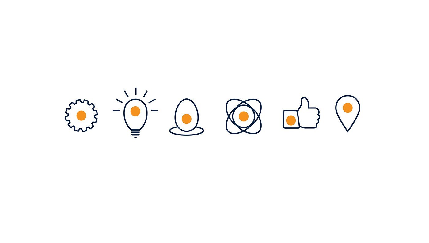
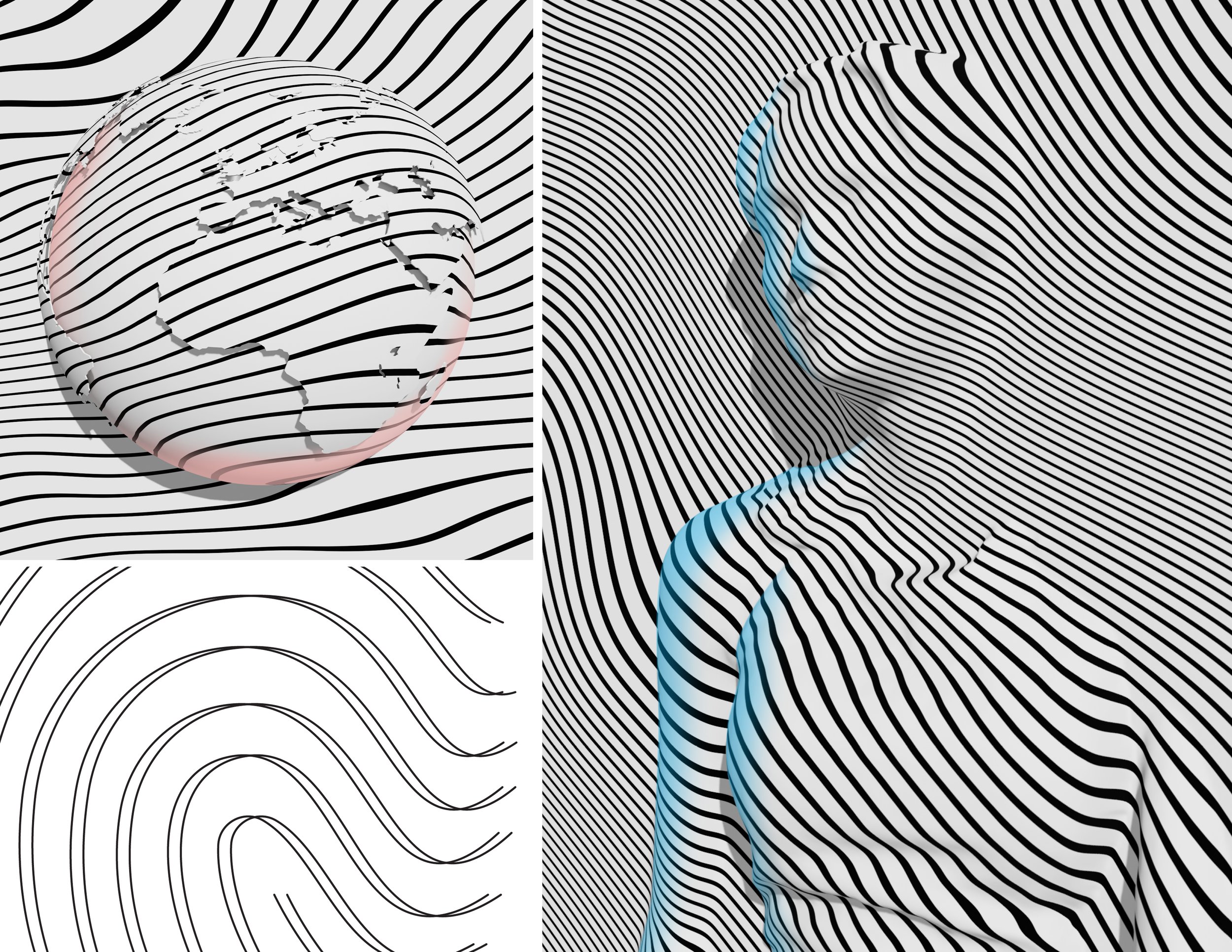
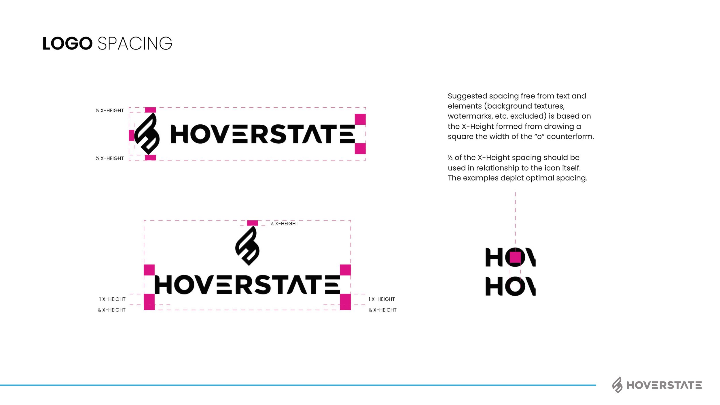
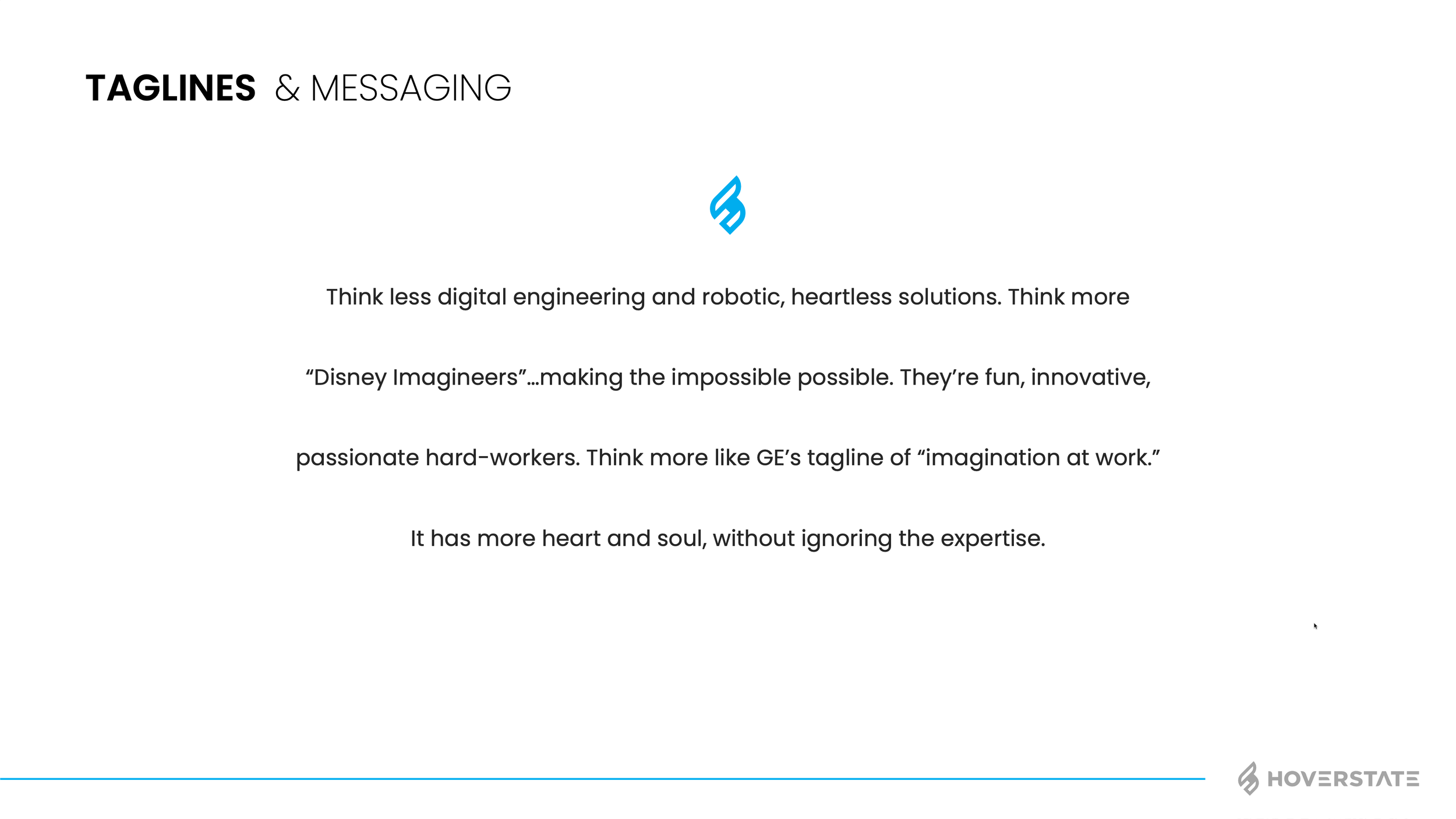
I think most of my clients have many brand pieces they need, but for some reason it helps having someone consolidate, bring it all together and unite around the vision. Does the kerning of the word mark matter, yep! Is the secondary color palette important to get right, yep! But more importantly than those things (and using proper grammar in this blog) is the voice and brand personality. I’m not going to explain this whole project as I do have a page on the work also now, but below are some of the assets and final brand guide I put together. We rallied the team around “Invent Tomorrow” as the tag and I think the brand voice we gave really fits well with the vision. The color palette, type style, assets and humanity elements helped push their CX, user first approach to business. See how I got to this point and the branding options shown by checking out the page here: Hoverstate Rebrand
JUST A BRAND REFRESH
I’m thankful for clients who know it’s not as simple as tweaking a few letters and calling it a day. Trailheads has been a client of mine for a few years now. They are great to work with and even greater people on top of that. They first reached out to me after seeing one of my badge designs and hoping I could help them on a hang tag layout. I did the layouts, added some overall branding suggestions and somehow that turned into helping them redesign all their product branding on their Amazon store. It’s been fun to hear how the focus on imagery and design has really upped their sales through Amazon and I always appreciate them keeping me in the loop with future project discussion etc.
Earlier this year Trailheads recruited me to help with some new headers and imagery for their new website. As most people are aware, creating a new website takes a lot of time and resources. That made for the perfect time to refresh the logo, update colors and give a bit of direction. Since I was familiar with their logo from so many previous projects, I knew quite a few changes to suggest right away. These changes would make the logo simpler, a bit more streamlined after taking out a few kinks/bumps and more current without losing the brand equity they established (especially in the women’s trail running space).
Here you can see a before and after of the work I did. I evened out the line weight, centered the diamond more with the “T” in the middle and adjusted some spacing. One thing I like to do also with a handwritten logo is tweak letters that are the same since the style is handwritten it only makes sense that they wouldn't be exactly the same. In this case the “A” letters were tweaked ever so slightly.
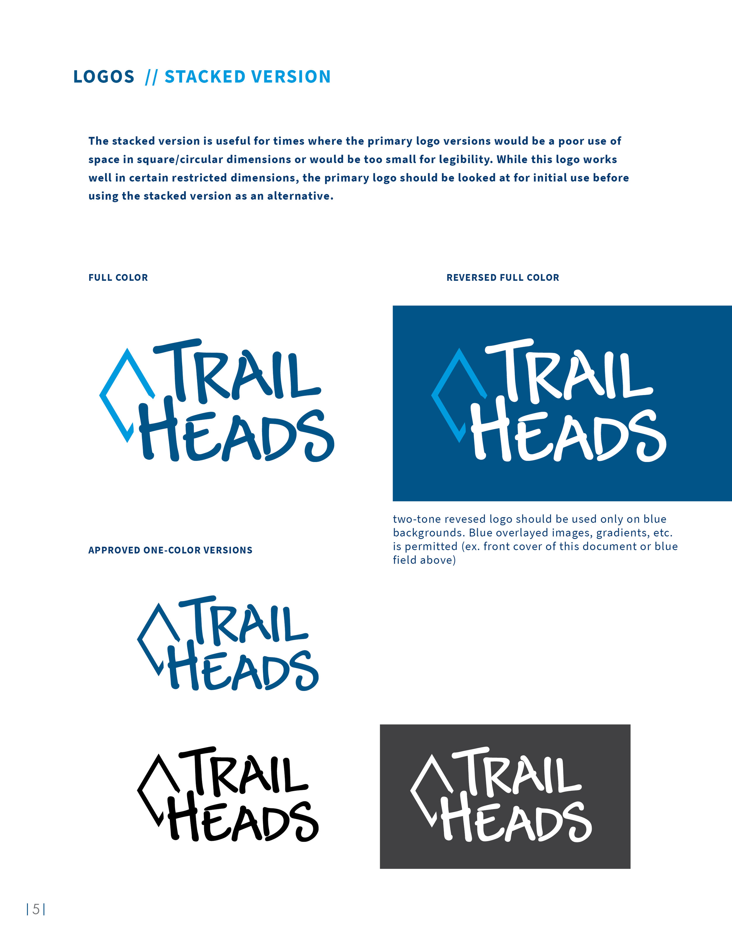
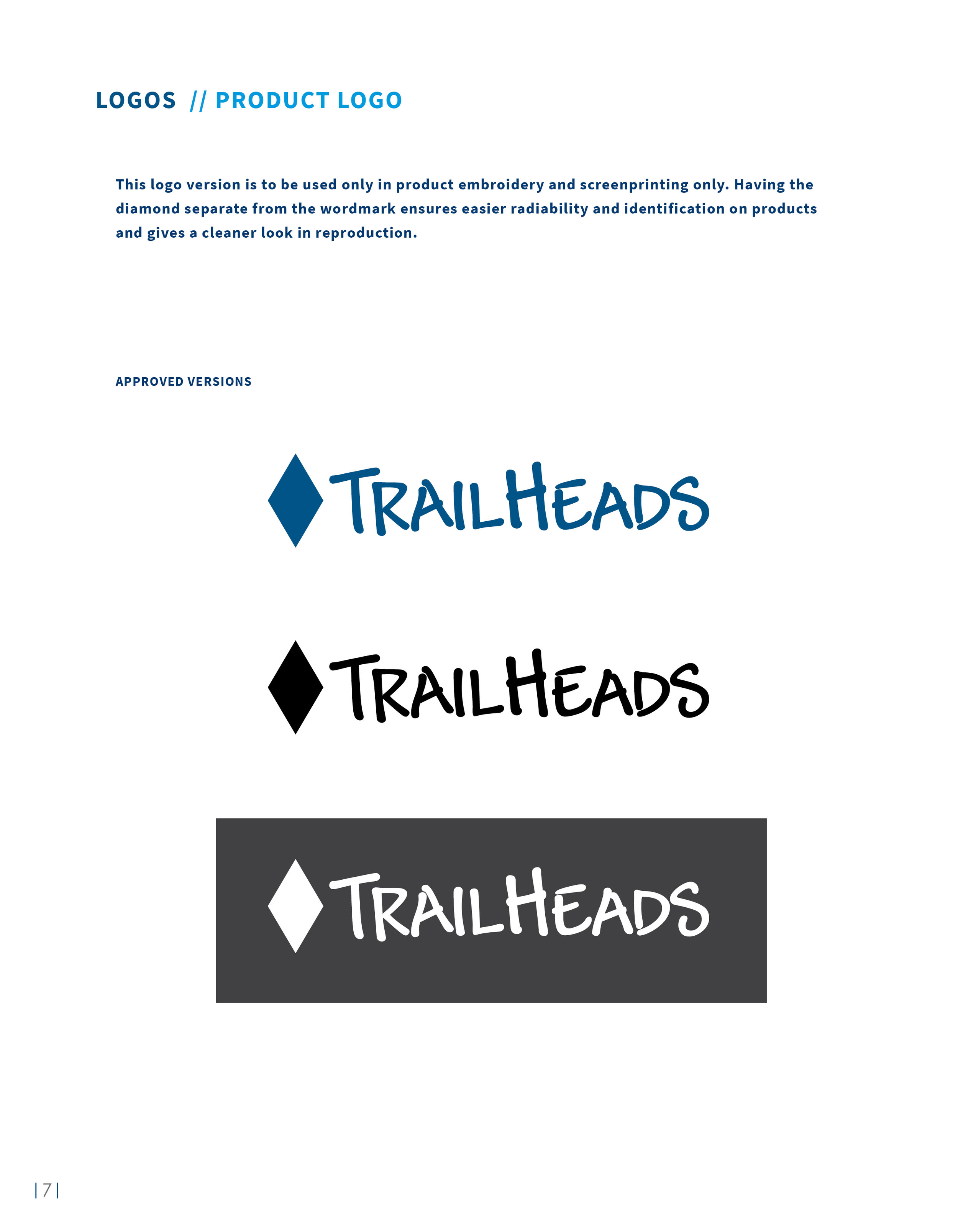
I also used a two-tone color scheme with a bright lighter blue for contrast. After looking at the logo and discussion over usage on profile images, hangtags, small ponytail holders, etc. I also created a stacked logo version. This would be very useful for square shapes and profiles the logo may need to live in. With so many printing methods and embroidery included, we also had variations on the logo created with taglines, separate diamond shapes, etc. all with a purpose to improve legibility or solve a problem on certain materials.
Key branding elements were also updated with the new color scheme and tweaked where needed to fit the new direction. These represent just a few elements used in branding and sometime I will do a post showing more vector illustration work and icons done for Trailheads.
A “TH” symbol was also created for favicon use and other very small space needs.
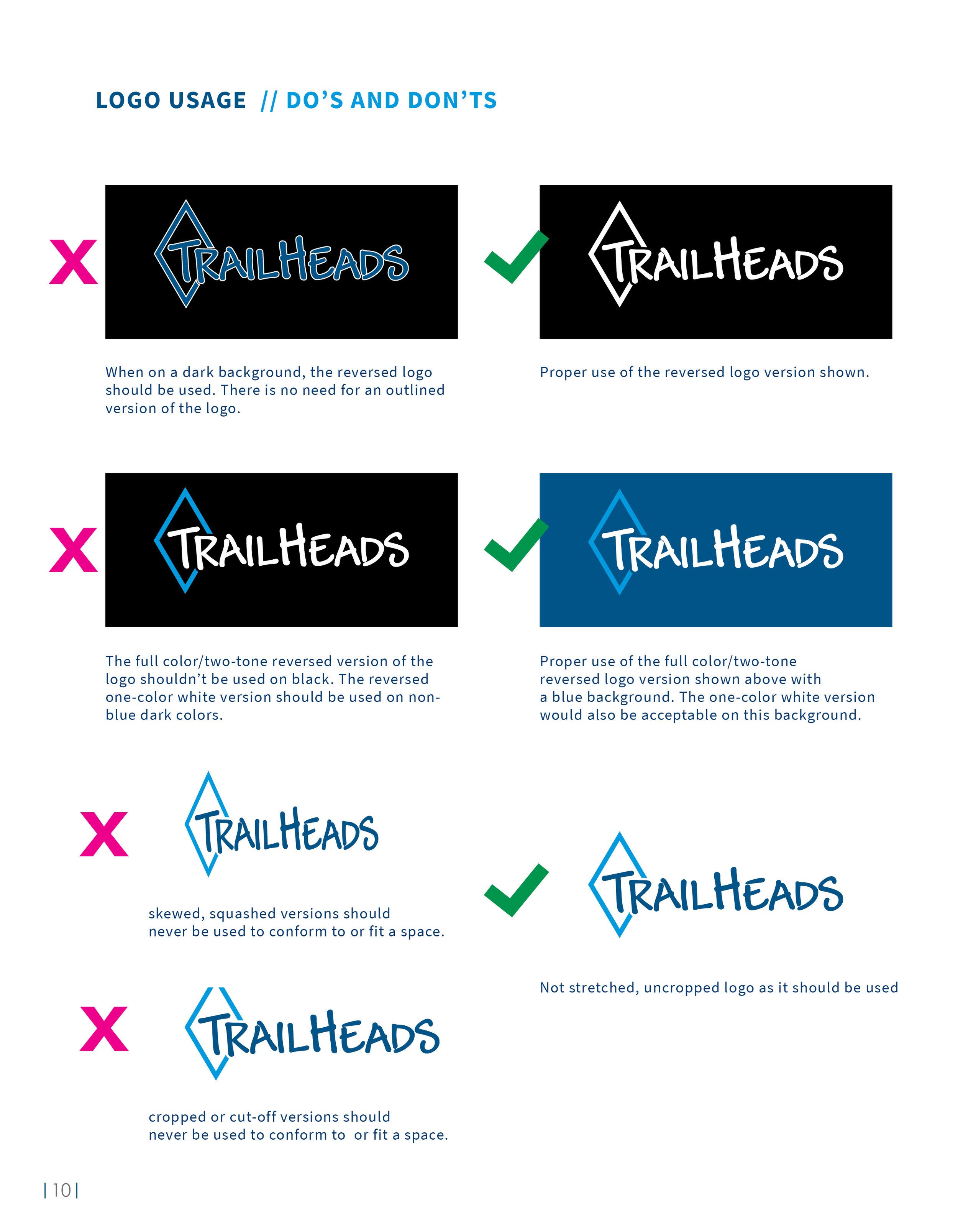
Below is the brand guidelines that were designed to provide direction with the new website and future projects. This was one of the larger brand guidelines I’ve done recently, so I removed some pages as to not make you scroll for a decade. I made it an interactive pdf with each section navigation being a live button and making it easier to navigate. The document talks everything from spacing, to color profiles, typography direction and branding examples.
Once the new website is live I may have to make another post. Trailheads is great to work with and I’m always excited about the variety of their projects. Somehow they even let me design a glove :)
ELITE SOCCER TRAINING STARTS HERE
On my sports identity and branding site (customsportslogo.com), I do a lot of badge and crest designs for various teams, leagues and clubs. I love doing sports design and the fact that I get creative requests after someone sees my work online is very rewarding. Since many of my requests are crest designs (most of the time soccer related) I have a standard price and process for that type of work. Level Up, on the other hand, wanted more of a brand logo and emblem that could be used at their newly acquired elite performance training facility. The logo would need to feel elite and work well with environmental graphics that were going up all over the interior of the building.
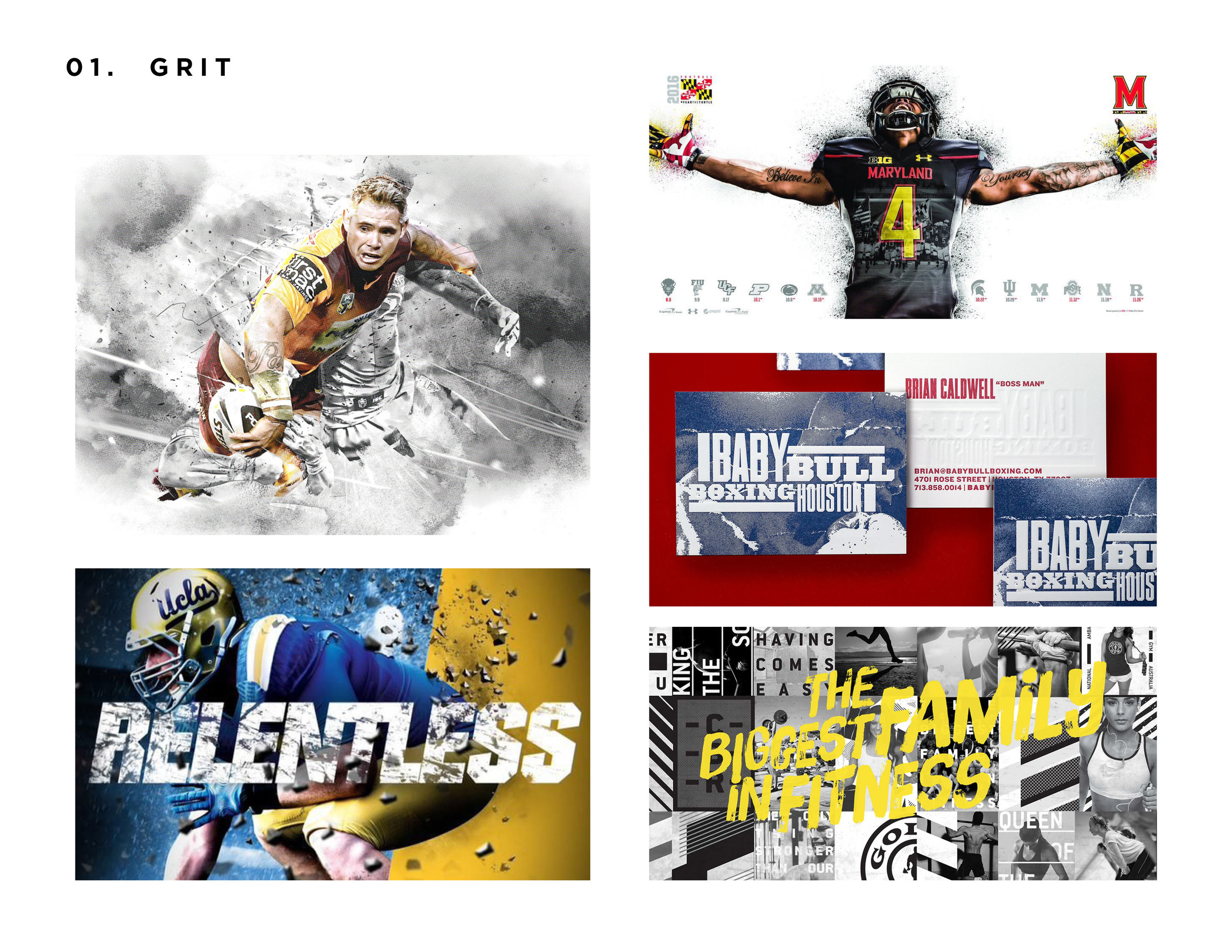
What an exciting project to work on with a lot of energy behind it as the training center is starting to come together. For this project I used a set of initial stylescapes to guide direction. Rather than showing multiple logo design concepts going every which way, I wanted to have a clear direction in moving forward and develop concepts that would be on target from the start. To accomplish this, I showed six different stylescape directions I named: Grit, Overlay, Monoline, Modern/Simple, Elite/Crest and Flat Dimension. In these stylescapes I showed a mood board or two of look/feel directions also that would give a sense of environmental graphics that would fit with the brand style. The styles capes consisted of examples and designs that fit the description well and also could provide inspiration or discussion for the direction of Level Up.
The two directions that the client gravitated to were as follows: Grit and Elite/Crest. The Elite/Crest style really lends itself to soccer branding and design. It quickly relates to an overall soccer style and then with the incorporation of grit, I could see the style having a cross-fit style pinch to it.
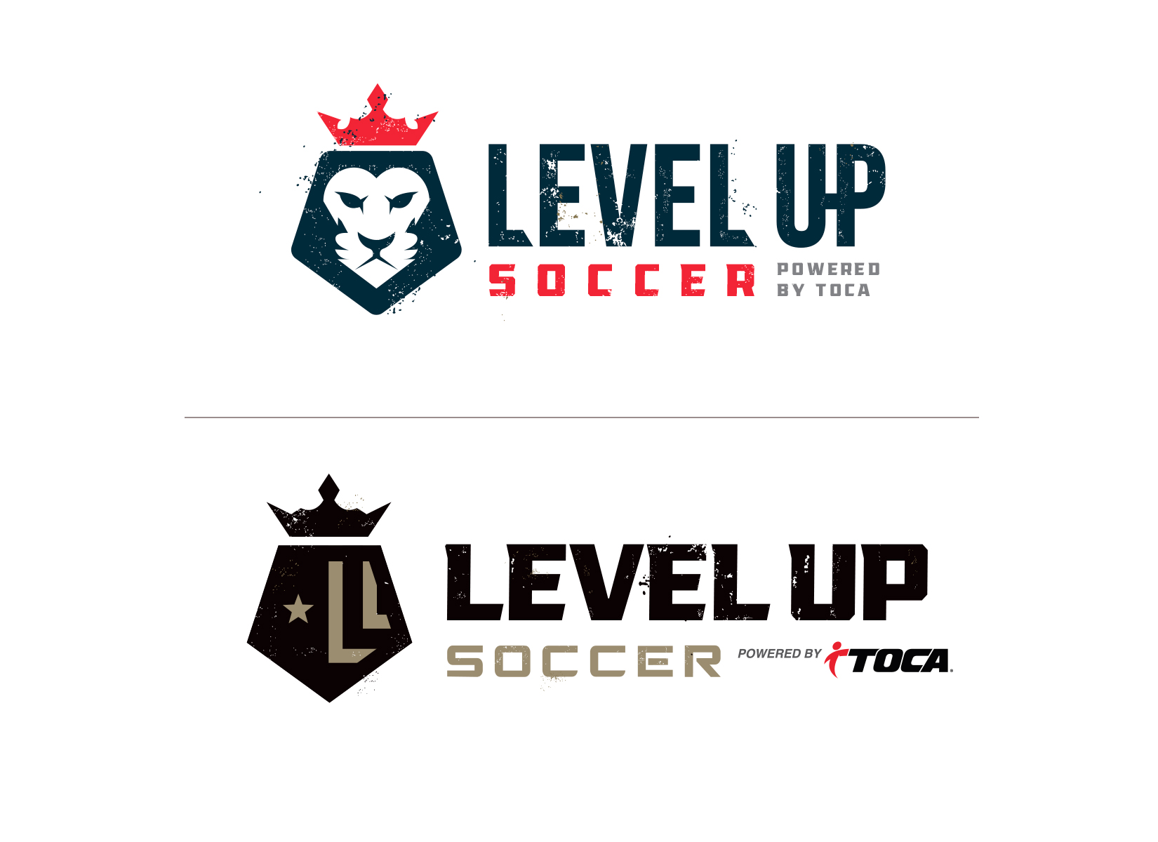
The initial concepts really hit the mark with the stylescape direction and thought the timeline for this project was pretty aggressive. Taking the time to do them was very helpful. I show below two of my initial concepts that were the top design variations by the client. After some discussion I went to work on the direction of keeping the lion head and crown but incorporating the hint of an “L” shape in the emblem. The coloring and typography was preferred in the second layout and having a responsive, engaged client really made the refining process fun for me.
As you can see, I created many styles of both the lion face and hinted “L” incorporation, some much more prominent than others. While I show multiple versions below, just know I did many many more till I felt confident I had a good direction. Spoiler alert (the first head won) and the final logo had both vertical orientation and horizontal orientation layouts for various uses.
Besides just the logo design itself, Level Up was interested in branding elements, brand standards for guidance going forward and other materials to come. Their program is designed to have various color represented levels to it and I used that concept in their brand elements as well. The angled color bars add movement and give a splash of color when used in layouts.
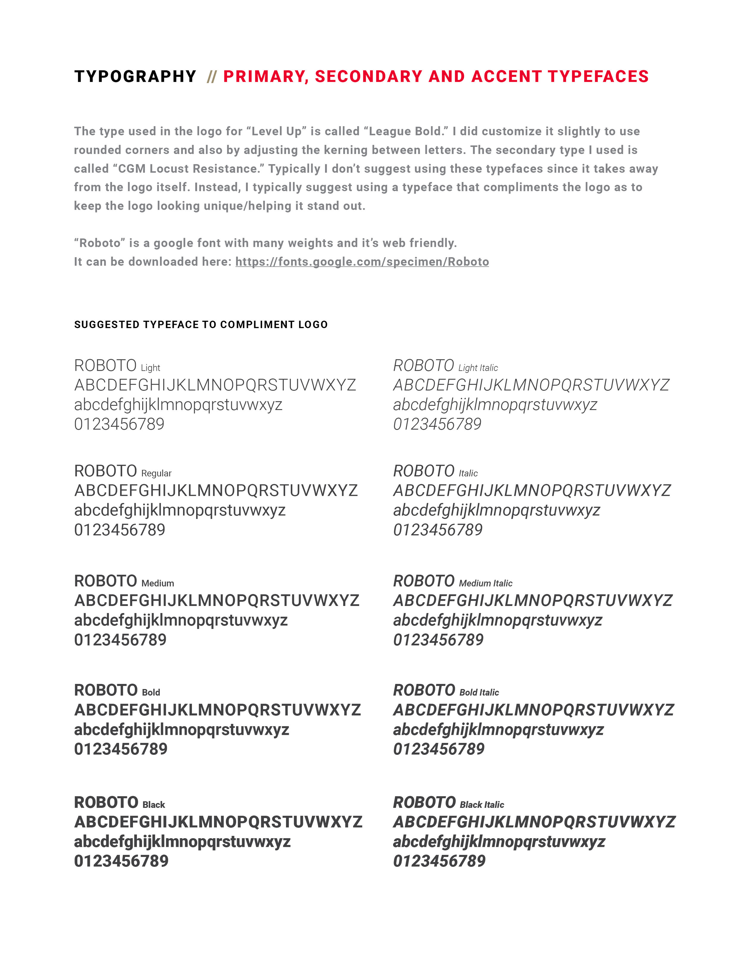
The brand guidelines shown below give direction and organize color profile information, typography guidance, preferred logo use and some helpful spacing suggestions. I try never to make the brand standards too restrictive, but create them as more of a guide to develop the branding around. Since the grunge elements in the logo can be problematic in a few production types, I also provided clean versions for use in those cases. Having a designer who really thinks through future usage can really help a brand get started on the right foot rather than having to rethink things in a couple years after everything has become watered down or disjointed. All in all this was a great project, process and a fun client to work with.
