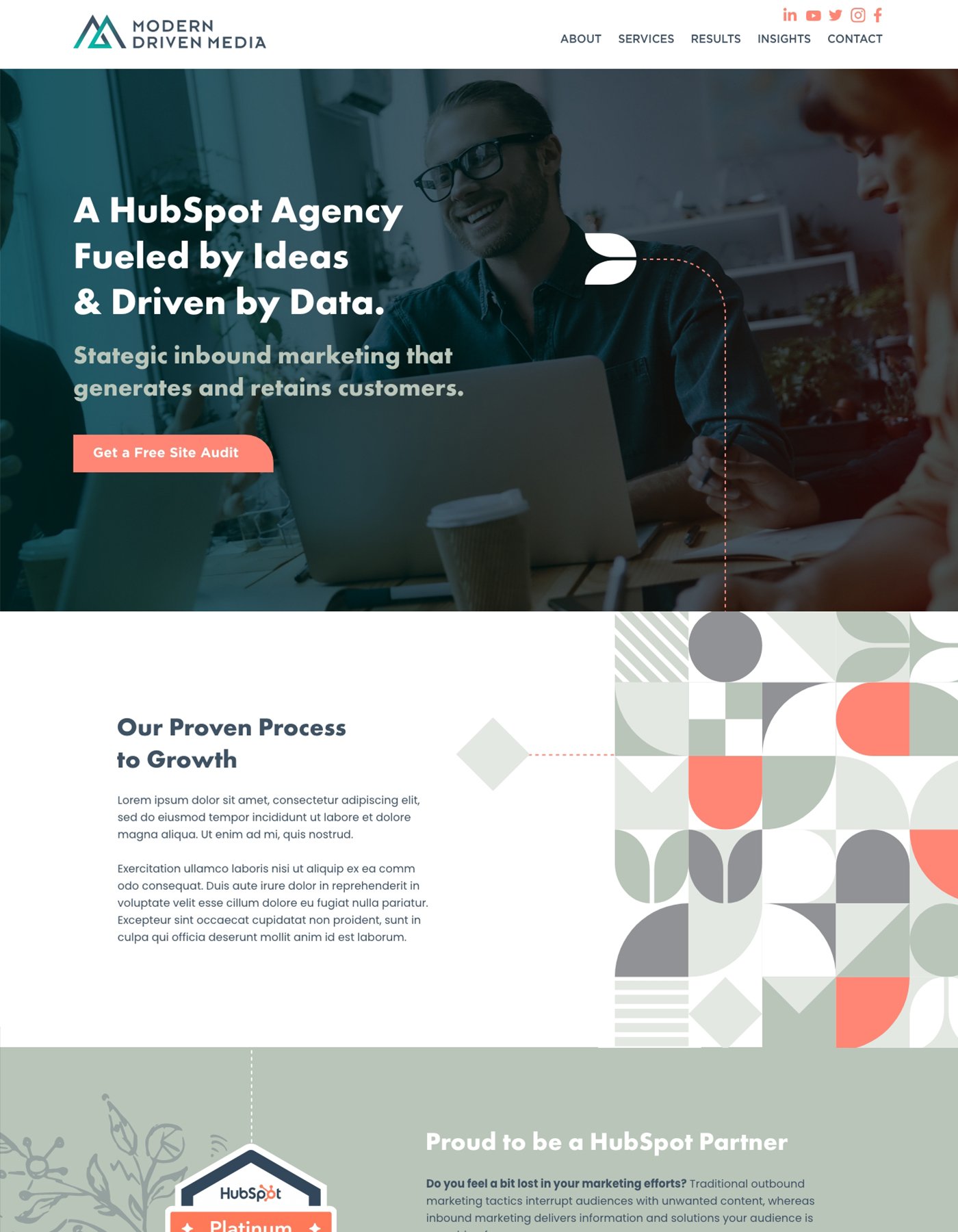
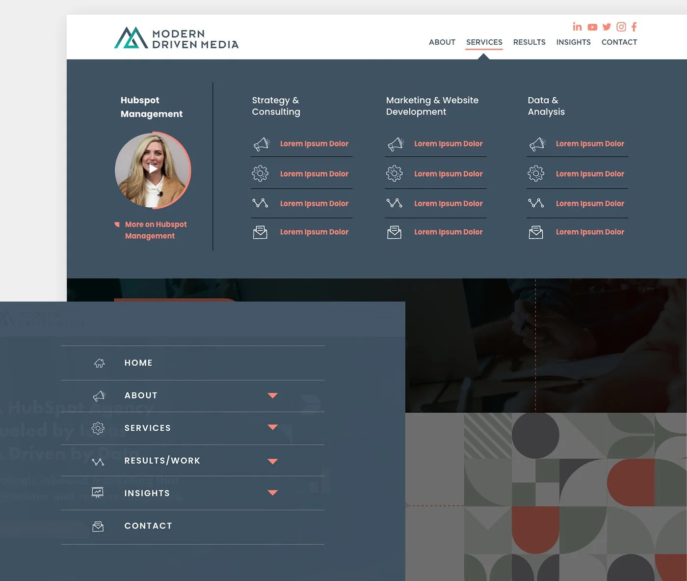
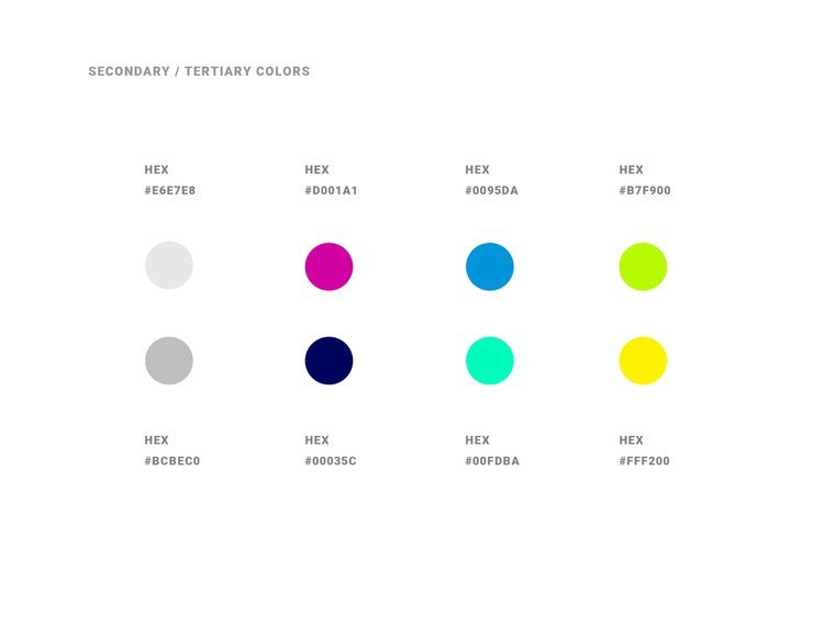
From logo design to branding, templates to the HubSpot site design, this project was a lot of fun to work on. Since some of the alternate options in initial direction on the logo were well received, we took elements from those concepts to pull together a consistent but interesting brand package. The site was complete with mega-menus and hand drawn elements that really give a custom feel. This site is still in development and I’m excited to show off on completion!
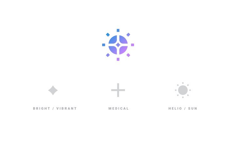
PRONOUNCED HE-LOW
Taking part in strategy sessions, ideation on names, logo and identity development, brand guides, etc. and this software brand was a lot of fun to work on.
REBRANDING SOFTWARE TOOLS FOR TESTING TOOLS
Testing tools in the real world is a heck of a lot different than saying they performed great in the lab or simulation. In the real world, there’s real outdoor elements, real rough conditions, real time that can’t be wasted, real guys and gals wanting products that can be trusted. TestedHQ takes products into the real world and gives them an actual score that can be analyzed and used to adapt final products. Ensuring a product isn’t just a great idea, it’s executed to perfection. We gave them a strong look and feel to match their market and used the “linking” concept to be used in explaining their benefits to clients. Real People. Real Perspectives. Real Results. Also I gave them a real brand guide and professional logo files. Always fun doing a rebrand and meeting new people, great group and a lot of fun to work with on this one.
TAGLINE / BRANDING / BRAND GUIDE / JUST GETTING EVERYONE ON THE SAME PAGE
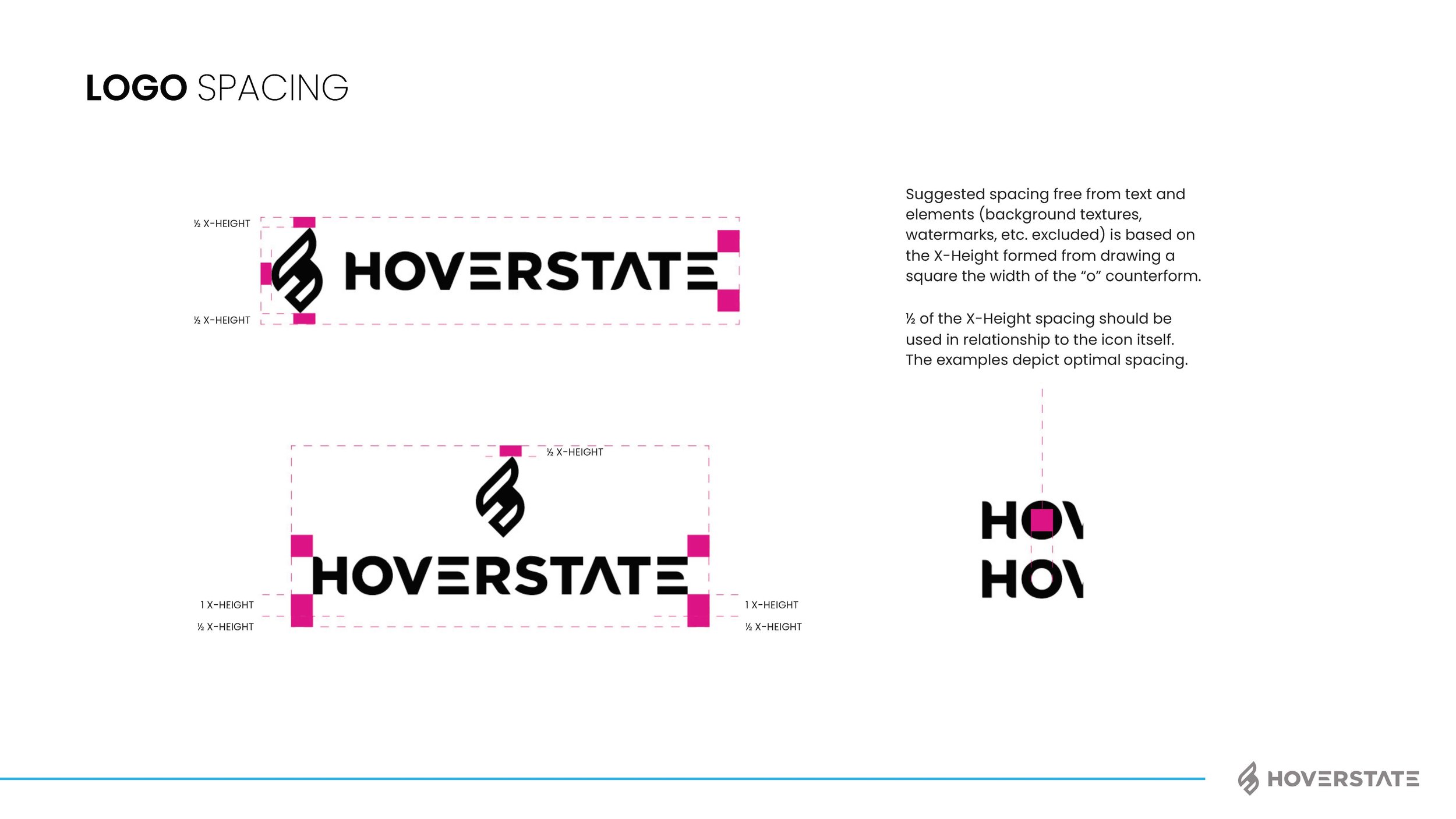
I think most of my clients have many brand pieces they need, but for some reason it helps having someone consolidate, bring it all together and unite around the vision. Does the kerning of the word mark matter, yep! Is the secondary color palette important to get right, yep! But more importantly than those things (and using proper grammar in this blog) is the voice and brand personality. I’m not going to explain this whole project as I do have a page on the work also now, but below are some of the assets and final brand guide I put together. We rallied the team around “Invent Tomorrow” as the tag and I think the brand voice we gave really fits well with the vision. The color palette, type style, assets and humanity elements helped push their CX, user first approach to business. See how I got to this point and the branding options shown by checking out the page here: Hoverstate Rebrand
