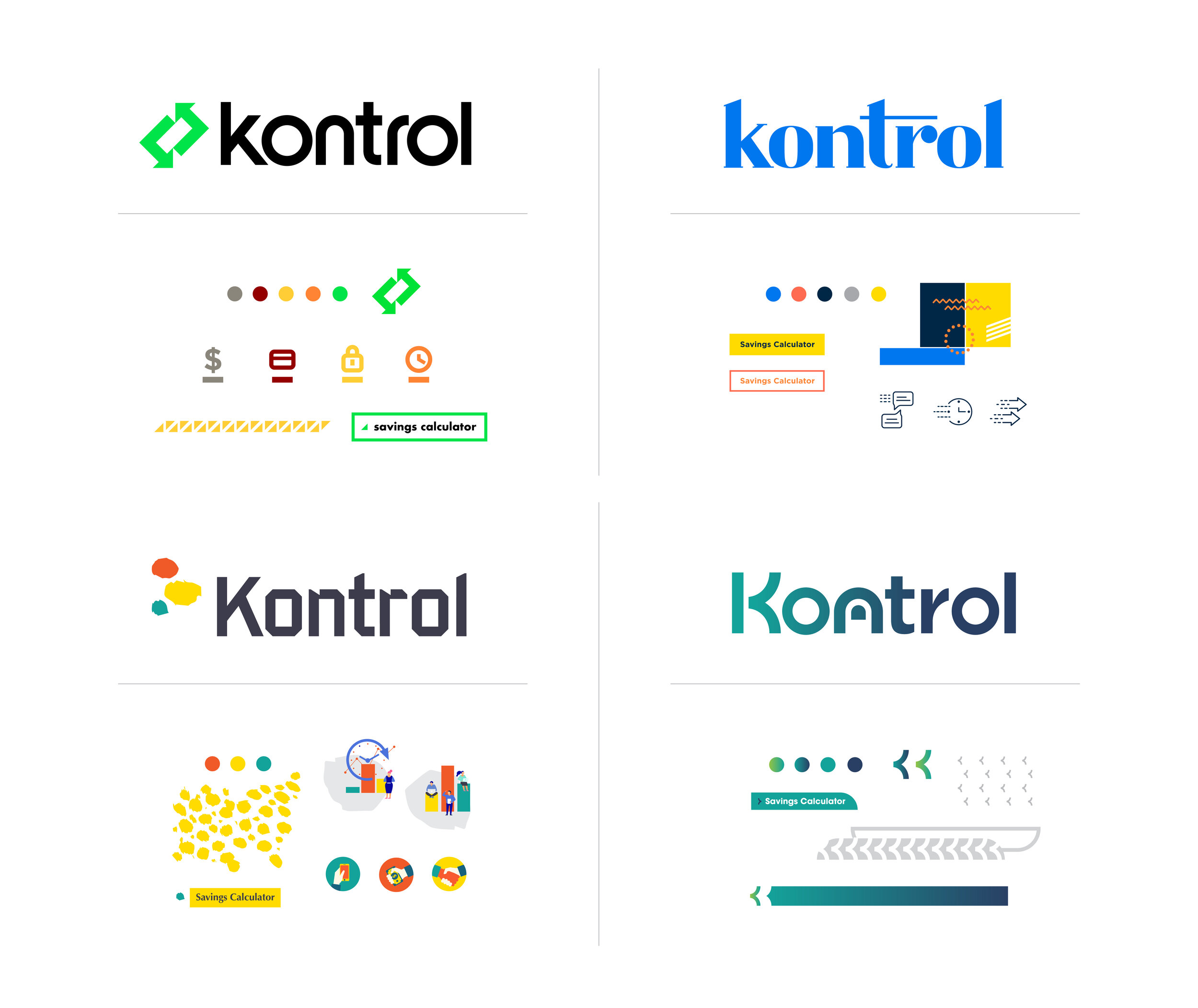
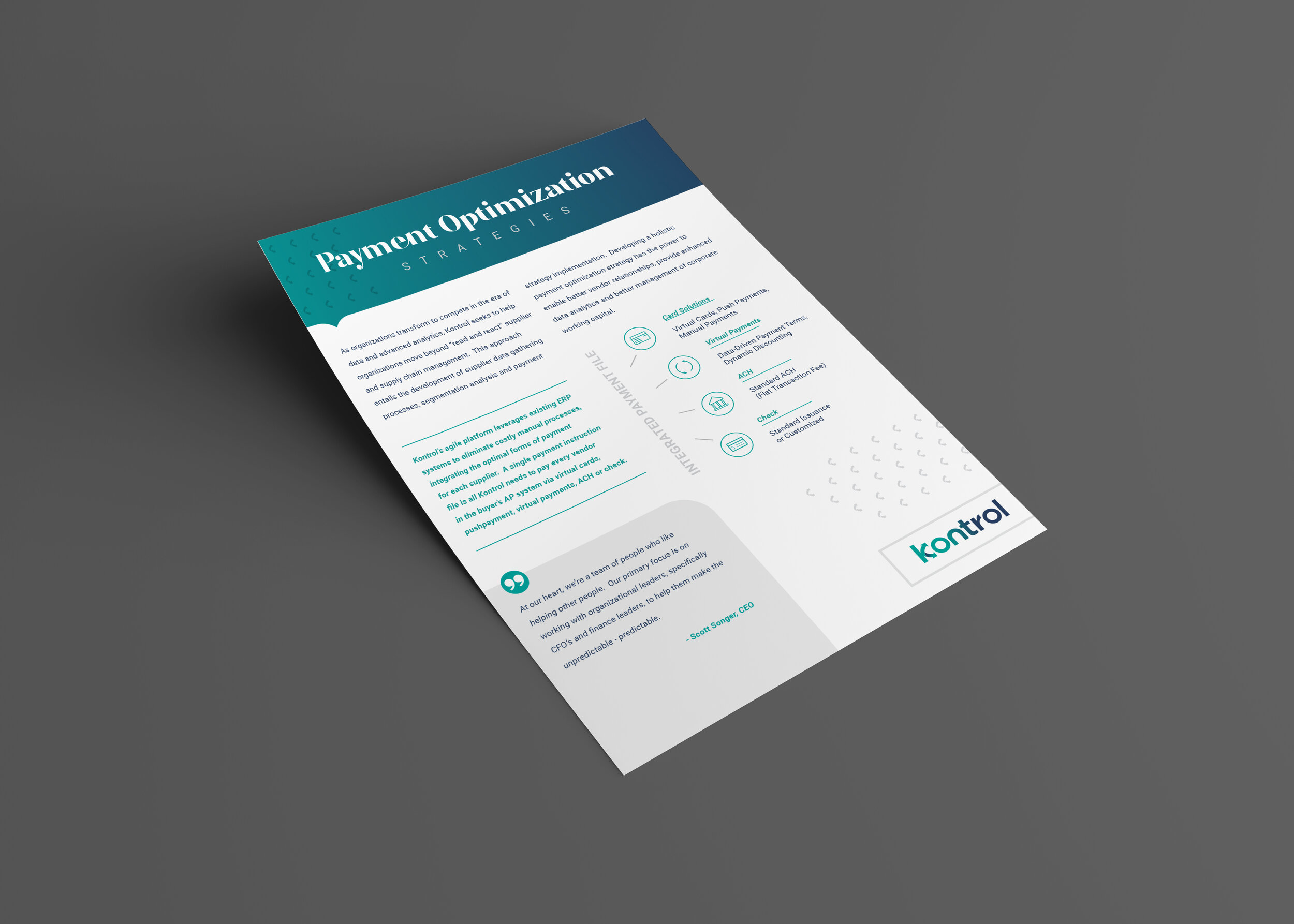
Keeping a mark as simple as possible is the goal of just about every logo/identity project I’ve ever done. Working with great clients and having a clear goal of the project for this one really helped set this rebrand up for success. See a glimpse at some of the rebrand below and go SEE THE FULL PROJECT. Excited to assist in fully rolling this out in the future. It’s been featured a few places now including, Communication Arts Magazine and appears in the 2023 Design Annual. Pretty cool.
KONTROL REBRAND
Kontrol Payables has built an amazing platform for companies to optimize payments to suppliers, vendors, etc. Their system provides cost savings by streamlining ACH, virtual cards, checks, etc. into a single, easy to implement platform and they get a rebate based on spending. Pretty amazing company, I don’t understand it all and likely won’t grasp all the capabilities, but boiling down the offerings into a single concept was fun. Some of the words I grasped onto for dear life were “payables and returns”, “speed”, “security”, “identity” etc. I’m also excited about them dropping “payables” in the logo itself as it makes for a really clean look and doesn’t limit them in launching new products and consulting in the finance space.
In presenting these logo concepts, I did a few animated .gif files to show my thought process in development. Showing how the ideas come to life has proven to be really beneficial in presentations. I know these aren’t giving any animators a run for their money, but I think they did their job in telling the story of each concept.
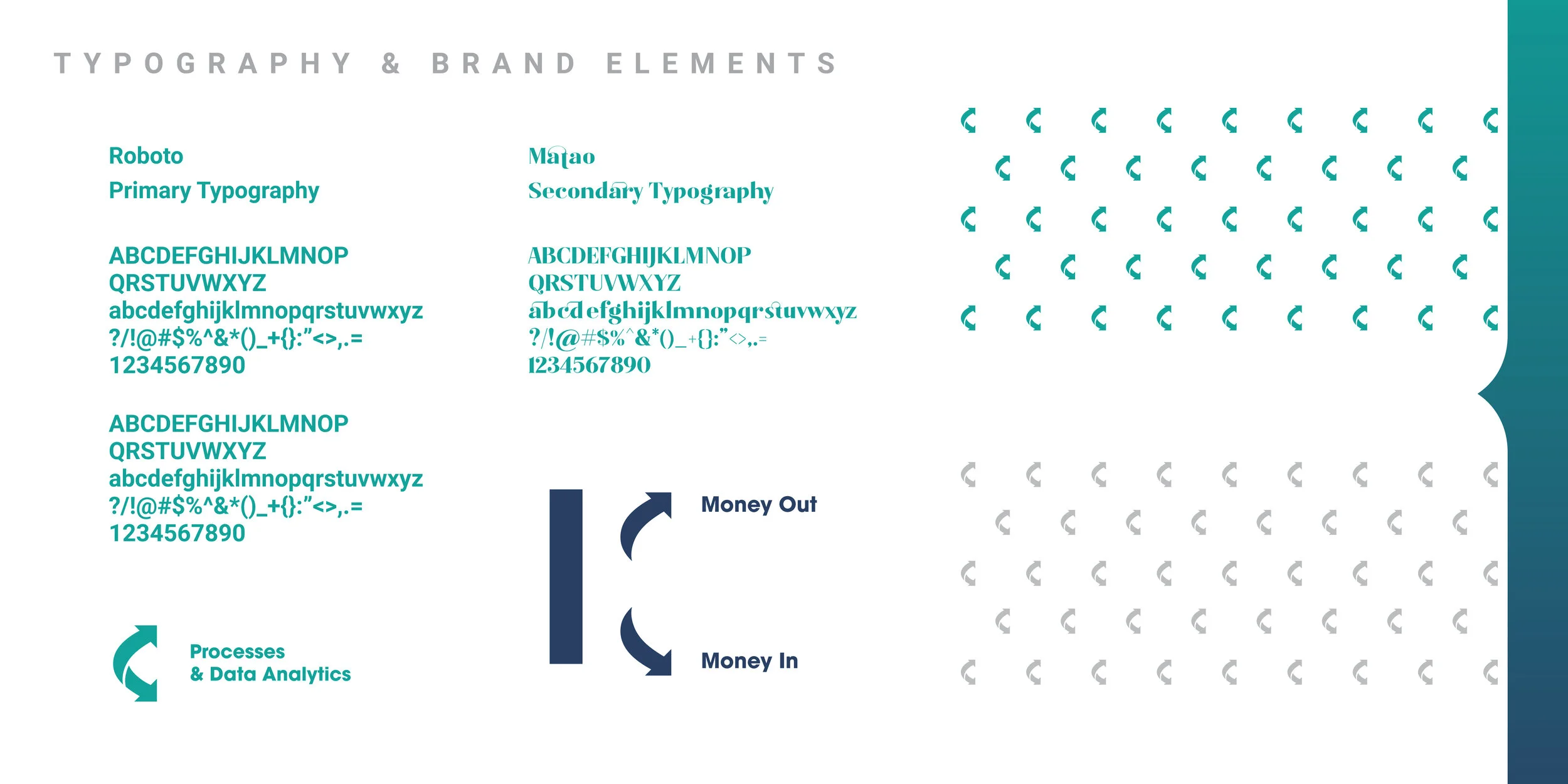
The final logo choice and some identity components are below, many more marketing pieces are in the works. The two way payment offering of “payables” and “returns” is displayed in the form of the arrow icon. I’m excited to continue building the Kontrol brand with new presentation decks, product offering launches, etc. I’m sure they’re will be some future blogs showing off that work as well.
