Keeping a mark as simple as possible is the goal of just about every logo/identity project I’ve ever done. Working with great clients and having a clear goal of the project for this one really helped set this rebrand up for success. See a glimpse at some of the rebrand below and go SEE THE FULL PROJECT. Excited to assist in fully rolling this out in the future. It’s been featured a few places now including, Communication Arts Magazine and appears in the 2023 Design Annual. Pretty cool.
THE "M" IS A BEATIFUL LETTER
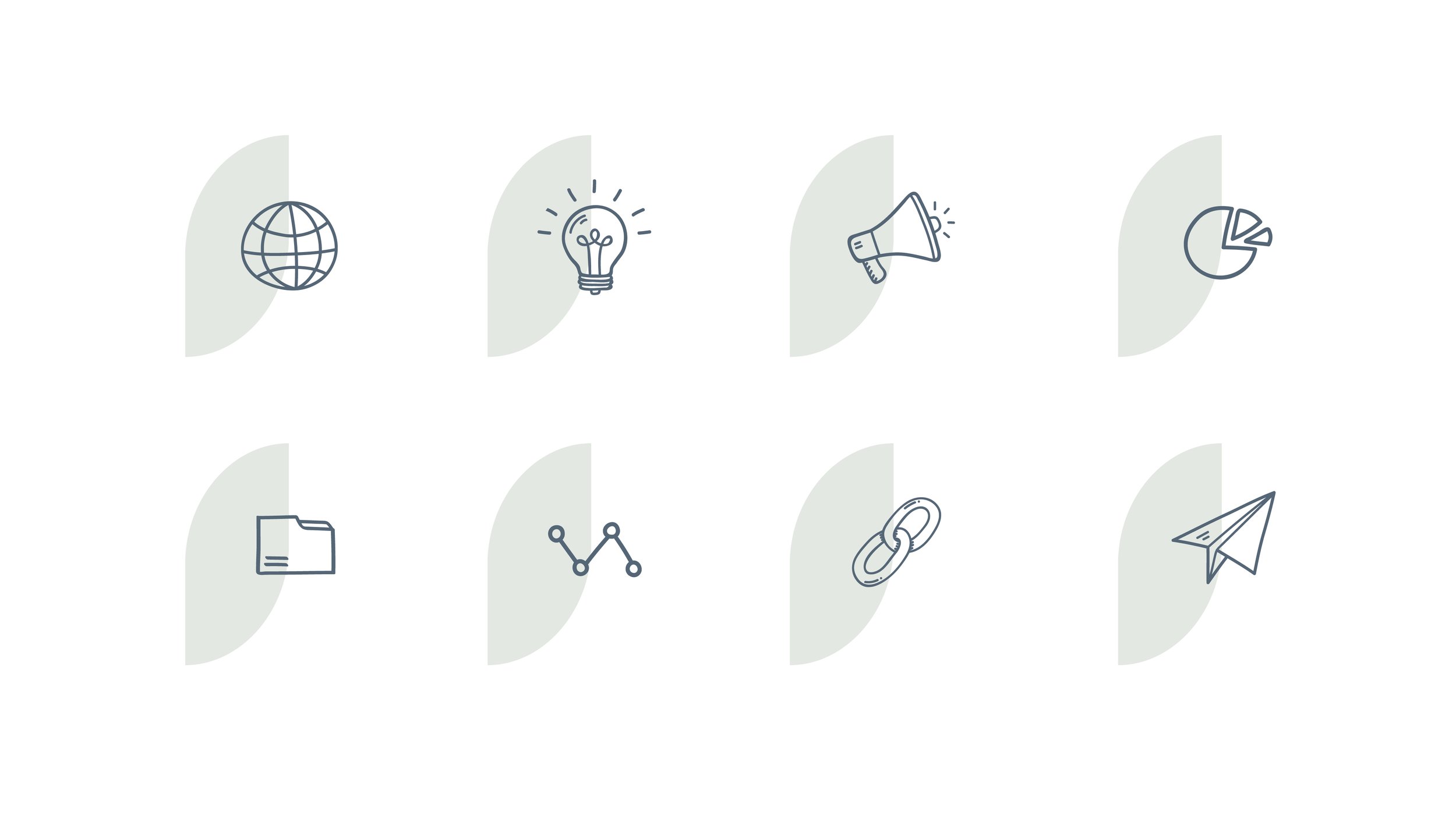
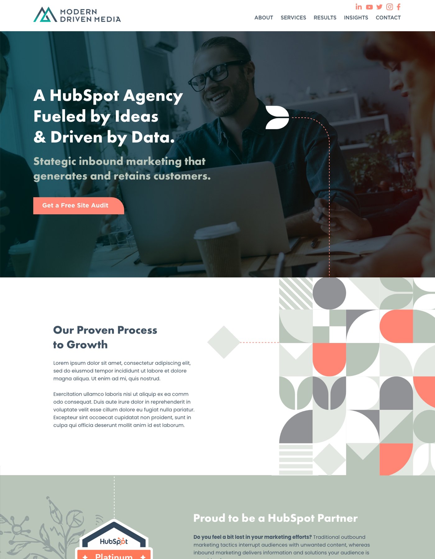
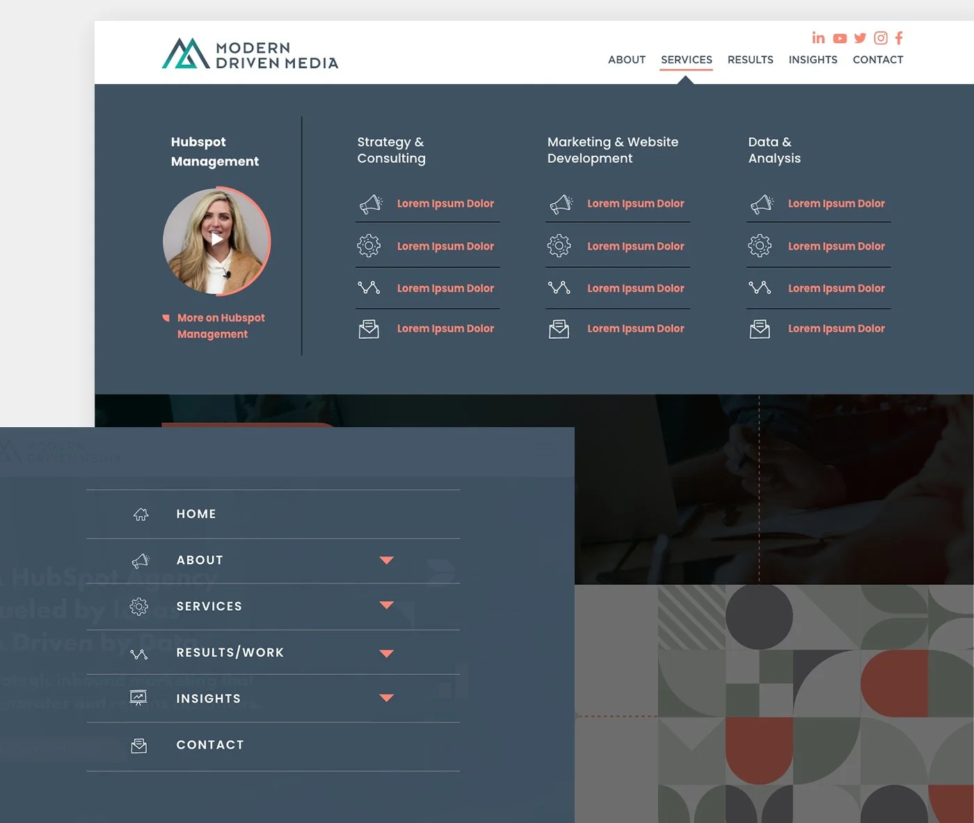
From logo design to branding, templates to the HubSpot site design, this project was a lot of fun to work on. Since some of the alternate options in initial direction on the logo were well received, we took elements from those concepts to pull together a consistent but interesting brand package. The site was complete with mega-menus and hand drawn elements that really give a custom feel. This site is still in development and I’m excited to show off on completion!
