I get asked to work on all sorts of identity projects. Some may be rebrands or refreshes of existing companies, others could be upstarts looking to invest in their look/feel or even projects where I’m putting a look together to add credibility to a presentation for gaining investors. This project was an exploration for a business that may include purchasing already existing, established brands and re-naming or even starting from the ground up with finding the right distribution channels and building something new.
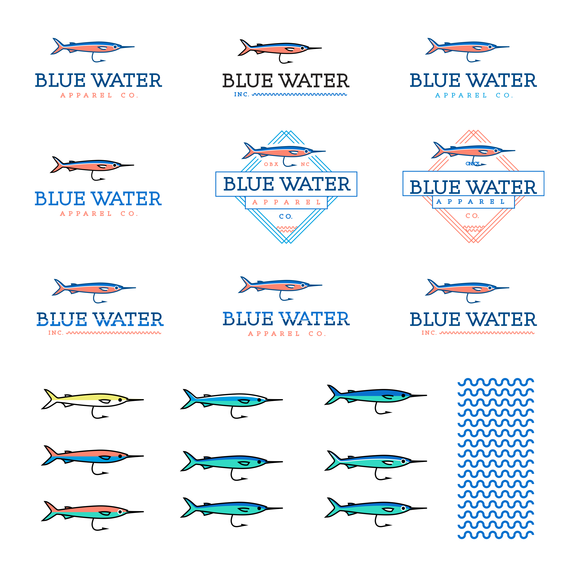
Either way, the project had a budget, and I was hired to start creating various looks/feels! I typically wouldn’t show all the unsold, unfinished work, but I pulled most all of my thoughts together for this post to give a little added insight into this project.
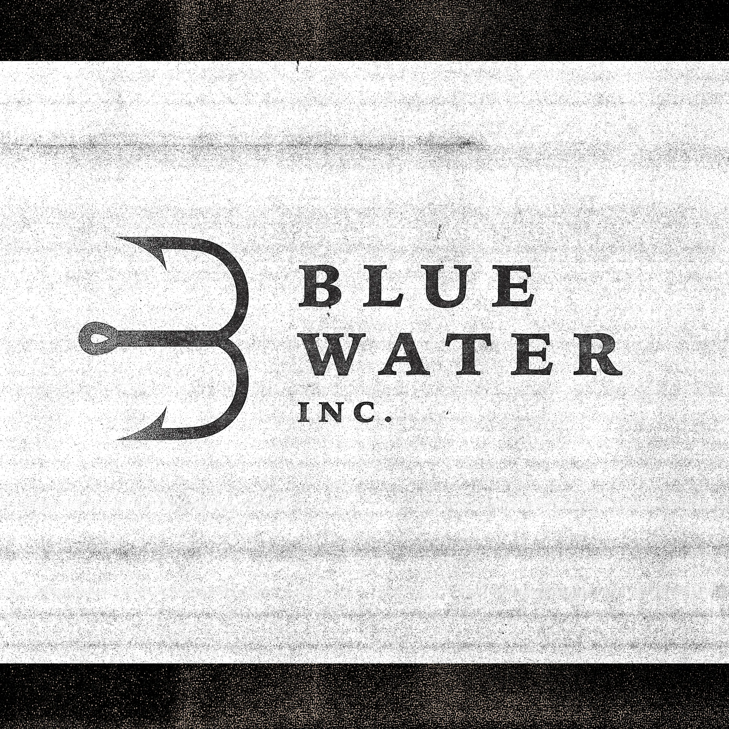
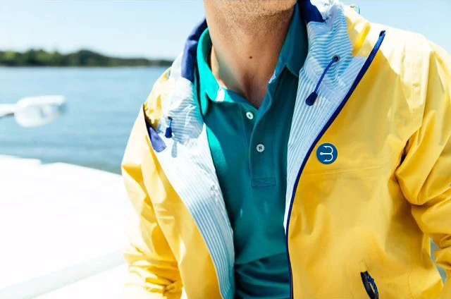
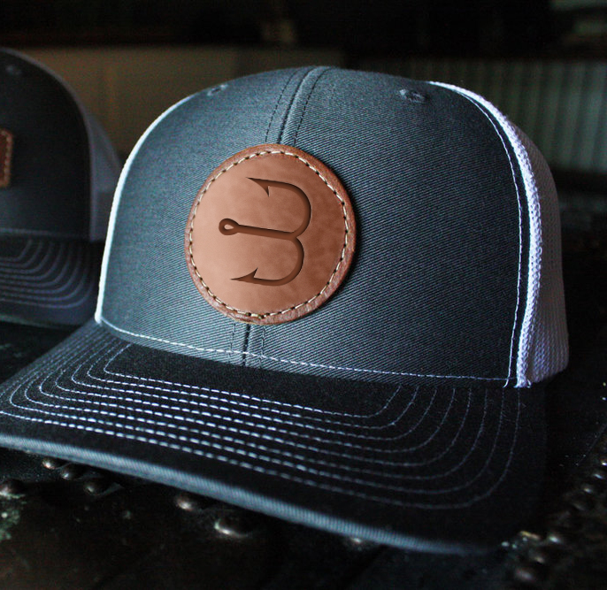
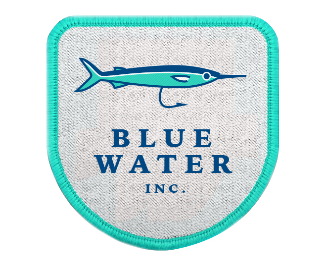
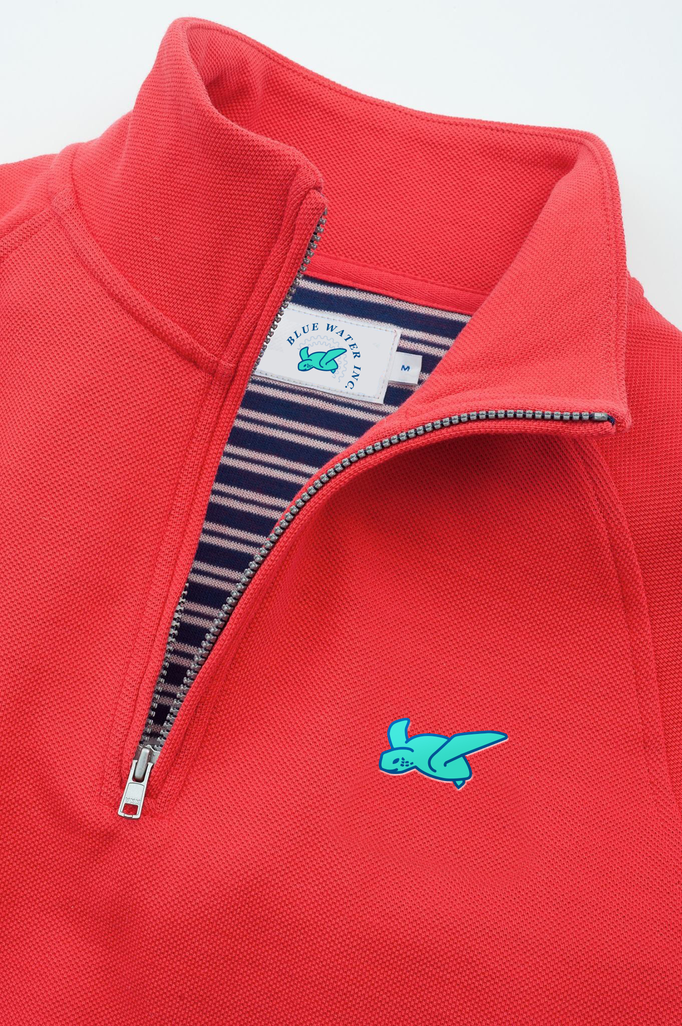
At the top of this post I show the final outcome, a simple “B” formed from a hook and a bit of serif type. I felt for the style we wanted, the serifs added an established feel that worked well with the fishing theme. Since this was an apparel business, I also looked at developing secondary marks for women’s, children’s and specialty men’s product lines. This idea resonated well with the client and gives a lot of flexibility in branding going forward. This also would require more funding and somewhat of a challenge in making sure each of the lines are linked back to Blue Water Inc.
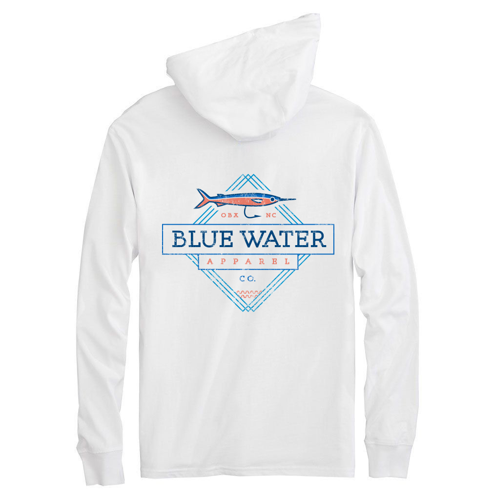
I used low res imagery for quick mockups to show some of the designs in an environment when talking over layouts. These mockups wouldn’t be used public facing in branding as I pulled all of them from google images, but just give a quick glimpse as to the style each brand mark could fit within.
It’s always such a fun process to see how sketches come to life in black and white vector pieces, the vectors then change into color selection and final versioning until finally really coming to life in realistic mockups.
I know some designers dislike a project where the intent is more exploratory than starting with an organized brief and sourcing paper samples for use etc., but there is something amazing about being given free reign to explore a brands direction and see where the concepts lead. In the end, the client was excited about the look and I was compensated to design/create which is my favorite thing to do!
