Keeping a mark as simple as possible is the goal of just about every logo/identity project I’ve ever done. Working with great clients and having a clear goal of the project for this one really helped set this rebrand up for success. See a glimpse at some of the rebrand below and go SEE THE FULL PROJECT. Excited to assist in fully rolling this out in the future. It’s been featured a few places now including, Communication Arts Magazine and appears in the 2023 Design Annual. Pretty cool.
THE "M" IS A BEATIFUL LETTER
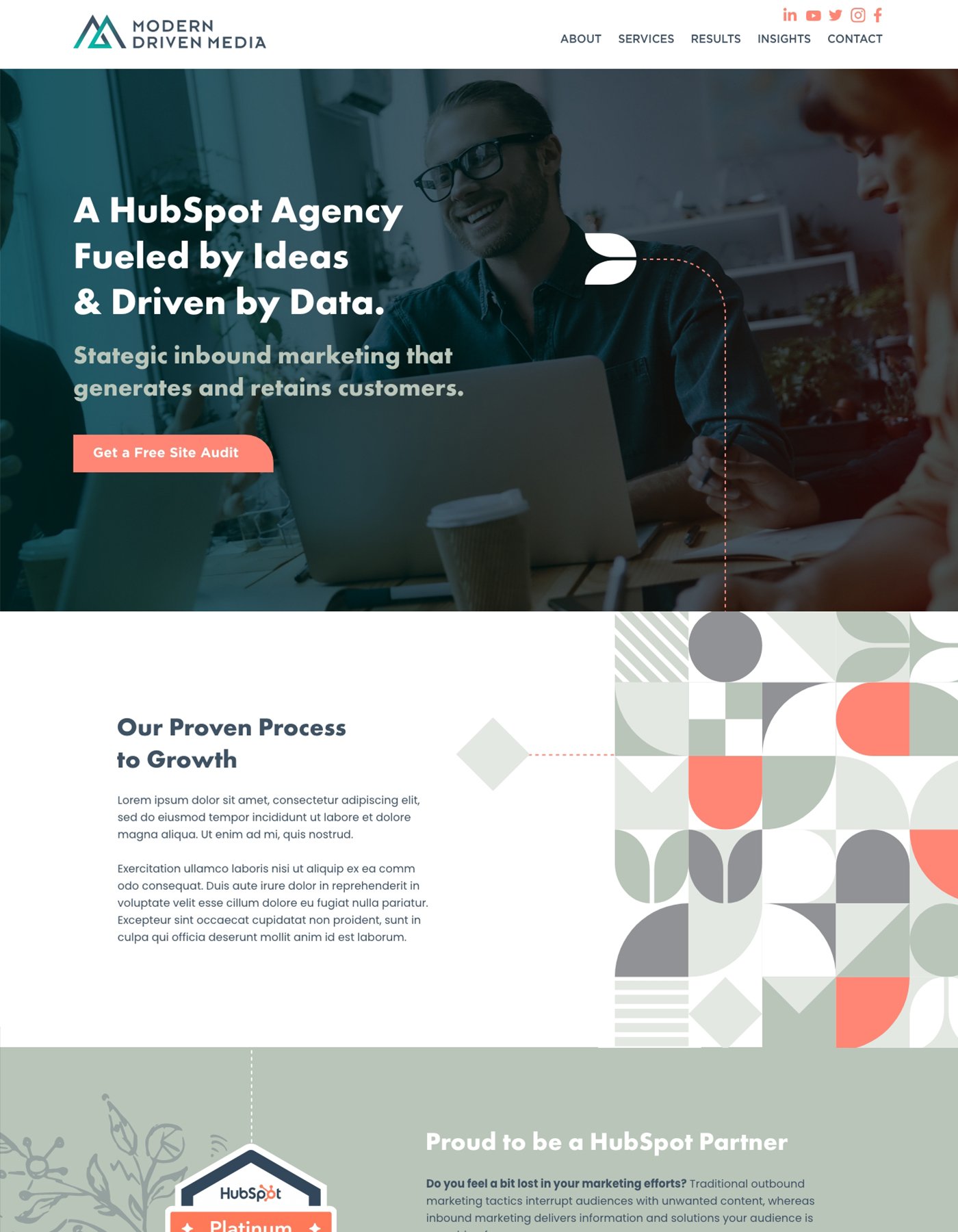
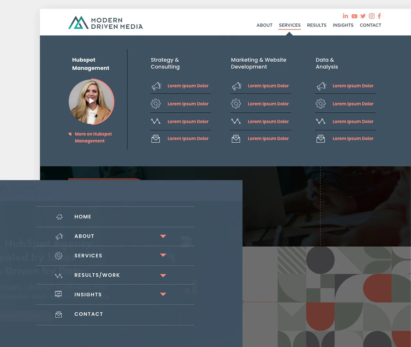
From logo design to branding, templates to the HubSpot site design, this project was a lot of fun to work on. Since some of the alternate options in initial direction on the logo were well received, we took elements from those concepts to pull together a consistent but interesting brand package. The site was complete with mega-menus and hand drawn elements that really give a custom feel. This site is still in development and I’m excited to show off on completion!
REBRANDING SOFTWARE TOOLS FOR TESTING TOOLS
Testing tools in the real world is a heck of a lot different than saying they performed great in the lab or simulation. In the real world, there’s real outdoor elements, real rough conditions, real time that can’t be wasted, real guys and gals wanting products that can be trusted. TestedHQ takes products into the real world and gives them an actual score that can be analyzed and used to adapt final products. Ensuring a product isn’t just a great idea, it’s executed to perfection. We gave them a strong look and feel to match their market and used the “linking” concept to be used in explaining their benefits to clients. Real People. Real Perspectives. Real Results. Also I gave them a real brand guide and professional logo files. Always fun doing a rebrand and meeting new people, great group and a lot of fun to work with on this one.
