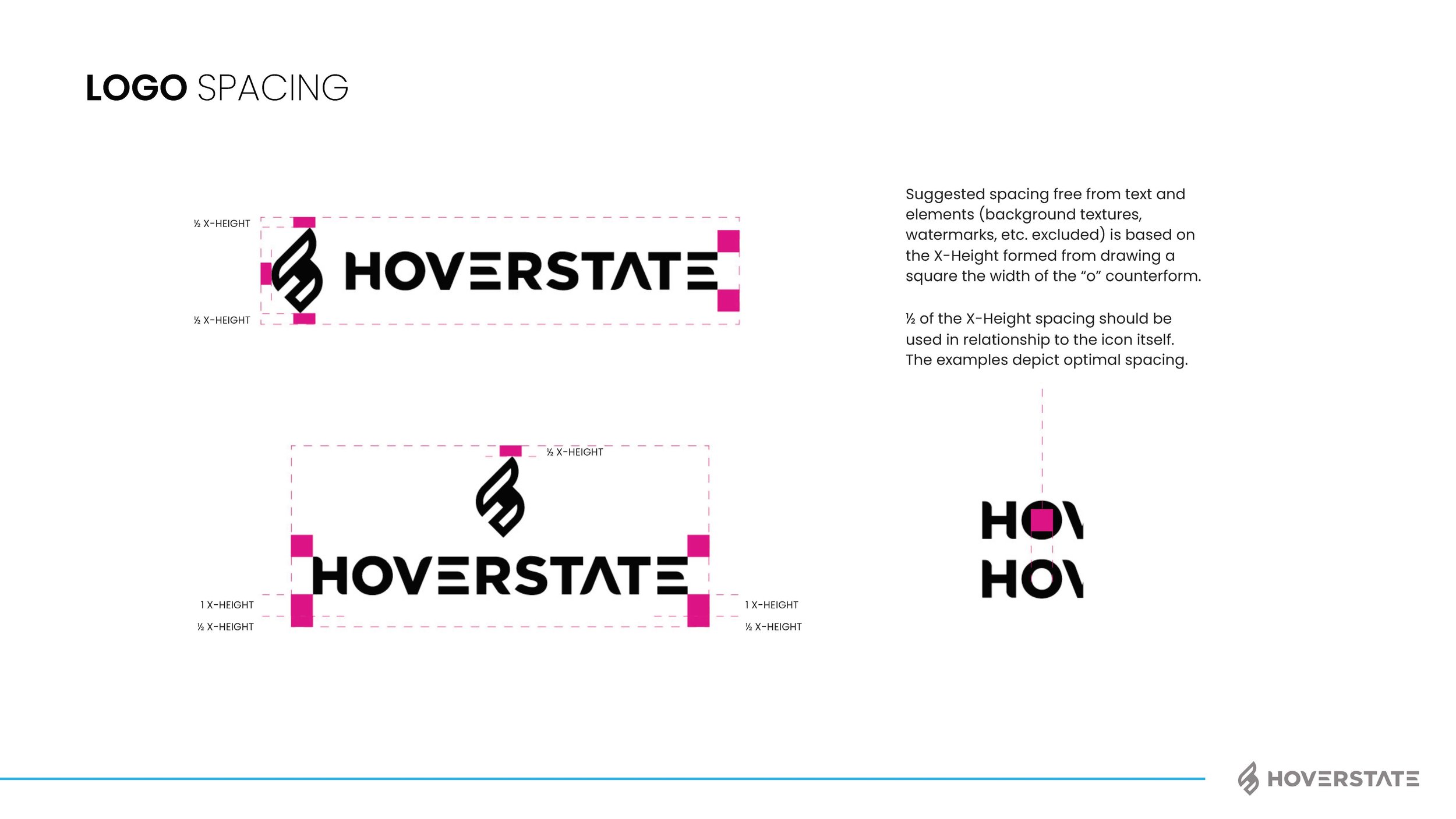
I think most of my clients have many brand pieces they need, but for some reason it helps having someone consolidate, bring it all together and unite around the vision. Does the kerning of the word mark matter, yep! Is the secondary color palette important to get right, yep! But more importantly than those things (and using proper grammar in this blog) is the voice and brand personality. I’m not going to explain this whole project as I do have a page on the work also now, but below are some of the assets and final brand guide I put together. We rallied the team around “Invent Tomorrow” as the tag and I think the brand voice we gave really fits well with the vision. The color palette, type style, assets and humanity elements helped push their CX, user first approach to business. See how I got to this point and the branding options shown by checking out the page here: Hoverstate Rebrand
MY ADVICE TO A YOUNG FREELANCER
Find a freelance niche that works for you.
"You can't be all things to all people." That principle is what I based my freelance business on. If you're coming out of school with a design degree and expect to post your portfolio/contact info and emails will just start pouring in, prepare to wait. I figure after a few years of doing sports identity for the primary income of my freelance business, I would take a couple minutes to record my experience and share a few things I learned and am, learning along the way. Do I do other types of freelance, yes all the time, but the core of my freelance and the consistent freelance I can rely on is sports identity. And I wouldn't have it any other way.
I love advertising, everyday I look forward to going to work in an agency. I can't say I always enjoy the stress of large event graphics, navigating tons of corporate brand standards or tight deadlines with suspect strategy, but the variety of bouncing from one industry to another and one type of design to another makes everyday different and the great projects make up for the others. However, after a long day (and evening many times) at the agency, I don't want to come home and work on freelance that is stressful or work for a stressful client. The best way I have found to get the work you want and good clients is for clients to find you, or really find your work, love it and want you to work on their brand. Sounds great, right?
Turn the bummers into something.
My first crest design was done for a friends son's soccer club team. They needed a logo for jerseys last minute and in the end, after multiple revisions, they didn't even use my design. I put the crest online and it ranked really high in google. Very high, like the first image when you searched for "soccer crest." Awesome, I was contacted about the design and since it wasn't ever used, I simply changed the initials in the design and sold it. Oh it wasn't great, it was built in photoshop (I had no clue what a smart object was and this baby was a raster mess), made use of a rough bevel emboss and some tacky gradients, but at least I was learning.
Starting with one-color sketches is the way to go. Don't be concerned with how all your sketch books look all the time, I wanted everything in a grid and no mistakes. Wrong! Sure, try and keep things organized, but don't be afraid to make mistakes or work things out. That is the whole point of sketches, to drill down to a great composition not have the best looking sketch book.
The next inquiry I received was by a club out in Colorado and I was soooo pumped. They wanted multiple options and when I sent over pricing, they were excited to get going asap and overnight a check. Boooom! I was sketching, working in illustrator now, didn't use Pantone colors and had no clue simplicity was a good thing yet, but I was learning and getting experience dealing with a legit client. Anyway, I came up with 3 different shapes, 3 unique looks and 3 pretty decent concepts. They were happy and after a couple tweaks I was sending final files. Awesome, now I have a real project under my belt and a start in actual freelance work.
Make mistakes. Don't repeat them.
After that project, I am not quite sure which was next, but I know early on I got burned bad on not setting a revision count for a team in Florida. It was rough, they wanted a "pearl" color to be used and we went back and forth on colors a ton of times. It was one of those projects where I started off working with the director and then his wife got involved. Wow, it wasn't fun and I ended up giving them far too many choices. A lesson I learned the hard way, but a very valuable one to learn. Quality over quantity. I wanted to be taken seriously and I wasn't in that project. I still remember the client's wife talking to me about changes to the crest while also teaching her son his colors. Yeah, it was that bad. And worse yet, it was a tight deadline and I kept making tweaks asap and they kept demanding them asap. They offered a different project afterwords and I turned that down with complete confidence it wasn't worth the money.
I did a few local crests. One for a team I played with for a bit and another for a league in town. It wasn't until I did a crest for a soccer academy somewhere out west that I started to think about creating a microsite. I found out early on that the more specific you can market yourself, the more traffic you can get. For instance, everyone is searching for "logo design" but not everyone is searching for a very specific niche in logo design. Take the niche of identity/logo design, more specifically the nitch of sports identity and even more specifically soccer identity. I decided to go with "crest" over "logo" as I felt that too was more specific to my target audience. I made an adaptation of my logo by placing my JF icon into a crest shape. It would be a natural progression and still hint back to my typical branding.
In order to create a microsite, first I had to learn a little more HTML/CSS and figure out the overall concept. The concept I developed was quality CUSTOM crests that may take more time, but are higher quality than the guy at their local t-shirt shop. I wanted the client to get something customized for them, inspired by the details they could give and a little research would provide. After thinking back to what I had learned from inquiries. I decided the way to approach my microsite would be to target clubs that were looking to rebrand or start a club with a professional look on a professional budget. There are going to be teams that can only afford to pay $50 for a logo, but the project has to be worth my time. There are going to be teams that need their logo in 2 hours, but these projects are supposed to be a creative outlet not cash grab, rush projects. I wanted to take time to craft layouts and have thought included, use inspiration and have a creative outlet on days where I did too much corporate work.
This is the homepage of my microsite. I used a textured background and I was saving png's galore. I liked showing a sketch or two on there to get across a crafted feel. It is still up today here. You can see it is basic and not totally professional, but it got the job done.
Ah, now I was getting on the right track. The whole responsive site thing wasn't really around yet (mobile wasn't a big deal) so I started to setup a simple microsite that I could easily update and I would enjoy adding to. I realized having pricing on my site may not be a great idea as I wanted to be able to adjust pricing if necessary and often, possibly barter some or also hear a request before deciding if I even wanted to do it. I also wasn't going to have a picture of myself on there. I would rather a club with a board think I was 40 and had 20 years experience than I was a young kid under an agency contract, creating crests in the evening while watching Breaking Bad or Teen Mom 2 (look, it depends on the day).
Get a return on your time.
What I decided to do was offer 3 packages in terms of pricing. See packaging terms here. For some teams that have a big budget they have an option, for medium budgets they are covered and for small budgets I would sell pre-created crests with generic type (I would later change that last package to a template crest option, partly because I didn't have the time to create new ones depending on the week). There was and still are times when people would send a sketch they created or had something they already liked and just needed it digitally created. Cool, fine, I can do that but the goal was to do custom crests that I take time to develop and I can really craft. That is the best. When I invest my time, I can create a higher quality product and that is what I wanted to be known for. Setting my prices higher also weeded out the simple stuff, they can go to a different less expensive designer for just using the pen tool to create their drawing.
Ok, so I got my packages set, I got my pricing (which helps with people taking me seriously) and now I needed some way to streamline the end game of providing final files. For this, I set revision counts. No more trying to create the first ever shimmering pearl color in a CMYK build. My time is valuable, so I also planned to take phone calls seriously. If there has to be a conference call, fine. Before I got an office I did some of those in my car during lunch breaks. Try sitting in a car when it's 90 degrees in South Carolina talking about soccer logos with a club's board on a conference call. Miserable. Most requests can be handled over email. First of all, everything is in writing (no confusion) and second, I could refer back to information all the time and not lose my notes (I'm that guy, sometimes).
Take yourself Seriously.
With taking myself serious and this microsite serious, I had to be serious. I learned best practices for filetypes. Clients get both CMYK and PMS versions. They get AI's, EPS', PDF's, PNG's and JPG's. I recorded saving these out in the "actions" pallet and that makes filetype saving move more quickly. If the client requests something special like a layered PSD file they can update themselves, or a few one color versions or grayscale versions, that is fine, but since that requires added time, it requires added cost.
Since most clients I am working with have never had vector filetypes, I always send a brief description of what best practices are for using each file. This has been really beneficial for my clients in their working with vendors and saves time answering questions after the fact. Also, after some projects, I will send a request for a quick testimonial or picture of the crest in use. This has helped me build a testimonial page and also get some good feedback.
On the financial side, no more do I take payment "sometime soon." I take payment half up-front and half after the project is finished. For lesser projects, all up-front. Does that turn people off, maybe, but I am investing time and they need to also make an investment in case something blows up, the project changes scope or the board throws in the towel.
I liked the copy to be disruptive and Chad Rucker helped me with the wording on my homepage: "It's time for a change, maybe you replace that low res, ripped-off NFL logo you've used for years. Maybe your cousin's cousin who has illustrator really doesn't know how to use it. Or the half-sister of a board member drew something up and you still can't tell if it's a lion or an aardvark. It's time to take your team or league seriously. And it starts with your brand. I've created professional sports logos and branding that have helped leagues and teams become more credible and marketable for years. Why not pay for quality work and quality filetypes the first time instead of recreating your brand every year. Contact me for professional logos and branding that stands out."
Don't be afraid to fail.
I launched CustomSoccerCrest.com and was off. Did the site work for what I needed? Yep. Was it going to win any awards? Nope. I didn't want to constantly be afraid of peers saying it wasn't great or looked cheap, so I acknowledged I'm not a Javascript programmer or UX master. I wanted to get online and show off some decent work with hopes of getting more work and improving (ok and make a few bucks doing what I love). So, I was officially in business. Besides inbound traffic (at that time, fingers crossed), I would email teams with bad logos and send them my info. Every once in a while I would get a response and that was all I was looking for. Trying to learn how to engage a team, how approvals from their boards worked and how easy it would be to get a team to update all their kits, signage and marketing with a new logo that they may or may not think they need. Basically, I was trying to learn how to sell without reading The Art of the Deal.
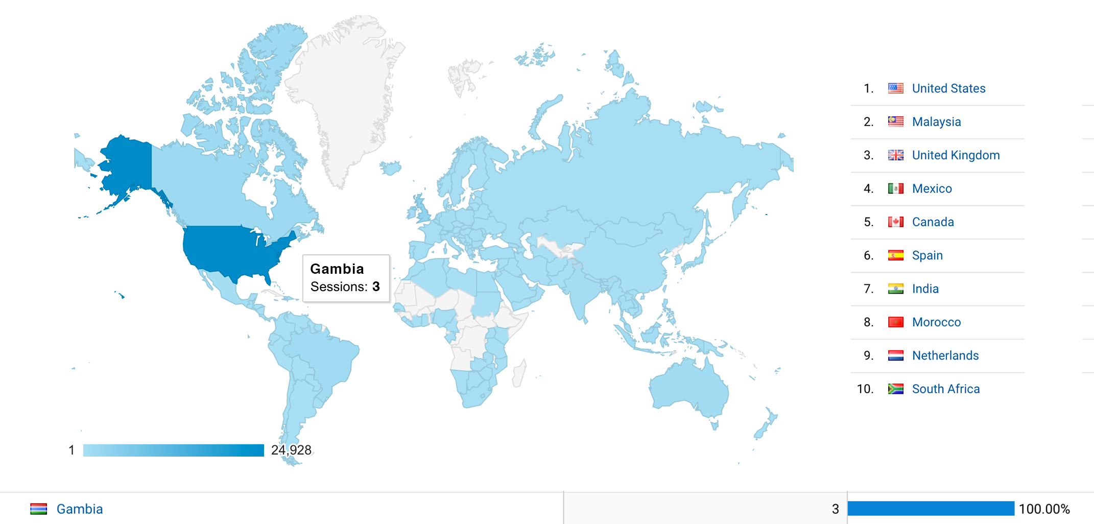
Over the next few years the site grew. I would get an inquiry or two a week, then a day and I was swamped with sending emails. Granted, those were inquiries, I wasn't doing that many crests (very few would), but slowly but surely more and more teams would say yes. I added google analytics. Talked to an SEO programmer. I did some crests for teams and leagues over-seas and was pretty excited to get contacted by small countries that I couldn't picture on a map. I did a crest for a team in Gambia. Yes, Gambia, and they sent me a full kit too. I did get tooled one time by a team from Canada that kept making excuses on the up-front payment, but I just assume the Mounties will catch up to that club someday. After the incident of no payment and tons of emails, I started using Paypal more. Everything moves so much faster that way.
Google Analytics was fun to follow. The top 10 visiting countries wasn't a huge surprise, but I did make tweaks from seeing how the navigation was used and what tabs were used most.
Everything was going fine, but not moving fast. Then Penn State called me. I was in shock. Finally a phone call worth taking and no shimmering pearl colors had to be discussed! I created a landing page with my final options for them, up-sold them on branding elements etc. and it was really fun for me. They were cool to talk to, super easy to work with and I got to do their women's soccer team crest. Ah, my first D1 school and that really did have an impact. Now every time I got an inquiry, it was, "I saw your Penn State Women's Soccer crest and..." People didn't love it because it was anything groundbreaking (even my curves weren't perfect, I was still getting better with stuff like that), but because they saw the Nittany Lion. Bingo, if I could get better and recognizable teams, I would get all the mid-size clubs.
Leverage the small successes.
Now that I had a few legit clients, I could start leveraging the small success and try to build on it. It was time to invest in a more disruptive form of marketing than just sending out emails to teams that had bad logos. So I decided to brand the message "RESPECT THE CREST." The idea stemmed from the added professionalism and credibility a quality crest or logo can give to a club or league.
I created a screenprinted poster (Printed by Emory Cash) and a postcard mailer and sent those out a few at a time. I hustled with teams a bit to get included in their programs, or as a sponsor. Slowly but surely I did work with a couple other D1 schools, some semi-pro teams, pro-team affiliates and outside the US pro teams. I even got to talk to the New York Red Bulls (went nowhere, but hey they talked to me).
Posters and postcards were mailed out to various pro and semi-pro teams in order to create awareness and just get on their radar. See more project photos here. The posters also made it into Print Magazine and if that isn't a bonus, I don't know what is.
Evolve and be willing to change.
The original site does what it needs to, but recently I felt it was about that time to expand. I wanted a responsive, more professional site. I had also designed a gym floor, logos for golf teams, frisbee teams, basketball teams and various other sports logos. In the agency world, I have gained experience designing for the Harlem Globetrotters, an ECHL hockey team and the Big League World Series so it was time to expand. With that experience I feel capable in expanding to other sports and building off of my crest site. So I purchased CustomSportsLogo.com in an effort to branch out more.
I decided the leave the past site up for now and update it semi-often because it still gets traffic and I don't want to lose the image rankings in Google. Yeah, yeah I know redirect those with blah blah, but I have done that before with a different site and I don't care what someone tells me traffic wasn't the same for a long time. So in the meantime, I have both up and running. The content is similar for now but slowly but surely if the Lord blesses this too will grow.
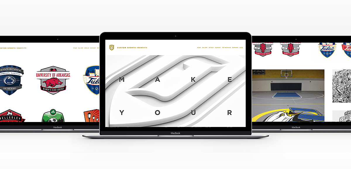
The new site is up and running. I don't update it enough, but enjoy tinkering when I can. It has room to grow, is mobile friendly and easy to navigate. See it here.
I get to do what I love for a living. In my spare time, I want to do what I love too. That means at times turning down teams that I can tell right off the bat won't be a good fit as a client of mine. That means at time dropping a price to help a team that I know would be a great client or good opportunity. I would love to say every crest turns out awesome. Nope, some have been tweaked to death and many could be much better, but I always try and take something away from a project to learn from it.
Don't be the guy that almost started something.
Have I made a six-figure salary off the marks, not even close. It's a small business I tinker with and not everything is perfect for sure. I never wanted to be the guy that talked about how he almost did something and for me just trying was worth it. The money from my crest designs was a big part of buying a mustang right out (it was a blast to drive and didn't leak anti-freeze like my beater taurus), helped put a down payment on a house and upgrade my freelance office at home. I got the biggest Imac you can get and a Wacom tablet (that was a legit day). My buddy in Atlanta made me a custom pallet wood desk and I still have my laptop for when on the road, on the sofa or at the airport. While really nice to have and helpful when I need the firepower, I wouldn't suggest going crazy and buying the latest Ipad Pro, Time Capsule, light tables, Microns by the truckload, etc. I learned that too, stuff gets outdated quickly and make sure you will get a return on your investment when you get something new. Everything I have I believe is a direct blessing of Jesus Christ and I am thankful for the opportunities I have been blessed with.
I remember once being discouraged to do freelance, but I never understood that. The agency I am at is fully aware I do crests and designs on the side. I have dropped a few clients to make sure there isn't a conflict of interest and always want to put my full time work first. That has to be great, and if it isn't because I am not putting in the time to make it great, that is a problem. But my spare time, is my spare time and freelance has benefited me in multiple ways. First, I learned a lot from interacting with my clients, investing in self-promotion (is it worth the foil stamp and eight custom die cuts?) or just learning some new Adobe software tricks. Second, I had added income to expand my creative library, tools of the trade and get out from debt/being financially a little more free. Now I encourage all the young designers at our place or that I meet, to at least engage in a bit of freelance to interact with a client and learn to better present your ideas.
Many evenings, there is a chance you will find me here sketching out a few new layouts or tweaking some designs in Illustrator. I will probably be working in a niche I love and just trying to get better.
