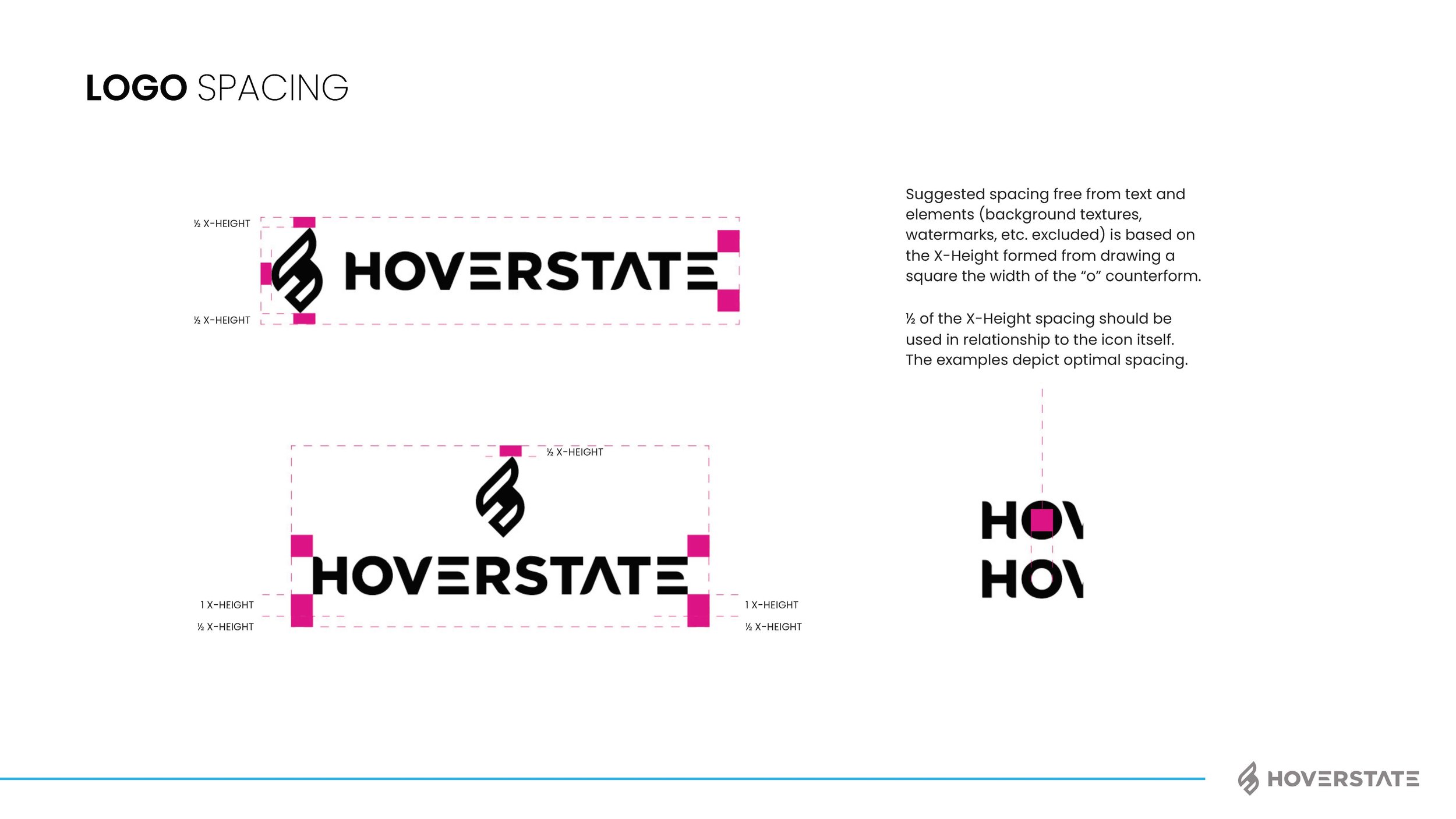
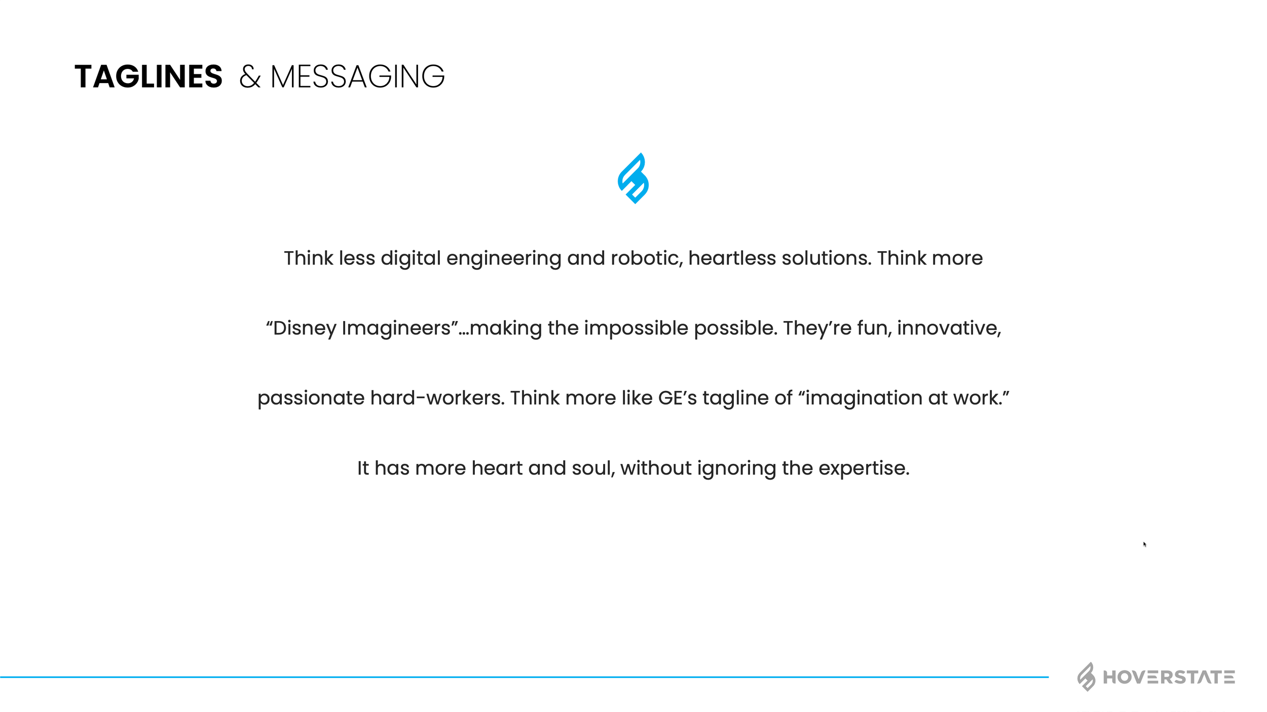
I think most of my clients have many brand pieces they need, but for some reason it helps having someone consolidate, bring it all together and unite around the vision. Does the kerning of the word mark matter, yep! Is the secondary color palette important to get right, yep! But more importantly than those things (and using proper grammar in this blog) is the voice and brand personality. I’m not going to explain this whole project as I do have a page on the work also now, but below are some of the assets and final brand guide I put together. We rallied the team around “Invent Tomorrow” as the tag and I think the brand voice we gave really fits well with the vision. The color palette, type style, assets and humanity elements helped push their CX, user first approach to business. See how I got to this point and the branding options shown by checking out the page here: Hoverstate Rebrand
BUILDING BRANDS OF BUILDERS
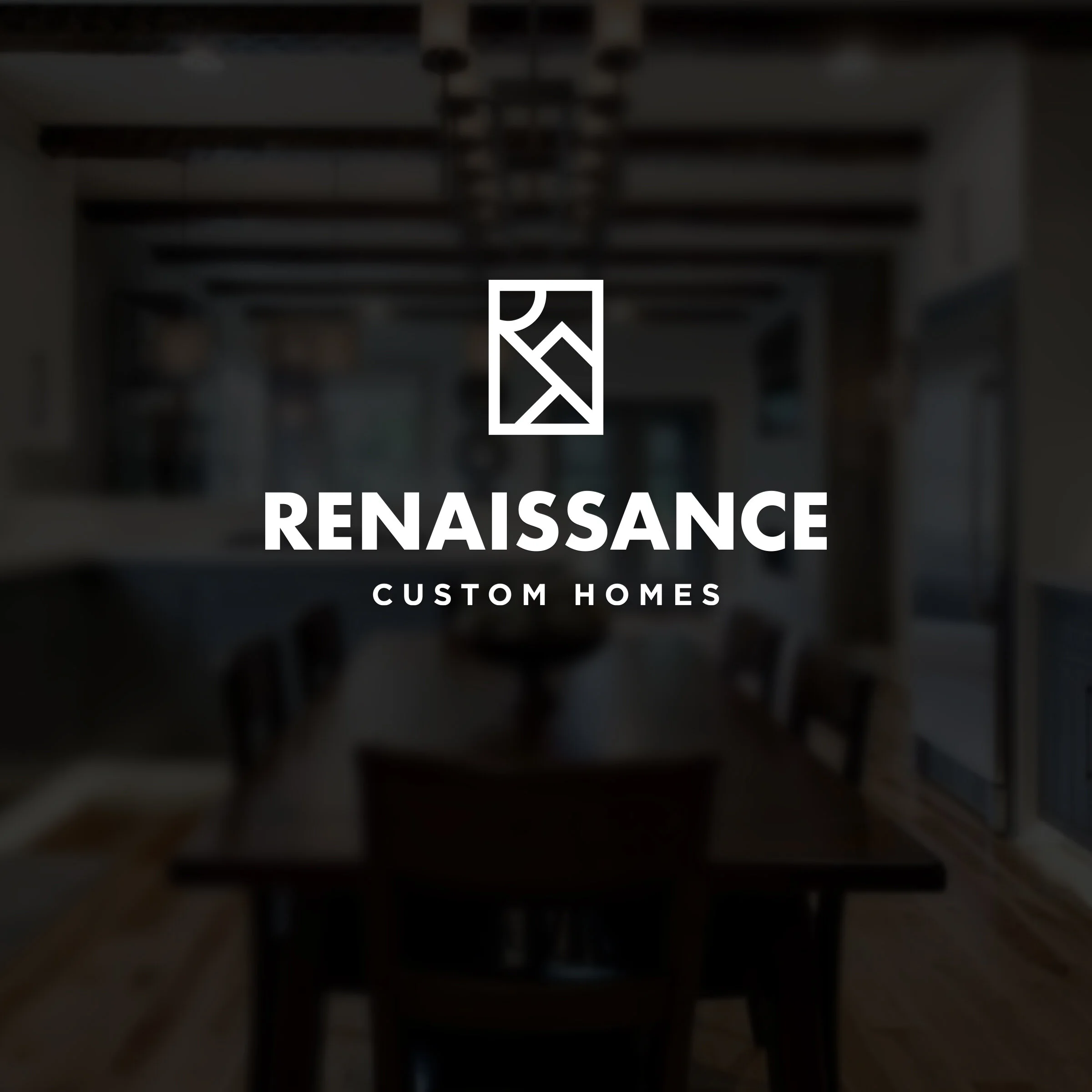
Some process photos of a recent logo design project for a custom home builder in Greenville, SC. I wanted to create a modern, elegant mark that still had some composition/artsy feels to it. I did show a few old school options, but everyone seemed to feel this was the best direction. Peasants included. Oh middle ages joke!!! Got em.
