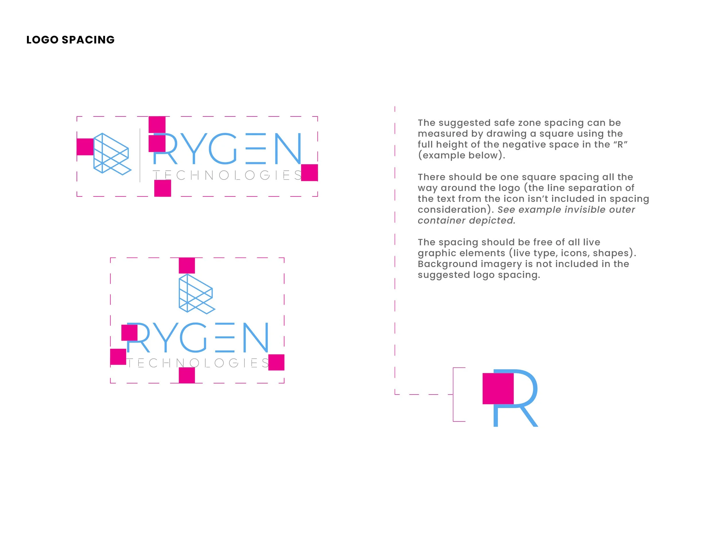
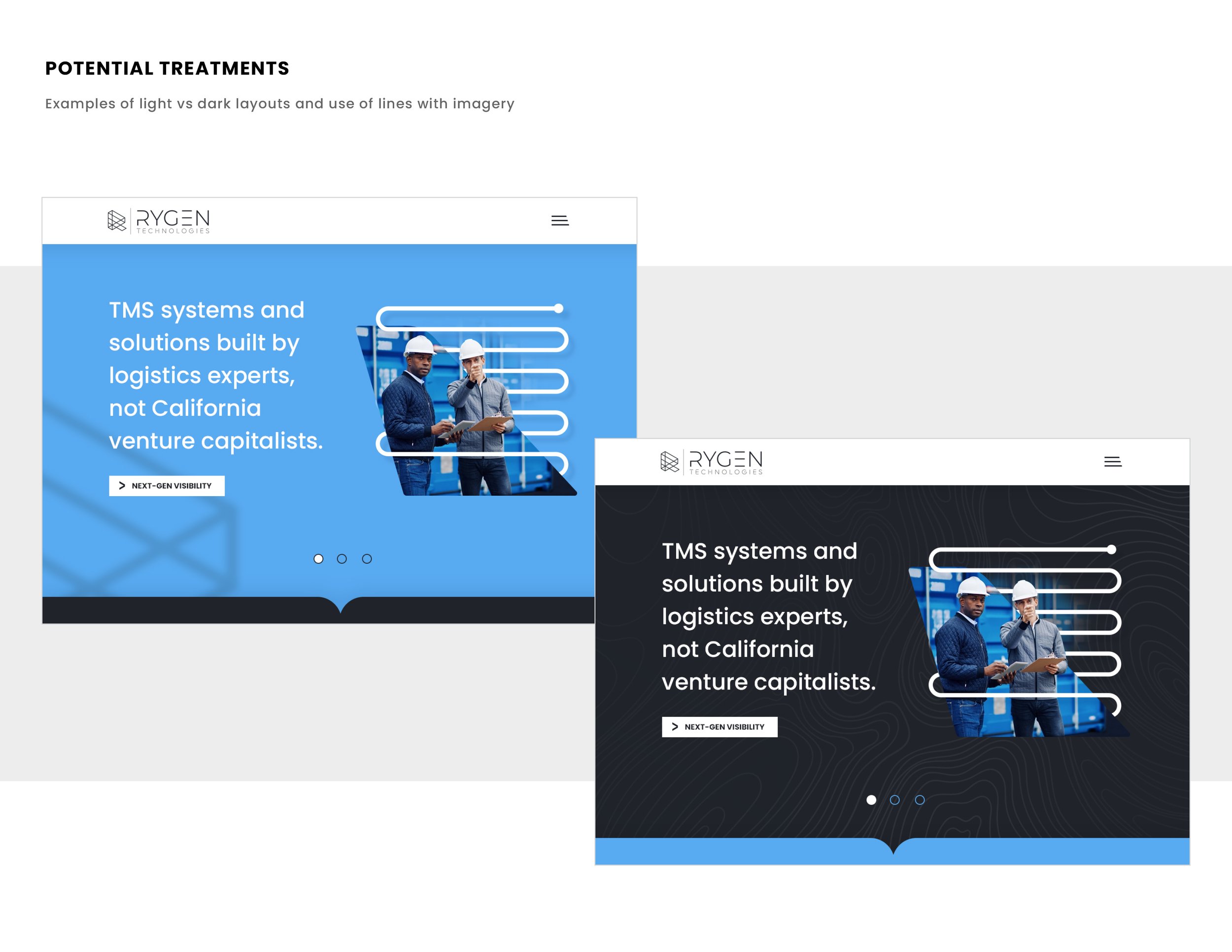
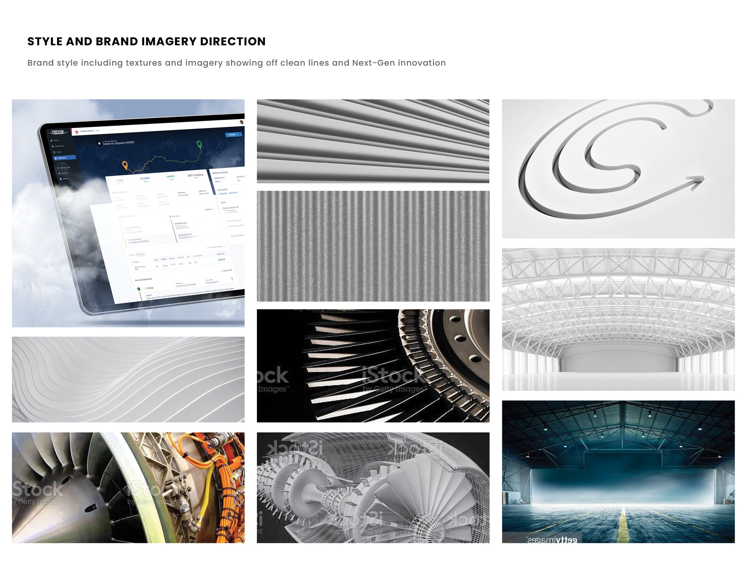
Laying the foundation of style, tonality and visual concepts/ direction for this logistics software. A refresh with a modern/ clean look and feel and the underdog mentality of the small innovative startup competing against the more stale/ older Goliaths of the space was a lot of fun for direction. More to come.
REBRANDING SOFTWARE TOOLS FOR TESTING TOOLS
Testing tools in the real world is a heck of a lot different than saying they performed great in the lab or simulation. In the real world, there’s real outdoor elements, real rough conditions, real time that can’t be wasted, real guys and gals wanting products that can be trusted. TestedHQ takes products into the real world and gives them an actual score that can be analyzed and used to adapt final products. Ensuring a product isn’t just a great idea, it’s executed to perfection. We gave them a strong look and feel to match their market and used the “linking” concept to be used in explaining their benefits to clients. Real People. Real Perspectives. Real Results. Also I gave them a real brand guide and professional logo files. Always fun doing a rebrand and meeting new people, great group and a lot of fun to work with on this one.
