Taking part in strategy sessions, ideation on names, logo and identity development, brand guides, etc. and this software brand was a lot of fun to work on.
REVITALIZING POE MILL
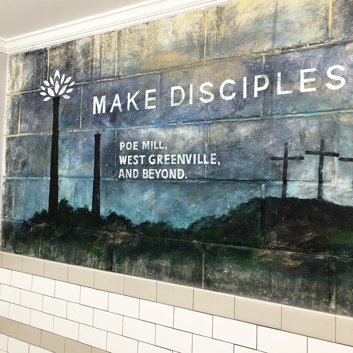
Poe Mill once was a booming area from 1897 to 1977; it’s milll was producing cotton fabric and thriving. The building burned in 2003 leaving only 2 smoke stacks as reminders of the past. Griggs Church has been serving the area since 1936. As the neighborhood declined over time, the church also dwindled down. In 2015, pastor Mitch Miller was called to the church with only a handful of adults and kids still in attendance. A revitalization effort began at this time, and recently Griggs has seen nearly 90 for a Sunday morning service. While the church is more than 80-years-old, we’ve had a large percentage of young people come in and breath new life into the church while reaching the neighborhood. A pretty cool story to lead a rebrand!!
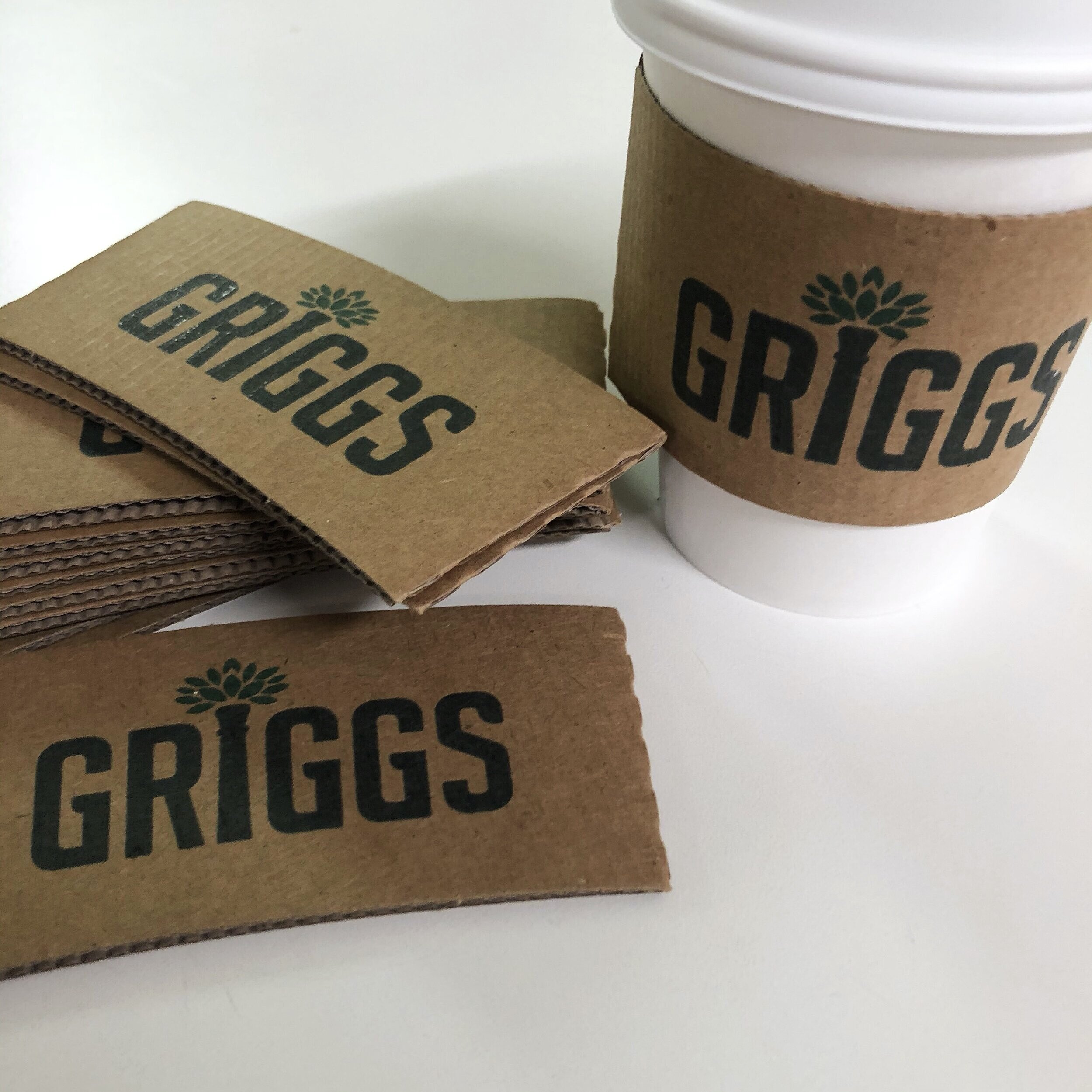
If you look closely, you can see a small weed/plant growing out of one of those old smoke stacks. This sparked the idea of a flourishing, growing plant reflective of Griggs new growth and the goal of revitalizing the neighborhood. There a tons of great, large churches in Greenville, but it’s been a rewarding experience to see a small church rebuilding and assisting a community who needs it. Anyway, it was fun to work on the rebrand, see the logo coming to life on materials, shirts at events etc. If you happen to be in Greenville, visit the church on Pointsett Highway, everyone would love to meet you.
PUT A LOOK TO IT
I get asked to work on all sorts of identity projects. Some may be rebrands or refreshes of existing companies, others could be upstarts looking to invest in their look/feel or even projects where I’m putting a look together to add credibility to a presentation for gaining investors. This project was an exploration for a business that may include purchasing already existing, established brands and re-naming or even starting from the ground up with finding the right distribution channels and building something new.
Either way, the project had a budget, and I was hired to start creating various looks/feels! I typically wouldn’t show all the unsold, unfinished work, but I pulled most all of my thoughts together for this post to give a little added insight into this project.
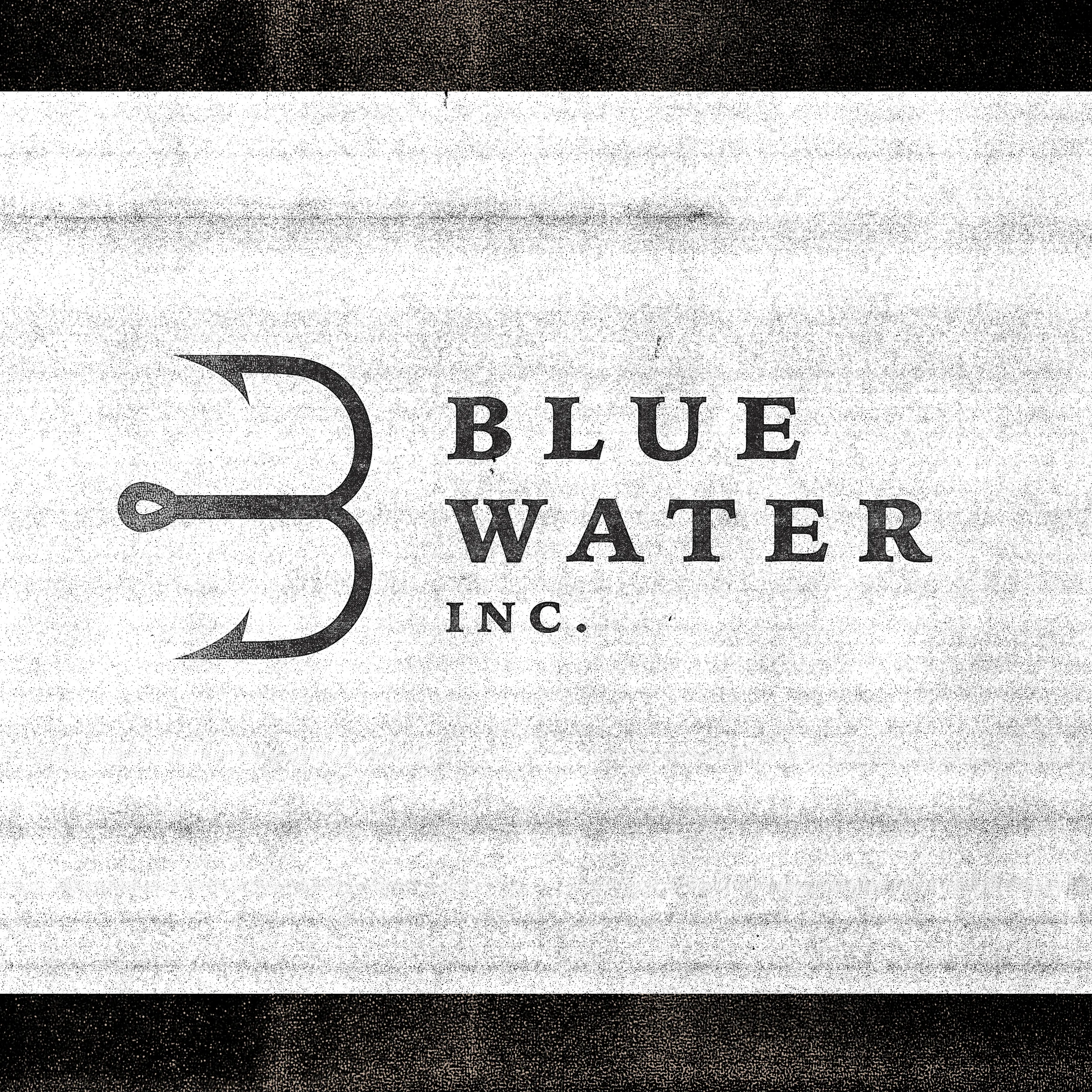
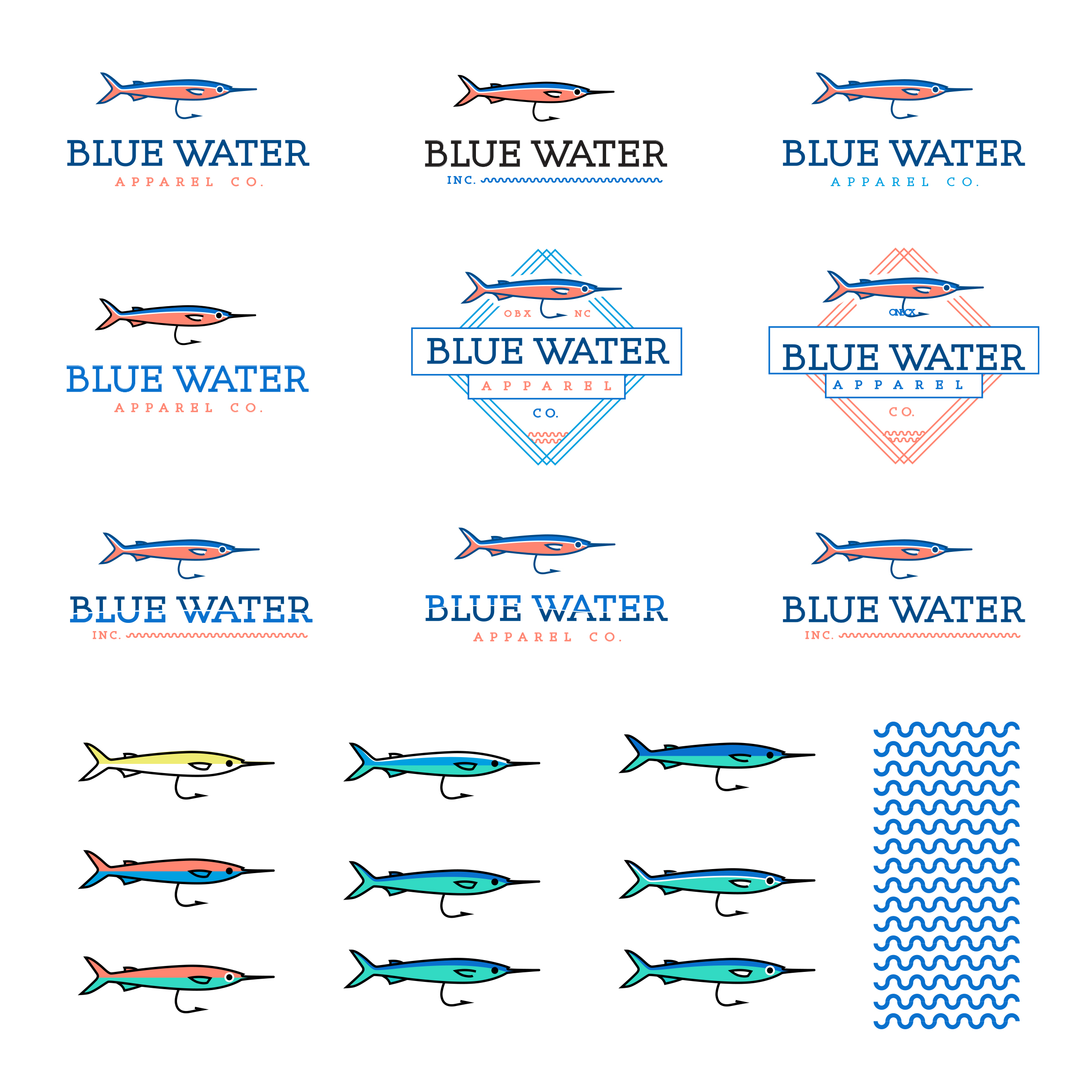
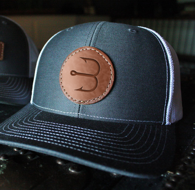
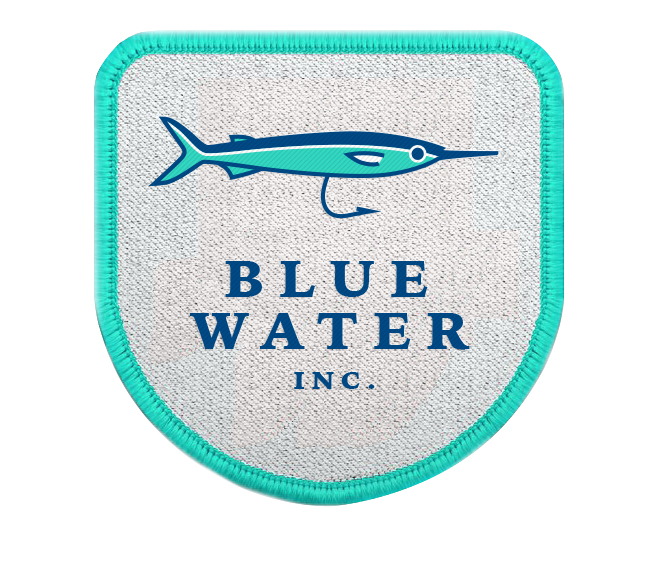
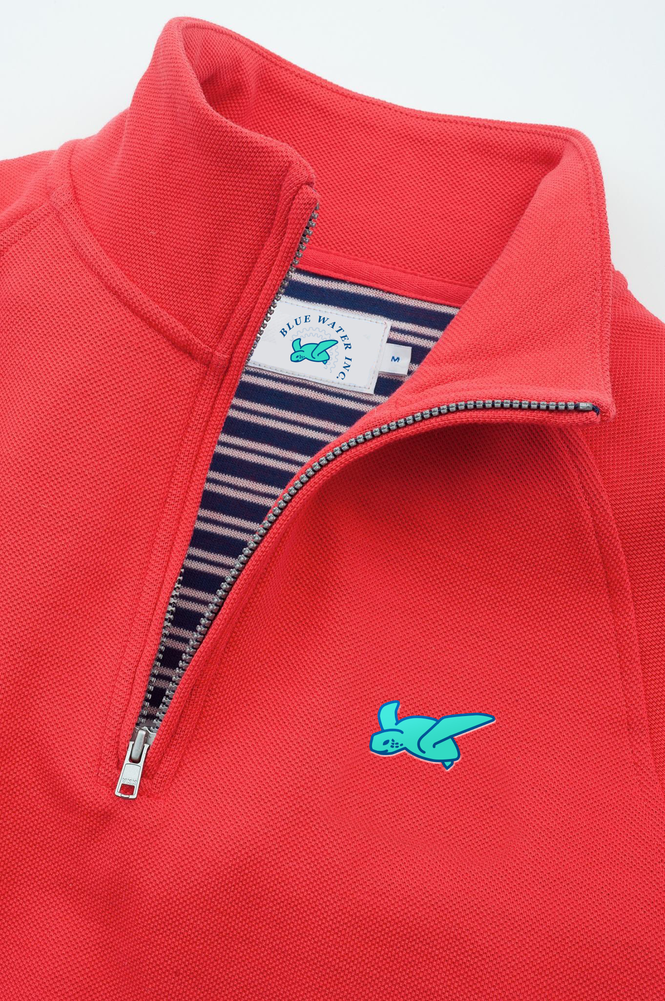
At the top of this post I show the final outcome, a simple “B” formed from a hook and a bit of serif type. I felt for the style we wanted, the serifs added an established feel that worked well with the fishing theme. Since this was an apparel business, I also looked at developing secondary marks for women’s, children’s and specialty men’s product lines. This idea resonated well with the client and gives a lot of flexibility in branding going forward. This also would require more funding and somewhat of a challenge in making sure each of the lines are linked back to Blue Water Inc.
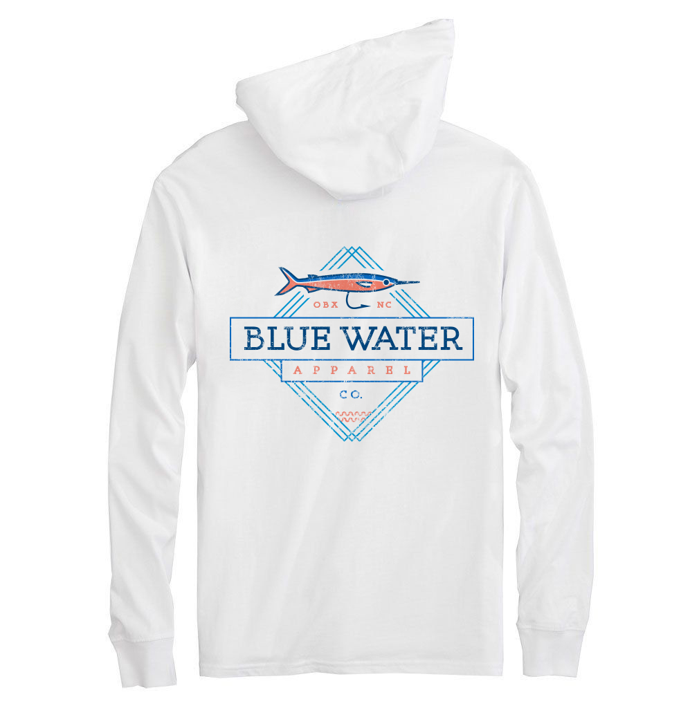
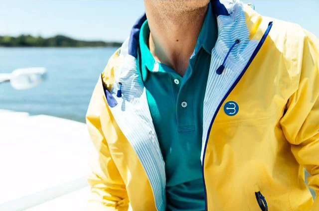
I used low res imagery for quick mockups to show some of the designs in an environment when talking over layouts. These mockups wouldn’t be used public facing in branding as I pulled all of them from google images, but just give a quick glimpse as to the style each brand mark could fit within.
It’s always such a fun process to see how sketches come to life in black and white vector pieces, the vectors then change into color selection and final versioning until finally really coming to life in realistic mockups.
I know some designers dislike a project where the intent is more exploratory than starting with an organized brief and sourcing paper samples for use etc., but there is something amazing about being given free reign to explore a brands direction and see where the concepts lead. In the end, the client was excited about the look and I was compensated to design/create which is my favorite thing to do!
AIR STARTERS. I'M CONFUSED.
I won’t even begin to act like I know how the air starters work. I know the images seem complicated and I’m no engineer, but after talking through the project that may be a good thing. There isn’t anyone alive who could explain exactly how the process works in a logo. Thank goodness logos don’t have to be literal. Many people try to make them that way, but to create a simple memorable mark always is best and that’s what I sought out to do.
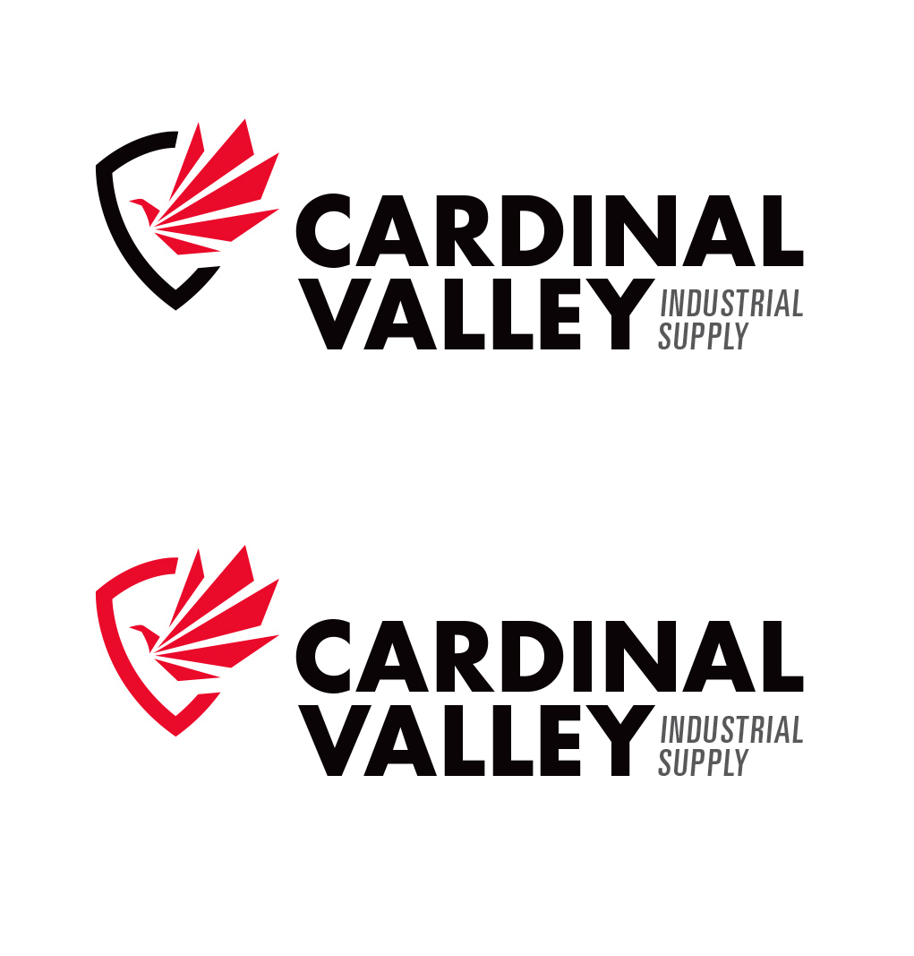
For this project, I broke down some components from engines and starters alike. The fan is an interesting component visually to me and with some evolution, I used the shape to morph into a bird which just makes sense with the name :).
The final logo was coupled with a crest-like shape and I liked having the mark placed in the upper corner of the text like it was about to take off. My suggestion for identity materials and branding going forward is to use a red foil stamp, where appropriate, with a flat black backdrop.
THANKS LOGOLOUNGE
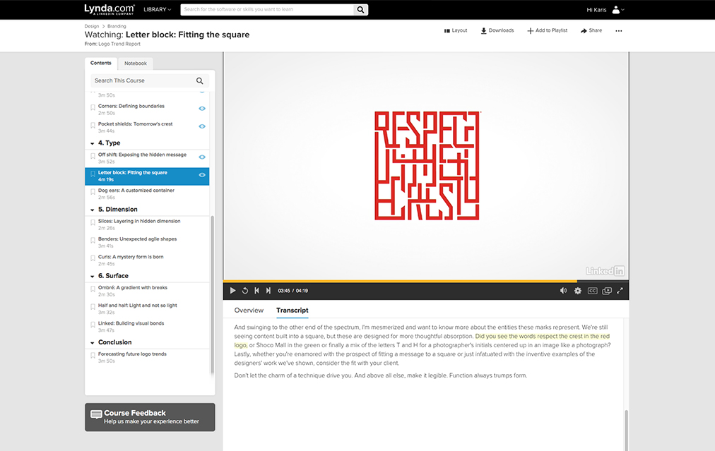
LogoLounge was one of the first books I bought (besides class books) in college. Great books for inspiration, motivation and jealousy :). I was excited last year to be in a Bill Gardner trends video on Lynda.com, but even more excited to have 2 logos featured in Book 10. I also have RVW and WorthLend to thank for the projects and being great to work with.
