I love to barter, but this one didn't have a chance :). I may never have a custom home, but I'd like to design for more custom home builders. Fairview wanted a mark that would convey a home and feel more modern than their previous design (before a name change). Currently their brand mark was a multi-colored home and didn't have that high-end/professional look that they were looking for.
Rarely have I done real client projects that seem to combine two really interesting names, like "Monkey Cafe" which I just googled and yes there is a "Monkey House Cafe" in existence. Those interesting names can really spark creative designs. The challenge with a logo like this is creating a mark that is interesting and can be the essence of a home, but not be super literal and dull.
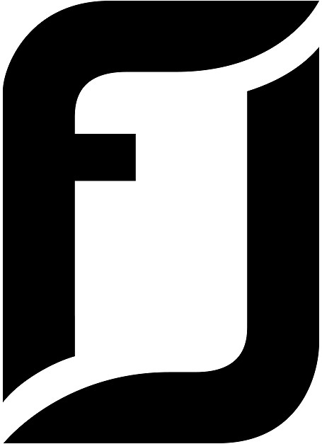
After a bunch of sketches and after exploring a few different directions, we liked how an "F", when tipped over appears to make two peaks of a roof. It's a very simple solution and could be used in some interesting ways in identity and future branding. The next step was finding the right balance of "F" to roof lines and the correct weight for the logo.
Multiple type styles were also explored and while the Sans Serif type gave a very modern look, Fairview had previously incorporated a script into their design and a serif type style seemed to be a smooth transition. I altered the type slightly with some added kerning and extended the leg of the "R" as it transitions down to "custom homes". In the final execution, I also changed from the original black and gold color scheme I showed to a navy blue and gold. It was a little less harsh and I liked how established the final layout looks.


