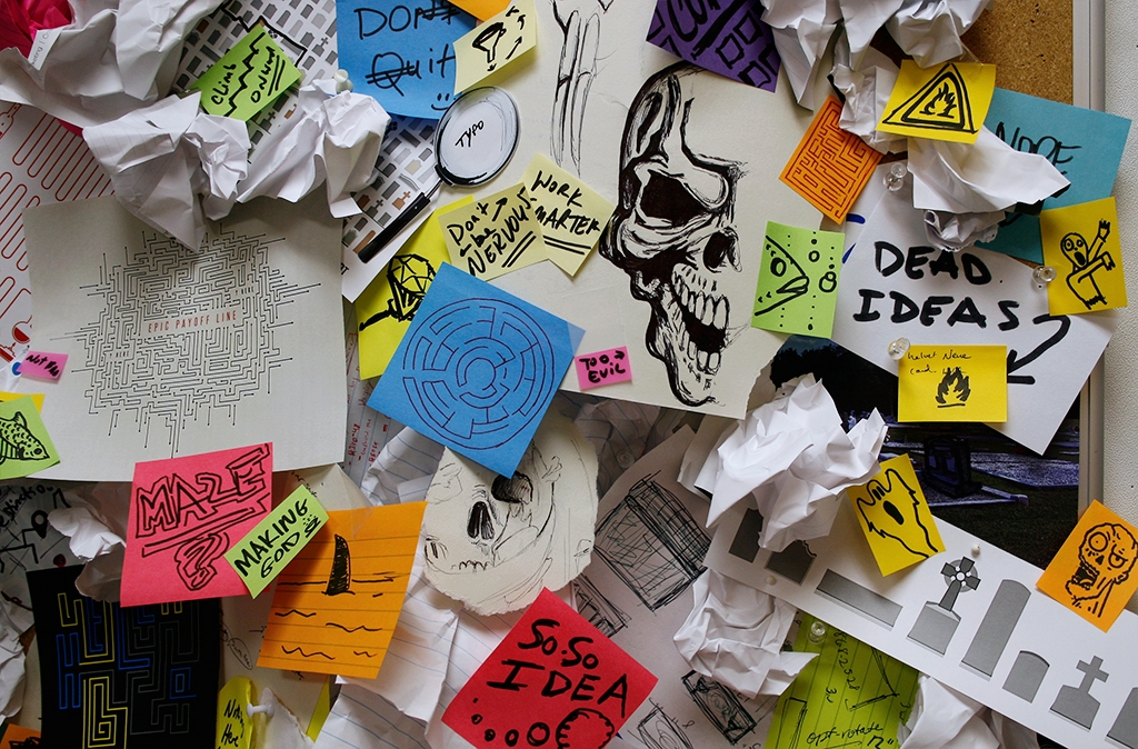
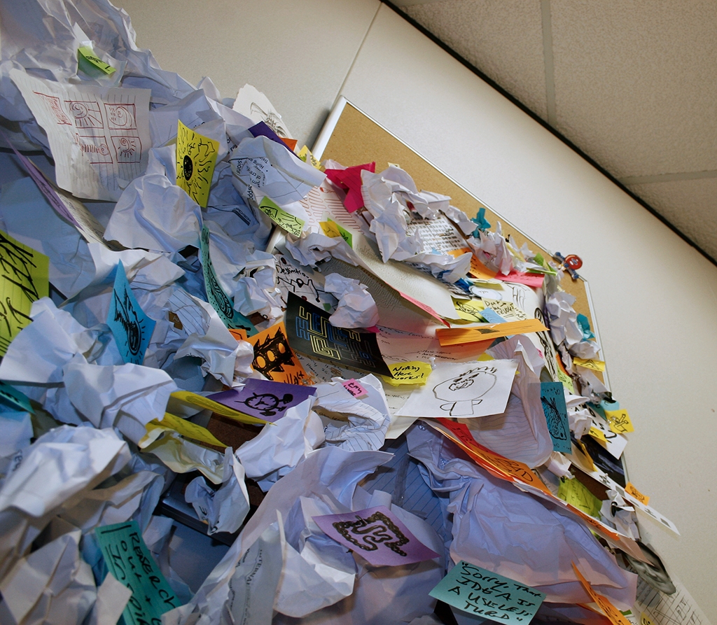
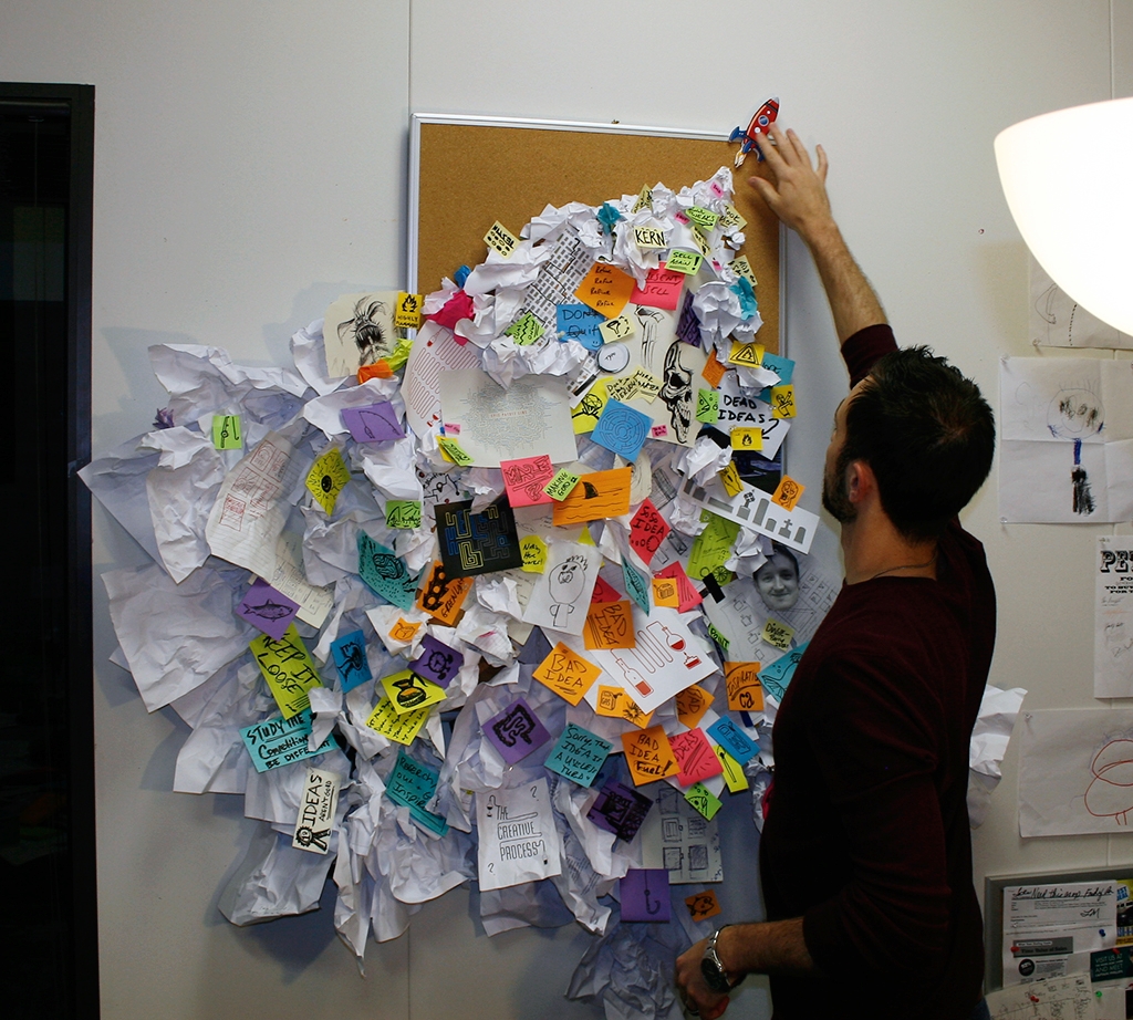
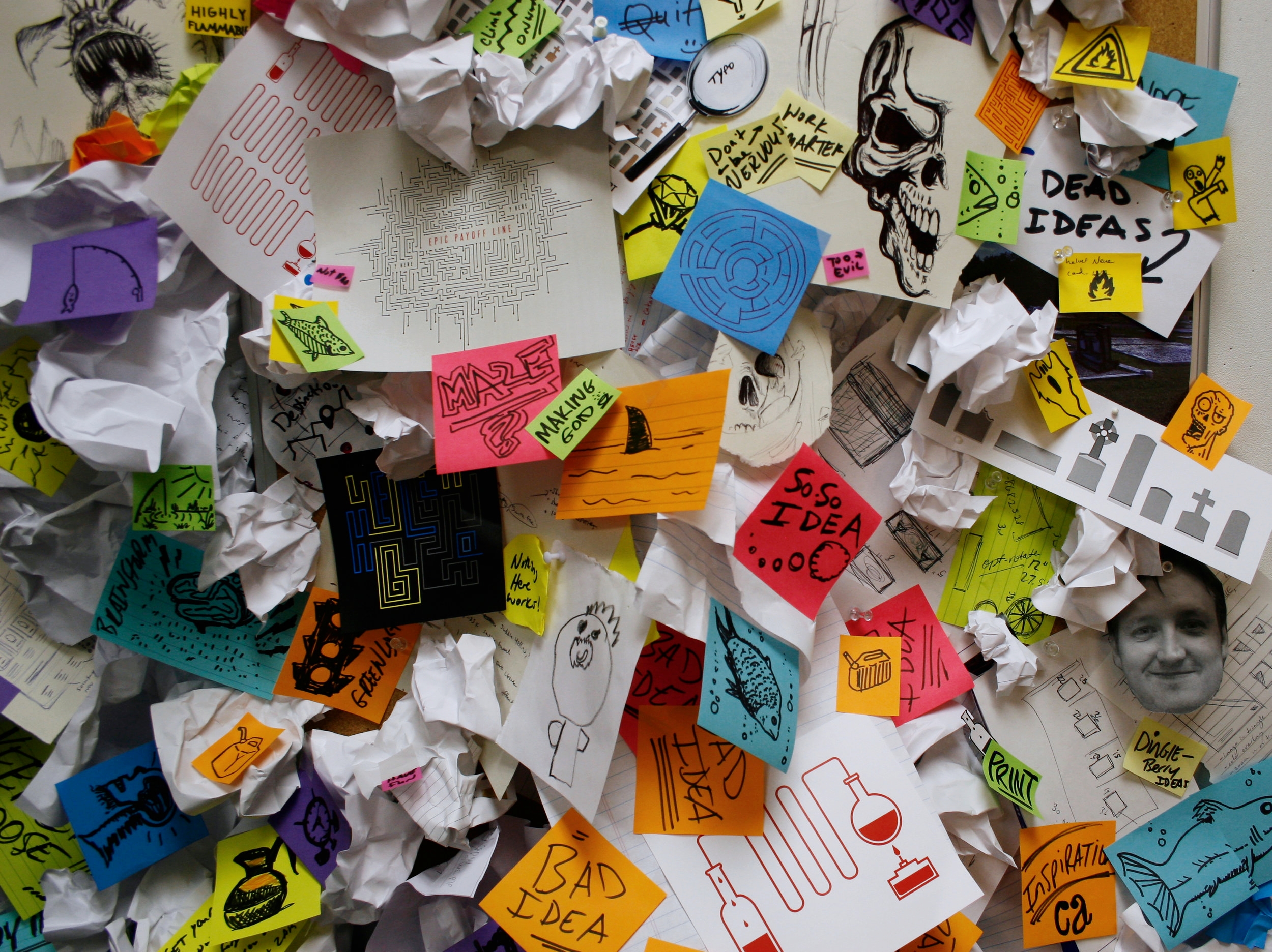
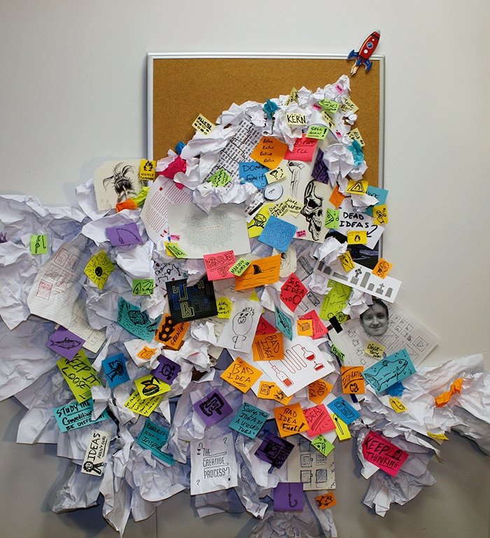
Well you never win a contest you don't enter. Truth be told I was ruined by a list minute contest I entered right after the school year ended my junior year of college. I won the contest, a chunk of money to put on my school bill and got to go to a conference for the weekend with a buddy (I really should do a post on that someday since that did really contribute to my start in advertising). Anyway, it's great to win, but some contests are worth entering and some aren't. I haven't always done the best at distinguishing them but this one seemed just fun to enter and since there was a .001% chance to win, why not do something different. The contest was through Ad Age for any creatives under 30. Winners make the cover of the magazine, fly to France for 4 nights for Cannes Lion stuff and will be on outdoor in France. Sure, big agency names were all over past winners work but it would be fun just to enter. The brief or ask was for a visual that represents The Creative Process. Myself and Micah Peek (a talented young designer at Jackson) brainstormed and came up with a few concepts. Of course we got swamped with work around this time and really ended up only having a few days' lunch breaks and a few hours after work to do something cool. That in itself axed some ideas. I wanted to do something 3-dimensional for our entry. I've noticed if you do the traditional approach for any contest there is a good chance you won't stand out and never get noticed. I removed stuff from a wall in my office and we began covering a bulletin board with stickies of ideas and quick thoughts that represented the creative process. Things like: fishing for ideas, skulls representing the ideas that come to life only to quickly die, mazes, stoplights and other imagery that corresponded with idea generation and problem solving.
As our ideas kept growing, we tossed in sketches, dumb sayings and tried to get more and more granular like a funnel with the detailed stuff heading up to the top right corner of the bulletin board. The initial stuff was pushed off the board completely and was tacked into my wall. The only annoying part was the work now covered my light switch and it was hard to find :). Anyway, once you see up to the top of the composition you can see words like "Kern", "Refine" and "Sell." Then at the very top I did a vector illustration of a rocket ship. I printed and trimmed it out of foam core and tacked it up there. The end result was a clowd of imagery and phrases that we fit contributed to the creative process all sending off the final idea in the form of a little rocket.
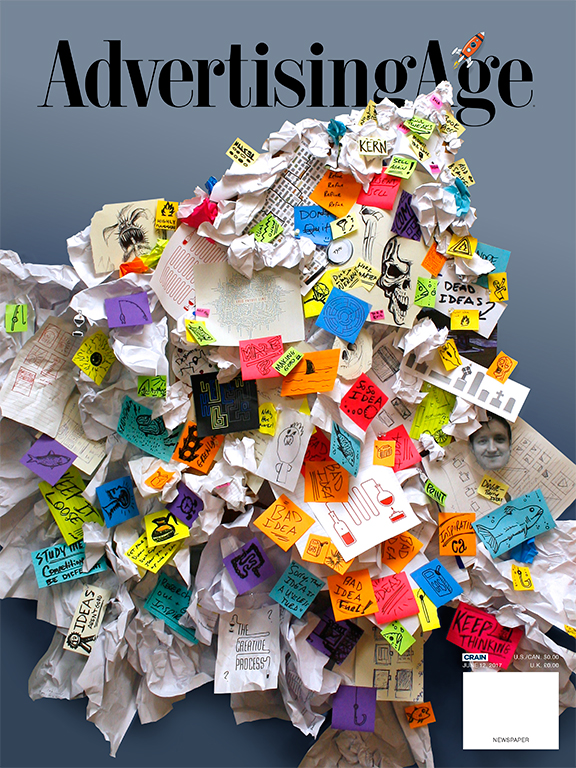
I did quite a few versions of the final layout. Some had the bulletin board and some I tweaked the look of the wall. In the end, I took out the bulletin board and went with a gray-blue color backdrop. It just seemed simpler and the colors popped better. We didn't win and I assume we didn't even come close but it was a fun project to brainstorm and do with Micah. Spending time working on something creative doesn't feel like a waste of time. I hope it never does. Someday I will win another good size contest like I did back in college but if I never do, I hope my entries are different. I hope work I contribute to clients or even work just done for fun get's noticed because there is a thought behind it. This thought was that the creative process is messy. It takes a lot of effort, work and refinement in order to send off one final idea.
