I used to do Soccer Crests and Badges all the time!!! It was a big part of my freelance work and I loved it. Small clubs, minor leagues, even talked to a few pro teams in the US and did some work with a few pro’s outside the US. I had the Custom Soccer Crest market on lock, then I changed to more tags around “sports logos” to expand and got a Sports URL, etc. and some domino’s fell, etc. Less inquiries, but was changing around how I was positioning my skills and doing design, anyway even though there was a drop off, I had to turn down most inquiries as clubs were too small for increased budgets and probably not worth the time, though I enjoyed the work! Howeeeever, every so often, when I can squeeze in a late night mark and help a club, I love it! Really fun to work on a quick turnaround project for this camp and the people are great. See other crest/badge work I did back in the day here: CustomSportsLogo.com Some haven’t stood the test of time, some dominated their leagues!! Here’s to doing stuff for a US pro team someday!
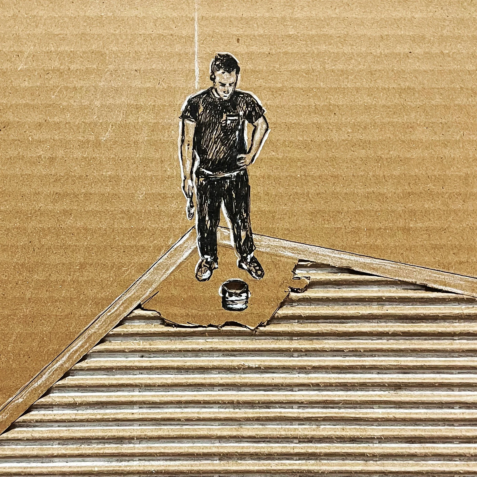
INKTOBER 2024
Well, made it through another Inktober. Wheeeew, while I do enjoy the creative challenge, the timing rarely is great and the pressure of some people mentioning how much they are looking forward to it makes it a bit stressful. A few highlights here, nice to get a break from the computer and do something with my hands that’s tangible, I’m not complaining, but that Banksy quote "If you get tired, learn to rest, not to quit” always rings true around this time. See more cardboard art here or on my instagram here.


A FEW EVENT BADGES
Got to love working on a patch/badge. These were done for Red Rover’s annual retreat in Scottsdale Arizona. Some variations and versioning with badges is one of my favorite things to do and I love the process of creating illustrations and elements that feel on brand to incorporate.
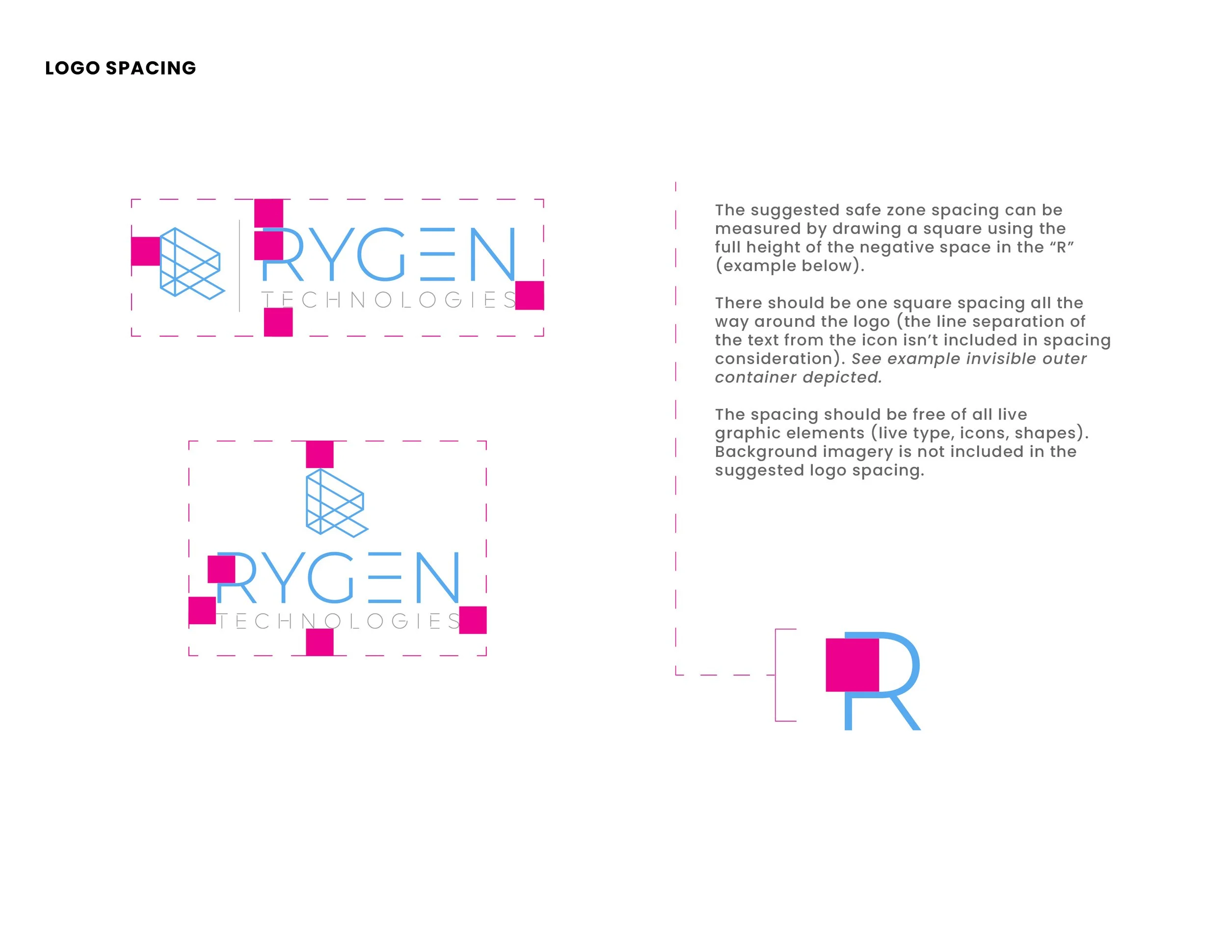
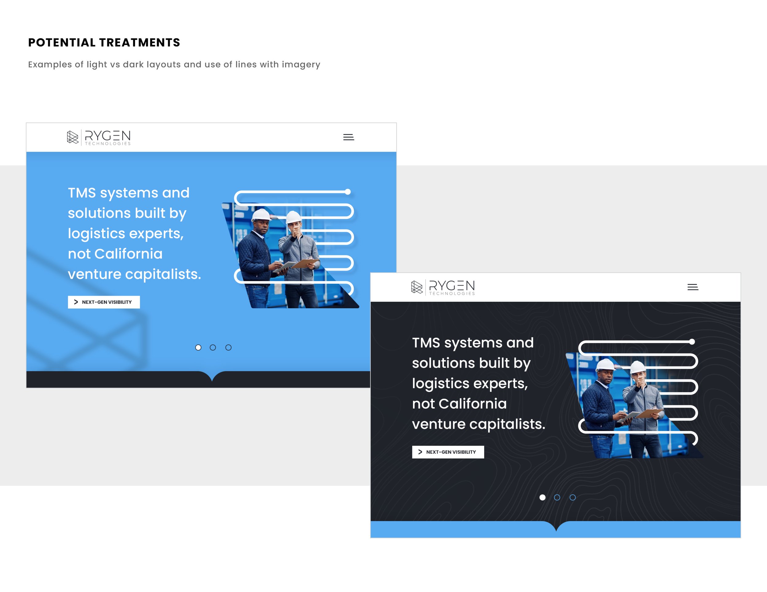
KEEP IT SIMPLE STUPID
Keeping a mark as simple as possible is the goal of just about every logo/identity project I’ve ever done. Working with great clients and having a clear goal of the project for this one really helped set this rebrand up for success. See a glimpse at some of the rebrand below and go SEE THE FULL PROJECT. Excited to assist in fully rolling this out in the future. It’s been featured a few places now including, Communication Arts Magazine and appears in the 2023 Design Annual. Pretty cool.


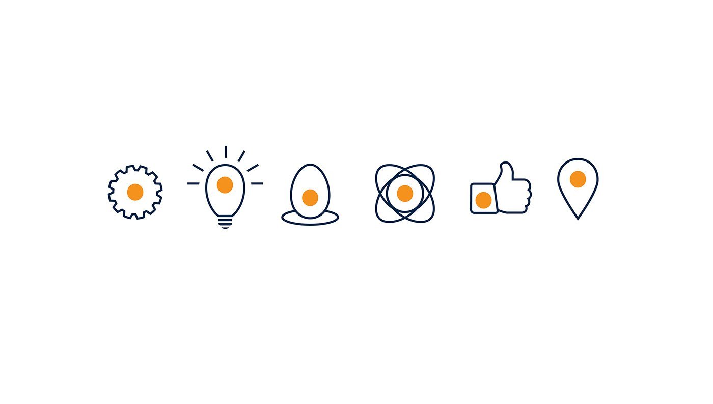


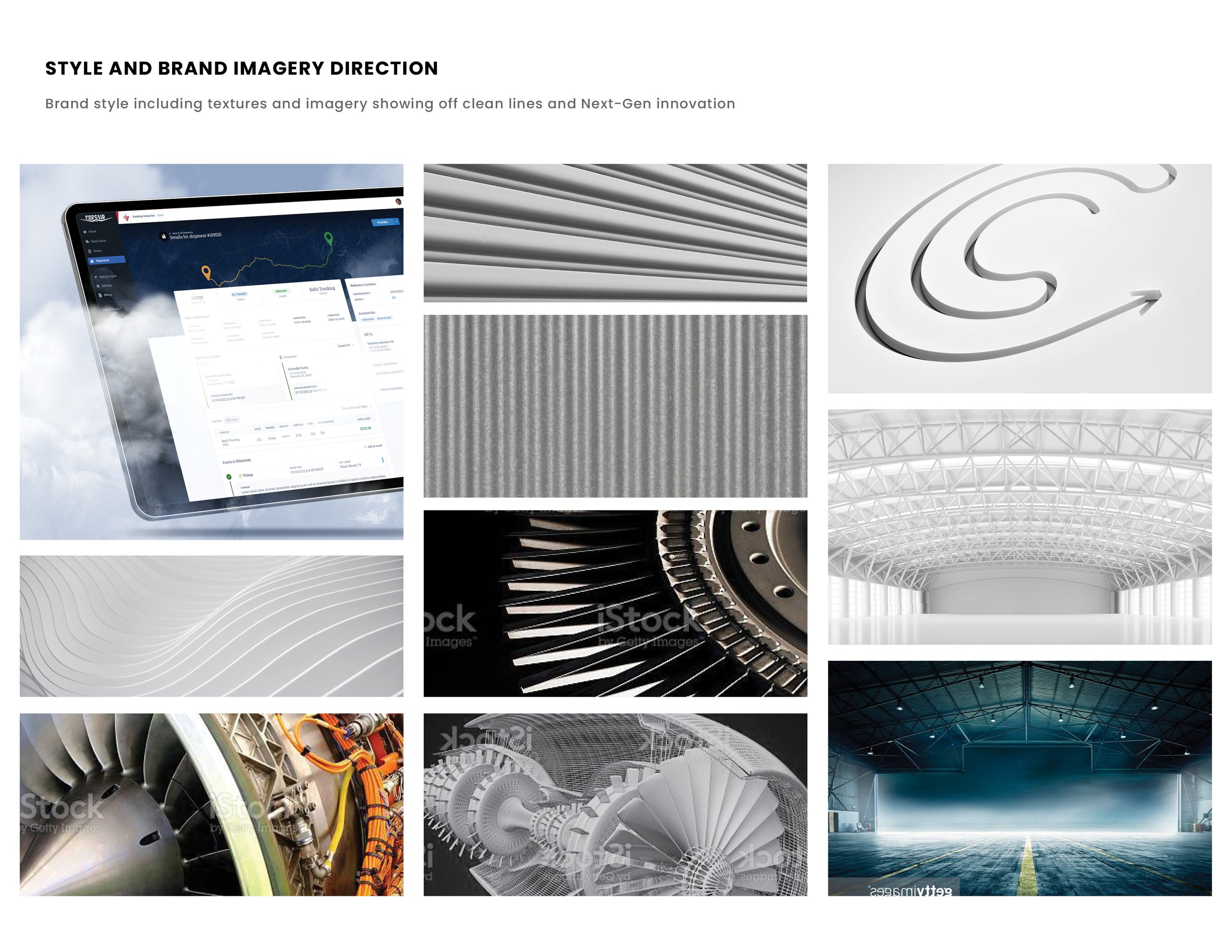
NEW OUTLOOK ON LOGISTICS
Laying the foundation of style, tonality and visual concepts/ direction for this logistics software. A refresh with a modern/ clean look and feel and the underdog mentality of the small innovative startup competing against the more stale/ older Goliaths of the space was a lot of fun for direction. More to come.


LOGOS & VECTOR ILLUSTRATION SERIES
Put me in coach! The fine people of Red Rover asked if I could knock out 20 additional illustrations to fit with their current branding and also toss in a few one-off logos ASAP. All illustrations were done in vector form so there is flexibility for the future in resizing/ adaptation. A lot of fun to work on and the subject matter of education combined with software was a fun pairing to navigate in visual needs. Looking forward to more here!


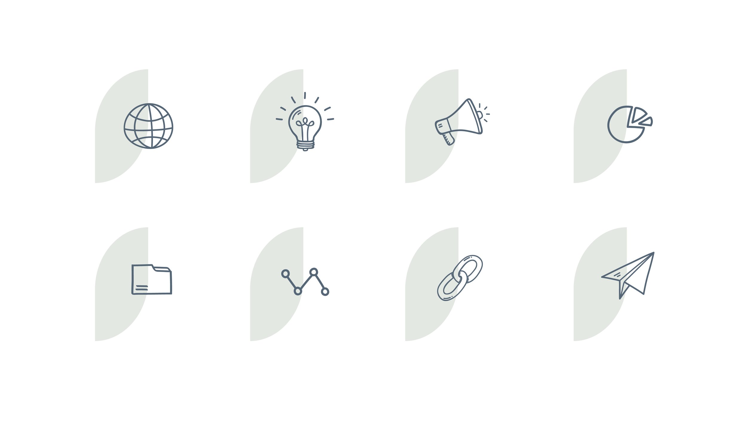
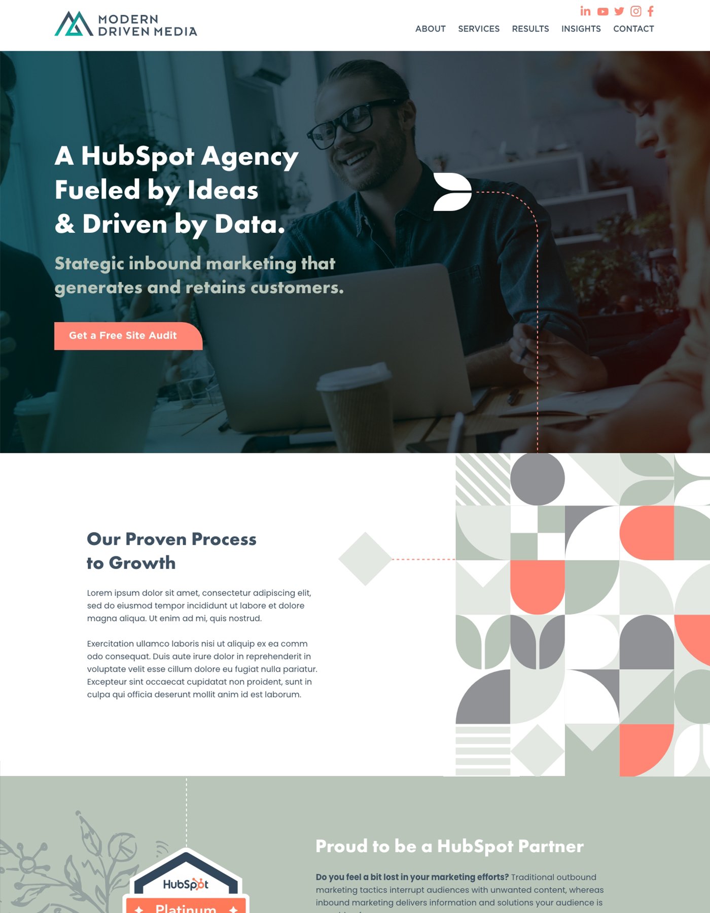
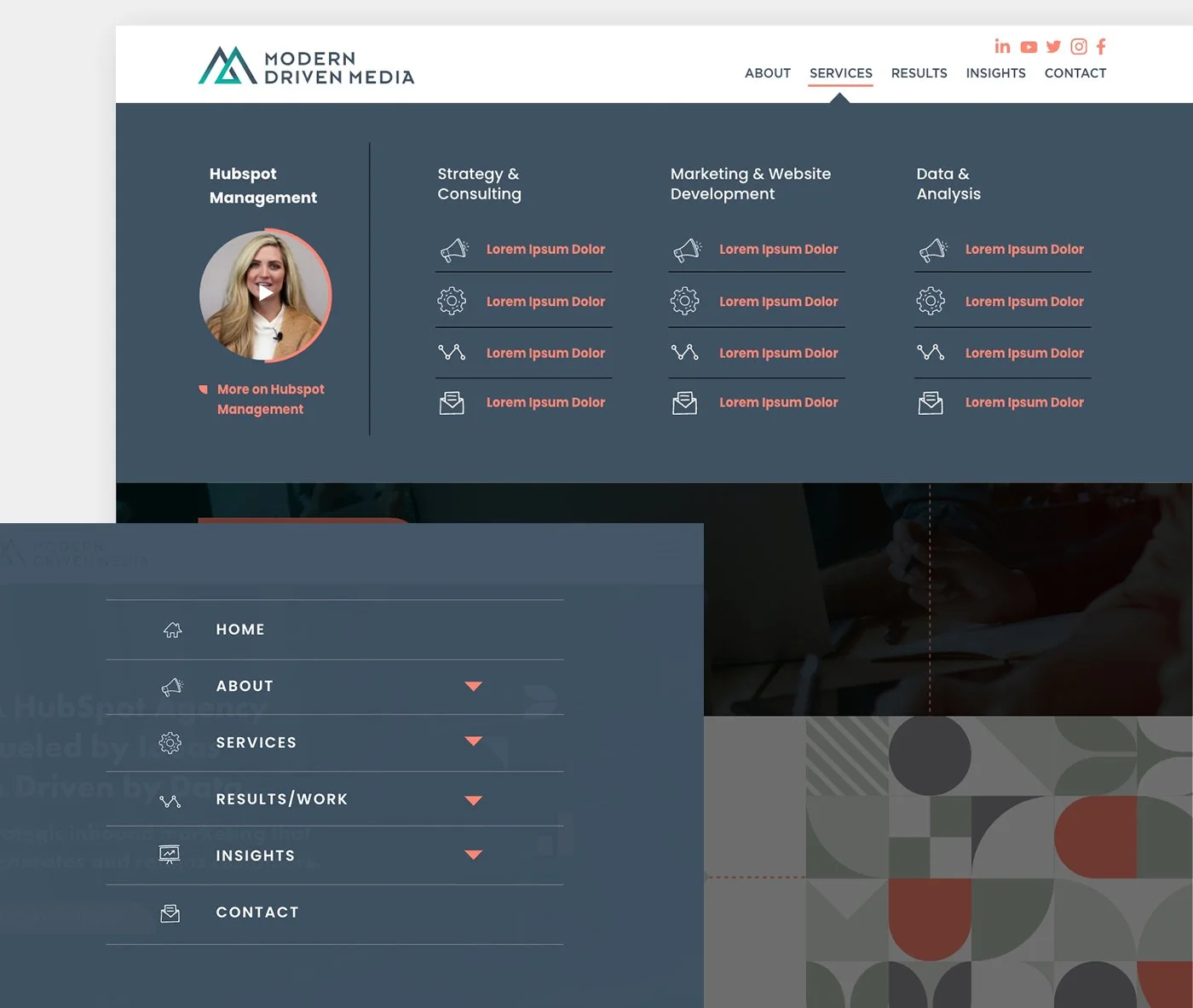
THE "M" IS A BEATIFUL LETTER
From logo design to branding, templates to the HubSpot site design, this project was a lot of fun to work on. Since some of the alternate options in initial direction on the logo were well received, we took elements from those concepts to pull together a consistent but interesting brand package. The site was complete with mega-menus and hand drawn elements that really give a custom feel. This site is still in development and I’m excited to show off on completion!