
I used to do Soccer Crests and Badges all the time!!! It was a big part of my freelance work and I loved it. Small clubs, minor leagues, even talked to a few pro teams in the US and did some work with a few pro’s outside the US. I had the Custom Soccer Crest market on lock, then I changed to more tags around “sports logos” to expand and got a Sports URL, etc. and some domino’s fell, etc. Less inquiries, but was changing around how I was positioning my skills and doing design, anyway even though there was a drop off, I had to turn down most inquiries as clubs were too small for increased budgets and probably not worth the time, though I enjoyed the work! Howeeeever, every so often, when I can squeeze in a late night mark and help a club, I love it! Really fun to work on a quick turnaround project for this camp and the people are great. See other crest/badge work I did back in the day here: CustomSportsLogo.com Some haven’t stood the test of time, some dominated their leagues!! Here’s to doing stuff for a US pro team someday!
ELITE SOCCER TRAINING STARTS HERE
On my sports identity and branding site (customsportslogo.com), I do a lot of badge and crest designs for various teams, leagues and clubs. I love doing sports design and the fact that I get creative requests after someone sees my work online is very rewarding. Since many of my requests are crest designs (most of the time soccer related) I have a standard price and process for that type of work. Level Up, on the other hand, wanted more of a brand logo and emblem that could be used at their newly acquired elite performance training facility. The logo would need to feel elite and work well with environmental graphics that were going up all over the interior of the building.
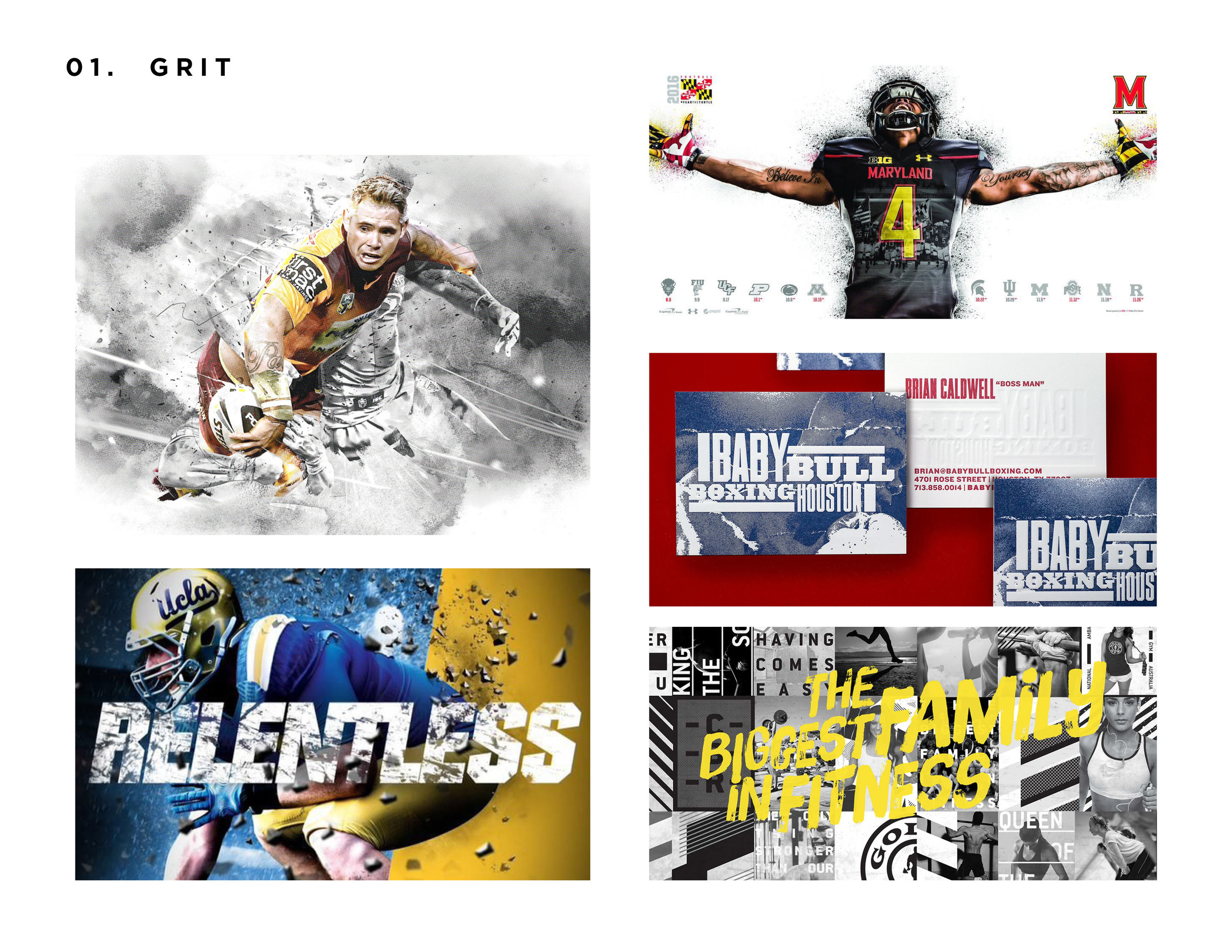
What an exciting project to work on with a lot of energy behind it as the training center is starting to come together. For this project I used a set of initial stylescapes to guide direction. Rather than showing multiple logo design concepts going every which way, I wanted to have a clear direction in moving forward and develop concepts that would be on target from the start. To accomplish this, I showed six different stylescape directions I named: Grit, Overlay, Monoline, Modern/Simple, Elite/Crest and Flat Dimension. In these stylescapes I showed a mood board or two of look/feel directions also that would give a sense of environmental graphics that would fit with the brand style. The styles capes consisted of examples and designs that fit the description well and also could provide inspiration or discussion for the direction of Level Up.
The two directions that the client gravitated to were as follows: Grit and Elite/Crest. The Elite/Crest style really lends itself to soccer branding and design. It quickly relates to an overall soccer style and then with the incorporation of grit, I could see the style having a cross-fit style pinch to it.


The initial concepts really hit the mark with the stylescape direction and thought the timeline for this project was pretty aggressive. Taking the time to do them was very helpful. I show below two of my initial concepts that were the top design variations by the client. After some discussion I went to work on the direction of keeping the lion head and crown but incorporating the hint of an “L” shape in the emblem. The coloring and typography was preferred in the second layout and having a responsive, engaged client really made the refining process fun for me.
As you can see, I created many styles of both the lion face and hinted “L” incorporation, some much more prominent than others. While I show multiple versions below, just know I did many many more till I felt confident I had a good direction. Spoiler alert (the first head won) and the final logo had both vertical orientation and horizontal orientation layouts for various uses.

Besides just the logo design itself, Level Up was interested in branding elements, brand standards for guidance going forward and other materials to come. Their program is designed to have various color represented levels to it and I used that concept in their brand elements as well. The angled color bars add movement and give a splash of color when used in layouts.
The brand guidelines shown below give direction and organize color profile information, typography guidance, preferred logo use and some helpful spacing suggestions. I try never to make the brand standards too restrictive, but create them as more of a guide to develop the branding around. Since the grunge elements in the logo can be problematic in a few production types, I also provided clean versions for use in those cases. Having a designer who really thinks through future usage can really help a brand get started on the right foot rather than having to rethink things in a couple years after everything has become watered down or disjointed. All in all this was a great project, process and a fun client to work with.


WHAT'S A VISUAL CASE STUDY?
Case studies are pretty common to portfolios. They tell the original problem (sometimes talking over the brief), what happened over the course of the project and how the solution was arrived at. They show some work and maybe even talk over what goals were met or exceeded with some statistics (number of impressions, number of leads etc.).
My soccer and sports logos have been a good side hustle for me. I have teams, clubs and organizations contacting me for work after seeing some designs on google images, pinterest, dribble or hopefully after visiting customsportslogo.com or customsoccercrest.com. The easiest way to sell work for new projects is client seeing previous projects and admiring the thought, styles and professionalism. For some reason when I seek out work, it's more difficult to gain that level of trust and be given the time with the same level of engagement.
With this in mind I wanted to create some visuals that would put some of my designs in an environment that relates to the design itself. I thought showing some of the iterations or variations on design would give insight to the time spent on each project and the level of detail I work with. I didn't want to include all the copy points and info surrounding the project, as I feel most people glance over that anyway, but instead show compelling visuals and keep them simple. Here are the first few I have done and I am excited to do quite a few and tell the stories visually online.
