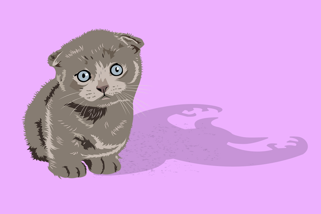
Put me in coach! The fine people of Red Rover asked if I could knock out 20 additional illustrations to fit with their current branding and also toss in a few one-off logos ASAP. All illustrations were done in vector form so there is flexibility for the future in resizing/ adaptation. A lot of fun to work on and the subject matter of education combined with software was a fun pairing to navigate in visual needs. Looking forward to more here!
THE HOPS RATTLE
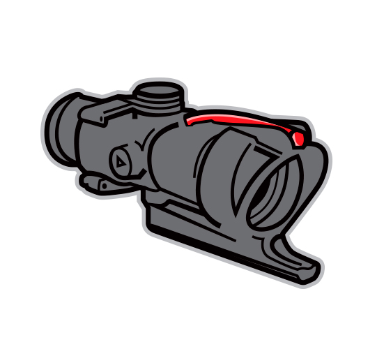
Unused vector illustration concept for Pabst Blue Ribbon.
COMMISSIONED ILLUSTRATION
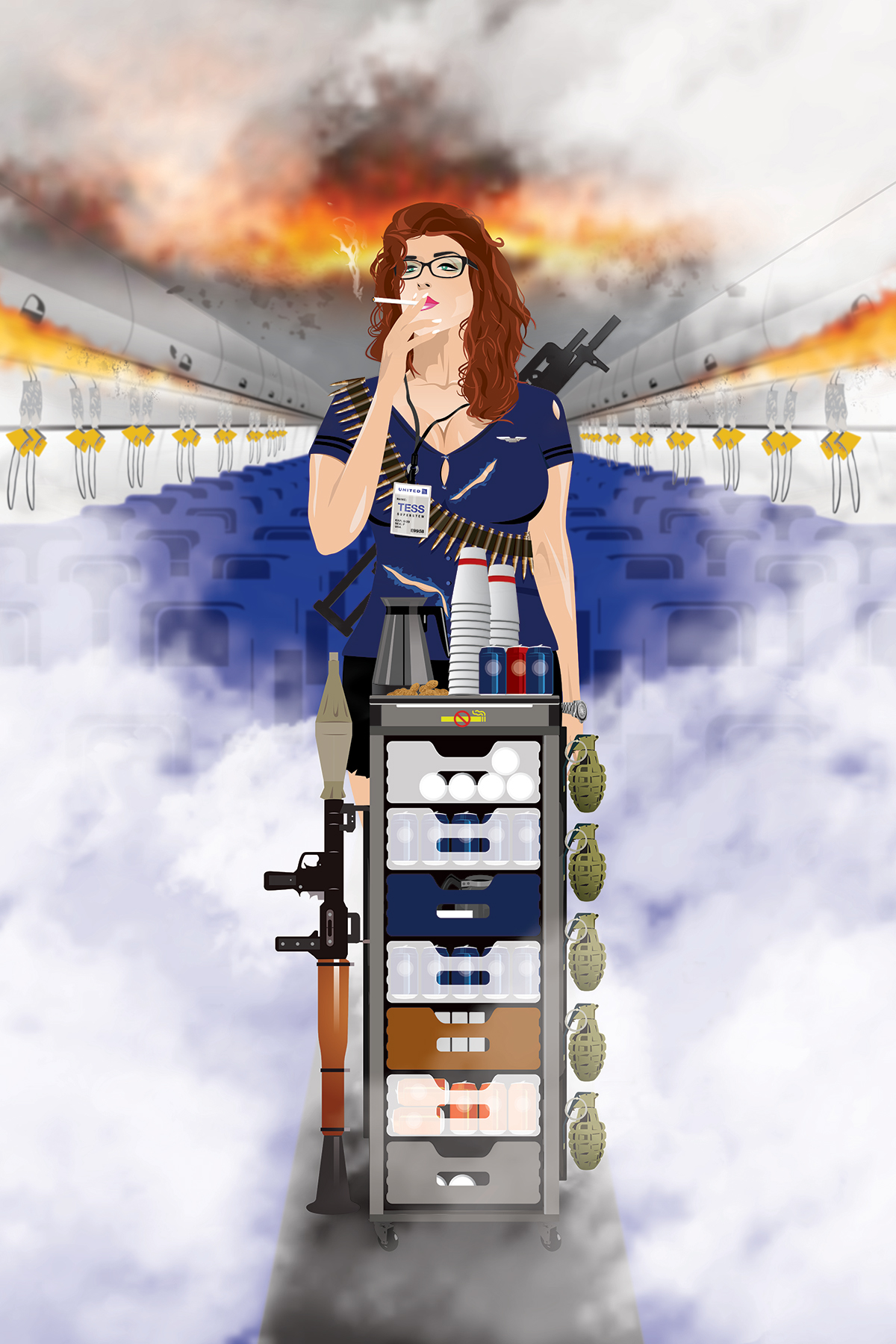
Pretty sure this is the largest vector illustration request I have had. Ok, not every component was vector, but just about everything. I did use a bit of warping and mesh effects, but for the most part it's straight up illustrator components (brought in as smart objects) with a bit of blurring and brush work in photoshop.
Due to most all of this being pen tool drawing, the process is time consuming, but really rewarding as components fit together.
I started the project by just creating the background seats, overhead bins and floor. This helped frame the other elements that would be fitting into the space and shape the perspective of the layout. Next I started tackling the individual components: grenades, bazooka, cans, cups, non-smoking sign, etc. This helped me enjoy the process a bit rather than trying to bounce around and tackle everything at once, which may have been a little overwhelming and not as enjoyable. Then I moved on to finish the cart.
Truly wasn't looking forward to the stewardess' face, body position, etc. as that can be a bit tricky without great reference photos and it's hard to figure out exactly how far to take the tough-as-nails attitude/look. In the end I really enjoyed doing the facial features and hair as much as the other components.
When I couldn't find a photo reference in perspective, it was convenient my wife has glasses and could tilt her head in the correct position for me to refer to. I didn't want to use gradient after gradient in the layouts and instead tried to use more transparency and flat colors for the style.
I will say using a Wacom tablet really is a game changer on something like this. I used the trackpad on my laptop for many of the items, but every time I was able to use the Wacom pen, it just seemed to move faster and avoid cramping.
I went back and forth on sketching on top as an added effect to the final art, but the vector work really pops against the blurred background and I thought it best to leave it clean. The final version was printed on canvas (24"x36") and stretched on a frame.
The vector components really looked sharp and that enabled the text on her badge to be perfectly clear (one request from the start was to have the badge text be legible). The no-smoking sign on the cart and oxygen hanging down really ads to the theme and is my favorite part of the whole thing.
Anyway, I am pretty excited the way it all turned out and so was the client. Would welcome more of this type illustration sometime soon!
SOME RECENT VECTOR ILLUSTRATIONS
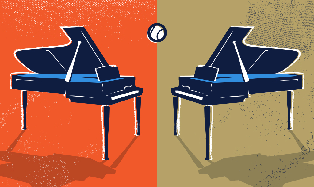
Good work attracts more good work. I've heard that before and it really is true. Also, the type of work you do will attract that type of work. Though it's best to be in a niche and focus on one area of design, I love so many that this is difficult to choose just one. I do focus on a lot of logo/identity work for my freelance business, while I also do advertising (ads, brochures, wraps, sites, etc.) here and there, for me identity work is the focus. Sports identity is the majority of my business but branding for any type of business is attractive. For those who want to invest in identity that is bold and stands out, I'm in. That being said, vector illustration has been an area I have always enjoyed. Below is some recent work done for various projects. Whether it be another children's book illustration, dueling pianos with a baseball twist, to portraits, it's all fun for me.
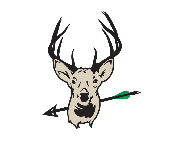
Immediately below is a few social post illustrations done around a couple holidays or just for fun. A Buzz Lightyear cupid just makes sense for Valentines Day. A Cinco de Mayo celebrating parrot was fun to illustrate and illustrating bucks is always fun because if I don't see them in the woods at least I can see them on my social feed I guess. I am not the biggest user of social media to say the least. I have Twitter simply to stay current on news. I have Dribbble to follow designers I respect and be inspired by work. I have Facebook because I've had it forever and I guess there really isn't a good reason. Anyway, how things get popular, go viral, get recognized really does interest me. Recently a co-worker and great friend was involved with a video that has over 10 million views. So in an effort to be more active on social media, I want to contribute more work that I enjoy in order to attract more work that I enjoy and maybe get noticed. I am trying to do more vector illustrations that have a thought or purpose for them. Whether they are specific to a holiday, event or just a part of a project I am working on, post the thing. Maybe someday I will even write stuff that contributes to the post and gets read, but I'm not sure I am that invested yet :).
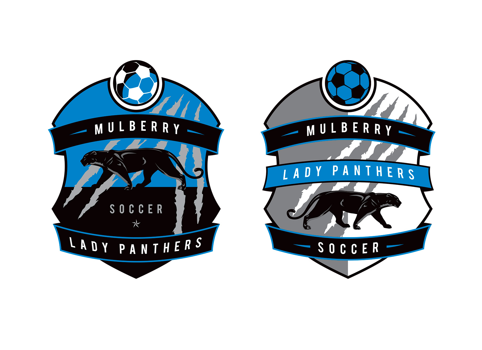
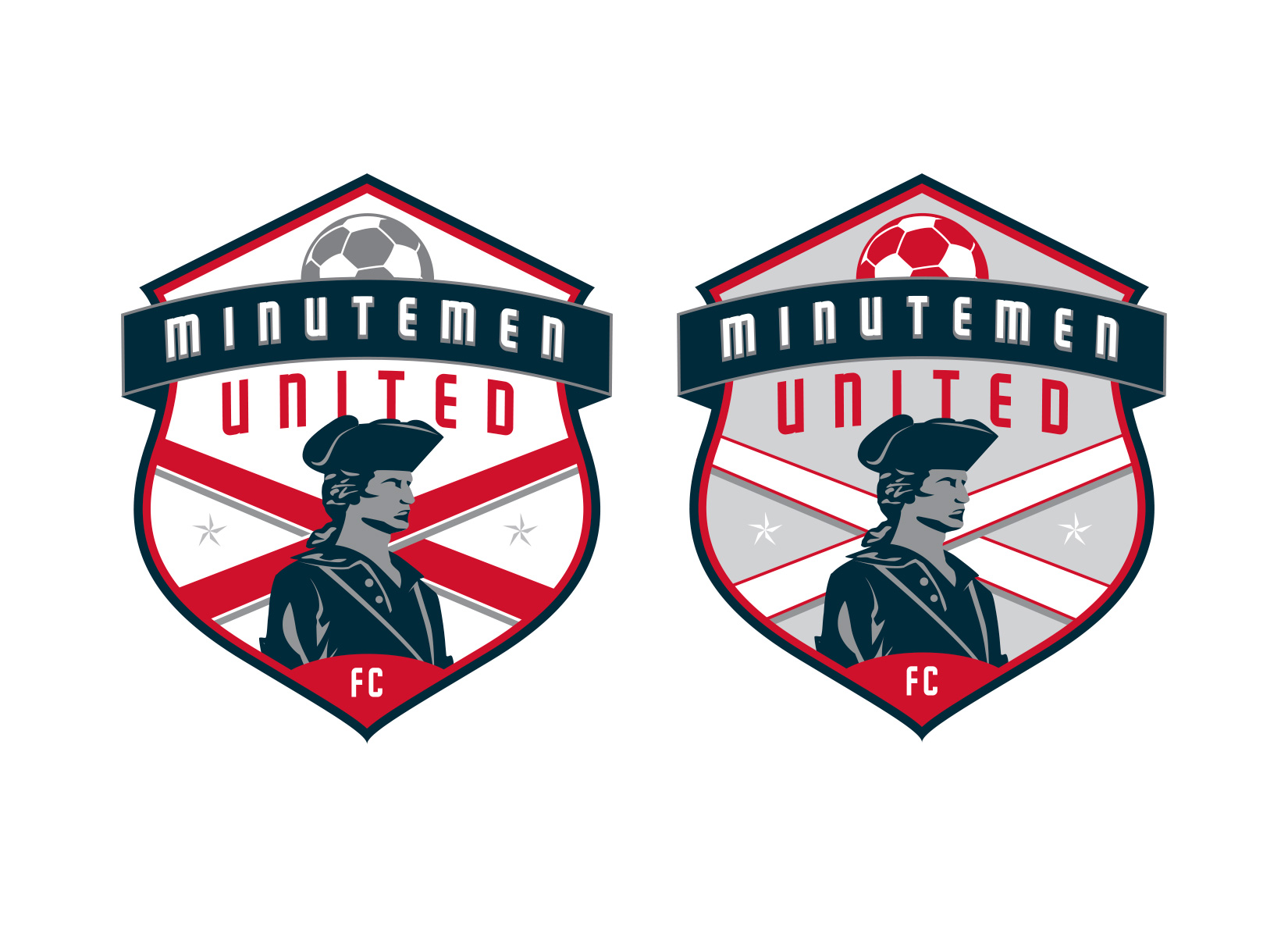
I've always done some amount of illustration work in the crests and sports identity I design. Below are two recent examples of vector illustrations that I have incorporated into the crest. I try not to go really intricate with these illustrations or I try to provide a simpler version of the crest for use with embroidery.
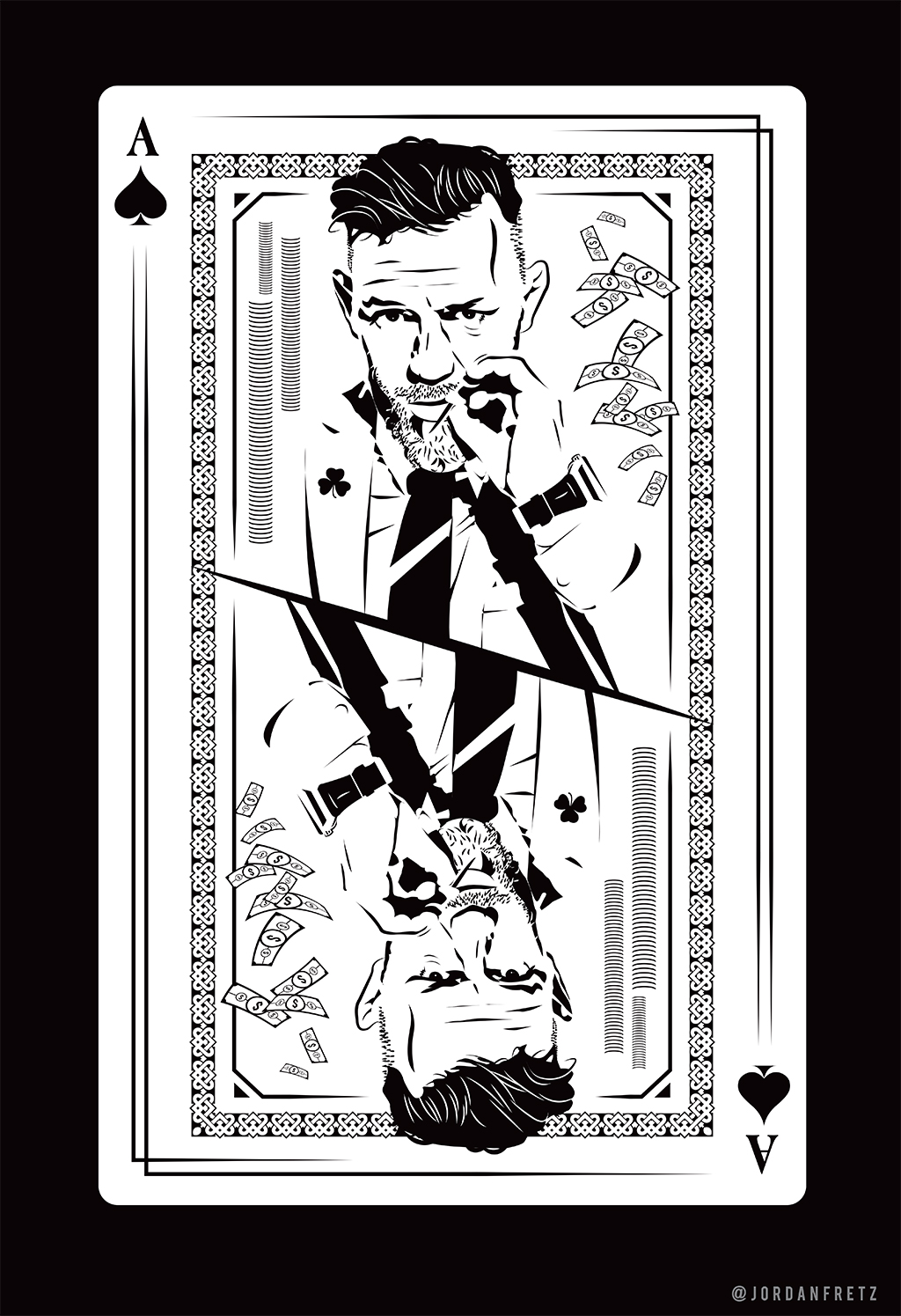
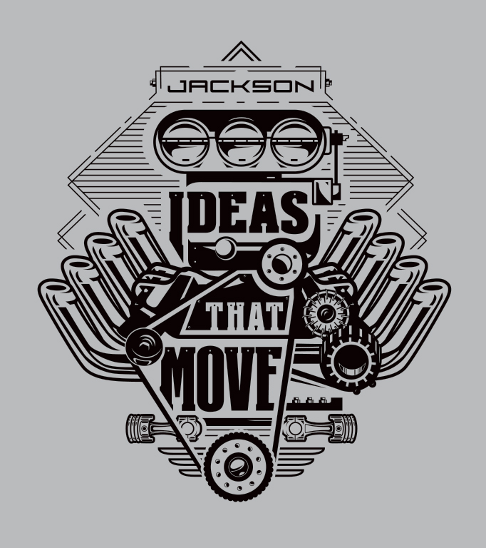
Below are some examples of more intricate line work in recent illustrations. One is a just-for-fun illustration of Conor Mcgreggor and the other is for Jackson Motorsports t-shirts. Since there was all kinds of talks of Conor vs Floyd and even more talks about the money split and who will be the A-side. I thought it only makes sense to show the Ace or A-side in the situation as I saw it. I used an Irish style border and put the shamrock on his jacket. Did this layout do anything for me on social media. Nope. Waste of time? Nope. Reason being, I just was contacted about a vector illustration with a reasonable budget and they asked for a sample before awarding the work. I sent over a few and not much reaction, but then I remembered I had done this Conor layout. They liked it and awarded me the project. Good work attracts good work and that's all I aim to do.
