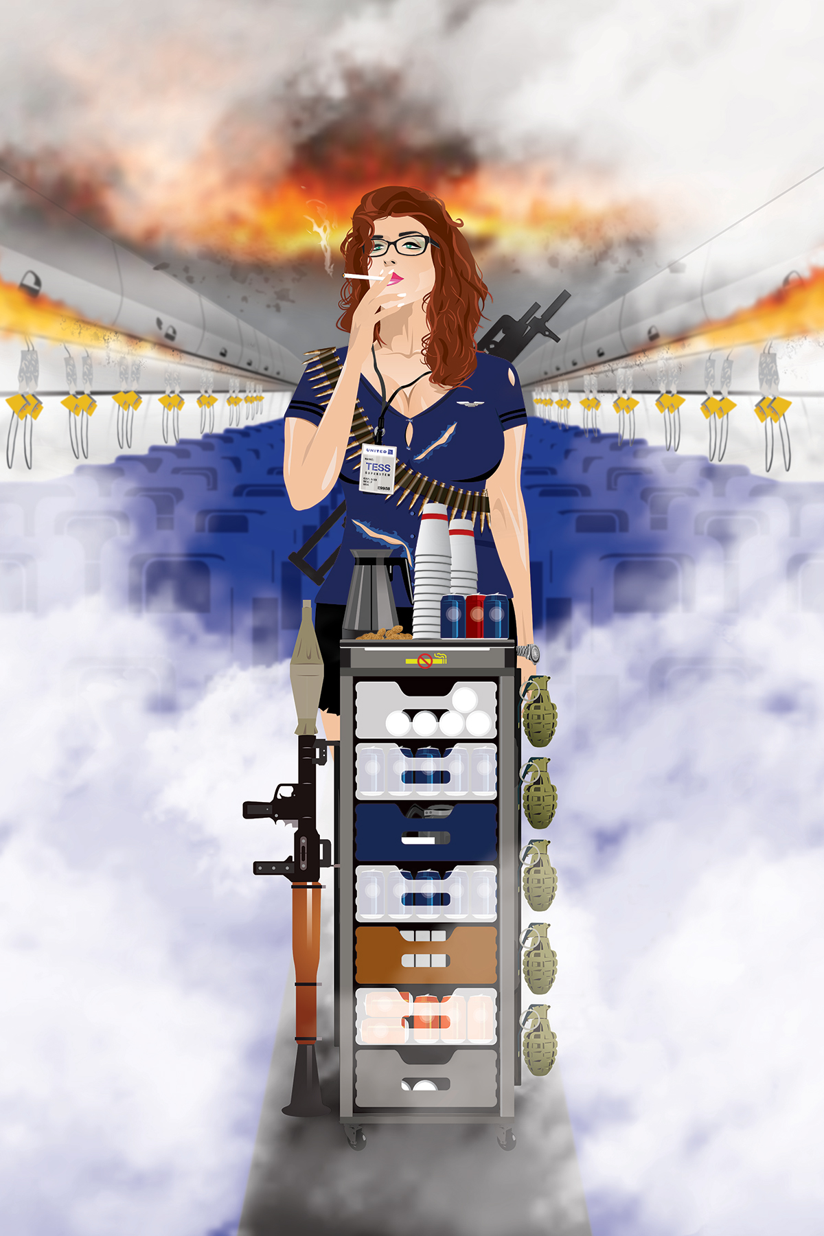
Pretty sure this is the largest vector illustration request I have had. Ok, not every component was vector, but just about everything. I did use a bit of warping and mesh effects, but for the most part it's straight up illustrator components (brought in as smart objects) with a bit of blurring and brush work in photoshop.
Due to most all of this being pen tool drawing, the process is time consuming, but really rewarding as components fit together.
I started the project by just creating the background seats, overhead bins and floor. This helped frame the other elements that would be fitting into the space and shape the perspective of the layout. Next I started tackling the individual components: grenades, bazooka, cans, cups, non-smoking sign, etc. This helped me enjoy the process a bit rather than trying to bounce around and tackle everything at once, which may have been a little overwhelming and not as enjoyable. Then I moved on to finish the cart.
Truly wasn't looking forward to the stewardess' face, body position, etc. as that can be a bit tricky without great reference photos and it's hard to figure out exactly how far to take the tough-as-nails attitude/look. In the end I really enjoyed doing the facial features and hair as much as the other components.
When I couldn't find a photo reference in perspective, it was convenient my wife has glasses and could tilt her head in the correct position for me to refer to. I didn't want to use gradient after gradient in the layouts and instead tried to use more transparency and flat colors for the style.
I will say using a Wacom tablet really is a game changer on something like this. I used the trackpad on my laptop for many of the items, but every time I was able to use the Wacom pen, it just seemed to move faster and avoid cramping.
I went back and forth on sketching on top as an added effect to the final art, but the vector work really pops against the blurred background and I thought it best to leave it clean. The final version was printed on canvas (24"x36") and stretched on a frame.
The vector components really looked sharp and that enabled the text on her badge to be perfectly clear (one request from the start was to have the badge text be legible). The no-smoking sign on the cart and oxygen hanging down really ads to the theme and is my favorite part of the whole thing.
Anyway, I am pretty excited the way it all turned out and so was the client. Would welcome more of this type illustration sometime soon!


