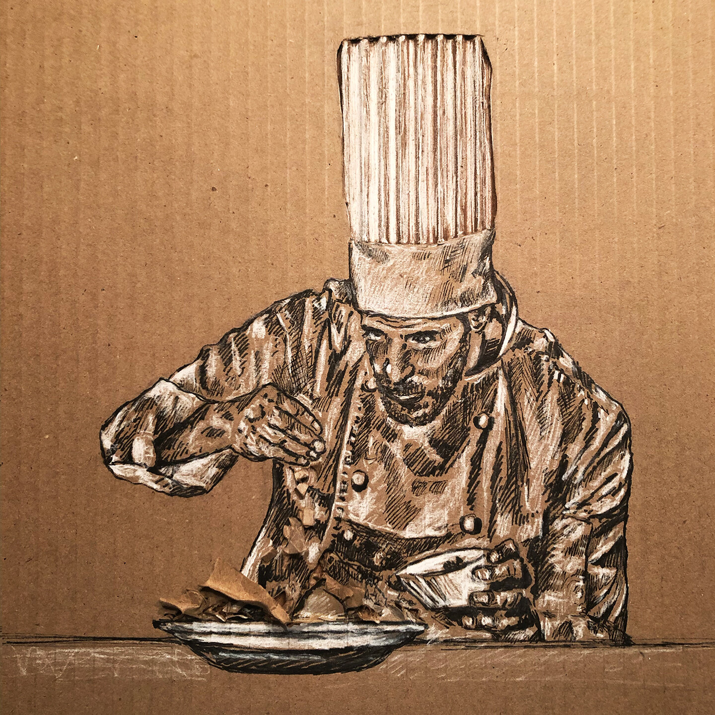
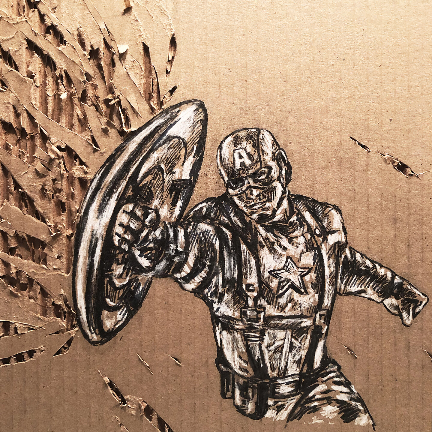
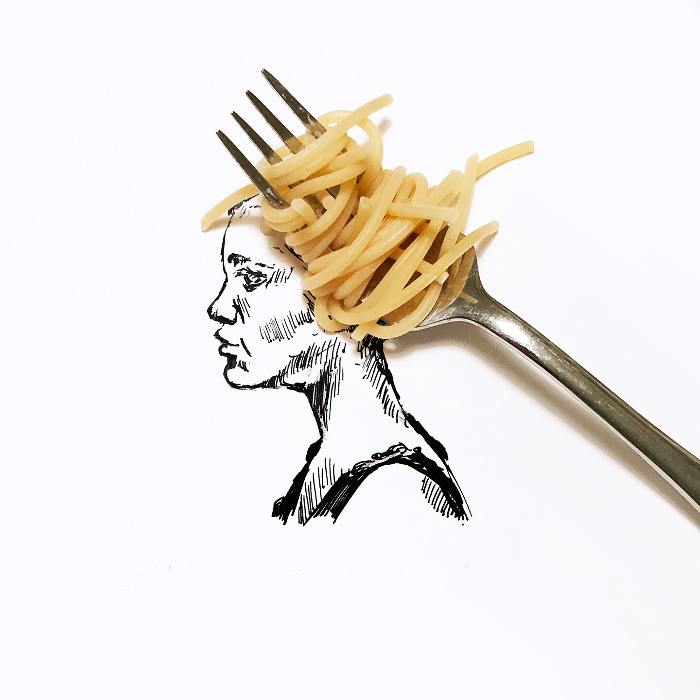
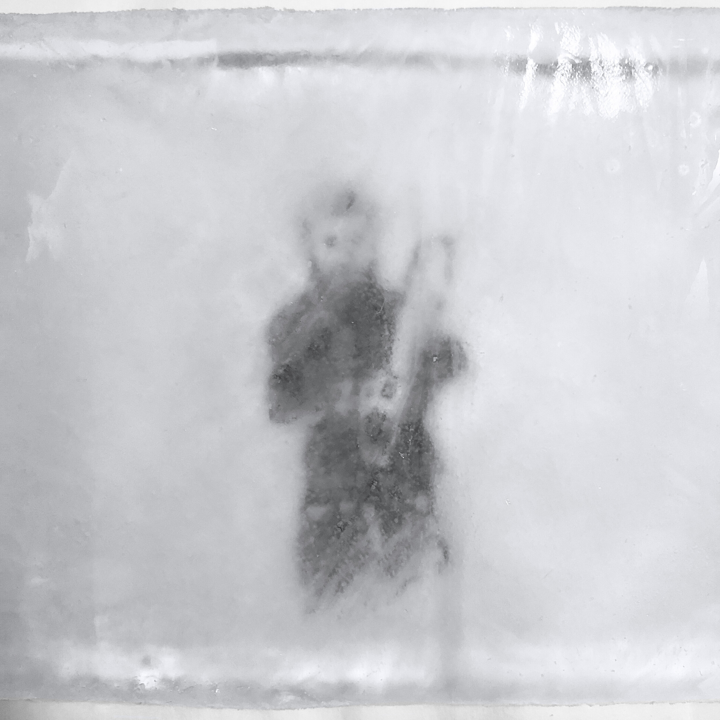
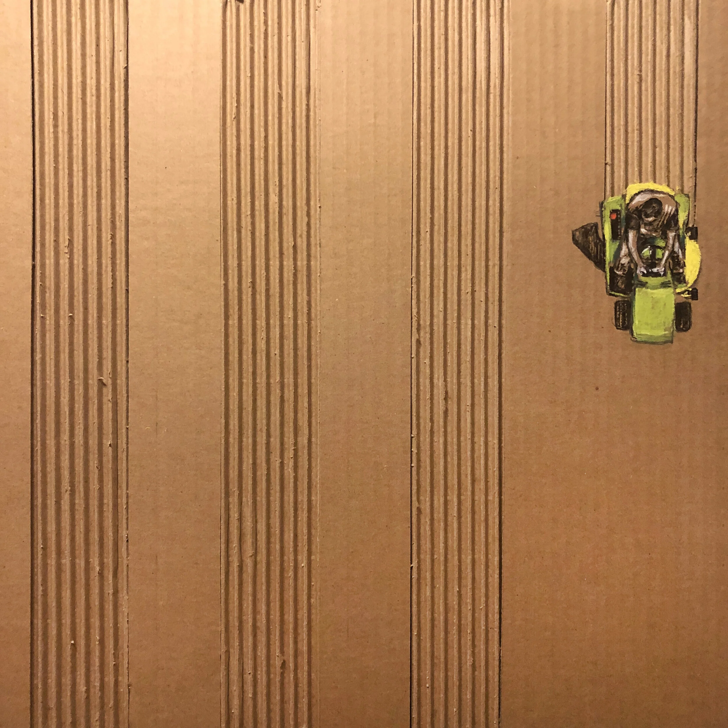
Inktober year #2 is in the books for me. I followed the prompts with some illustrations last year and really enjoyed them forcing me off the computer to think creatively, quickly. Time is always my nemesis and while October was a challenging month between agency work, freelance, art, family, bad digestion, a quick trip to Myrtle Beach, ok whatever you get the idea. I was swamped, but really worth it and while my wife dreads October again next year. I’ll most likely be back once again.
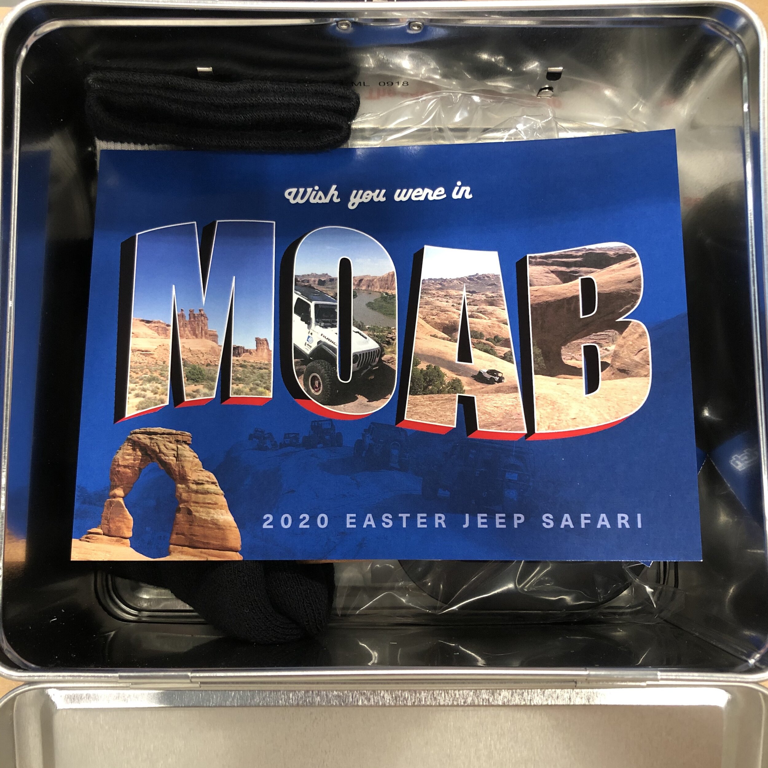
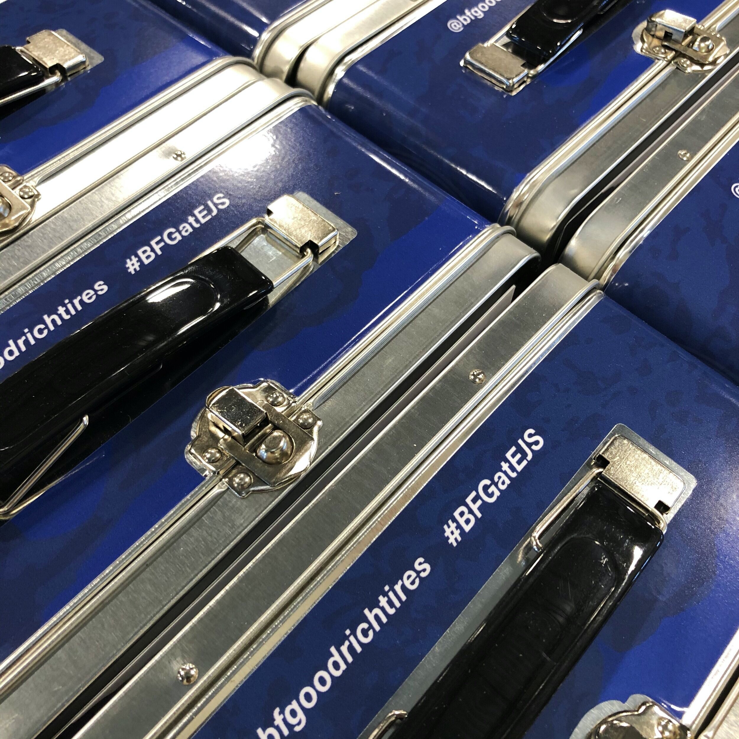
EVEN COVID COULDN'T STOP THE DIRT FROM FLYING
With event cancellations everywhere, we sent a virtual experience to influencers complete with actual dirt from Moab. It’s like you were there, but you weren’t, but almost. Influencers were also able to get an immersive, VR experience with 360 videos and additional product insights. If that wasn’t enough, some swag was in each box also. With events cancelled everywhere, trying to keep brands top of mind has been an interesting challenge. 2020, what a year!
KONTROL REBRAND
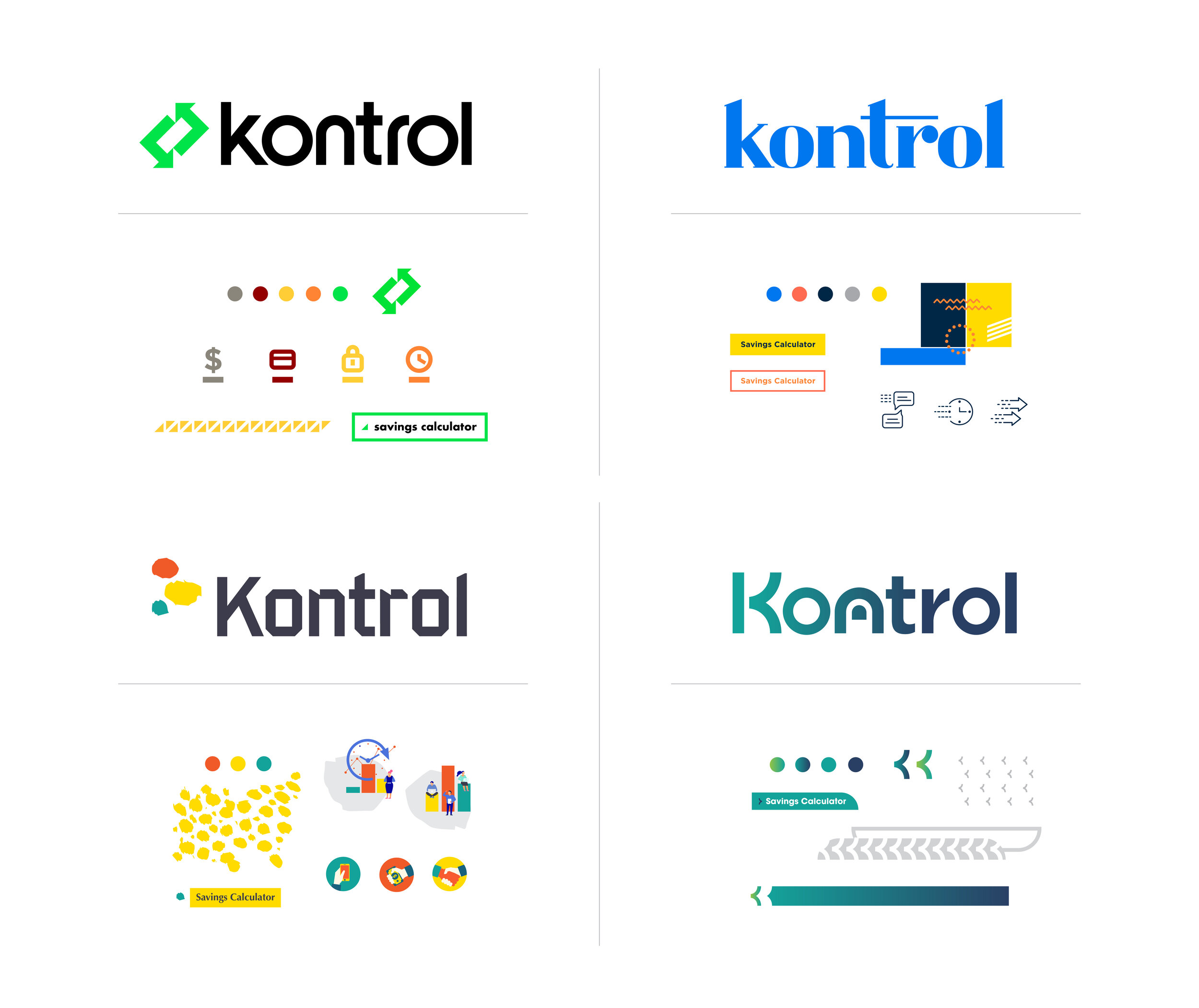
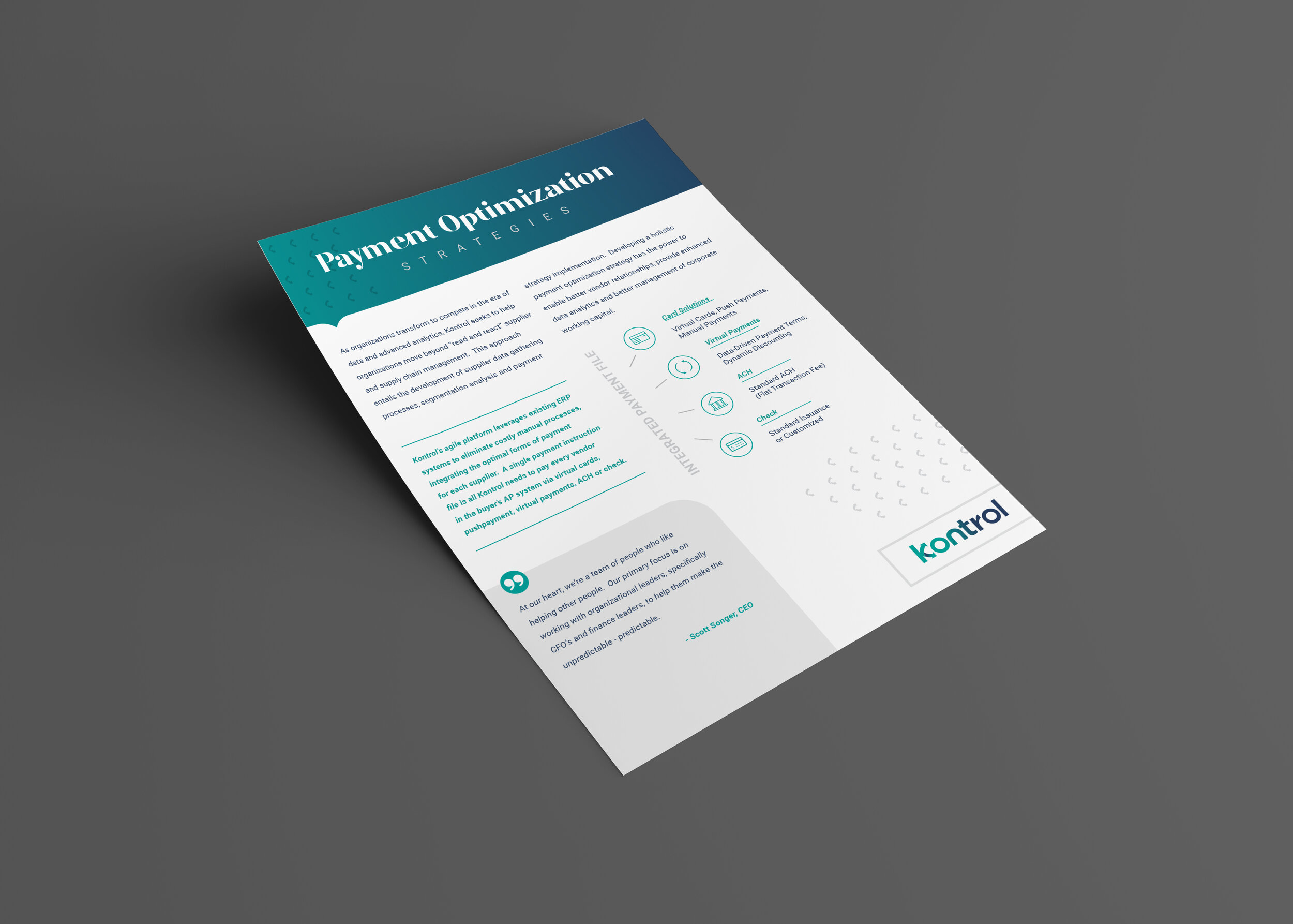
Kontrol Payables has built an amazing platform for companies to optimize payments to suppliers, vendors, etc. Their system provides cost savings by streamlining ACH, virtual cards, checks, etc. into a single, easy to implement platform and they get a rebate based on spending. Pretty amazing company, I don’t understand it all and likely won’t grasp all the capabilities, but boiling down the offerings into a single concept was fun. Some of the words I grasped onto for dear life were “payables and returns”, “speed”, “security”, “identity” etc. I’m also excited about them dropping “payables” in the logo itself as it makes for a really clean look and doesn’t limit them in launching new products and consulting in the finance space.
In presenting these logo concepts, I did a few animated .gif files to show my thought process in development. Showing how the ideas come to life has proven to be really beneficial in presentations. I know these aren’t giving any animators a run for their money, but I think they did their job in telling the story of each concept.
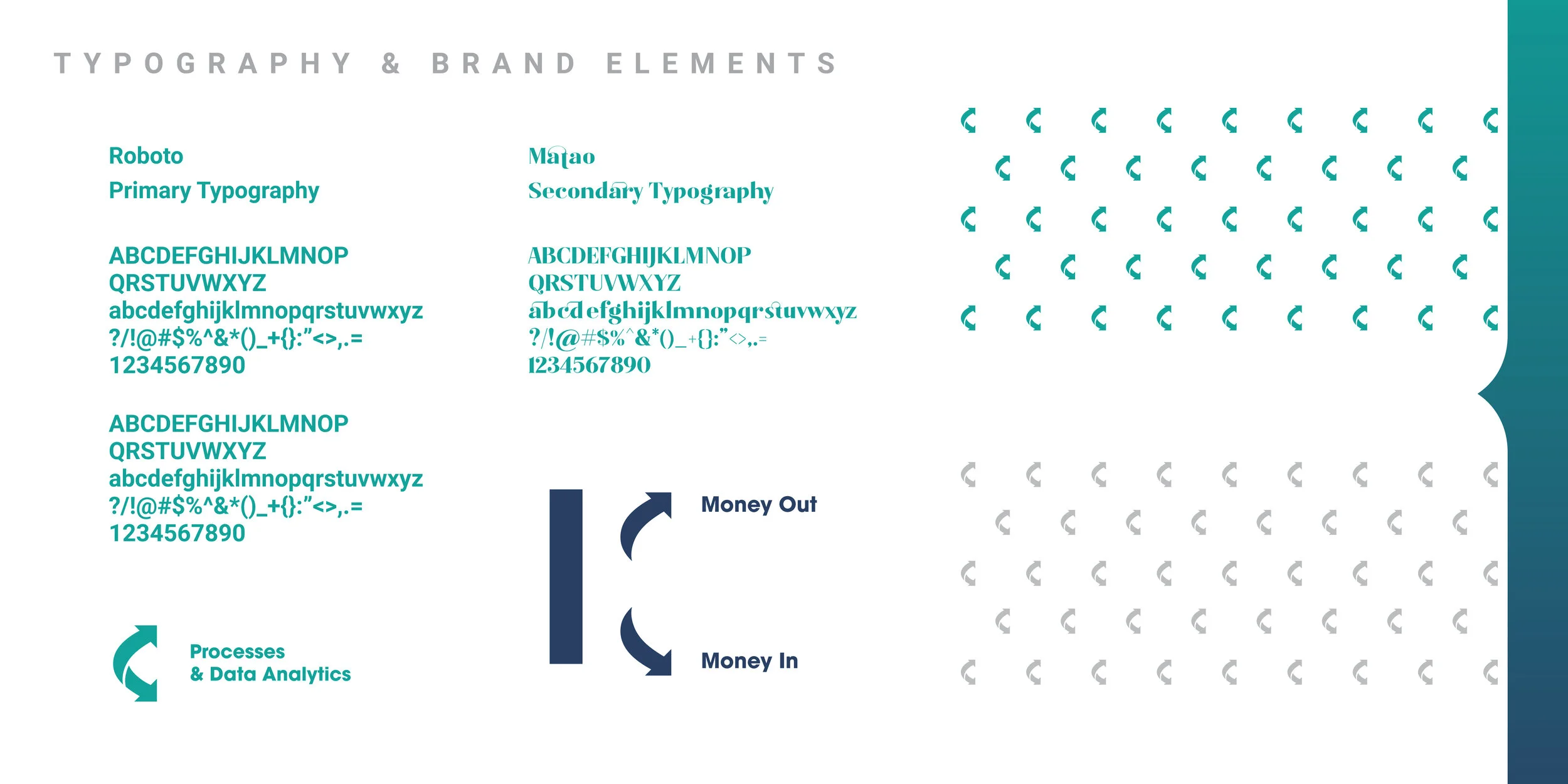
The final logo choice and some identity components are below, many more marketing pieces are in the works. The two way payment offering of “payables” and “returns” is displayed in the form of the arrow icon. I’m excited to continue building the Kontrol brand with new presentation decks, product offering launches, etc. I’m sure they’re will be some future blogs showing off that work as well.
HERE'S TO INNOVATING FOR 10 YEARS
Here’s some recent graphics for Innovative Manufacturing celebrating 10 years in the biz. Their business is all about precision and the caliper highlights that in the mark. I don’t know the ins and outs of EDM, CMM or any other equipment fine details, but basically they can fabricate and manufacture anything in the aerospace, automotive and I’m pretty sure I saw a UFO being worked on in the back.
FULL USE OF HALF-PAGES
These simple ads for Ben Daniel Dentistry have been a lot of fun to work on. Prior they were just running some resizes of various social posts done by the magazine and I was excited to help make better use of the purchased half-page placements. Not many places would be all for doing such simple ads, they may want a massive logo or loads of talking points. Props to my client on wanting to get across one thought and crack a smile for some added awareness.
INKTOBER COMPLETE & MADE THE JOURNAL
I’ve always wanted to do INKTOBER. I got on Instagram as a creative break from the computer and I just wanted to do some random illustration stuff. In that sense, INKTOBER is exactly what I was looking for. A 31 day challenge using a prompt list and joining a community of illustrators/artists in doing so. Anyway, see all the days illustrations/interactive art I did on my Instagram @jordanfretzart.
Pretty cool the Greenville Journal took notice of some of the work and wrote a cool article in printed and digital form. See the article online on their site here: Greenville Journal Article.
TAKE YOUR FREELANCE UNDERGROUND
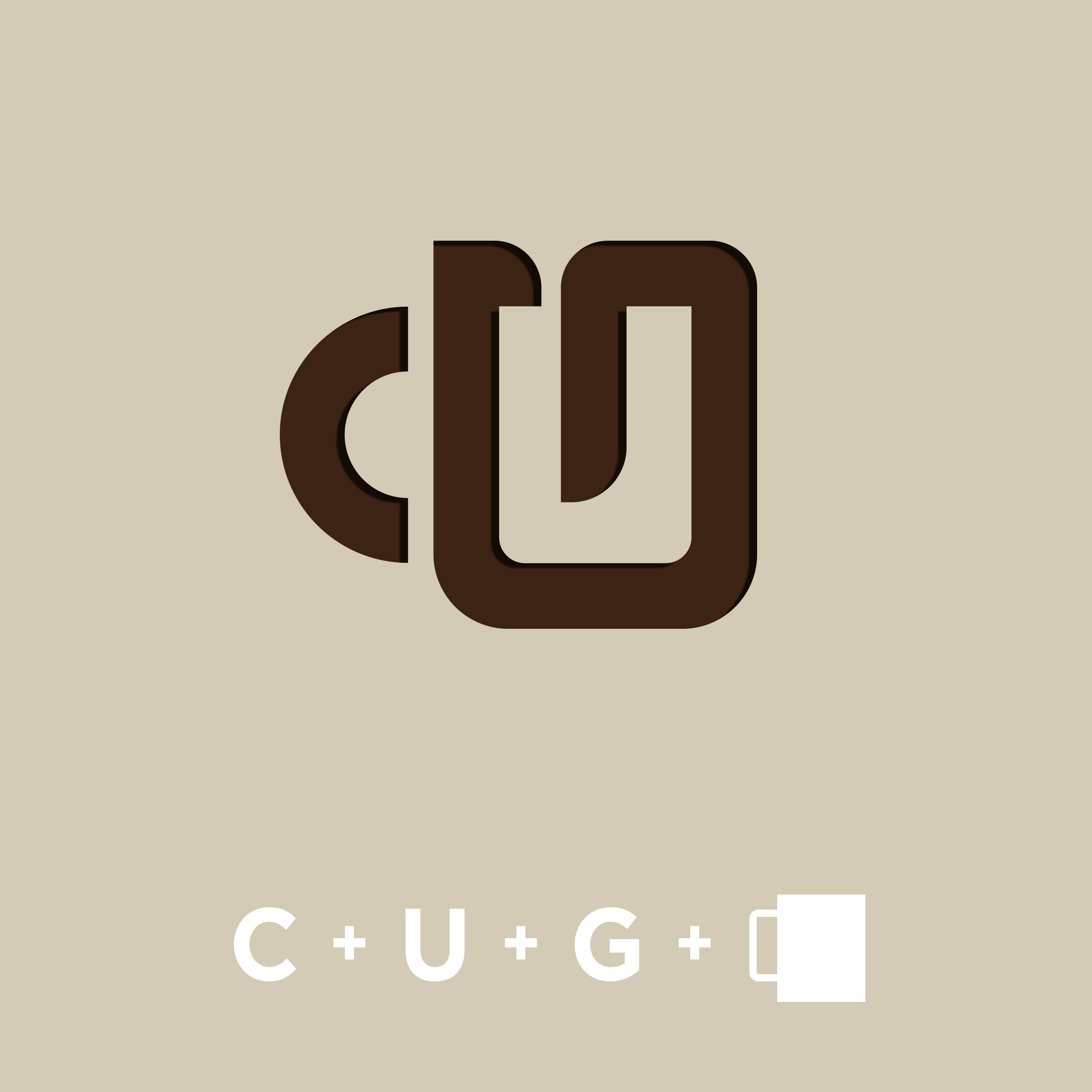
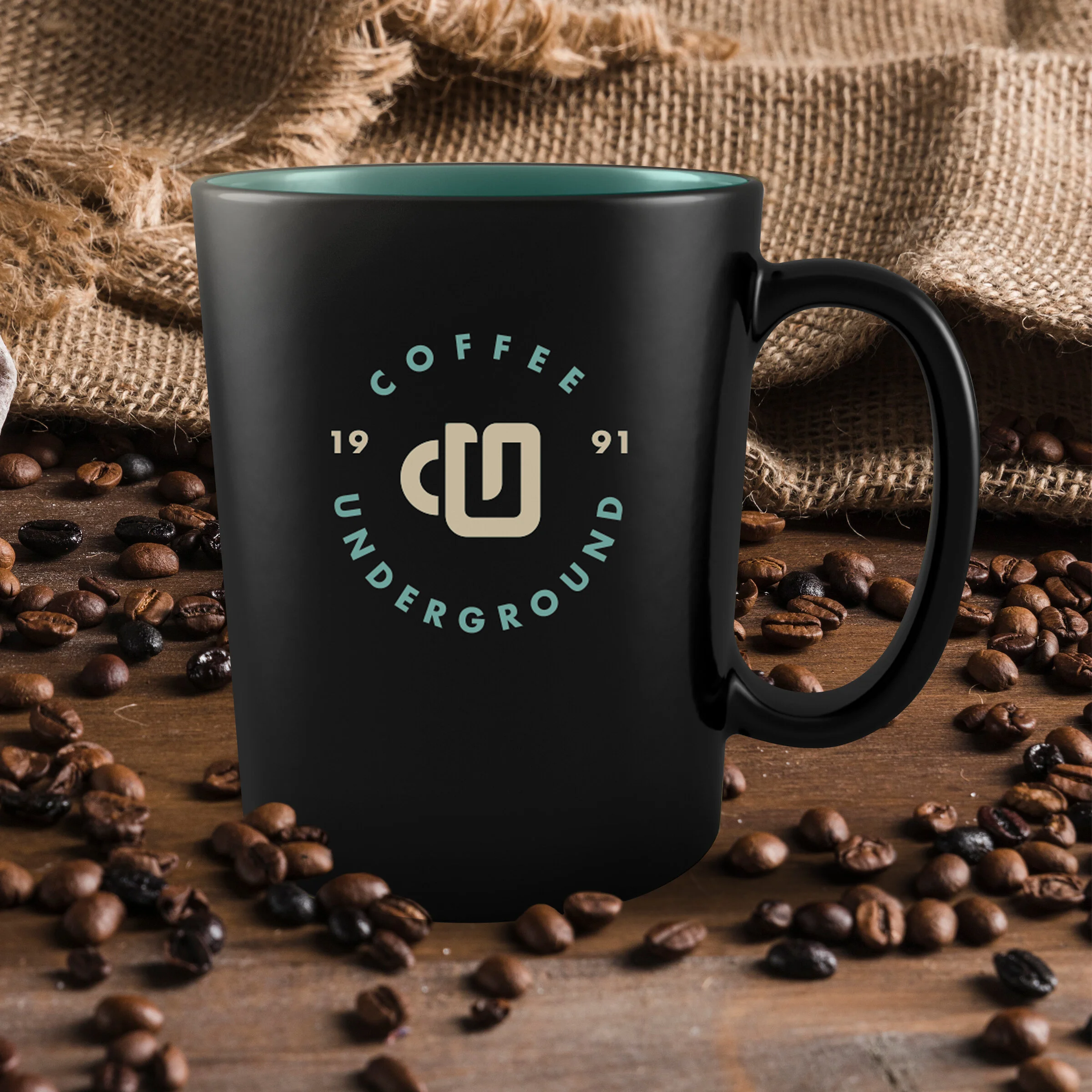
I love freelancing at coffee shops. I did it waaaaaay more before kids,, but my favorite spot to go was Coffee Underground. I've always loved there location downtown, setup, food etc. but their logo/signage could use an refresh!! While so many customers and Greenville natives love this place, I can’t remember seeing shirts, vehicle stickers, or other branded elements around town. They should have loads of stickers on customers vehicles, laptops, coolers, sweater vests (Too far?). THE PLACE IS AWESOME. Anyway, I put together a little proposal with a new logo design and a few ideas for using coffee sleeve art (you can see some on my instagram @jordanfretzart). Taking a few minutes to put together a proposal for some work I’d love to do, for a place i’d love to do it for felt like a great use of time. It’s always tricky to know where to send something like this, how to get it to the right person and not come across like a tool, etc. Besides sending online and hitting up their social accounts, I drew the Liberty Bridge downtown on a coffee sleeve and cut a hole in the cup lid giving room to insert a rolled up printed proposal and dropped it off for the owner. You never know, but it would be a cool story to do a bit of freelance for a place I’ve always loved to freelance at.
