VS REBRAND
> INITIAL CONCEPTS > REVISED CONCEPTS
REVISION 1
ROOTED IN RAIL.
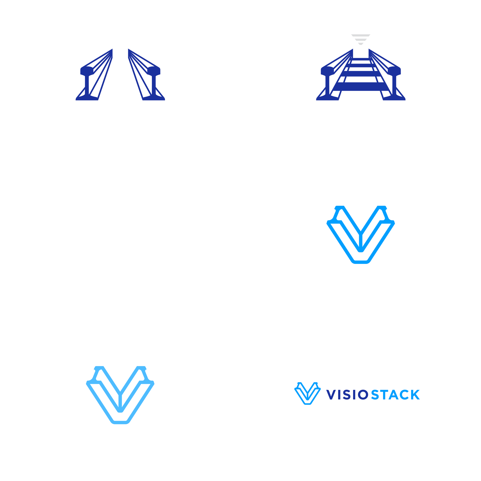
In concepting representations for the heritage of rail, I worked through railroad signage, tracks, industrial shapes, etc. and I loved the shape of the rail beam sections. The end shape feels industrial, somewhat unique and I thought it fit well with an outline/monoline style. I thought the rail sections coming together to form a “V” could symbolize the 2 needs for our clients, the industrial/asset part of their business and the tech/management/health side that keeps it moving. Another way at that is the partnership we have demonstrated over the years in rail is now available for other industries. For customers outside the rail industry, I don’t feel this is over-the-top and still comes across as a stylized “V” that’s formed by interesting geometric lines and feels strong/industrial.


