VS REBRAND
> INITIAL CONCEPTS > REVISED CONCEPTS
CONCEPT 1
BRIGHTER & BOLDER.
This concept takes the current logo/brand aesthetic and breathes in some some new life. The colors pop. Since applications are primarily (maybe only) in digital form, utilizing the RGB color space to stand out and get noticed makes a lot of sense. I loosened the curves slightly and changed the angle slightly to suggest a bit more movement. This would be really cool to animate and have flowing for use in video formats also. I gave a sampling of how these flowing lines could be used in some brand elements, interact with photos and extended the curve design style into buttons, icons etc. It’s clean, simple and flexible reflecting the ever evolving VS tech offerings and support.
CONCEPT 2
EVOLUTION: SHARP ANGLES
A farther departure from the current logo, this concept utilizes some modern, sharp angles combined with the curves for a new look. For this design, I used a warm color scheme with spots of blue for a contrasting color. The infinity symbol to me really works as it pertains to exactly what the benefit is of your products, health management and maintenance planning to keep businesses moving, constantly. Anyway, the sharp angles and curves can be used in branding and I think having multiple lines running side by side is a nod to rail in a way but also the road in general. The roads/lines twist and turn in complexity, but no matter how complex a business VS can assist in management/diagnostics etc. Anyway, the idea of beautiful complexity can be seen in these elements.
CONCEPT 3
A NOD TO THE CLOUD
Another Infinity style icon that combines the “v” and was meant to allude to a simple curving shape representing a cloud. Branding elements could reflect this big data message also with dotted lines all flowing toward a given area or highlighting a message, etc. The bright yellow pop of color against the light and dark blues creates an interesting color palette and the icons could work well with a two-tone monoline style. The initial-cap type with rounded shapes gives modern feel while still being approachable/friendly and with the bold weight doesn’t feel wimpy as you do also live in the industrial space.
CONCEPT 4
ALONG THE WAY
This abstract “V” shape with a route inside ending to form the “S” makes for a compelling symbol. I included a dot inside the shape for balance and it represents location. Typically you’d see a dot location on the line or route itself, but VS allows the user to get health information and alerts remotely. Obviously the branding in this concept relates well for a nod to the rail product offering and the heritage of the company starting in rail, but I think the idea of abstract maps, and the direction VS gives companies, could extend and translate to many industries. It speaks to connection, direction, planning, etc.
CONCEPT 5
A HERITAGE IN RAIL
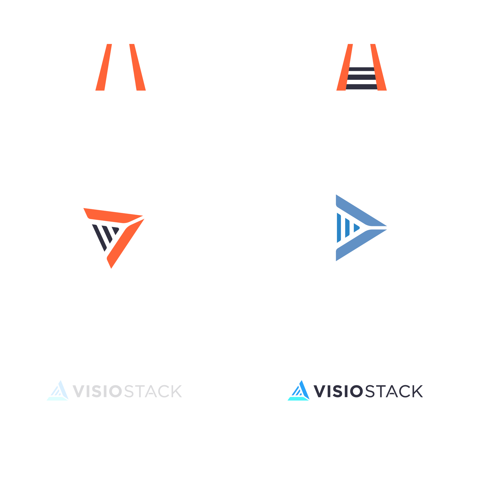
This concept is the furthest departure from the original logo. I wanted to create an abstract symbol that could have been birthed from Rail, but didn’t alienate new clients, products or direction. The bright colors in this concept reflect a fresh, modern feel. I customized the cross-bar in the “A” as well to relate back to the line shapes in the symbol. I thought the inner piece of the symbol could also reflect some key benefits and displayed this thought below. That multipurpose icon could also flip around to form an interesting pattern. The blue-gray color combined with the bright blue pop of color would look really nice online when reversed and shown below in the styling example.


