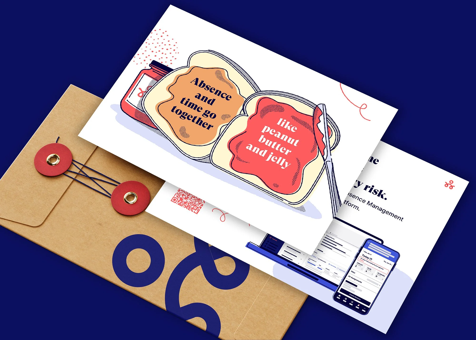
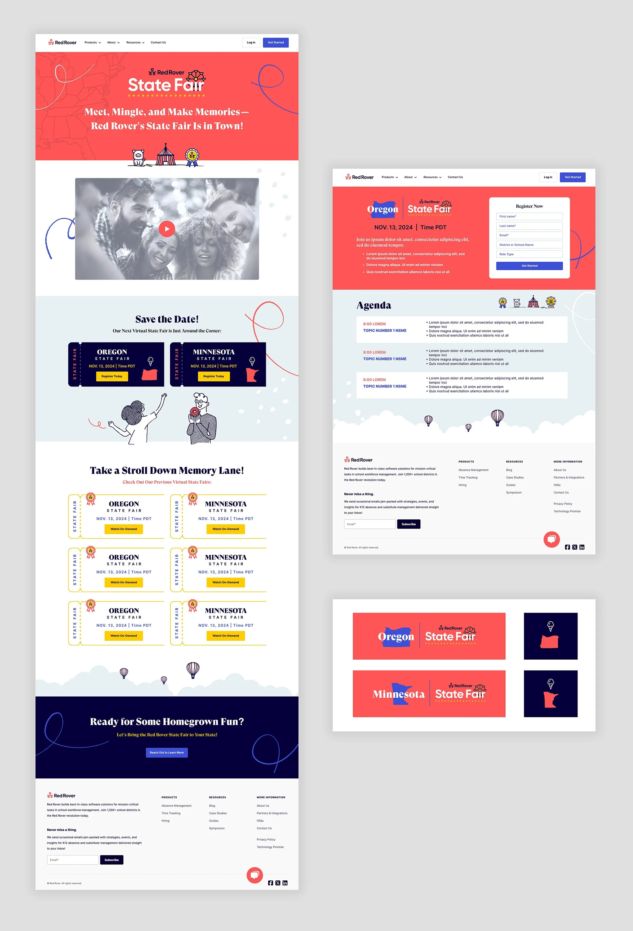
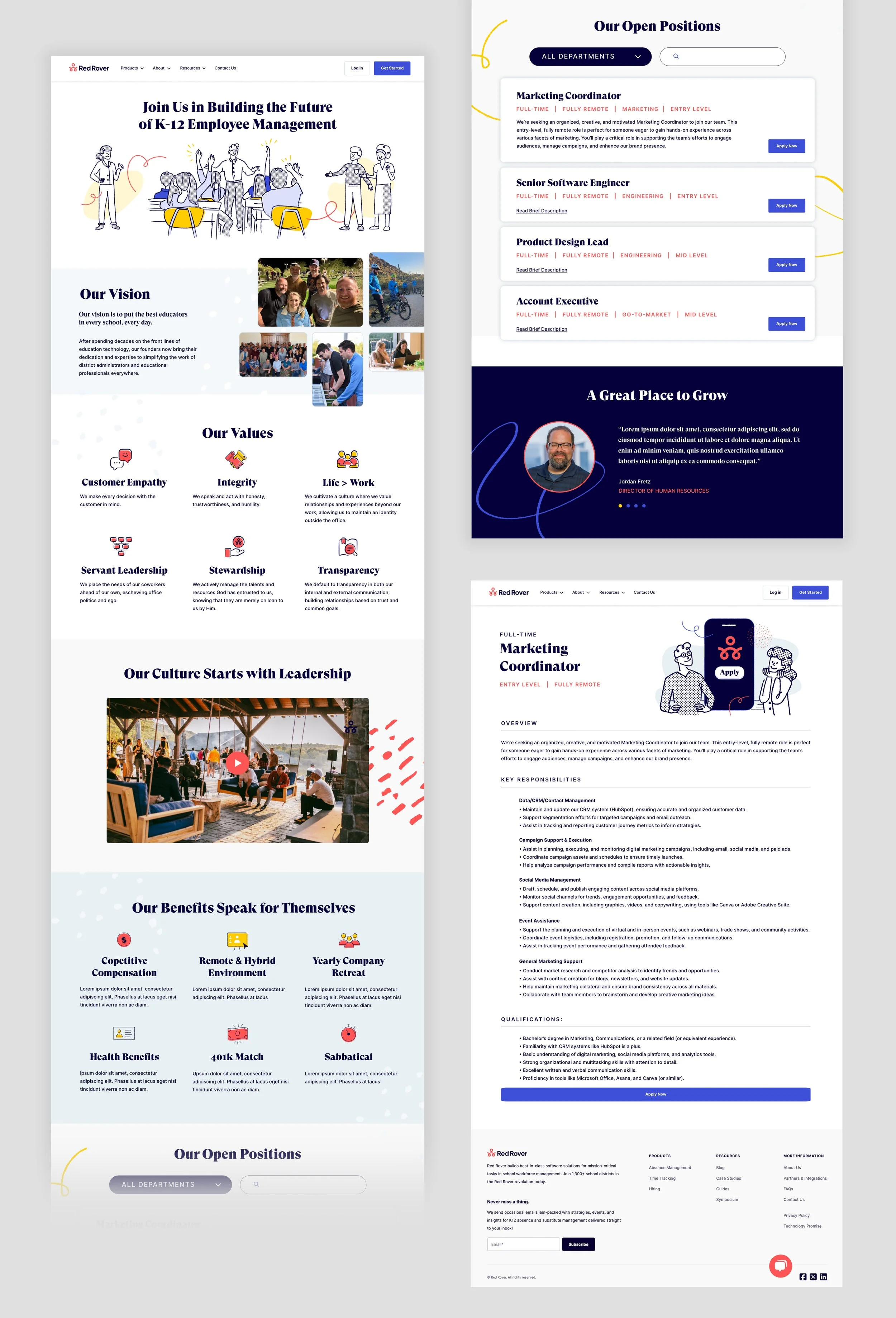
Red Rover makes absence management simple for K–12 school districts. Their suite of tools—including scheduling, professional development, and hiring—is thoughtfully built and highly effective. Their brand needed to reflect that same level of quality and professionalism, while still feeling engaging, approachable, and as fun as they are.
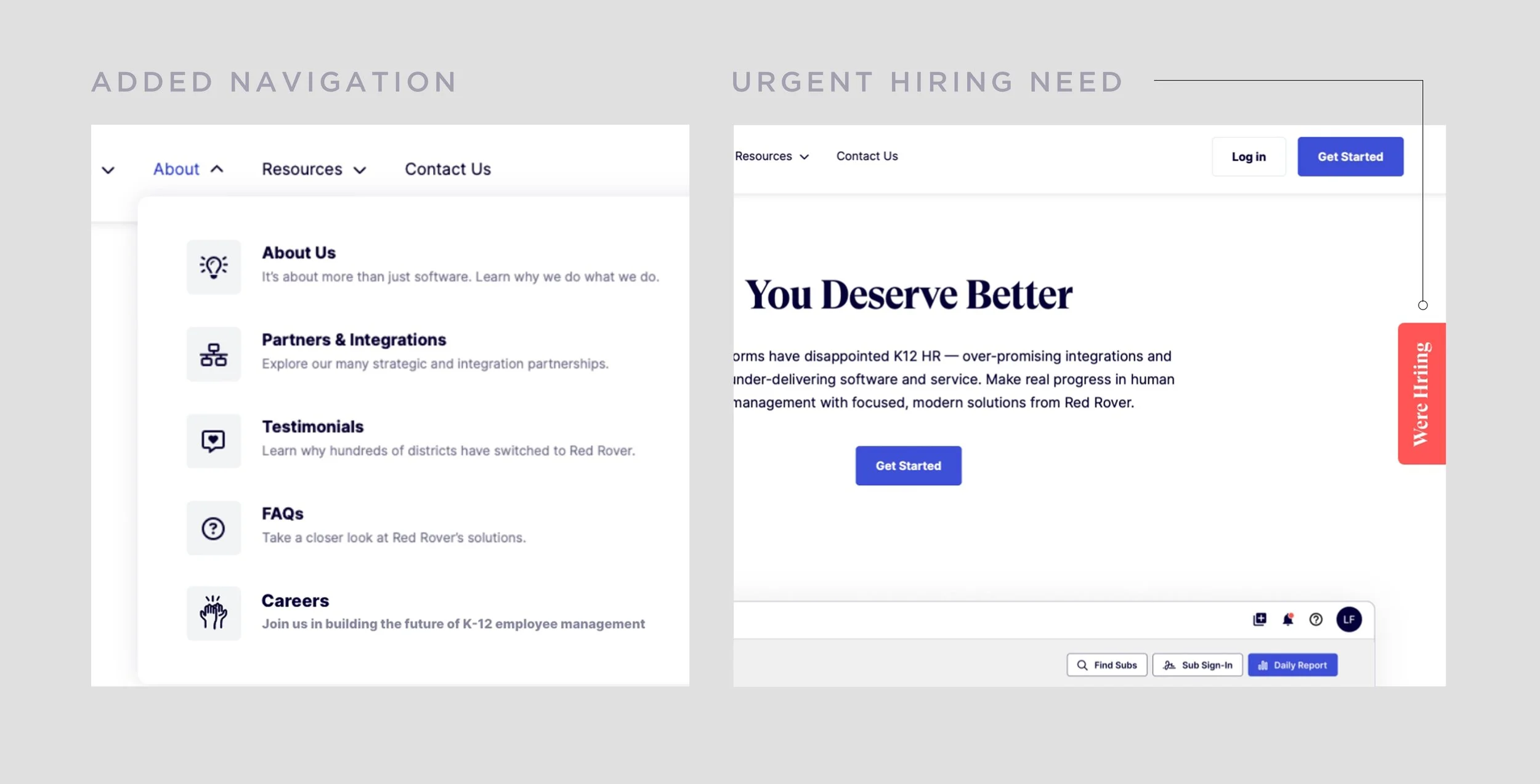
Expanding their brand across illustrations, characters, website layouts, product launches and visuals, trade show materials, and event and product logos has been an incredibly rewarding experience.
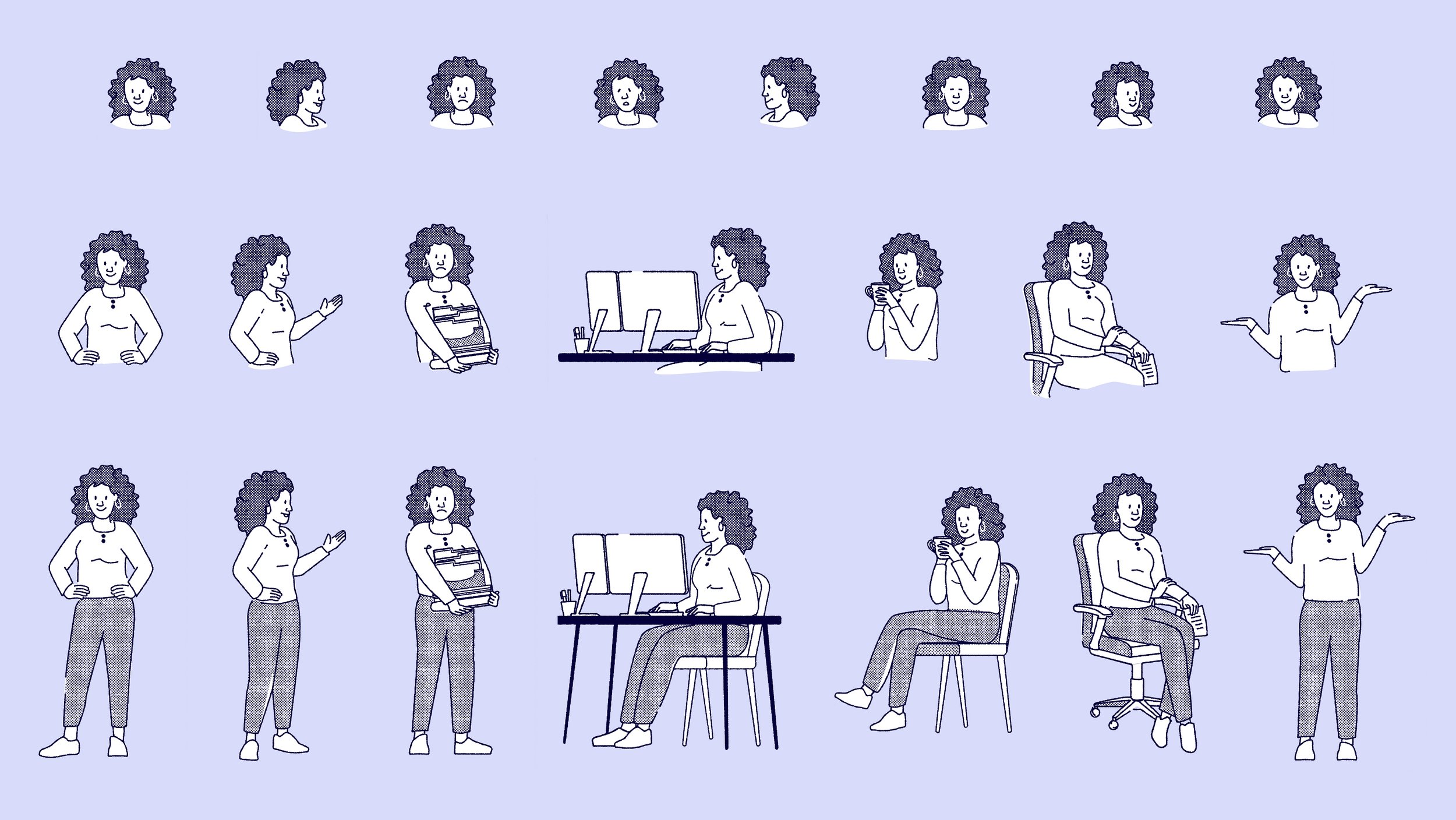
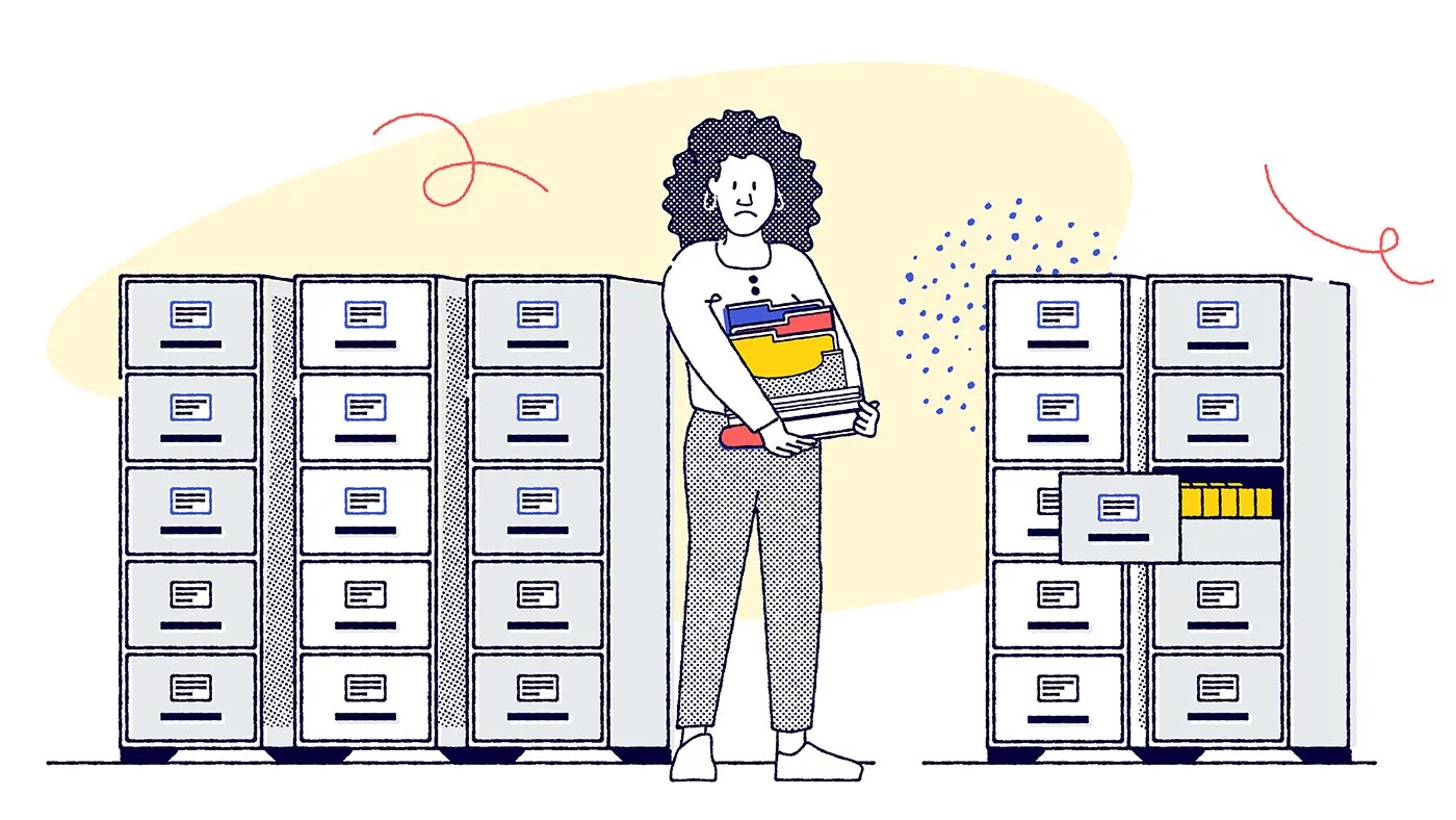
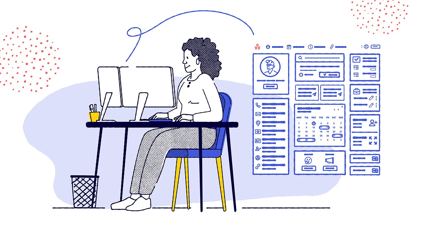
Working with a bold color palette and developing textured illustrations offered a refreshing change of pace, and highlights a different side of my skill set compared to more traditional, corporate-focused projects. Even their product visuals carry personality—we incorporated stylized screenshots and subtle .GIF animations to showcase key features in a more dynamic way. Having a diversified skillset in design really can be showcased with a client like this as it gives the opportunity to help with a variety of mediums and techniques which can be really fun to bring to life.
The team at Red Rover is passionate about what they’re building, and that energy has been contagious. As the product continues to gain traction and awareness, it’s been exciting to help shape how that story is told visually with their team. Starting with a strong product always makes the process more meaningful—then it becomes about translating that value into a compelling and engaging brand experience. See a bunch of work at their site here.