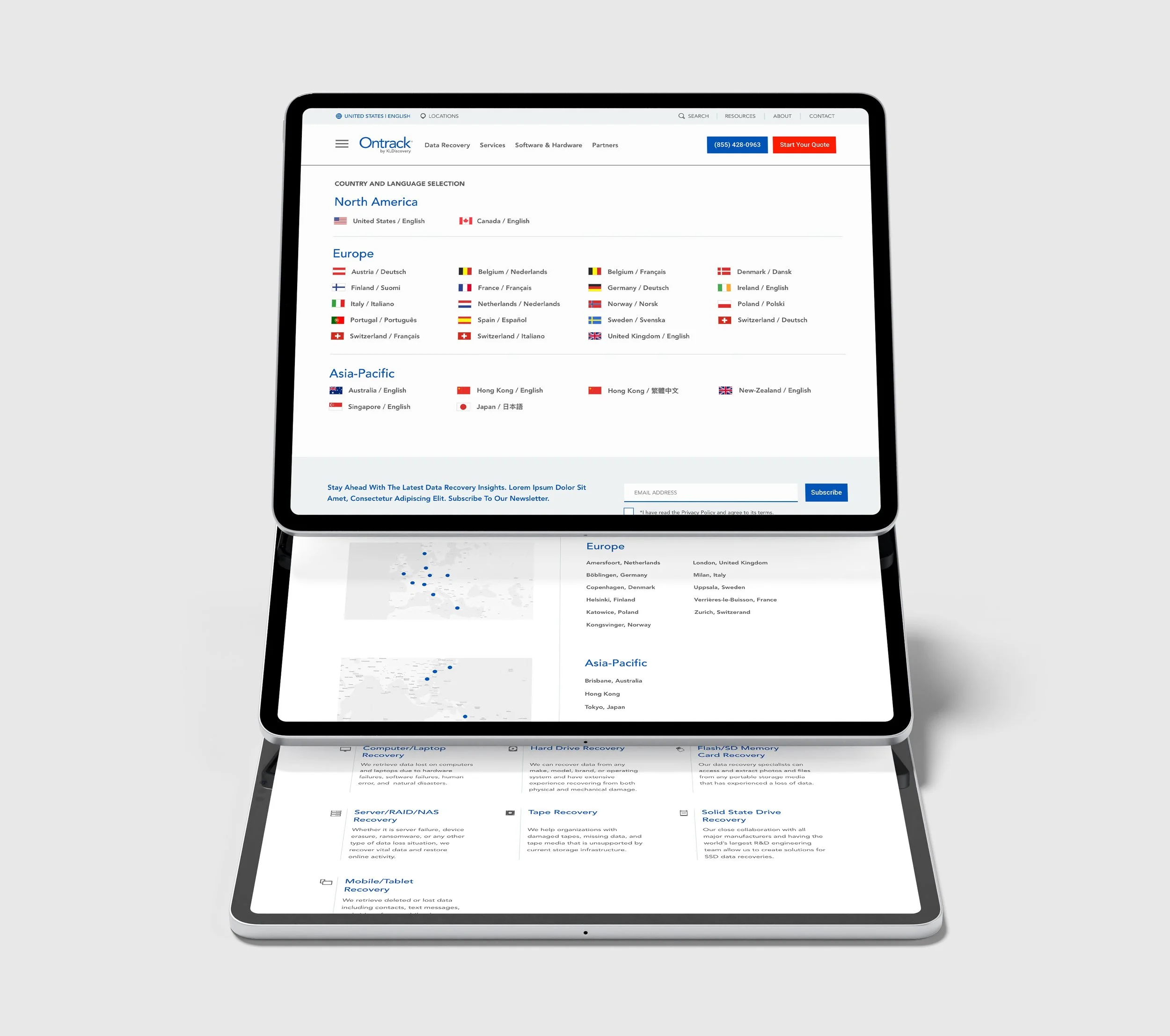
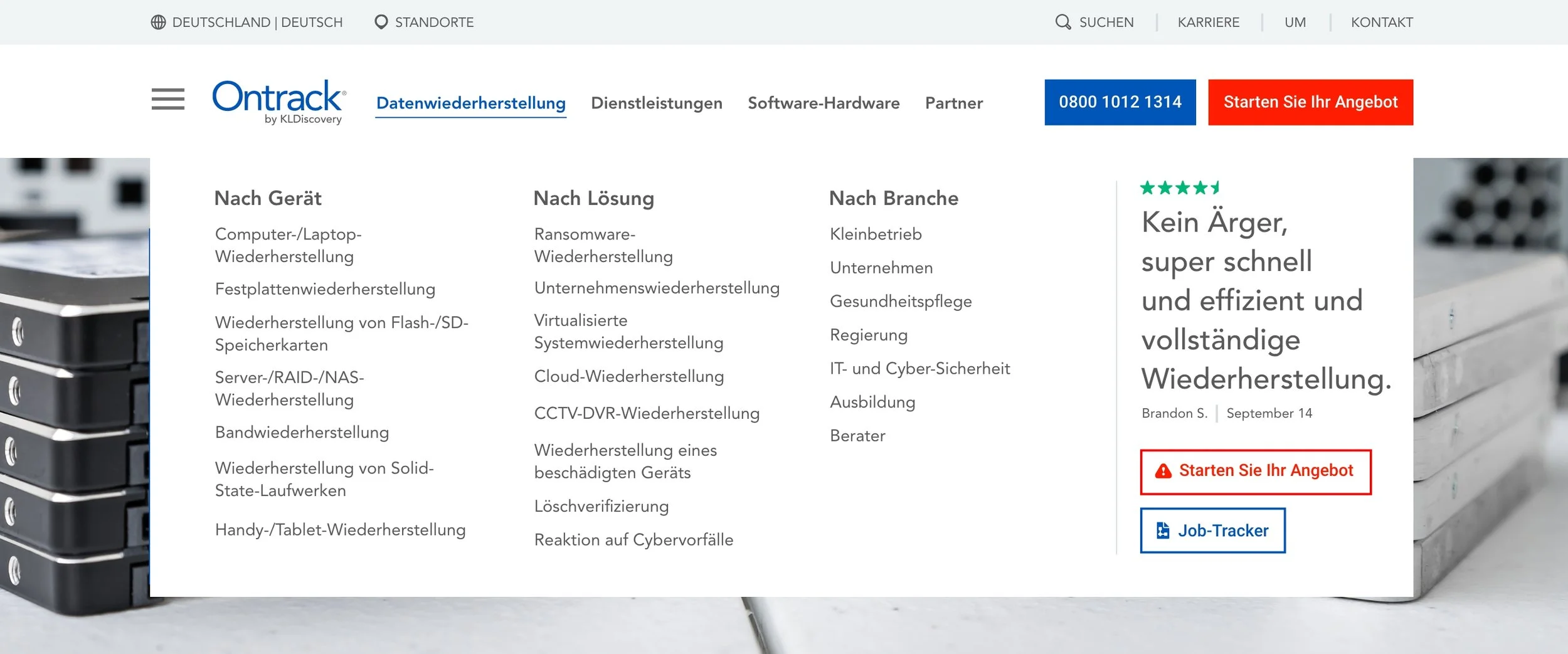
Designing a large corporate site for the english language alone could be a big project. Designing a large corporate site while keeping 22 languages in mind, not to mention thousands of pages, complex forms and all the localization, truly wild. The navigation alone for English vs. German took a bit to align well.
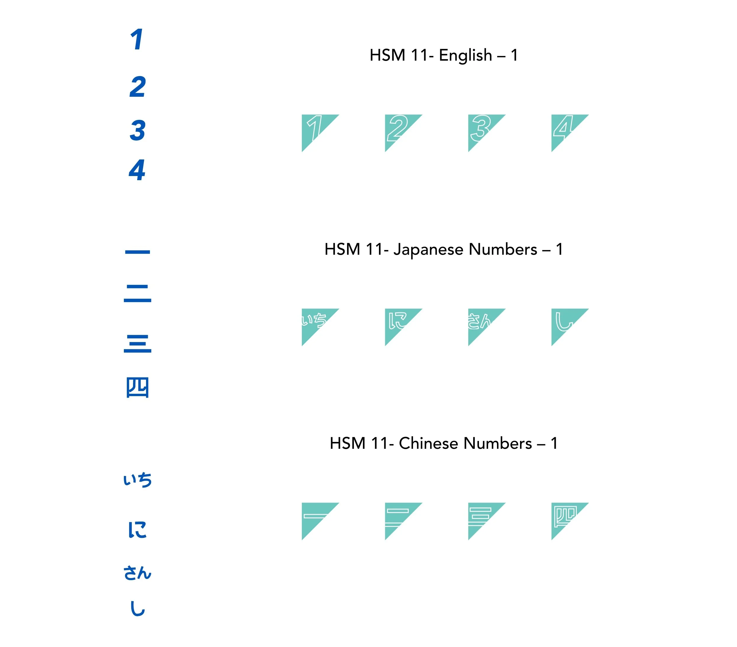
I learned a lot working on this project: designing a successful system, how to manage the timeline, organization, etc. were things I’ve done before, but with so many languages to keep in mind for consistency/aesthetics, I’m really happy with the final result. Some of the visuals are what they are as they were reusing some from prior sites, but for the icons and design elements like numbers, etc. everything needed to be thought through from a global perspective.
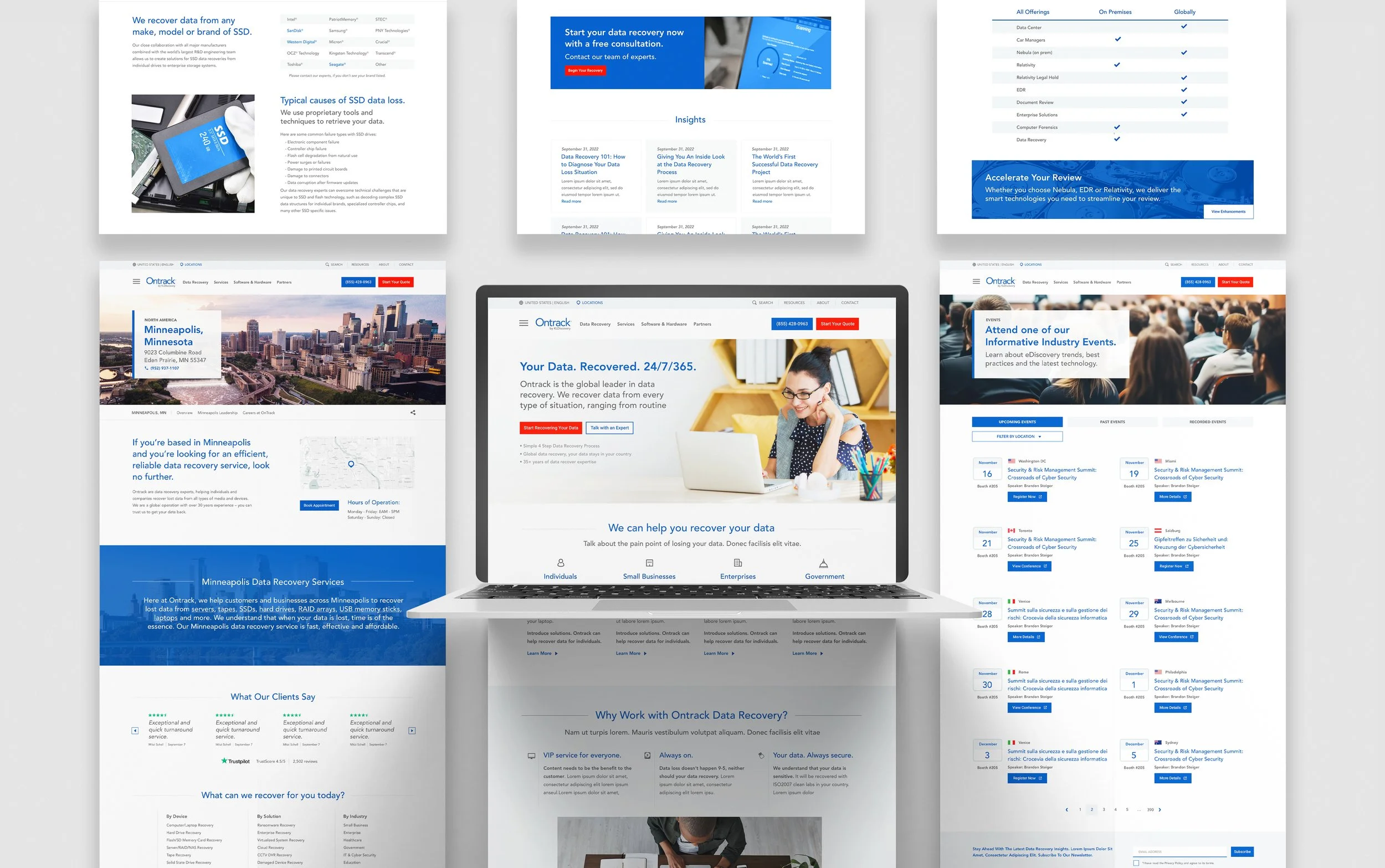
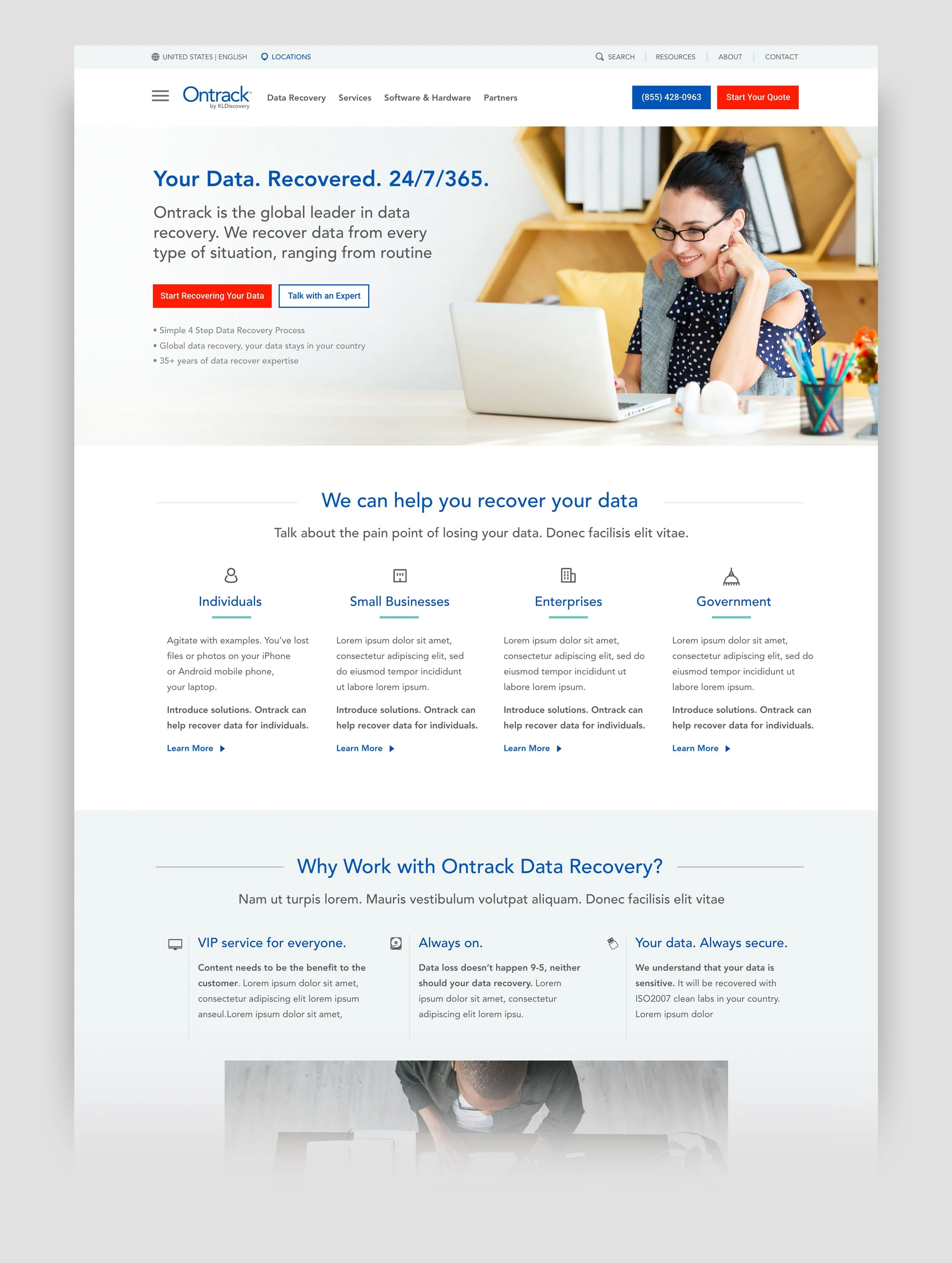
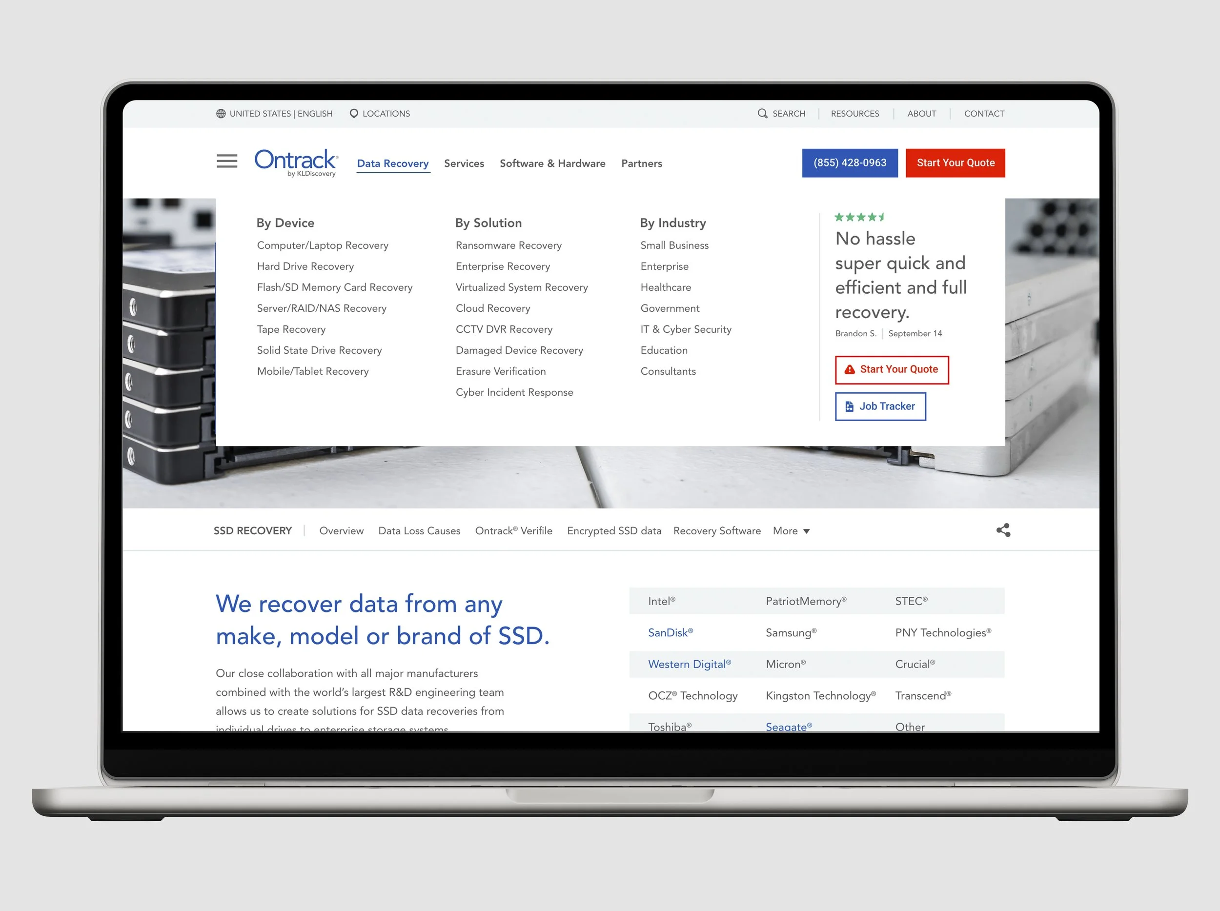
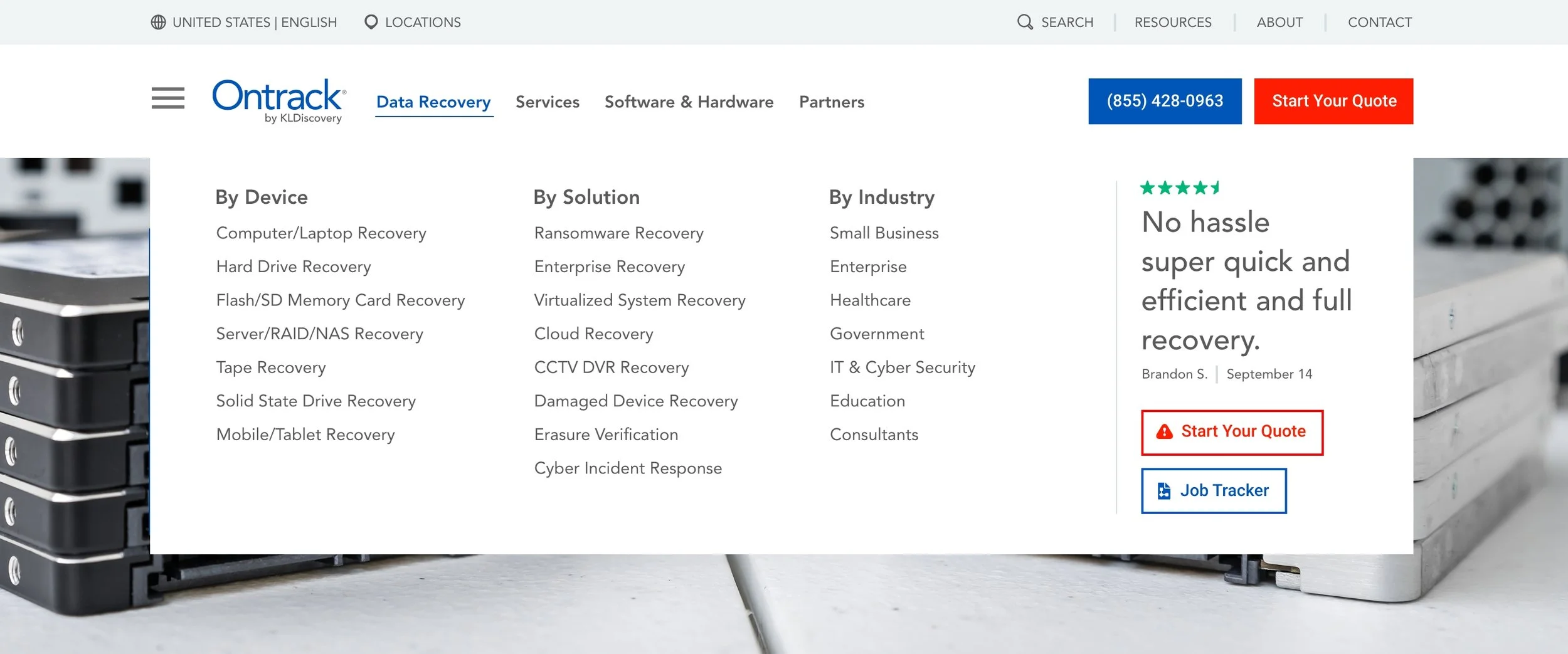
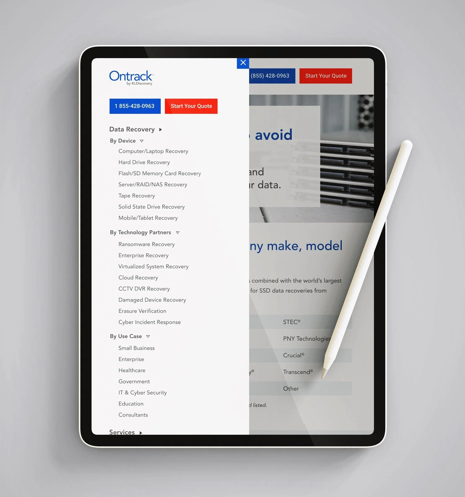
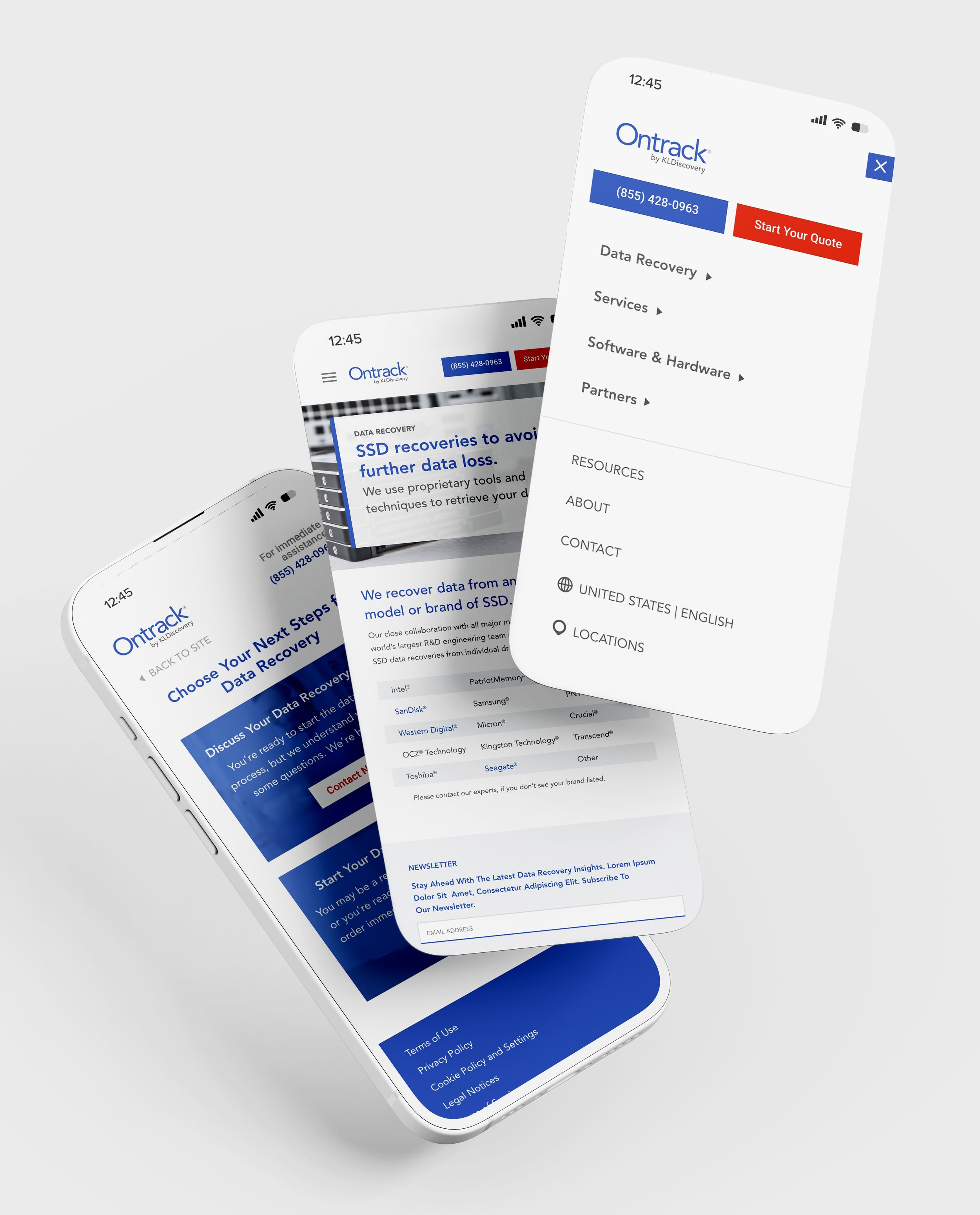
For starters, the navigation was going to be a megamenu with brief testimonial, calls to actions, etc. all incorporated. That had to be thought though in English and also how the appearance would be impacted when some languages have 30% more text displayed. Then we had a side naviation menu that could be used with accordions for tertiary pages. Lastly, at the page level we had a anchor menu with section titles for easy navigation on long scrolling pages.
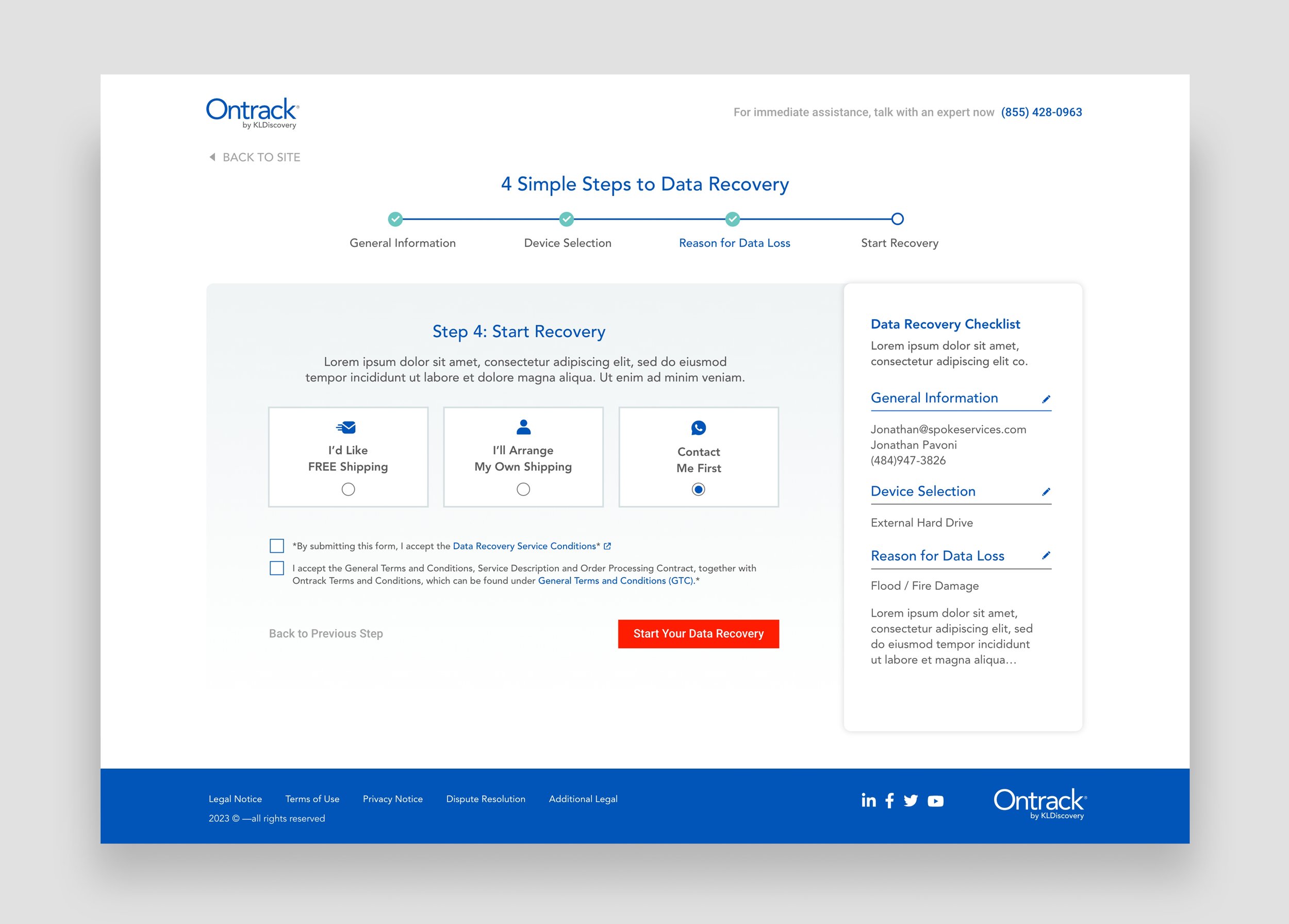
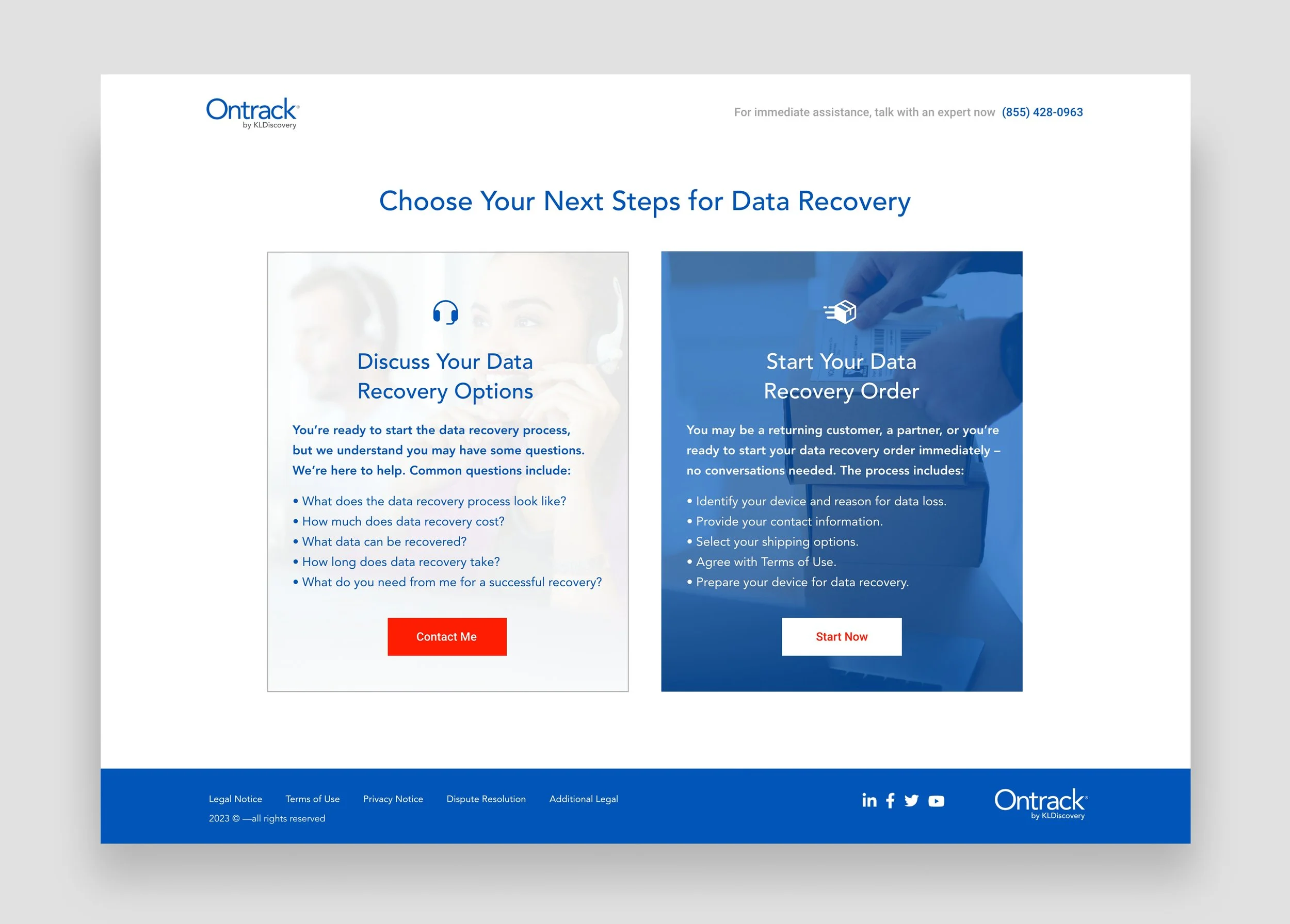
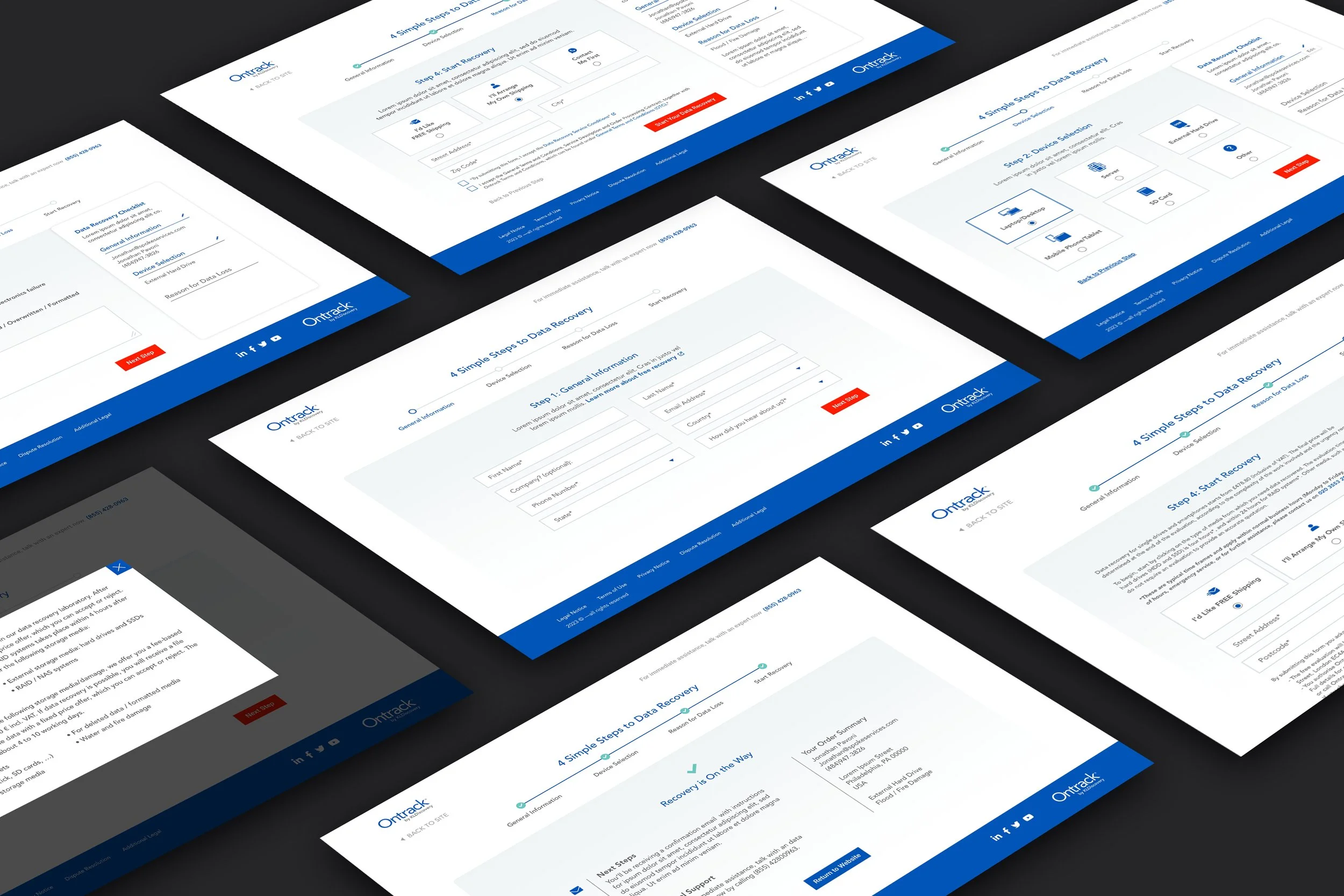
One highlight in the site from a user experience perspective was a sophisticated progressive form we had to think through. We used a service to follow current form users and were able to see where users dropped off or didn’t finish sections and rethink how we keep them engaged in the quote process. We gave the form clear steps and live summaries while also serving up different shipping information and requests based on location for global use. Between data capture at different steps and all that goes into progressive forms, it was exciting to rethink based on a user’s interactions with past forms and content.
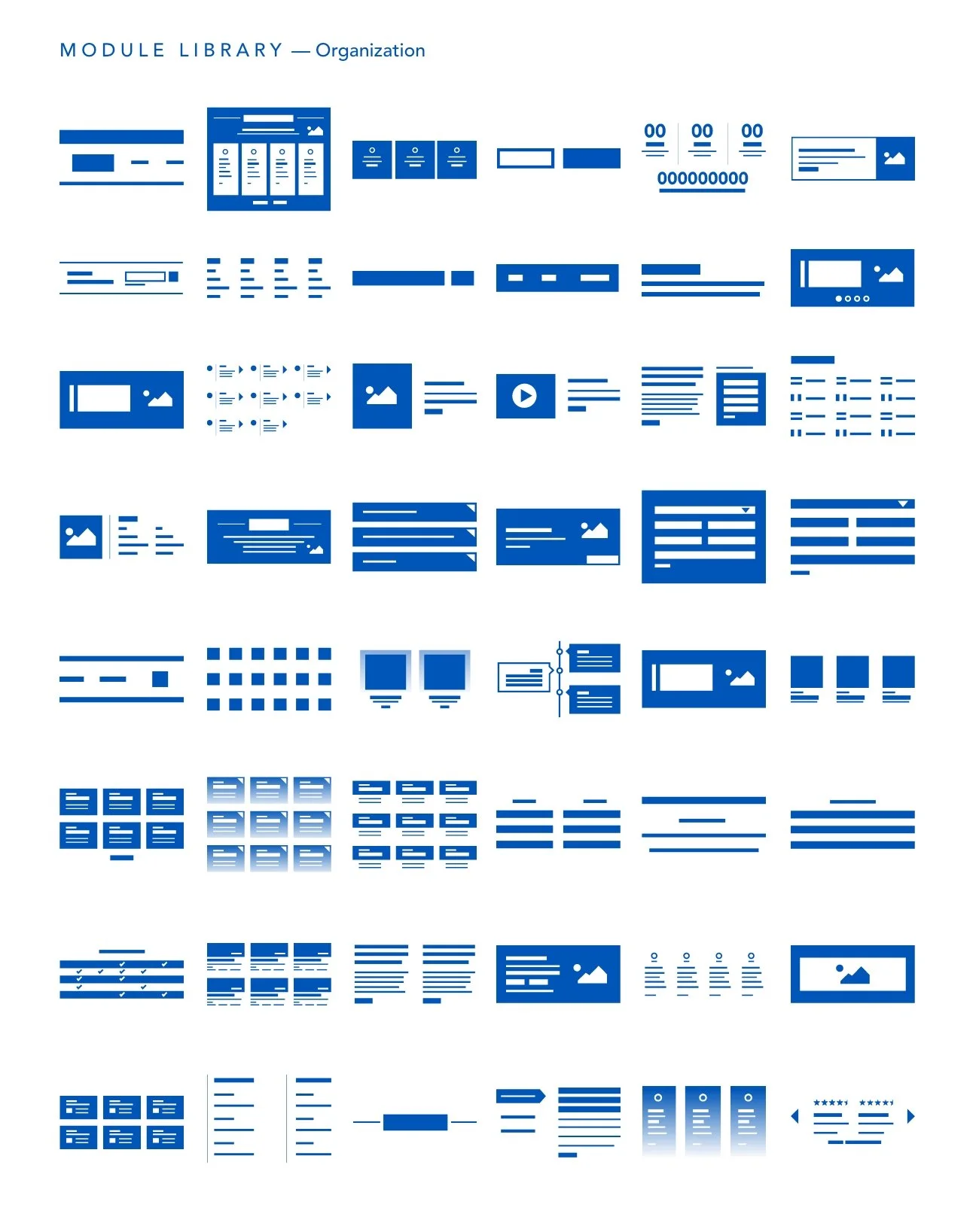
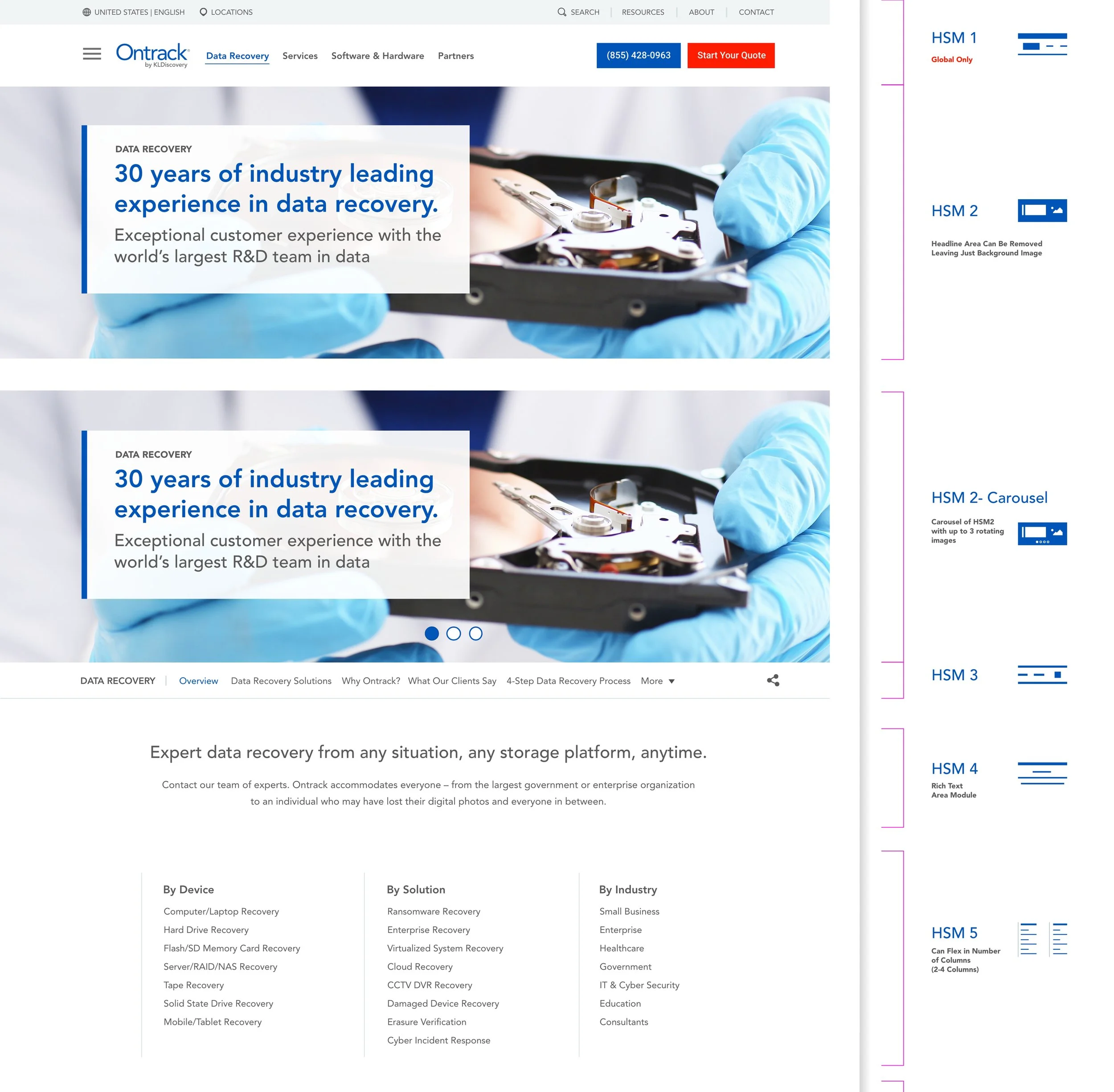
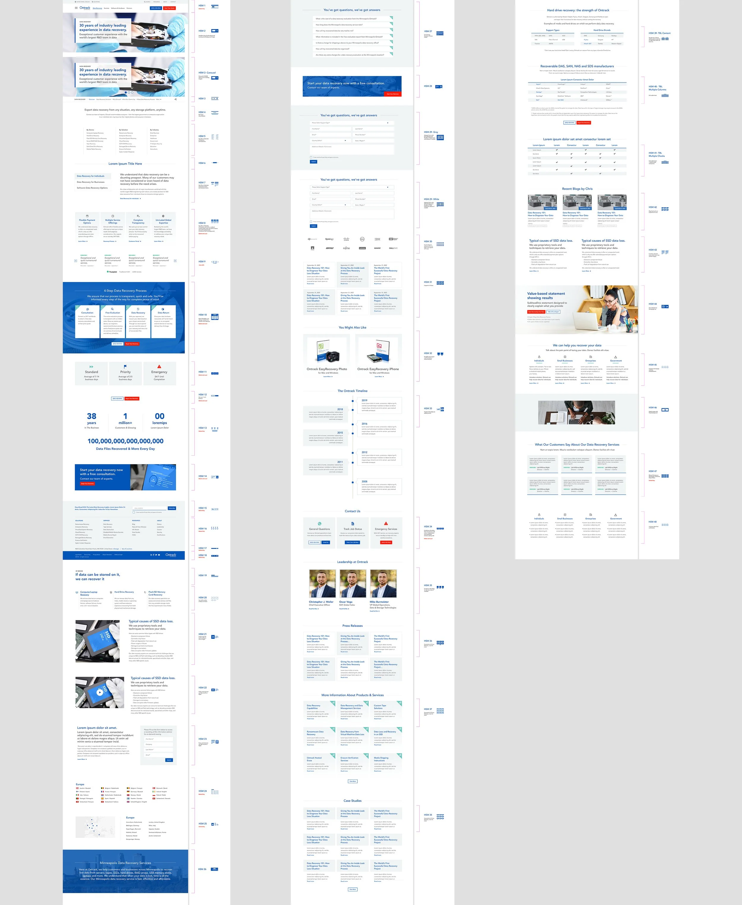
Maintaining consistency and creating a full module library was an important part of the project as you can imagine. We had some modules globally adaptive across the site while others were local to their specific page use or individualized module variation. I also created an icon visual set representing each module created in the library just for quick identification when inserting into pages. We had a set of templates also created for easy use and adaptation for saving time when future additions are made. Visuals still need to be updated as many of them are very obvious stock, outdated, etc. but that may be a future undertaking. We were focused in this project on structure and overall aesthetic as well as ensuring a user in China had a similar experience and relevant information for that area to a user in the Italy. Pretty dope.
All in all, a large project made much simpler via structure, organization and the use of HubDB tables and HubSpot functionality (not to mention the robust design system put in place). See the site here (and don’t just look at english/USA :)