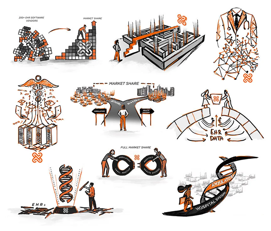
Yesss, a rebrand!!!! This client was a tech company providing data-driven products for the healthcare industry. Enough buzzwords for you? Basically they make software I can’t understand but streamlines the complex side of healthcare (in a bunch of areas I don’t understand).
Their original logo looked like it was crowdsourced and was pretty lacking in terms of the innovative company they’ve proving to be. The concept of simple interlocking elements based around healthcare and speed drove my design for their new logo. I also was hoping to give a modern, clean type design that felt more custom than something typed in Powerpoint.
This interlocking idea could make an interesting, modern mark and still convey the connectivity their products and partnerships create. Since healthcare is at the core of the product focus, the animation shows off the heartbeat movement in it’s reveal and that “heartbeat” verbiage became a theme of content both internally and externally. In branding, like everything with a team involved, it really helps to get everyone aligned and focused on the vision. I was excited to play a small part in helping give a visual direction to their future, give the board/ employees a look they’re proud of and fuel their vision going forward.
All in all, this was a really fun rebrand and I hope to finish off the customized letterforms for a full alphabet, add some custom illustration hero graphics and additional branding pieces in the future. This project was art directed while working with BS+co.