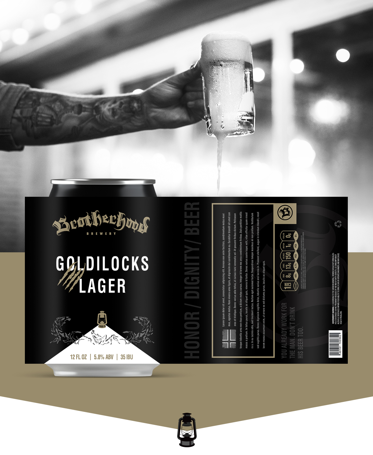
Creating a look for an upstart is always a lot of fun, especially when the deadline isn't around the corner. I had a great time sketching out the look for Brotherhood Brewery. The direction for this brewery could have gone a dozen different directions, but we focused on the Brotherhood name. The headline on the typography "Best enjoyed the way it was brewed, with friends" became the direction. We couldn't have a snooty, superior high end look when the brewery is everyday guys who started the brewing to get time together. The hand-drawn typography was fun to create and gave the impression they were looking for.
There is more in the works on this project and a lot of emails going to and from Norway.