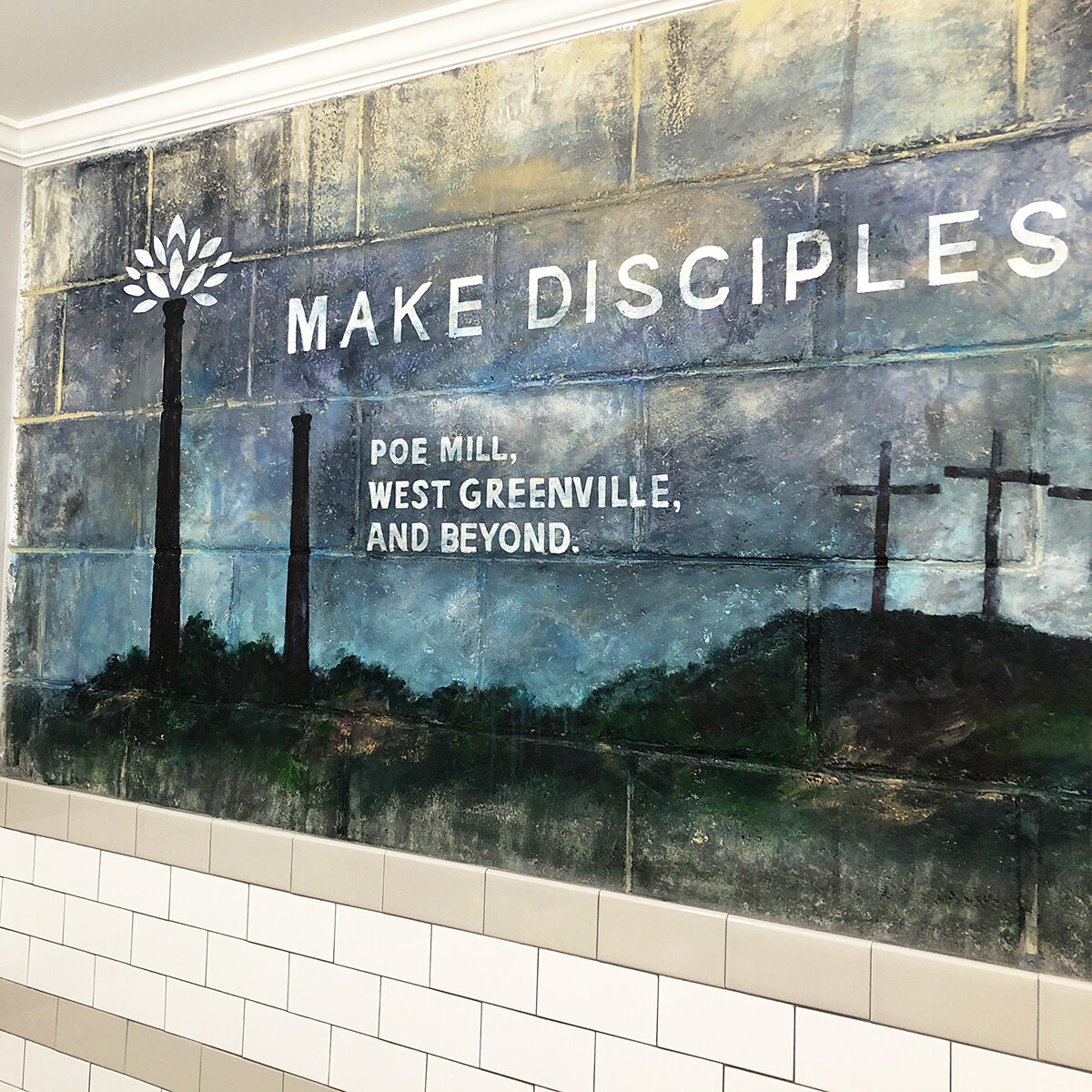
Poe Mill once was a booming area from 1897 to 1977; it’s milll was producing cotton fabric and thriving. The building burned in 2003 leaving only 2 smoke stacks as reminders of the past. Griggs Church has been serving the area since 1936. As the neighborhood declined over time, the church also dwindled down. In 2015, pastor Mitch Miller was called to the church with only a handful of adults and kids still in attendance. A revitalization effort began at this time, and recently Griggs has seen nearly 90 for a Sunday morning service. While the church is more than 80-years-old, we’ve had a large percentage of young people come in and breath new life into the church while reaching the neighborhood. A pretty cool story to lead a rebrand!!
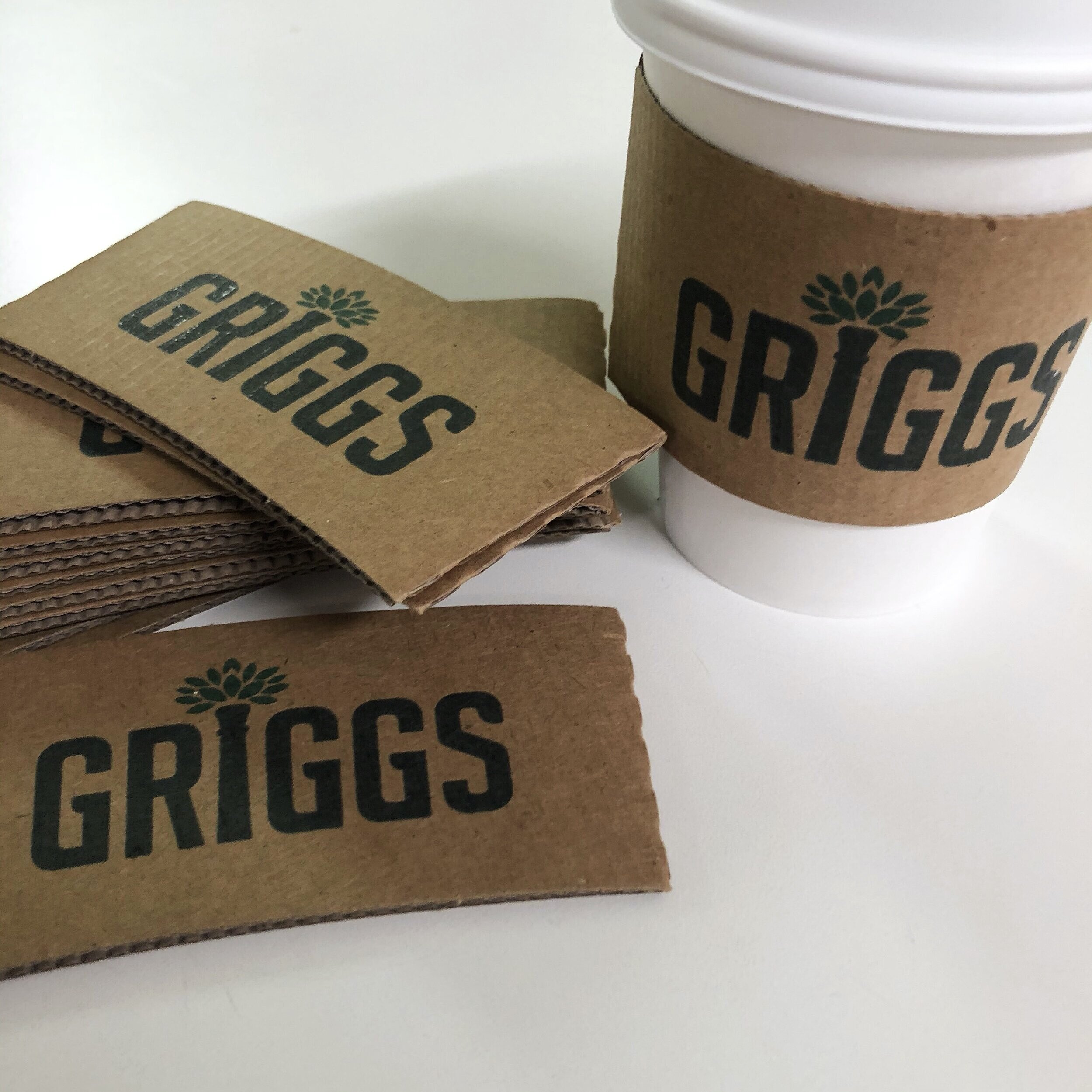
If you look closely, you can see a small weed/plant growing out of one of those old smoke stacks. This sparked the idea of a flourishing, growing plant reflective of Griggs new growth and the goal of revitalizing the neighborhood. There a tons of great, large churches in Greenville, but it’s been a rewarding experience to see a small church rebuilding and assisting a community who needs it. Anyway, it was fun to work on the rebrand, see the logo coming to life on materials, shirts at events etc. If you happen to be in Greenville, visit the church on Pointsett Highway, everyone would love to meet you.
E-BLASTS SUCK
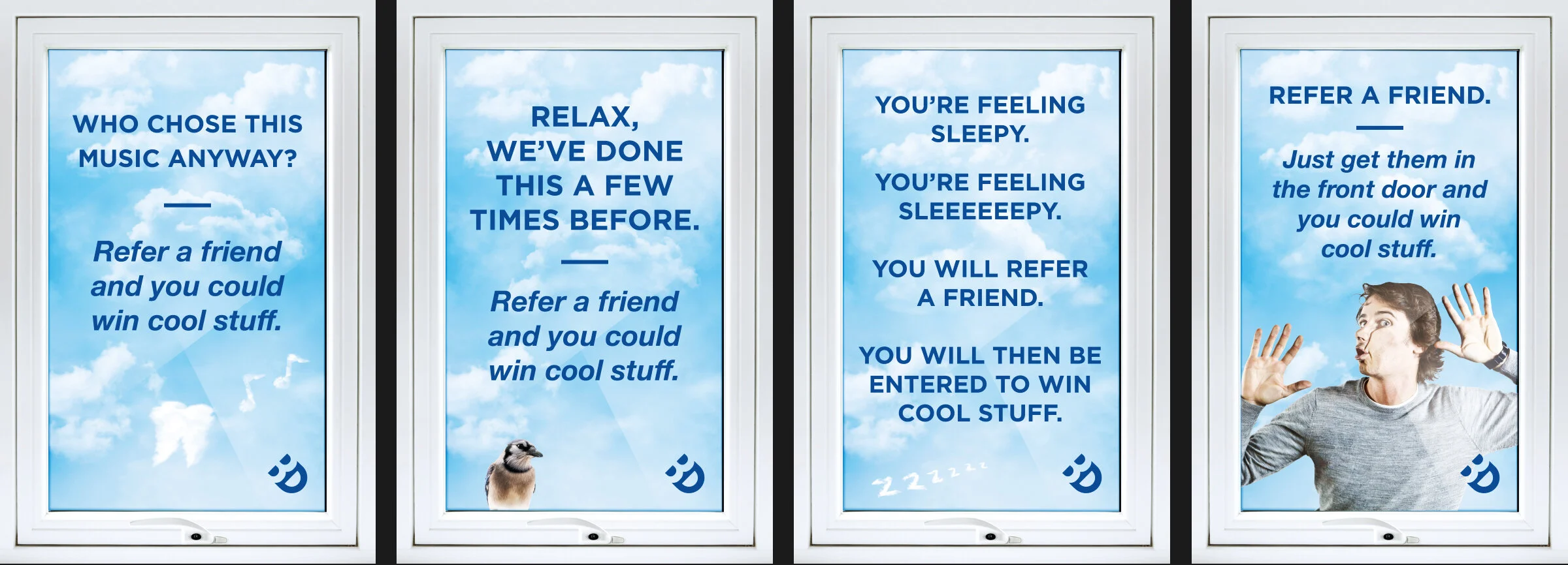
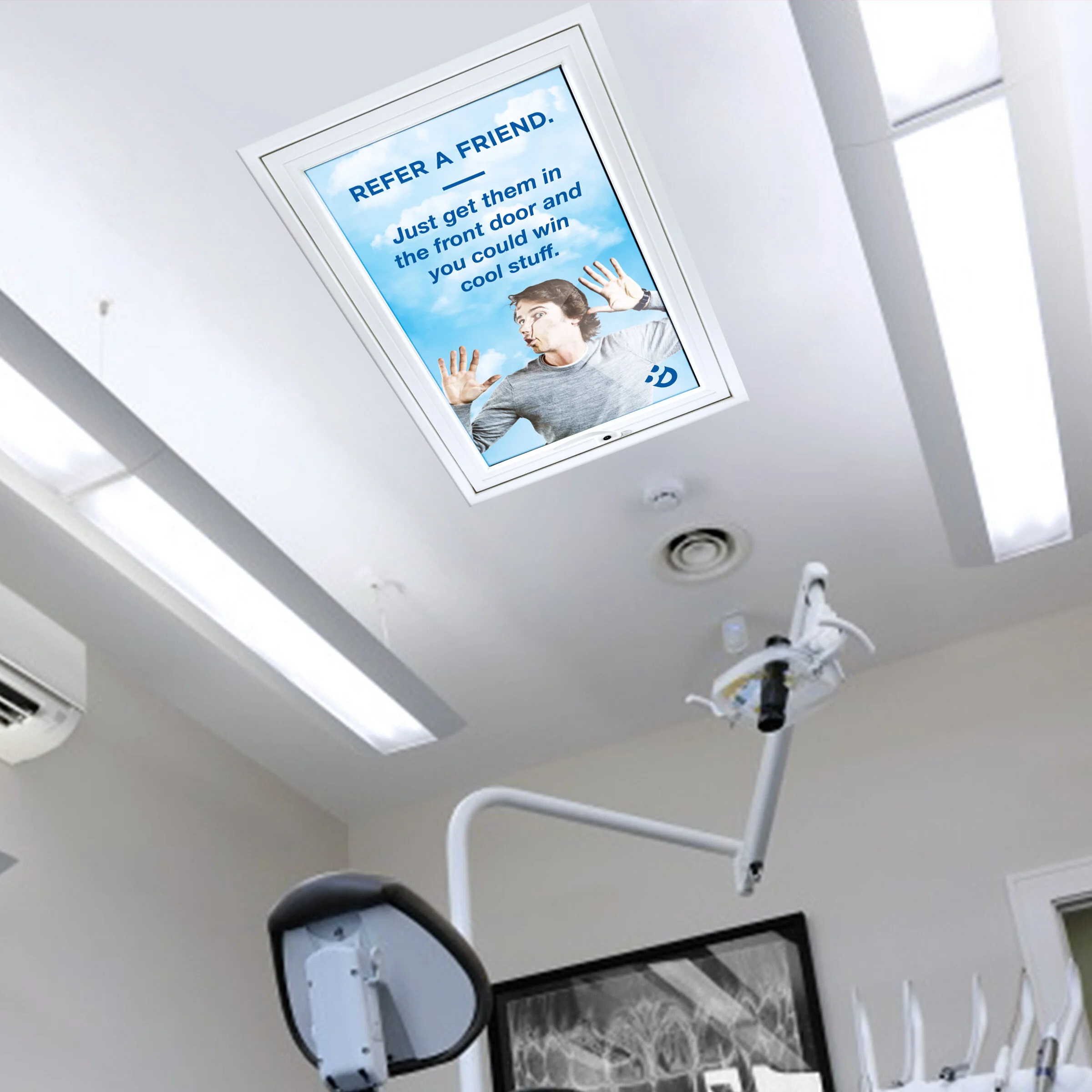
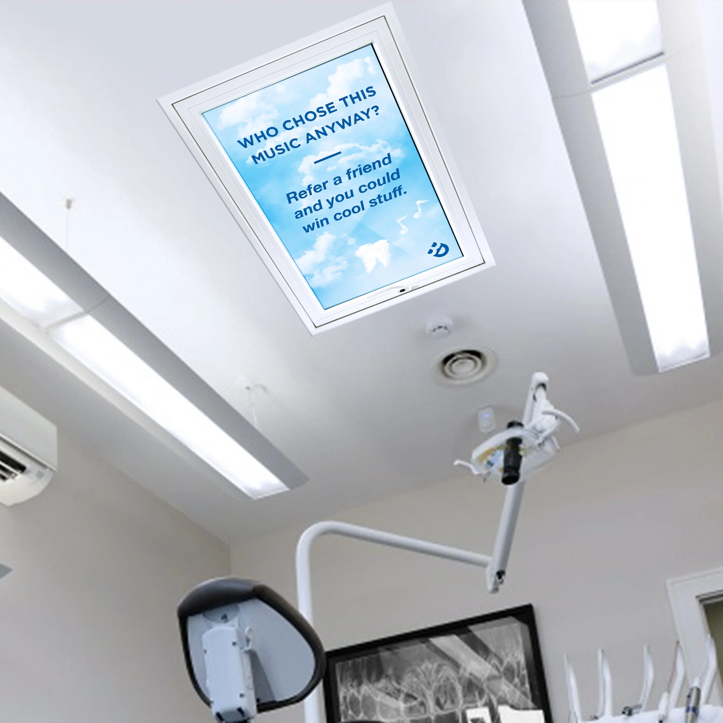
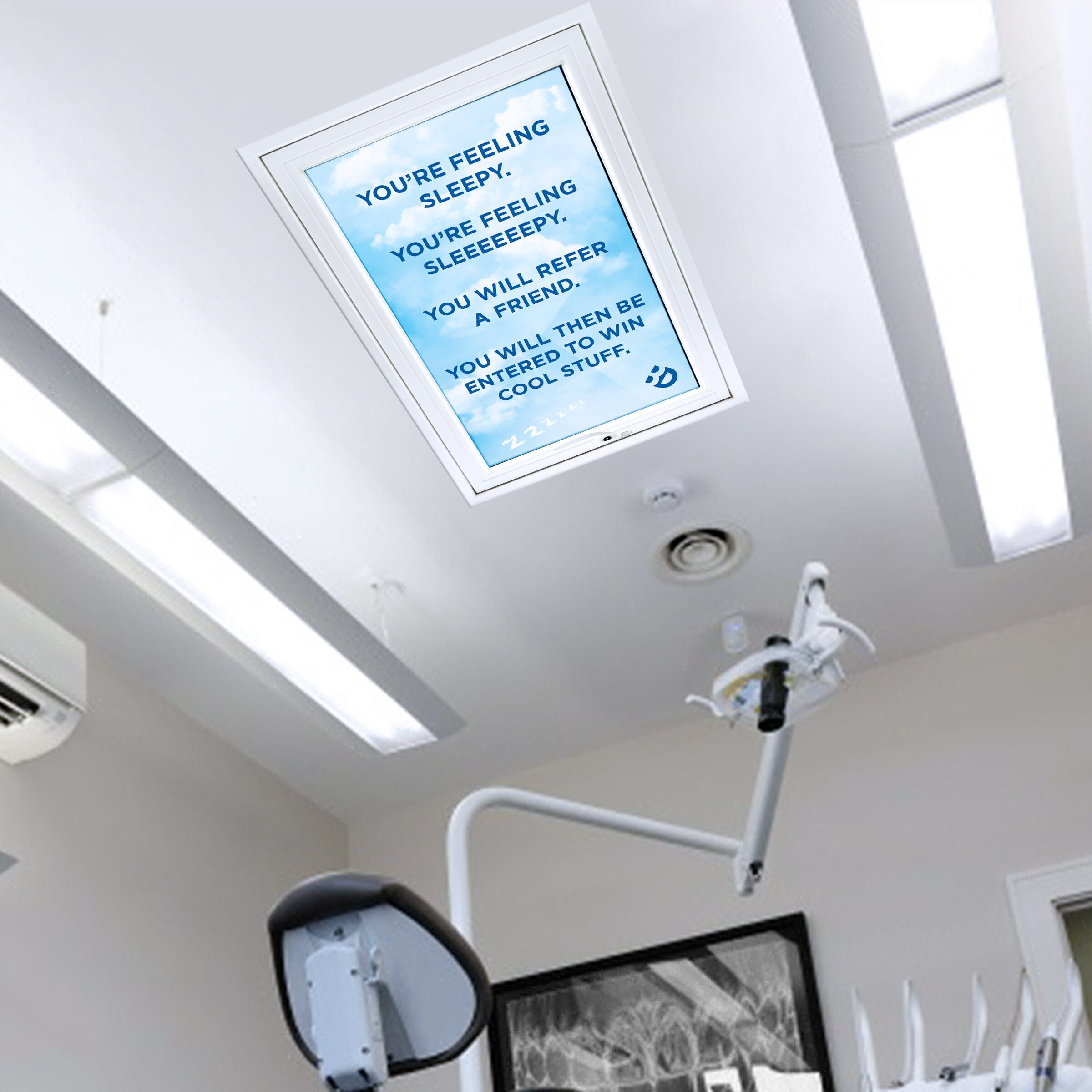
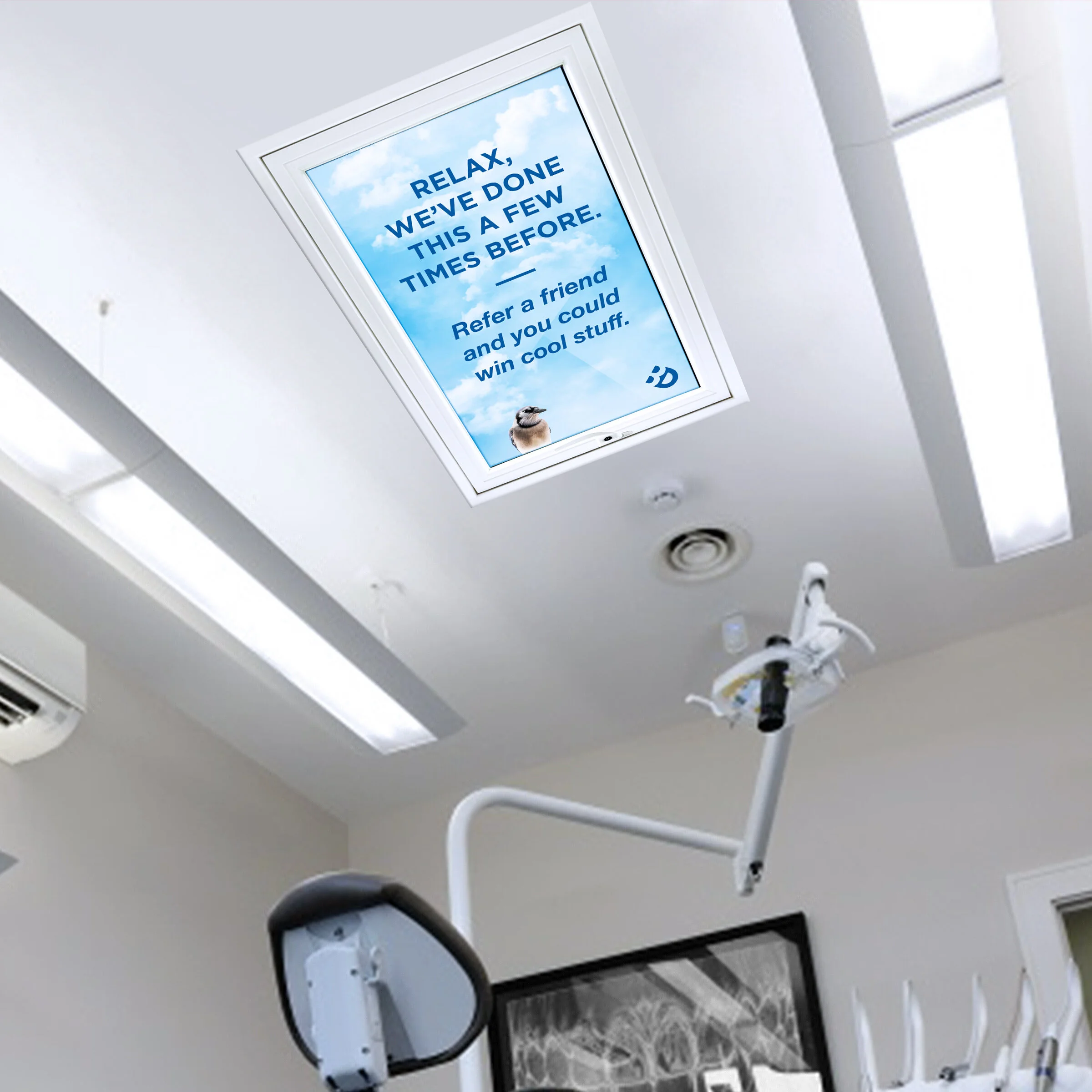
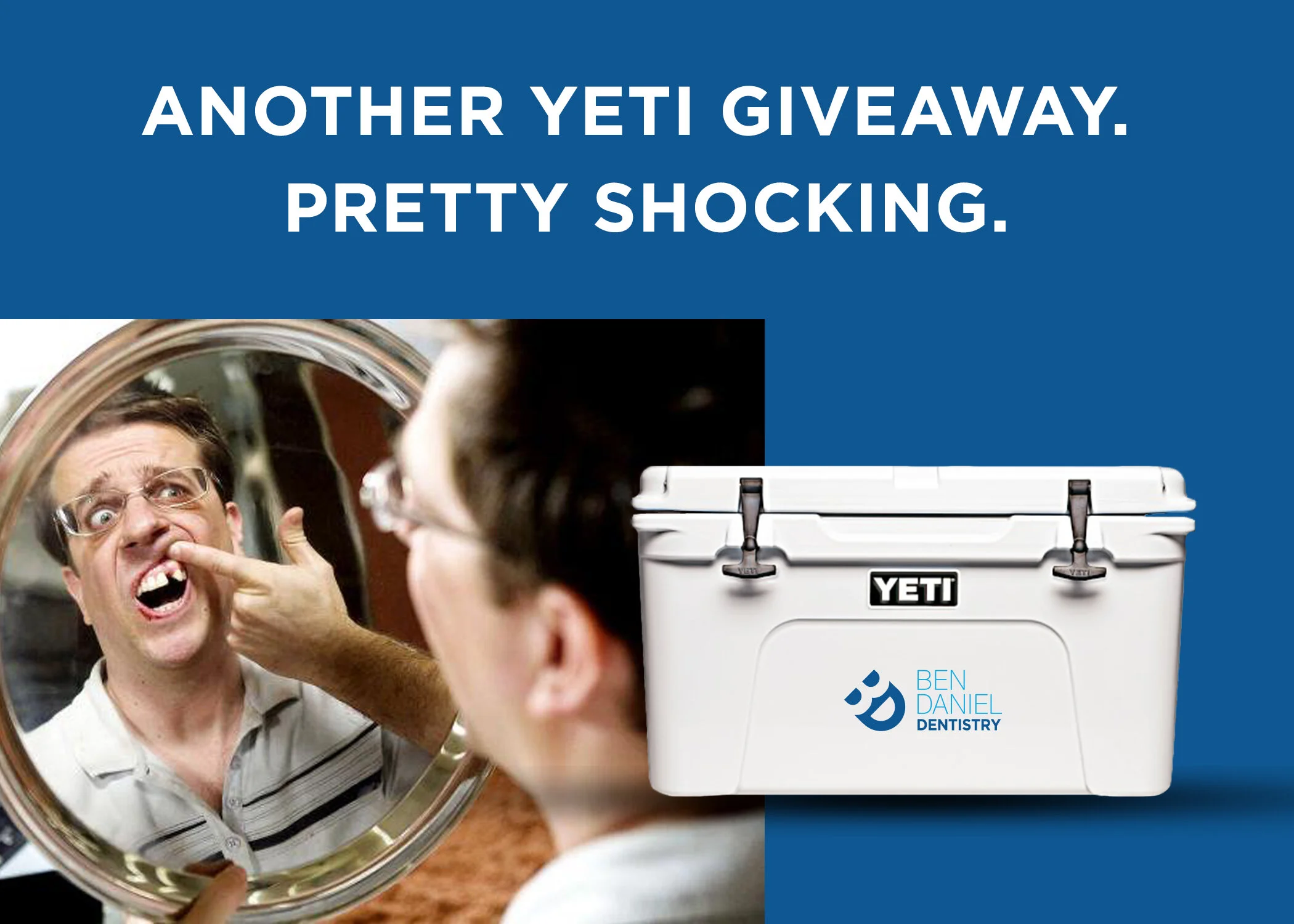
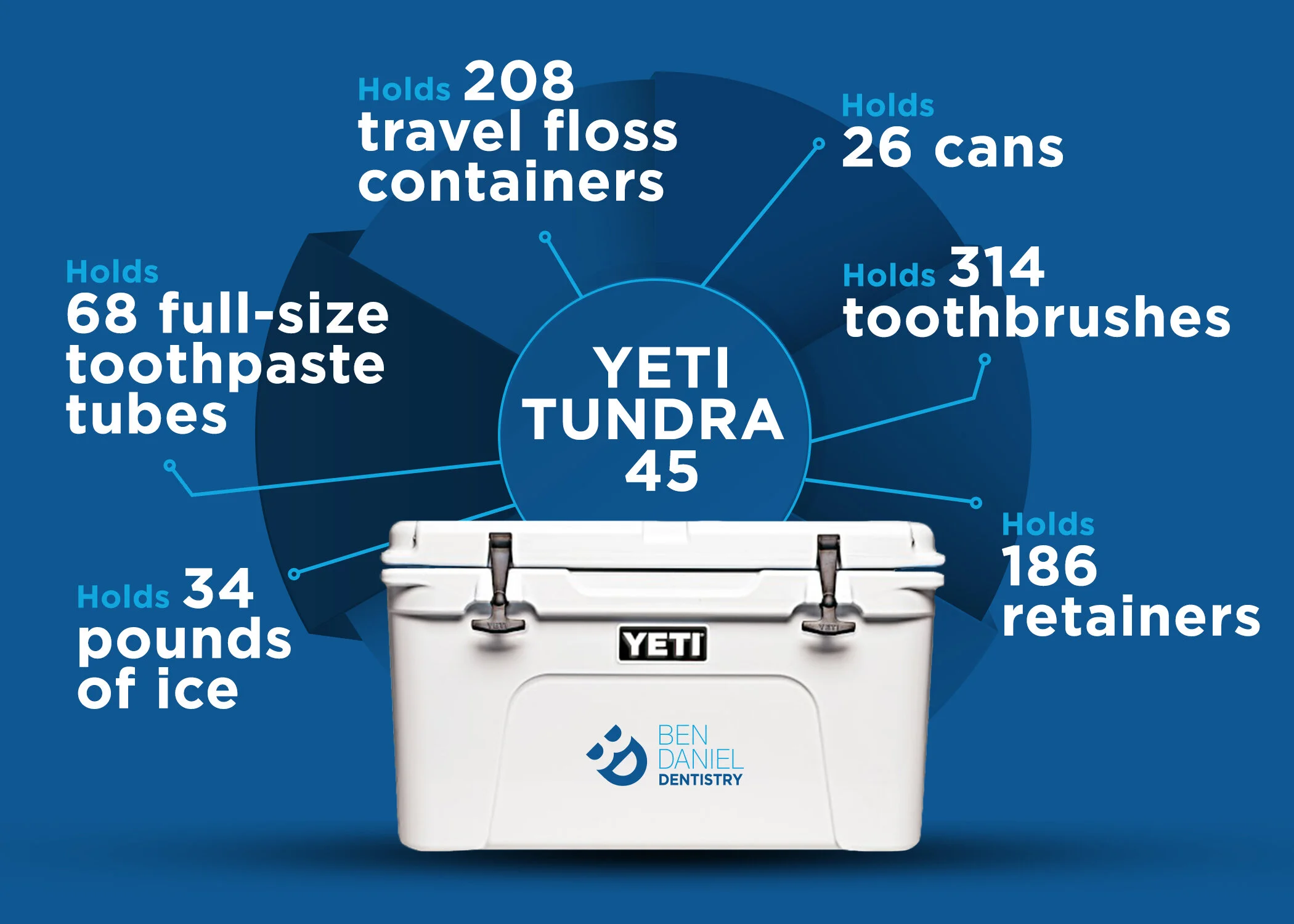
Concepts done for a local dentist I am working with. To get the word out on some referral offerings you could send an e-blast that most likely will hit the trash bin or you can do some interesting things around the office to see at the next cleaning they have. When you sit back in the chair and get asked questions you can’t answer because your mouth is wide open, now you can look up and see a funny message. You also will be walking past a Yeti cooler giveaway when you walk in and will be seeing some fun social posts/direct mail. These ceiling clings are quick low-res mockups to sell the idea and final produced items will be going up shortly.
WAIT, I DID THOSE A WHILE BACK??
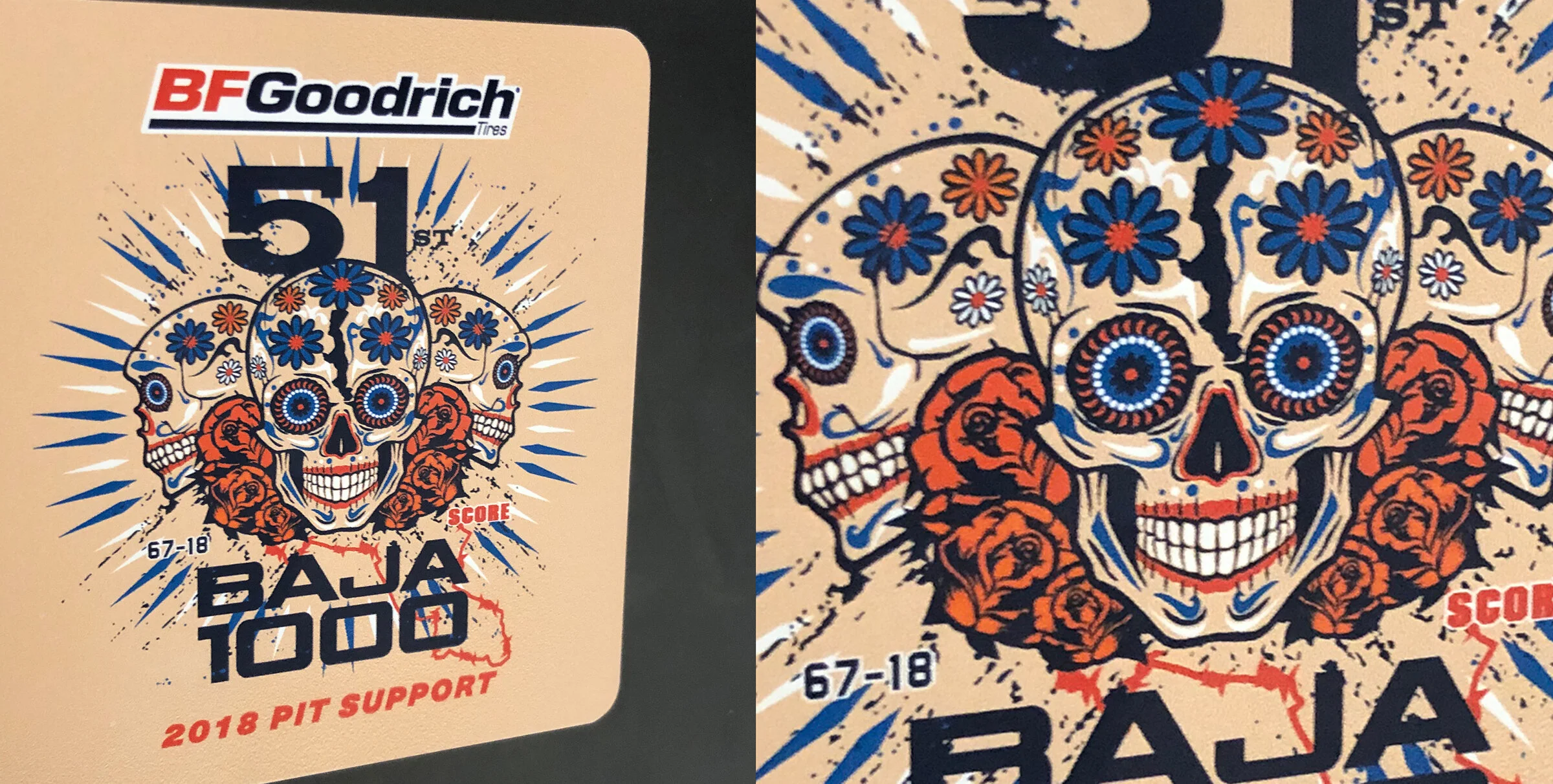
I’ve done the most random projects for BFG in the past and I’ve loved it. Everything from squirrel suites to trophy truck wraps to ice luges to 40’ signs to name it. Custom illustrated wraps for water bottles? Yep, those too. Anyway, I saw some stickers on laptops around the office and said “I forgot those got produced, can I get a pic?” I feel like that happens all the time as I’m buried in projects and forget to follow up and see the final items produced. Anyway, some sugar skulls with the baja peninsula on down the forward felt right for pit support items used in Baja by the Jackson Motorsports and BFG teams.
HOW MUCH DID YOU REALLY CONTRIBUTE ON THIS?
Award winning work brings notoriety to both the individuals that worked on the projects and both the agencies they work for. It’s the shiny object on the shelf that makes clients think you know what you’re doing. If you have both big name clients and big awards, you’re a big deal. All too many times though, I’ve met creatives who’s books look good, they have some awards and then I come to find out they barely were a part in the projects that won. Or maybe they just were in the room and took some credit, because once they are given a project to take leadership of, it’s a scary sight. I’ve always aspired to do work that is both smart/attention getting which is achieved by creativity/a smart strategy and also that looks on point in terms of aesthetics/style. When that all combines it’s great work that get’s noticed and probably will snag some awards along the way. In that goal of great work within the agency world, i’ve been fortunate enough to be recognized in some competitions both nationally and locally. One of those has been the American Advertising Awards. This year due to an agency move, a lot of unsold really creative stuff and of course all the chaos/crazy deadlines our agency didn't enter. Not a big deal, we’ve been successful in showing our creative thinking in the past and already have a good relationship with local universities for scooping up the young talent and they take some time to enter (it was chaos at entry time, straight chaos).
I’ve often thought of entering myself as Jordan Fretz Design since my freelance business has been growing, but didn’t think it would benefit me much overall. I’ve entered other competitions that we typically wouldn’t enter as an agency before, but the Addy’s seemed more like a local agency thing and less of a one man shop thing. This year my thoughts changed a bit, I had a few successful projects, but maybe none more than my work for Ben Daniel Dentistry. I was going to talk about all what I do for him, but I may do that later since this is already way to wordy and I’ve already lost everyone who started reading.
Anyway, I don’t want to go into too much detail on the work itself since I already posted that on a blog you can scroll down to see, but I had a simple disruptive idea during primary voting time to promote his dentistry in the midst of all the political signage. The signs were standing all down Woodruff road by his office and the backup of traffic there made them easily visible (even if your texting while driving :). The campaign brought in more than ten new patients when first setup and just last week they had four more patients credit the campaign I was told. Anyway, such a successful campaign with a simple idea made a good entry I thought for the Addy’s. Sure, I had a few more impressive design projects I did on the side, but as far as ideas and execution with results, this took the cake. Excited to see that a simple idea and execution could compete with some massive budgets and brands also represented there like Denny’s, grocery chains, automotive brands etc.
The award was exciting for both myself and my client while also validating some of my work for them. Also, while i love collaboration, if someone asks “How much did you contribute on this?”, I can say “Everything!” I even proofed the thing by myself (scary thought if you have read any of these blogs). The campaign entry will go on to regional competition and I just got the opportunity to give some added client support with strategy and branding in an effort to expand the client’s practice in the near future.
CREATIVE FIX
When stuff gets really busy for a creative, sometimes rest doesn’t come in resting. For myself, I’ve learned when everything hits at once (as it always does) the most re-energizing thing to do is to make a few minutes time to create something fun/creative/worthless. Many times the work isn’t always glamorous too, tradeshow layouts, data books, presentations etc. may be more client directed and include a lot of loading time. So doing something creative in among the more objective “do it this way” work really keeps the creative batteries fresh.
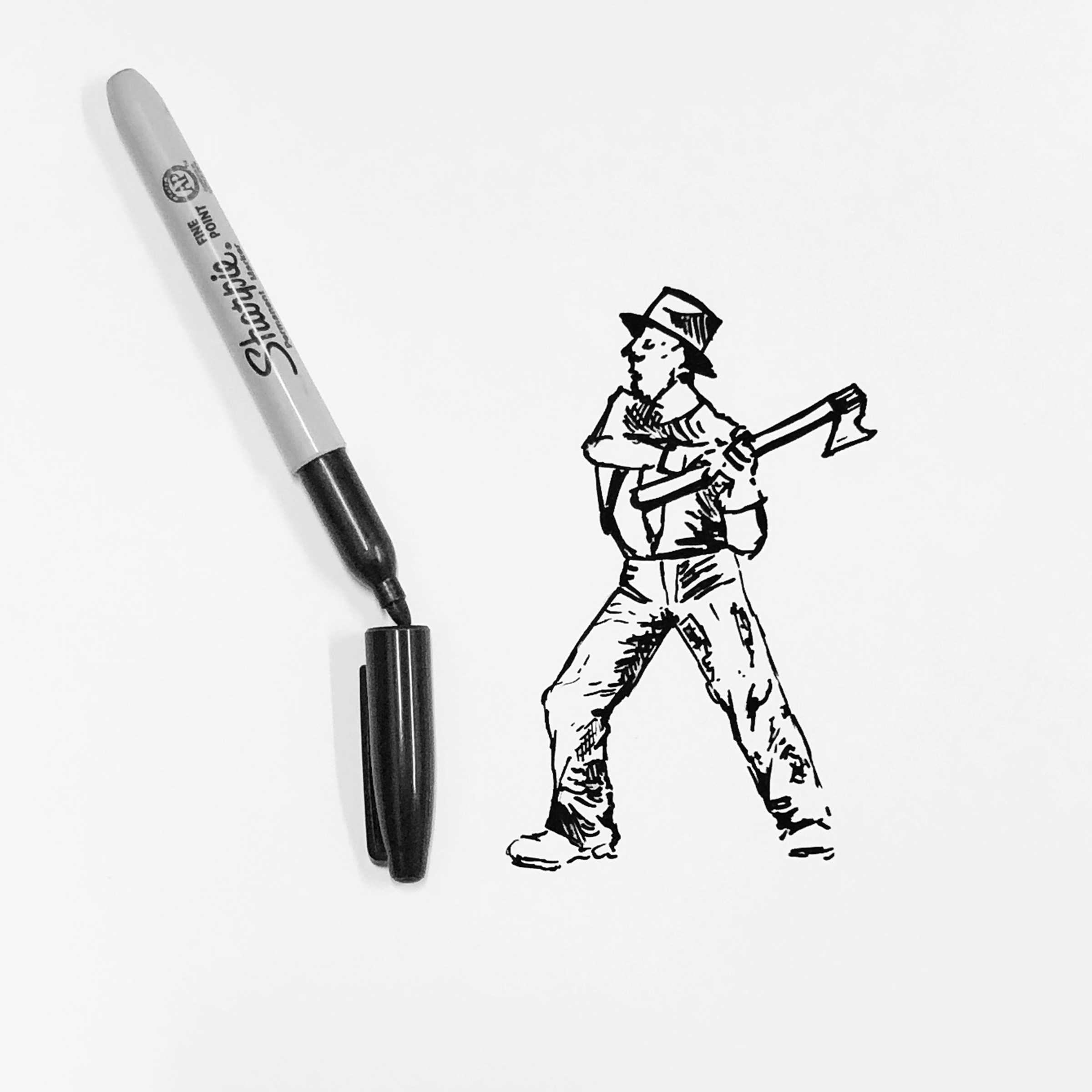
For some reason creative sparks creativity and I’ve see that in looking through a CA magazine, watching some spots featured on Ad Week or talking with other creatives. I’ve noticed when I start on a “just because” new idea (however insignificant and simple) and I flex those creative muscles that may be a little stiff or tight, It gives a satisfaction and spurs more creative thought. Brainstorming with coworkers does something similar, everyone starts throwing out ridiculous thoughts, bad ideas, good ideas and all of a sudden something builds to form a direction that may work. It’s amazing how a bad idea or even joke tossed into the mix, sparks something. Anyway, below are some of my insignificant interactive drawings and creative doodles that sparked some creativity for me during busy times.
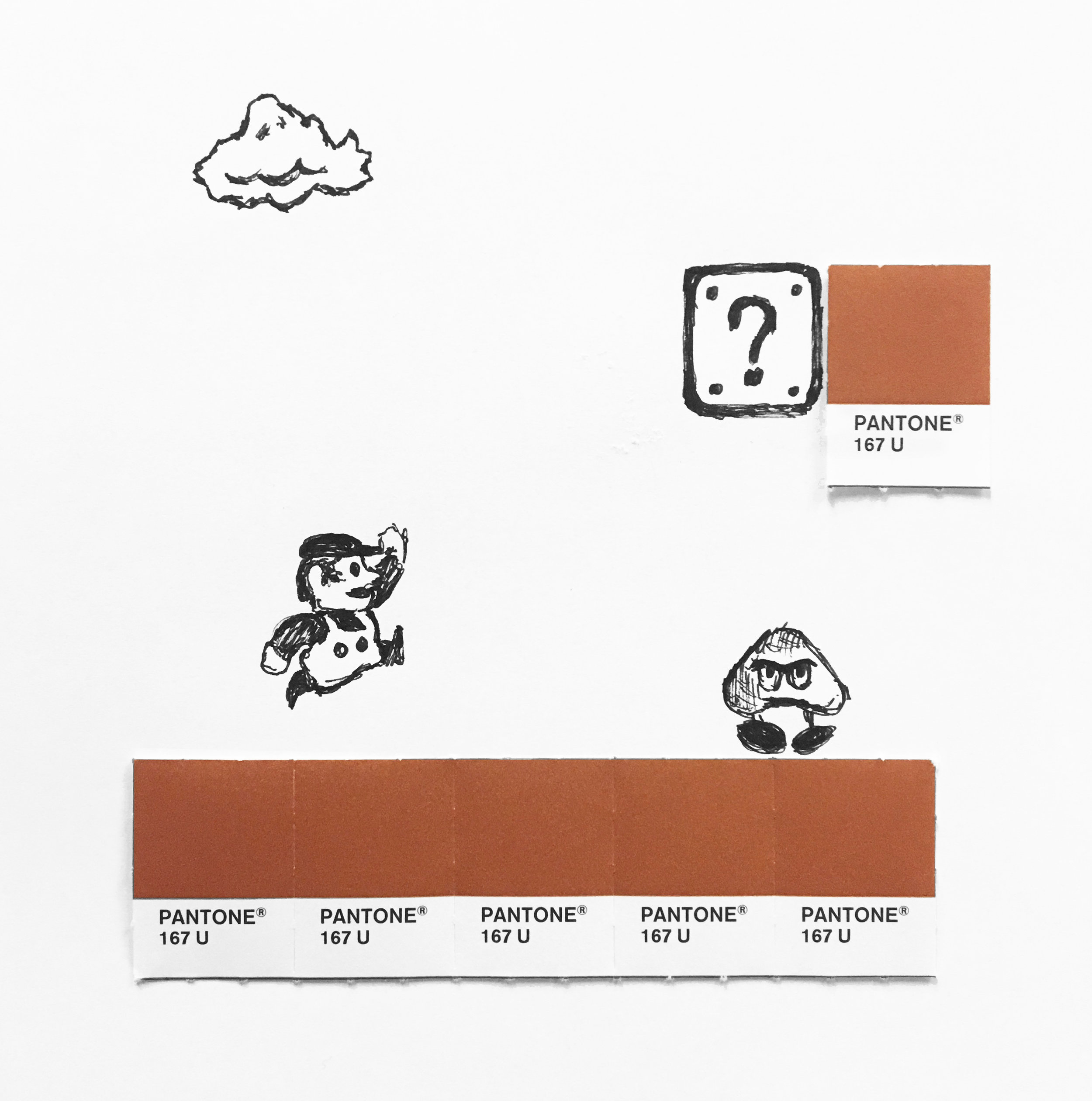
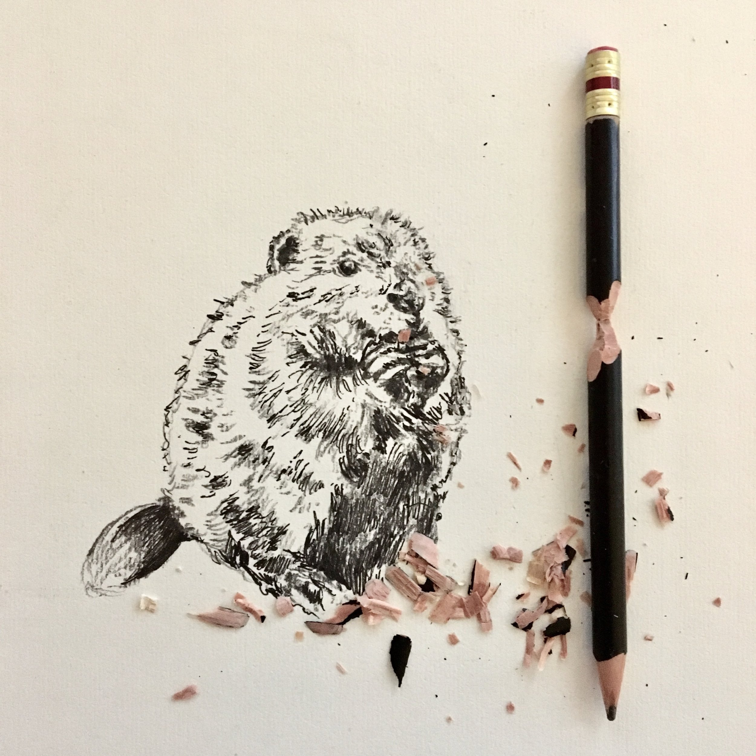
I used Pantone swatches that were by my desk, snacks/ peelings from snacks and the back of a ceiling tile after I was leaving my office. I want to do more drawings like the Santa sketch that replaces the long scroll of the naughty/nice list with something even longer, THE CVS RECEIPTS. I got one that week that was insane, folded like 5 times to fit into the bag! Anyway, I’ll be doing more once I get a break or just stay busy and need that creative fix during lunch.
PUT A LOOK TO IT
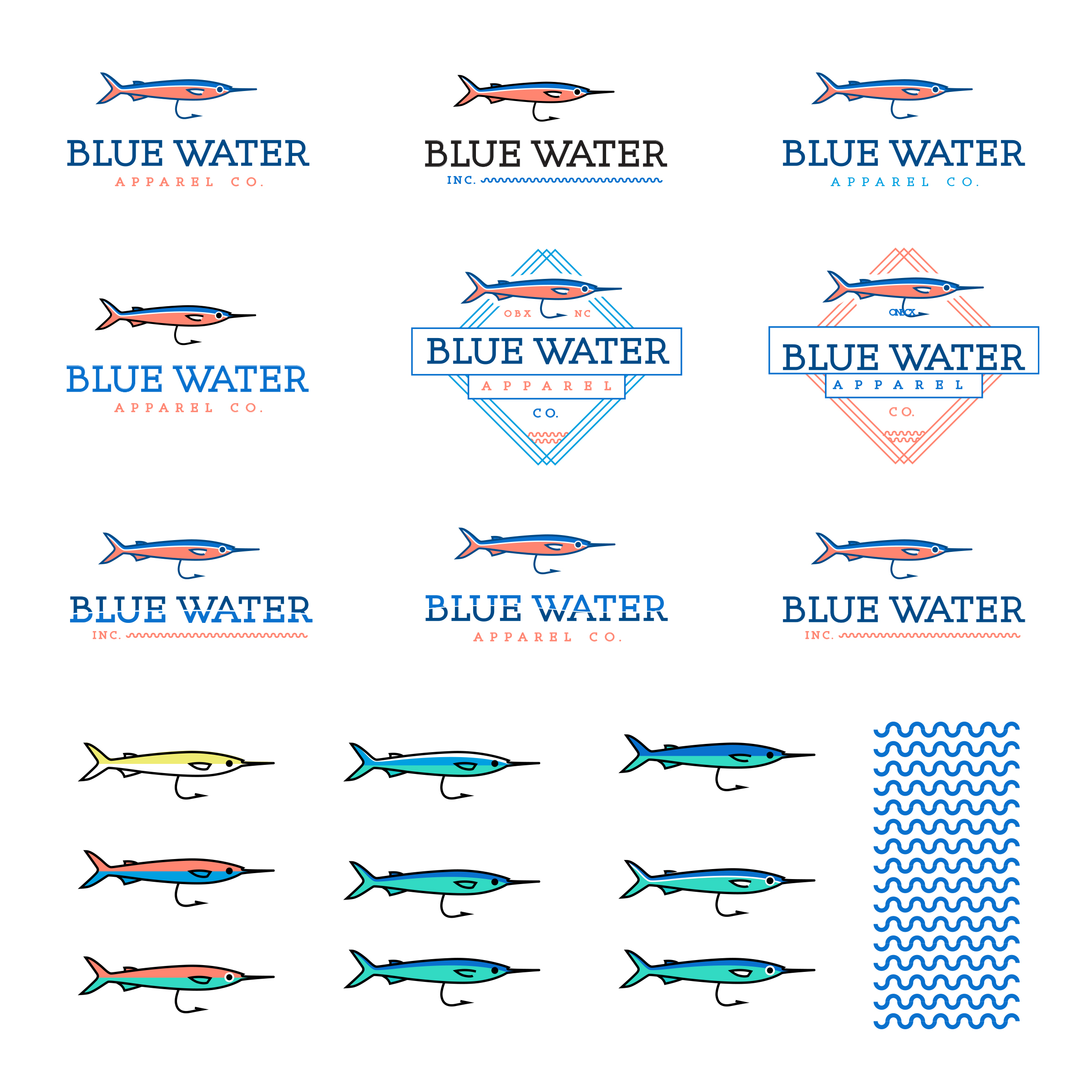
I get asked to work on all sorts of identity projects. Some may be rebrands or refreshes of existing companies, others could be upstarts looking to invest in their look/feel or even projects where I’m putting a look together to add credibility to a presentation for gaining investors. This project was an exploration for a business that may include purchasing already existing, established brands and re-naming or even starting from the ground up with finding the right distribution channels and building something new.
Either way, the project had a budget, and I was hired to start creating various looks/feels! I typically wouldn’t show all the unsold, unfinished work, but I pulled most all of my thoughts together for this post to give a little added insight into this project.
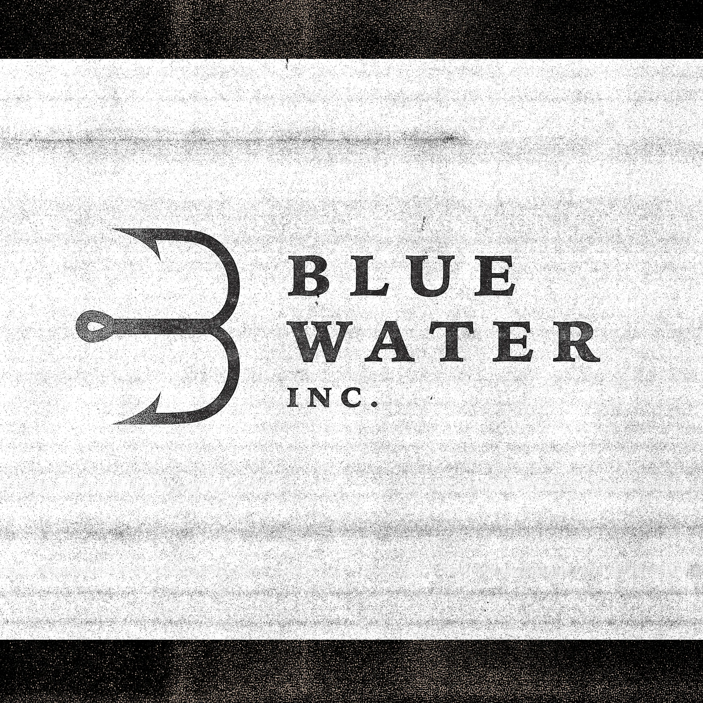
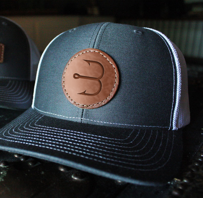
At the top of this post I show the final outcome, a simple “B” formed from a hook and a bit of serif type. I felt for the style we wanted, the serifs added an established feel that worked well with the fishing theme. Since this was an apparel business, I also looked at developing secondary marks for women’s, children’s and specialty men’s product lines. This idea resonated well with the client and gives a lot of flexibility in branding going forward. This also would require more funding and somewhat of a challenge in making sure each of the lines are linked back to Blue Water Inc.
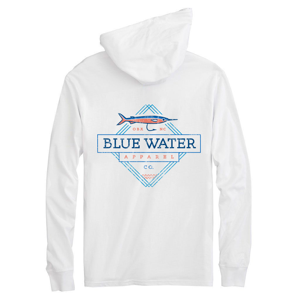
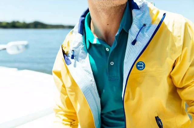
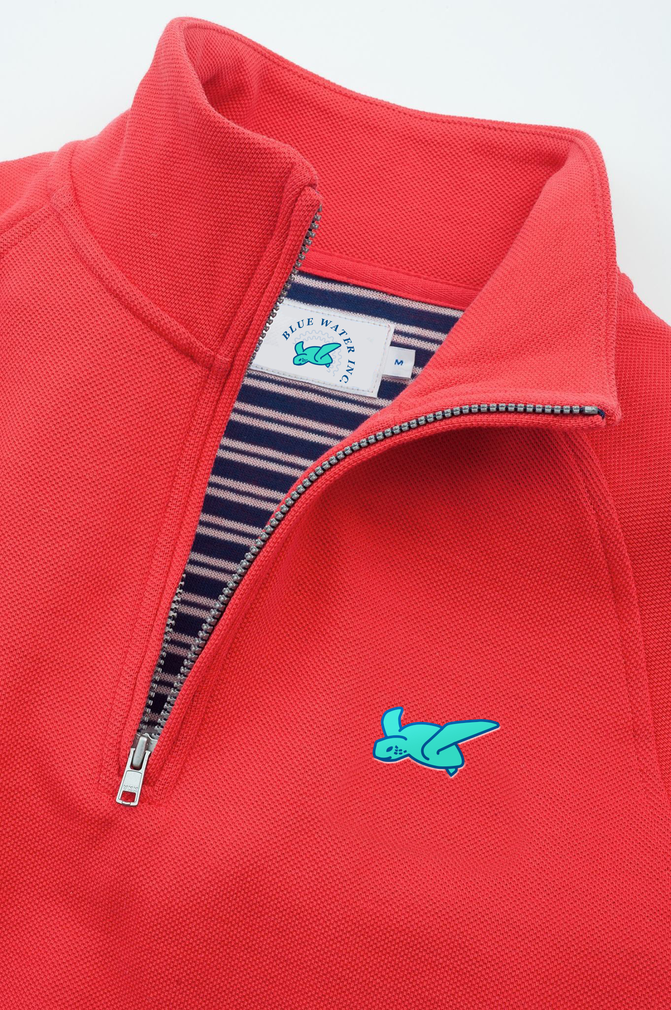
I used low res imagery for quick mockups to show some of the designs in an environment when talking over layouts. These mockups wouldn’t be used public facing in branding as I pulled all of them from google images, but just give a quick glimpse as to the style each brand mark could fit within.
It’s always such a fun process to see how sketches come to life in black and white vector pieces, the vectors then change into color selection and final versioning until finally really coming to life in realistic mockups.
I know some designers dislike a project where the intent is more exploratory than starting with an organized brief and sourcing paper samples for use etc., but there is something amazing about being given free reign to explore a brands direction and see where the concepts lead. In the end, the client was excited about the look and I was compensated to design/create which is my favorite thing to do!
E-A-G-L-E-S
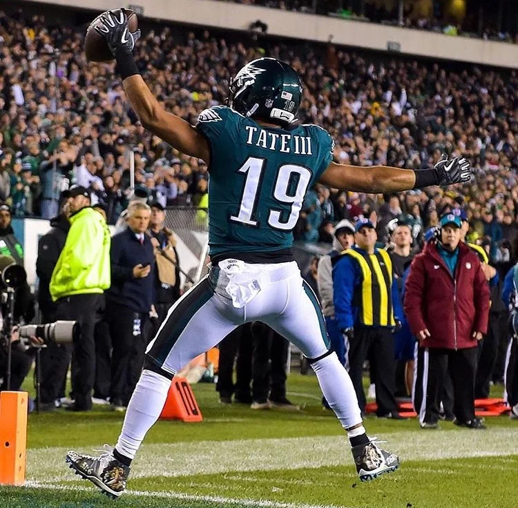
Got a fun opportunity to work with local artist Jared Emerson on a few layout designs for hand painting Carson Wentz’ cleats. Carson’s foundation needed to be prominently included and they wanted to add a verse reference with Jared’s artwork. I created mockups showing various layout designs/content arrangement that would give some different looks and feels before Jared got to painting. It’s pretty amazing that he hand paints multiple pairs of cleats with covering all the nooks and crannies created by the textures. Anyway, Jared did a great job on painting the final cleats and it was fun to see multiple players wearing them on the field.
