QUICK HOLIDAY TYPOGRAPHY
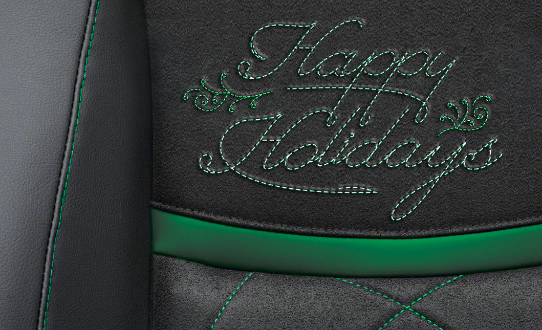
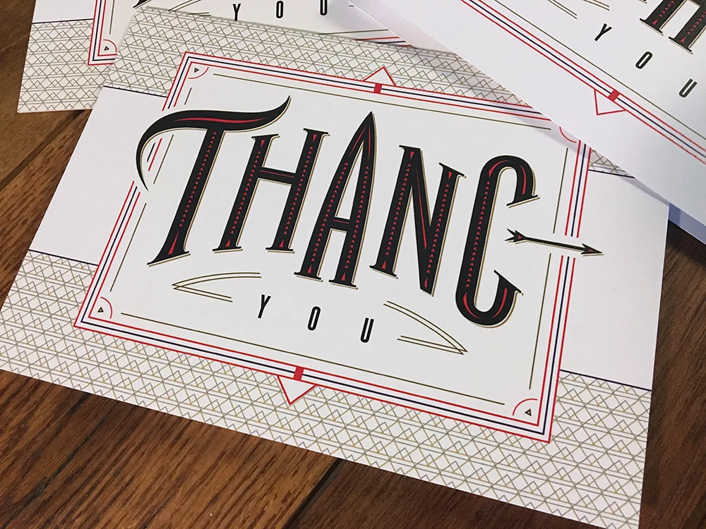
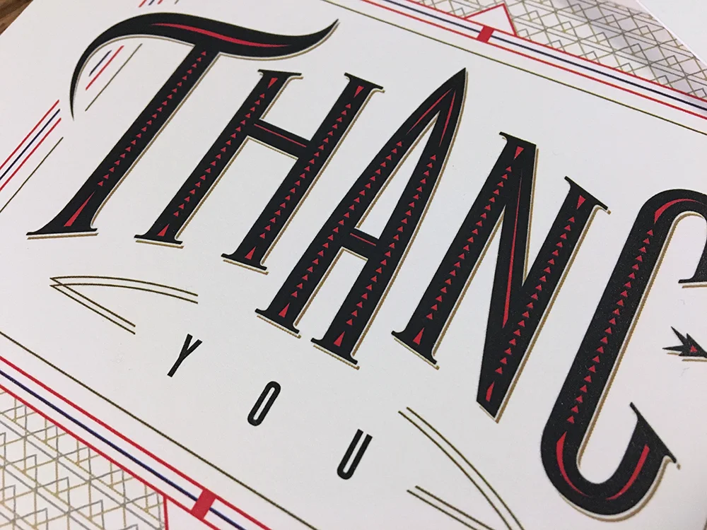
Last minute type treatment done for a car interior fabric client. This was used in their holiday mailings and utilized a thumbnail photo of their seat design with the multiple fabric styles and textures working together, but did it in a subtle way without pushing that capabilities message over the simple message of Happy Holidays. We can sell the capabilities and key messages the other 350-some days of the year. Anyway, for a rush design, I think it worked pretty well overall and we made the client happy too.
SELF PROMOTION PAYS OFF
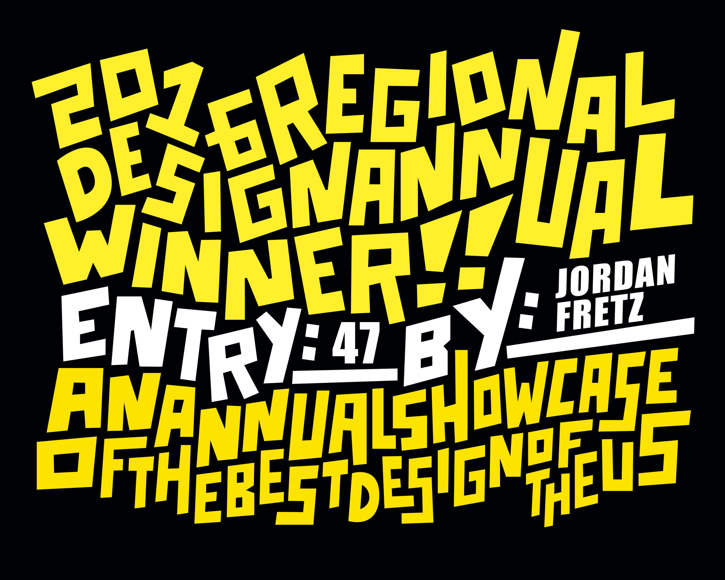
Really fun to work on self promotional pieces for my my freelance design work or more specifically the custom sports identity work I have been doing. Pretty exciting to get more eyeballs on my work, attract new business and even make it into Print Magazine with the design work. Props to Timothy Goodman on the custom type certificate they sent out to winners as well. We always suggest pro-active ideas to promote the agency or direct mail for our clients so it only makes sense to put my own advice into practice. At first screen printing posters, having cards printed, oversized envelopes and stickers was an investment that made me cringe a bit, but getting the work out there, especially into the hands of decision makers, pays off. Another self promotion project in the works again now and I am pumped about it!!!! Anyway other award winners and a couple pics of mine here: South Annual Winners.
I THINK YOU'D BE SURPRISED
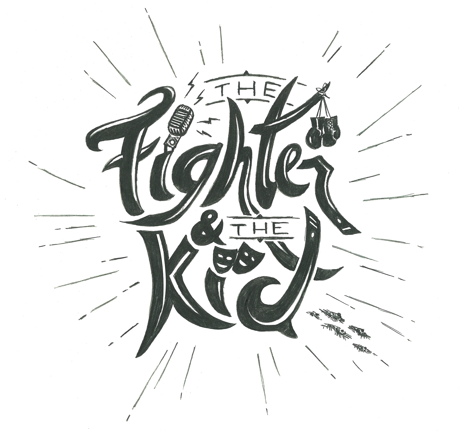
Quick sketch done after seeing Brendan tweet "ATTENTION artist Email the website or DM me if you have logo ideas." I would draw the final version in vector form (some color will help too) and work out all the details in the computer. Some parts need to be cleaned up and or redone, but you get the overall idea here. I got Brendan's gloves hung up (easily recognized with the boxing gloves, yeah I know UFC gloves are opened fingers to poke Mitrione in the eye and your a BJJ guy but you get it), the old school mic, some theatre/actor mask icons (since Callen is into theatre and is hilarious on The Goldbergs. Yeah, we look forward to the spin-off), the end of the "R" and top of the "D" are the ends of blackbelts (I've done some martial arts and threw a stripe or two on em) and there are some krill trying to get away from Bryan at the bottom right (little nod to Onnit too). Some won't get it, but it's fun and different.
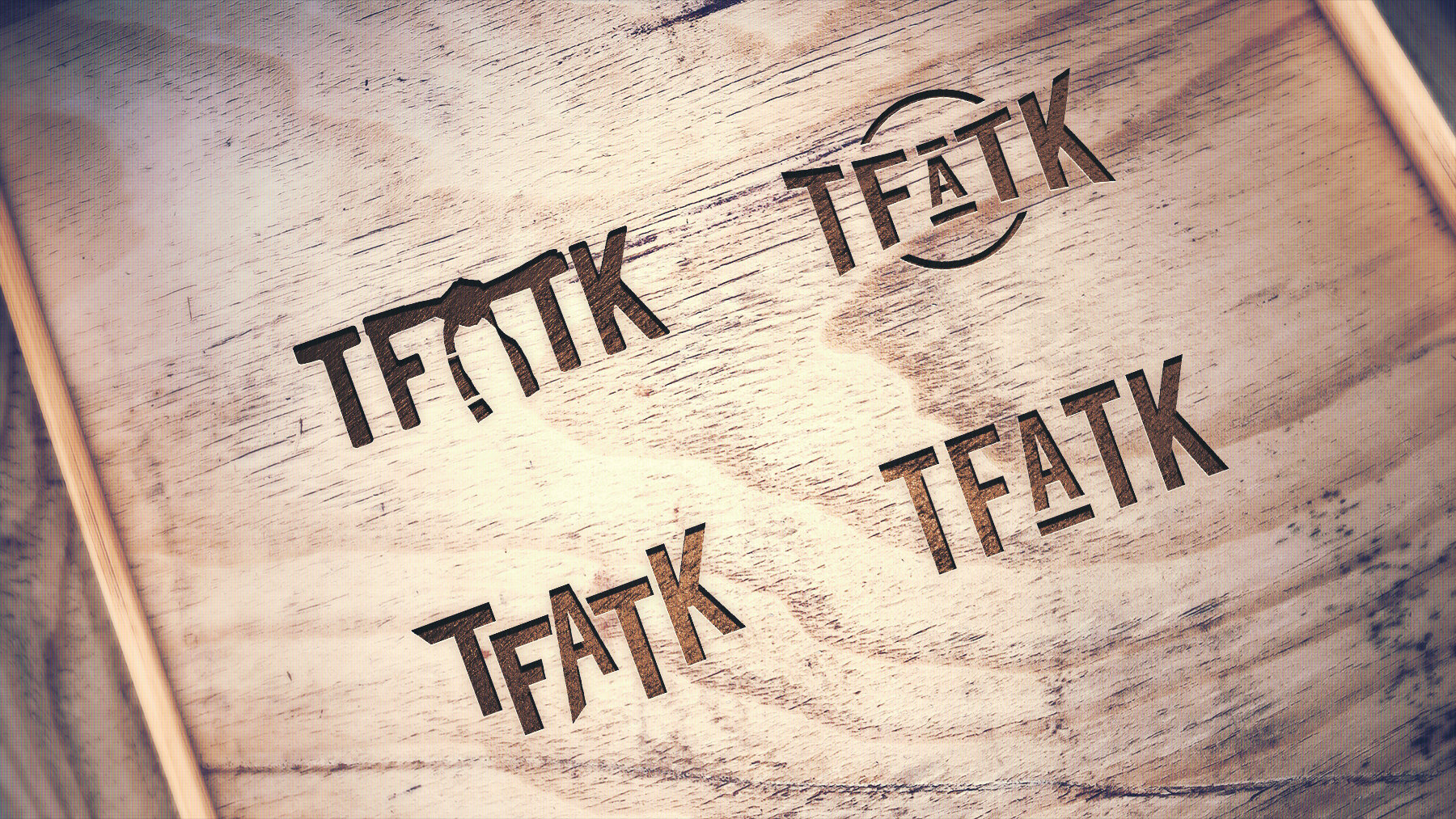
If you guys like the idea and it's useful with the new studio space, I will get on making the vector version, would make a simpler text version also and maybe even a "TFATK" same type treatment for really small thumbnails in various applications if needed. Anyway, the show is hilarious and I have followed Brendan's career from the Ultimate Fighter days through the podcasting/comedy days now. The dynamic with Bryan is great on the show and fight companions etc. Called is too funny and even my wife listens on road trips (though to this point I haven't used anything from a "dropping knowledge").
Seeing the pallet wood of the new studio made me think a hand-drawn type style could blend fun with a unique, tactile feel. Anyway, wish you guys more success as you take the next step for the show and hit me up if you are interested in my direction for the logo. Throwing in a couple alternate type treatment thoughts as I get time as well.
EVERY ONCE IN A WHILE
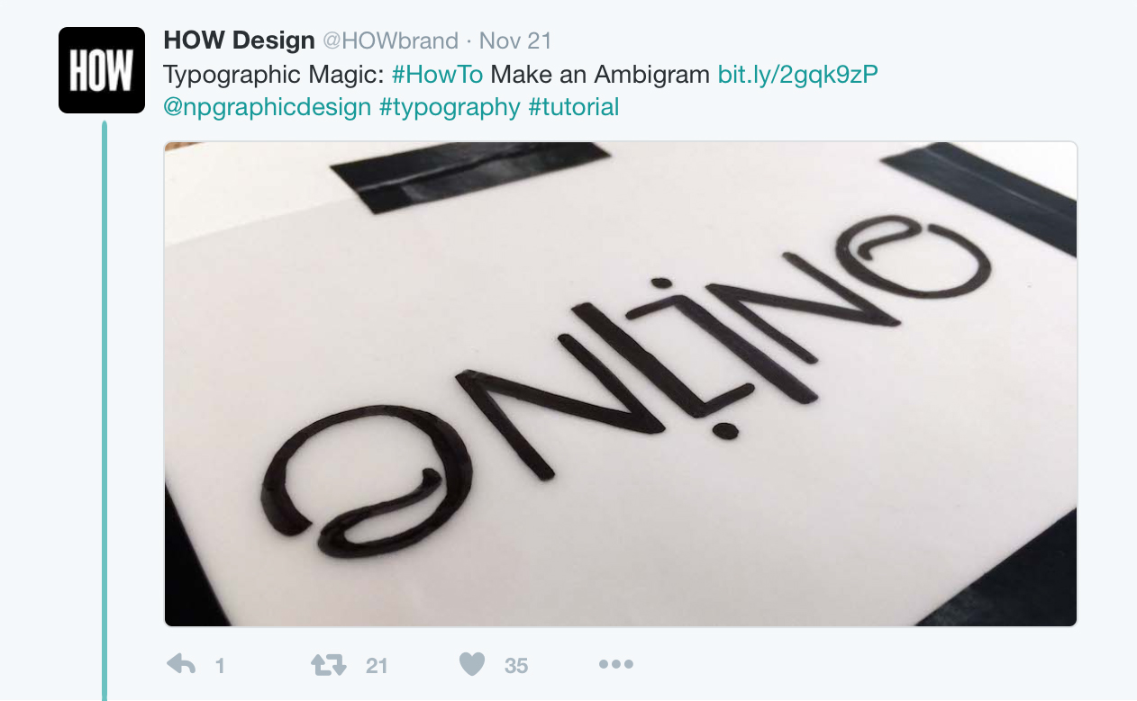
I'm not real active on social media, never really have been. Friends are far more popular and better connected just because of their social presence. I love coming up with ideas for businesses and social media tie-ins for campaigns, but my personal stuff just kinda blows. Turns out I would rather work on an idea than spend a lot of time posting about it. How quickly an idea has to be executed also is tough. To be relevant and smart, the work has to be done immediately. I wanted to challenge myself to act quickly on an idea after seeing something that is interesting, relevant and just makes sense. At least try to do that every once in a while. After seeing How post an article on ambigrams, I made my own of the word "print." I animated it (for dribble) and then also did a second version with "magazine" included and replied to How's post. They picked it up and tweeted it out and then Print Magazine retweeted it. I learned a few things from it about posting times, how to engage more over time, etc. Oh and learned a bit about Ambigrams too.
PERSONAL THANK YOU'S
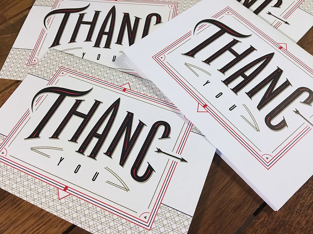
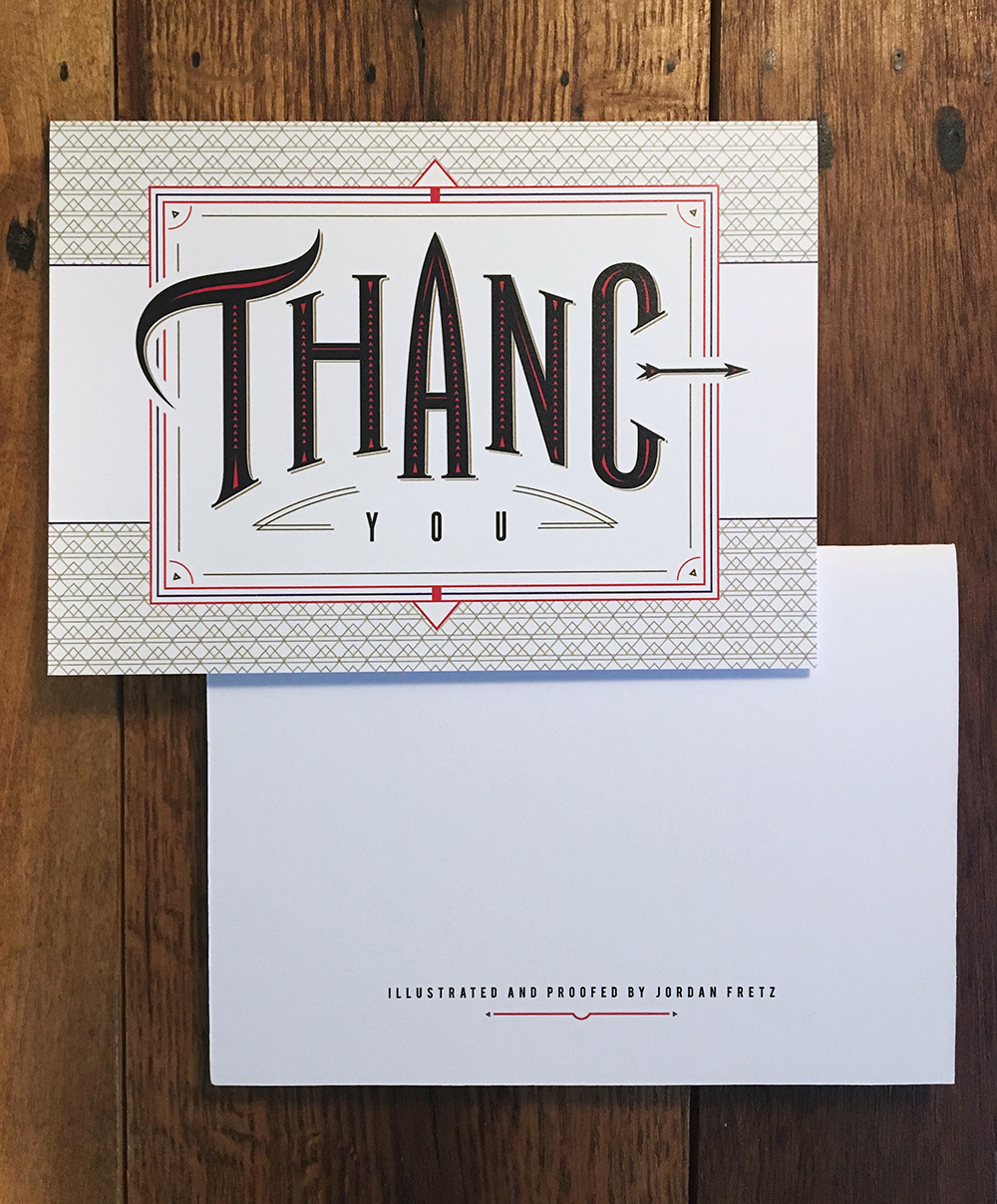
At the agency, I am notorious for some bad spelling from time to time, or all the time. Anyway, I never have been a great speller (I still remember being the first one out of competition in a spelling bee in the third grade and being super embarrassed at how simple the word was) and typically have to get my work proofed a couple times before going to clients. I thought it would be fun to make fun of myself in my personal branding, since many times my thank you's are going out to clients or those who know me well. I love doing custom typography and thought it was interesting to have detailed design and a misspelling in there. Cards were printed on uncoated 100# cover stock by a local printer and are going into stamped black envelopes. Send me a big freelance project and I will mail you one in return ha.
A CHANGE OF PACE
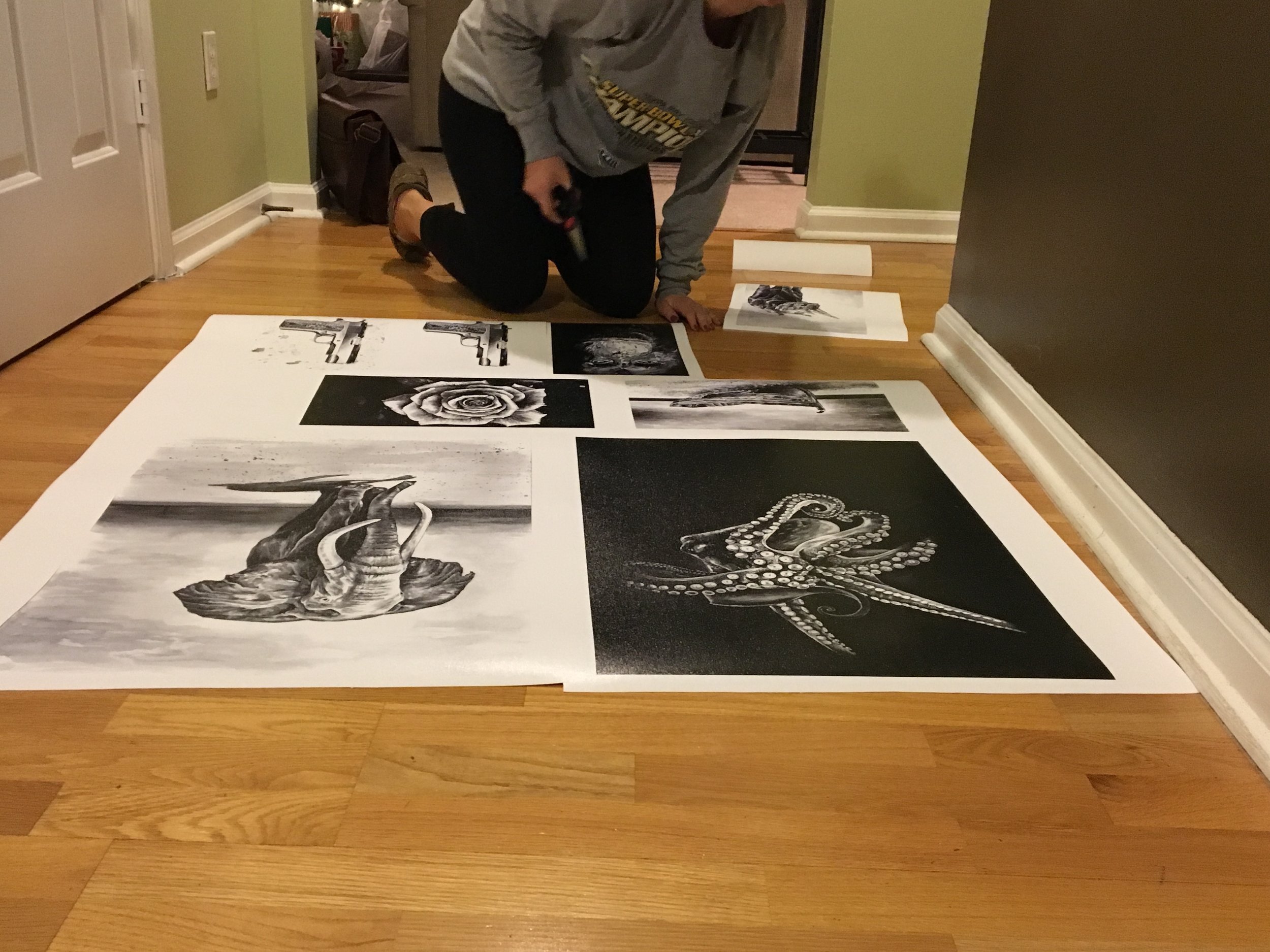
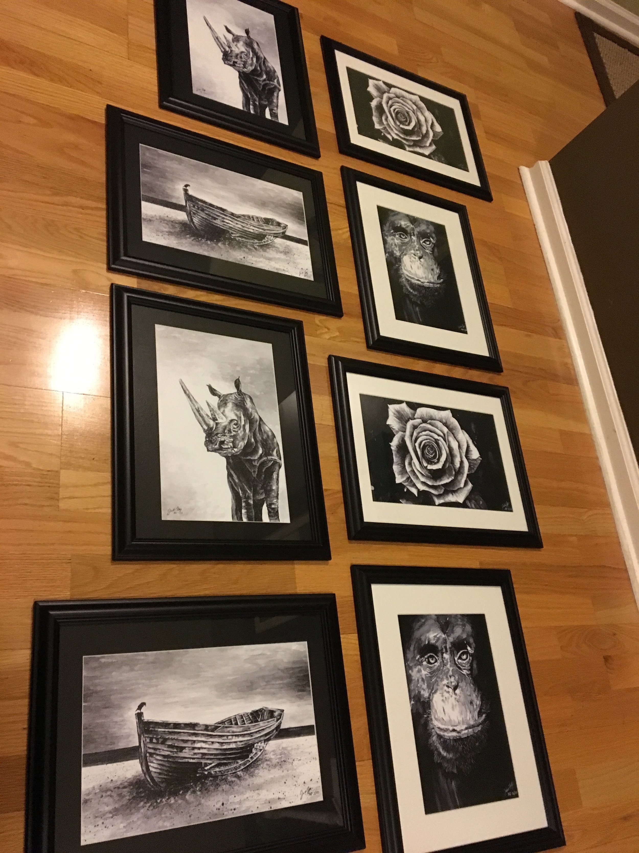
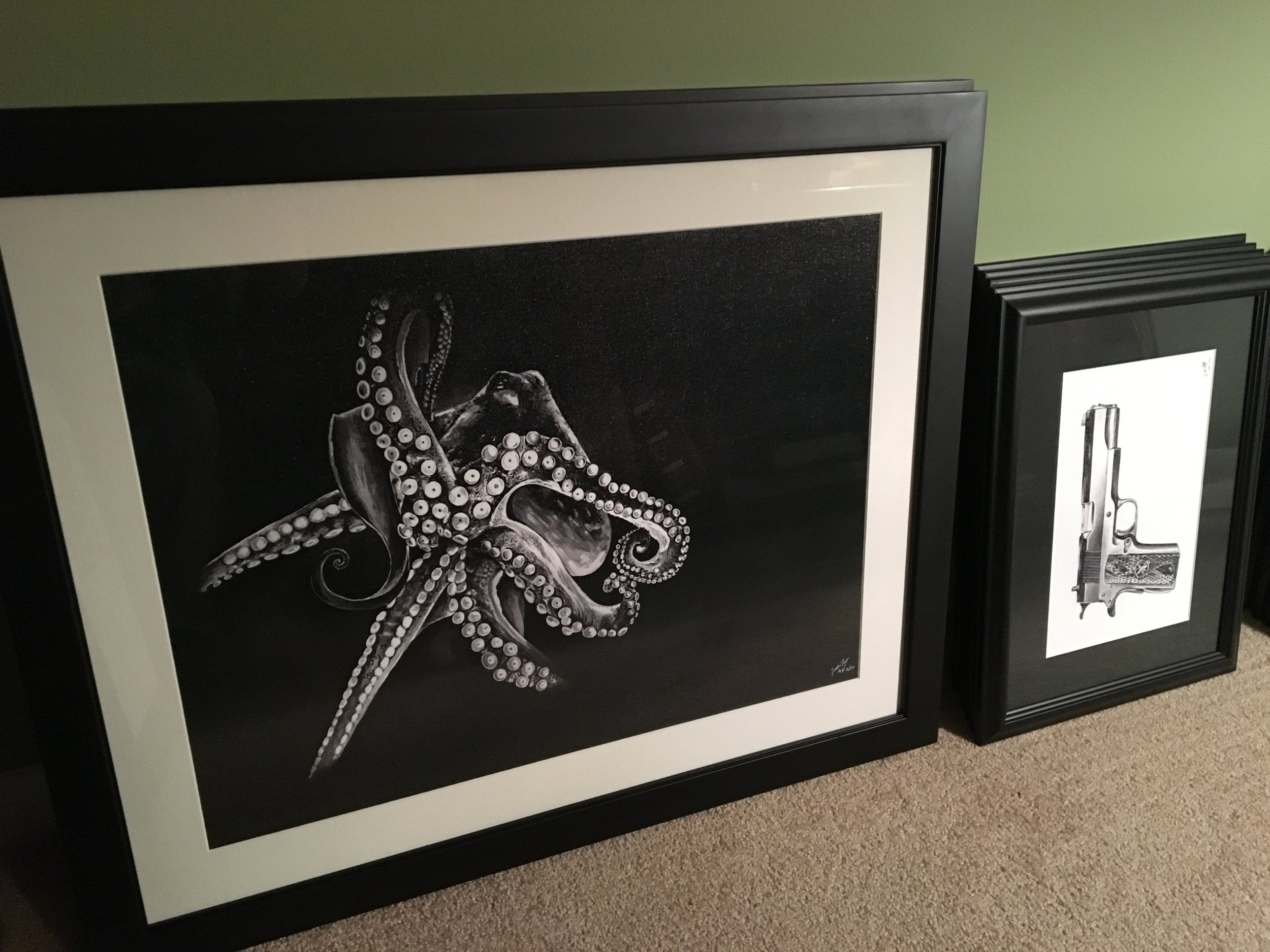
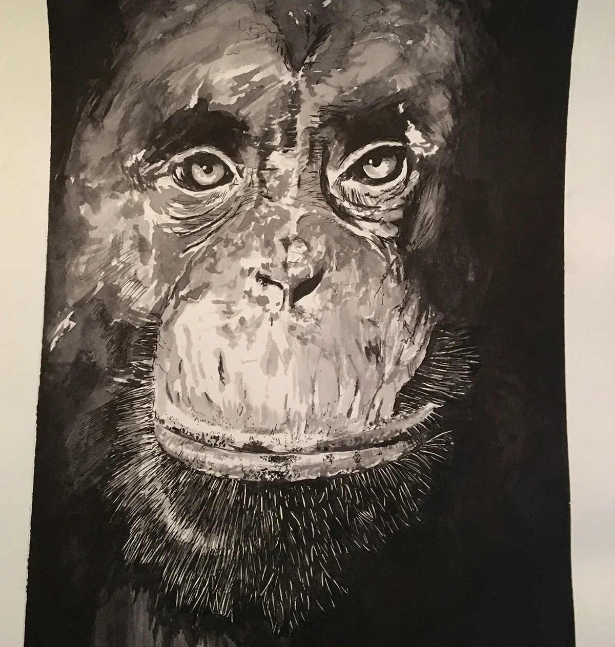
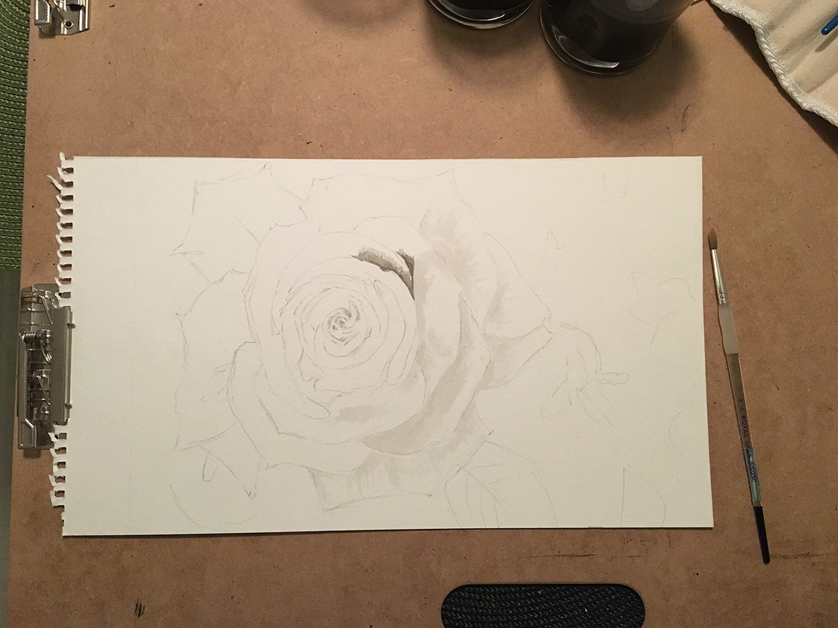
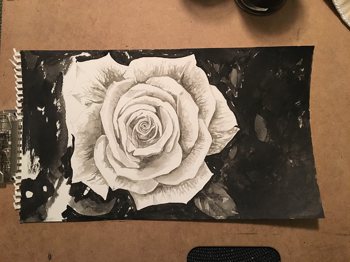
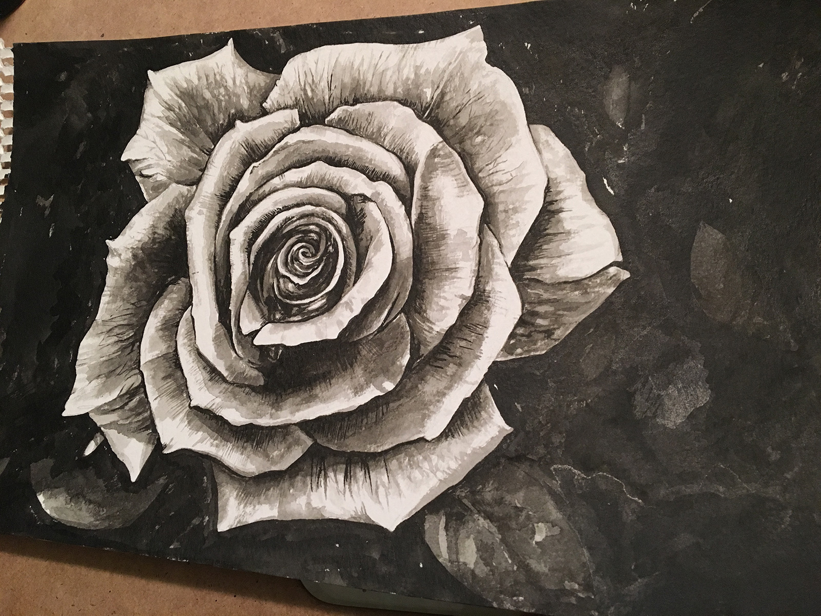
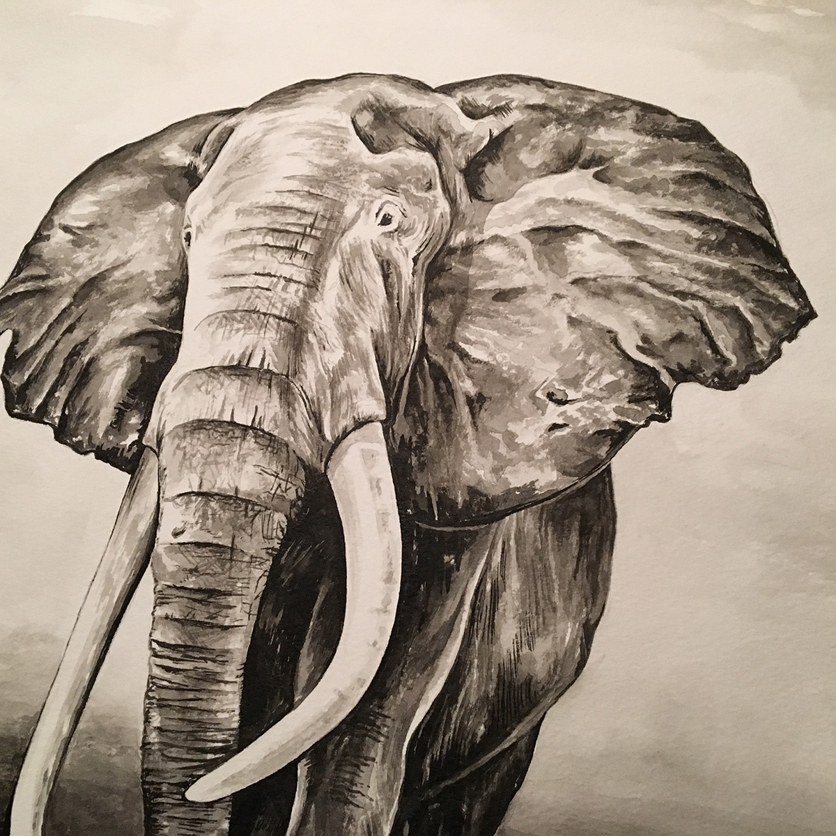
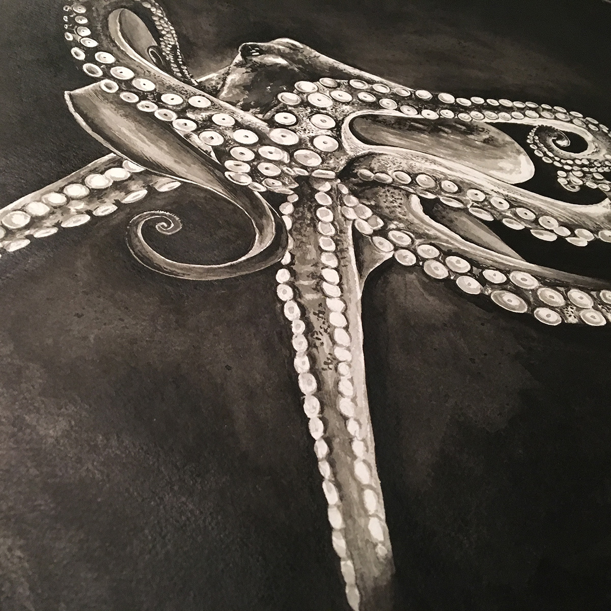
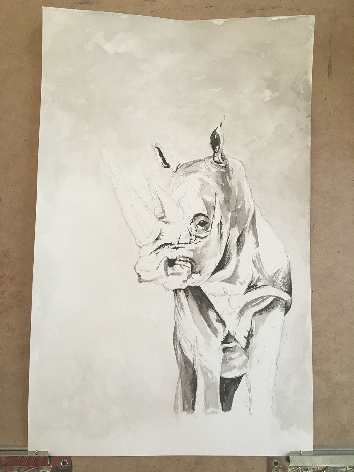
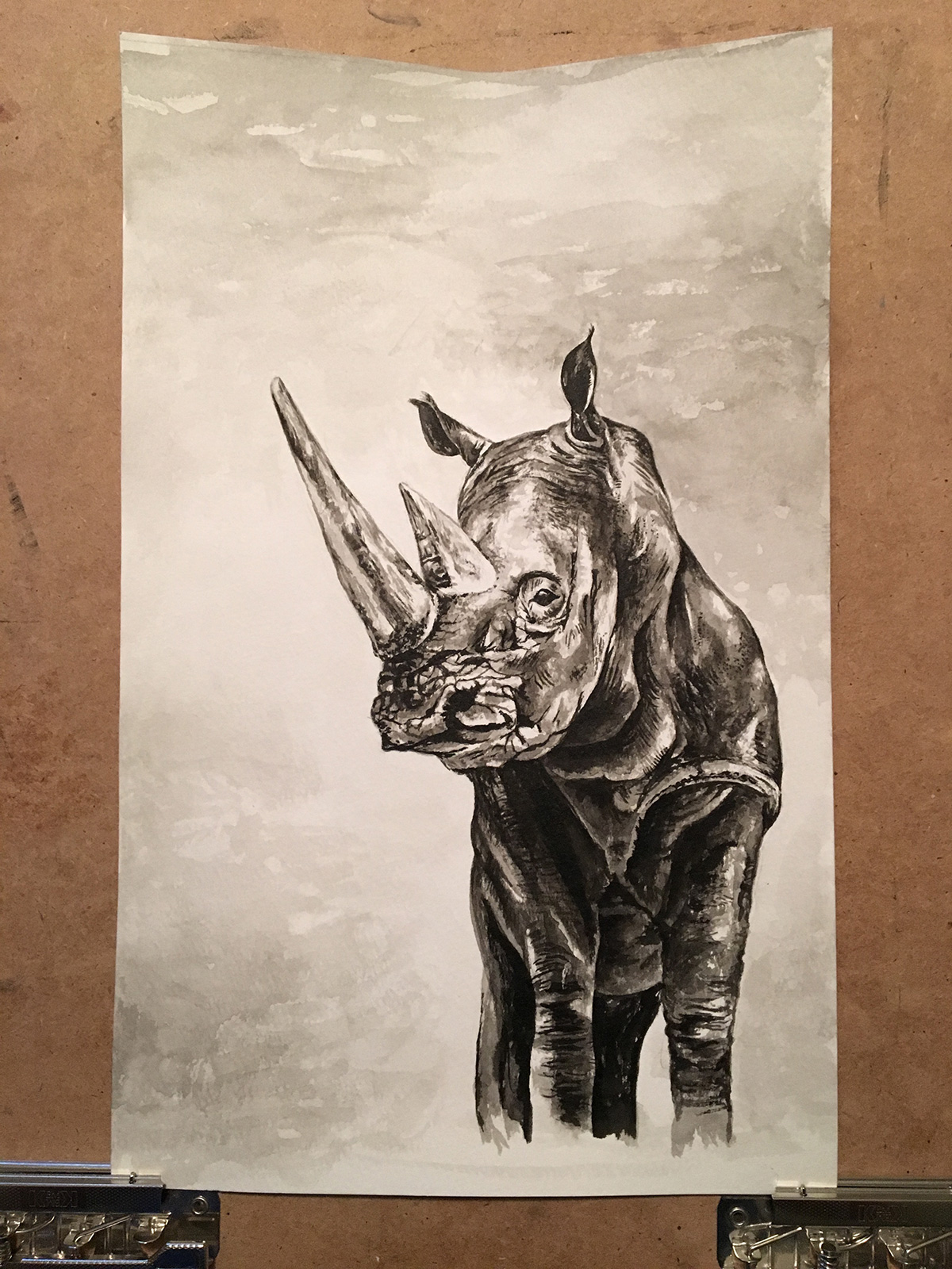
I love artwork. As a kid, if I wasn't playing basketball or soccer, I was in our basement drawing, painting or looking through books for something to draw or paint. Ink wash artwork that has always been a favorite medium. Maybe because it has a similar consistency to watercolors or because it doesn't require the setup of oils, it's just a brush, a small bottle of ink (your carpet's worst nightmare) and water. Anyway, most of my design work is done on the computer and I love it, but being able to set the computer aside and create some artwork for some up-coming art auctions in town is a nice change of pace.
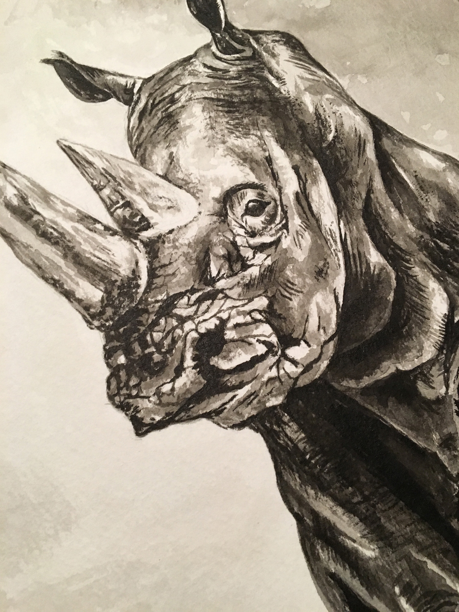
Last year, I donated a painting to a charity auction in Greenville and really had a great time attending the event and seeing all the artwork. There is still a lot of mediums I want to work with, but without much time in the evenings to set aside, going back to some ink wash work has been a good transition. I plan on doing some still life compositions and some nautical themed landscapes besides the animals, but there is something about the emotion in developing the eyes and expression of an animal that is really fun.
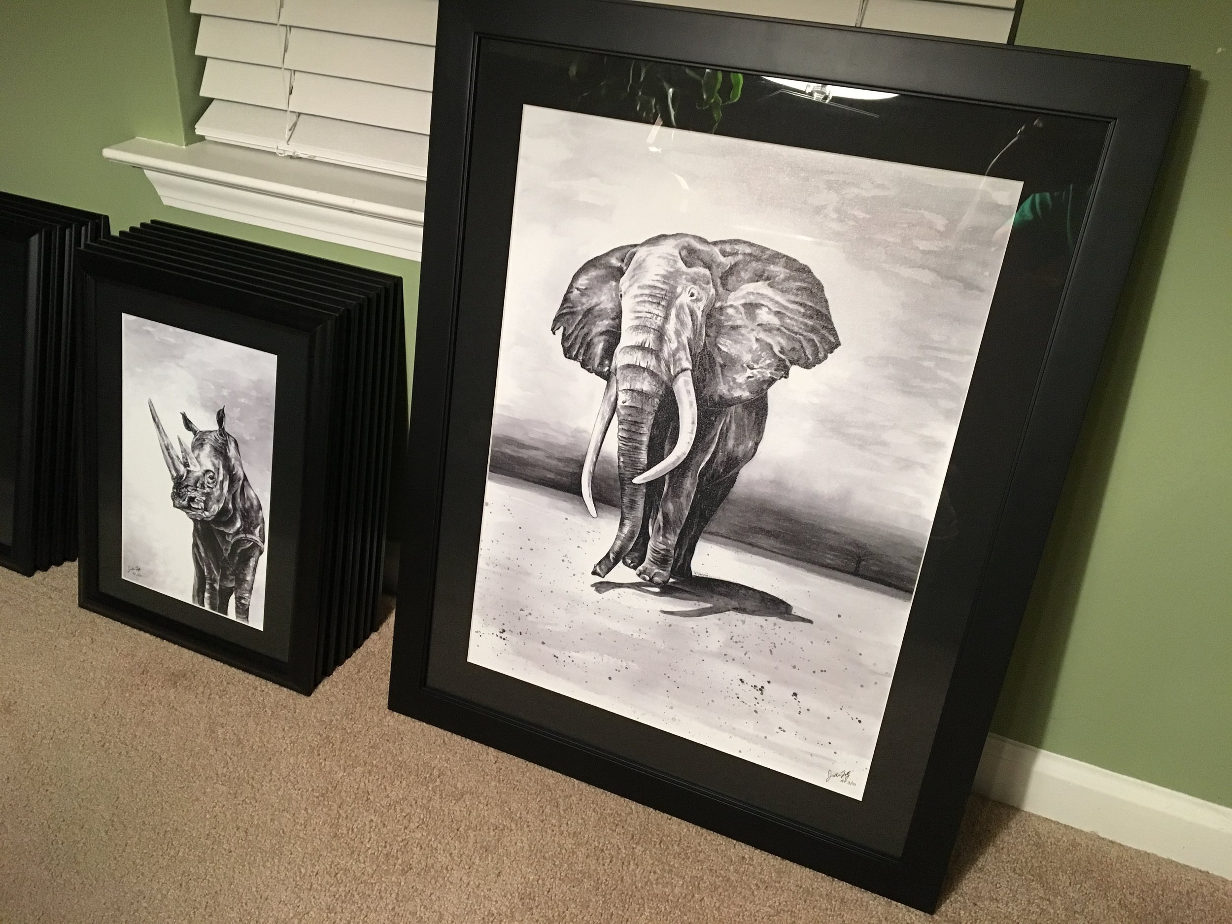
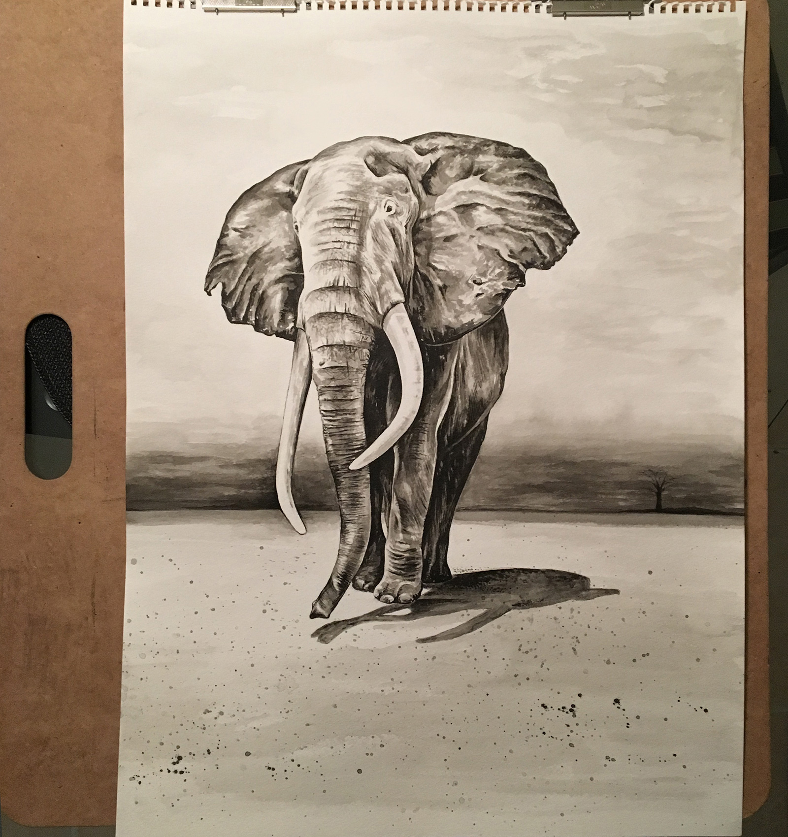
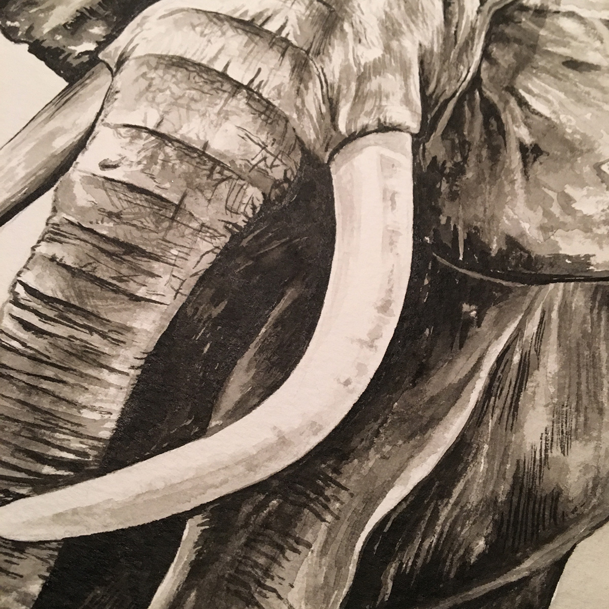
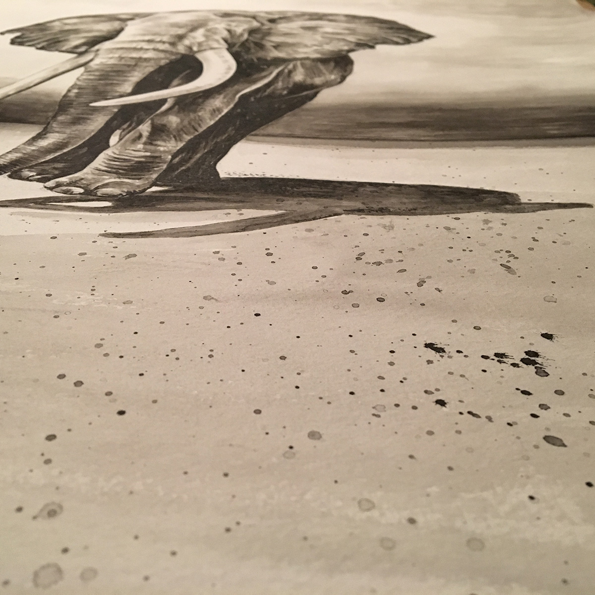
The texture of an elephant's skin really makes it a fun animal to work on. I really liked working with a splatter technique that gives a gravel type of look for the ground. I loaded up the brush with ink and water and smacked the brush sending splatters on the bottom of the artwork, our kitchen floor and a couple probably on my wife's cat :). The cat has been a problem whenever sketching out the layouts for sure, always smacking at the pencil and walking on the paper. Anyway, there is some things I would have changed for sure, but still am excited the way this turned out. It's a larger piece that many I have done in the past and really will stand out when paired with a black matte and frame.
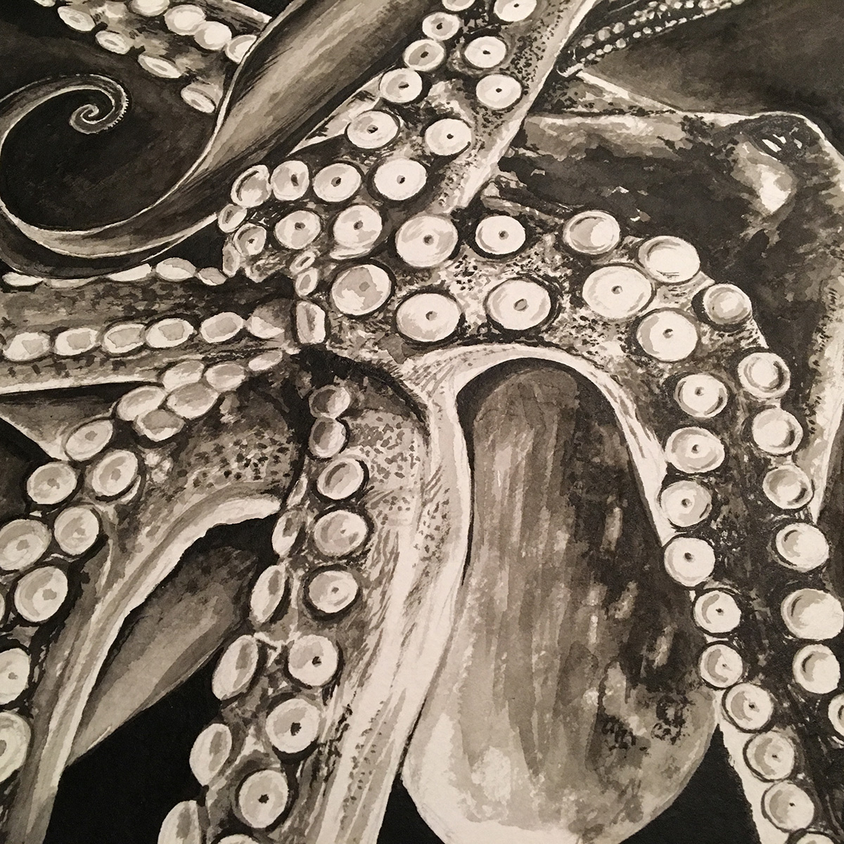
The octopus with all the suction cups was really fun to work on. I wanted the background to be very dark but also have some personality in the black with some areas lighter than others and I really like how there is slight splatters here and there,and brush strokes throughout. All in all, it was fun to do these first two and hope to start work on a few others soon. Planning on doing some canvas prints (Giclée as the pros say) and matte/frame up the originals as well.
