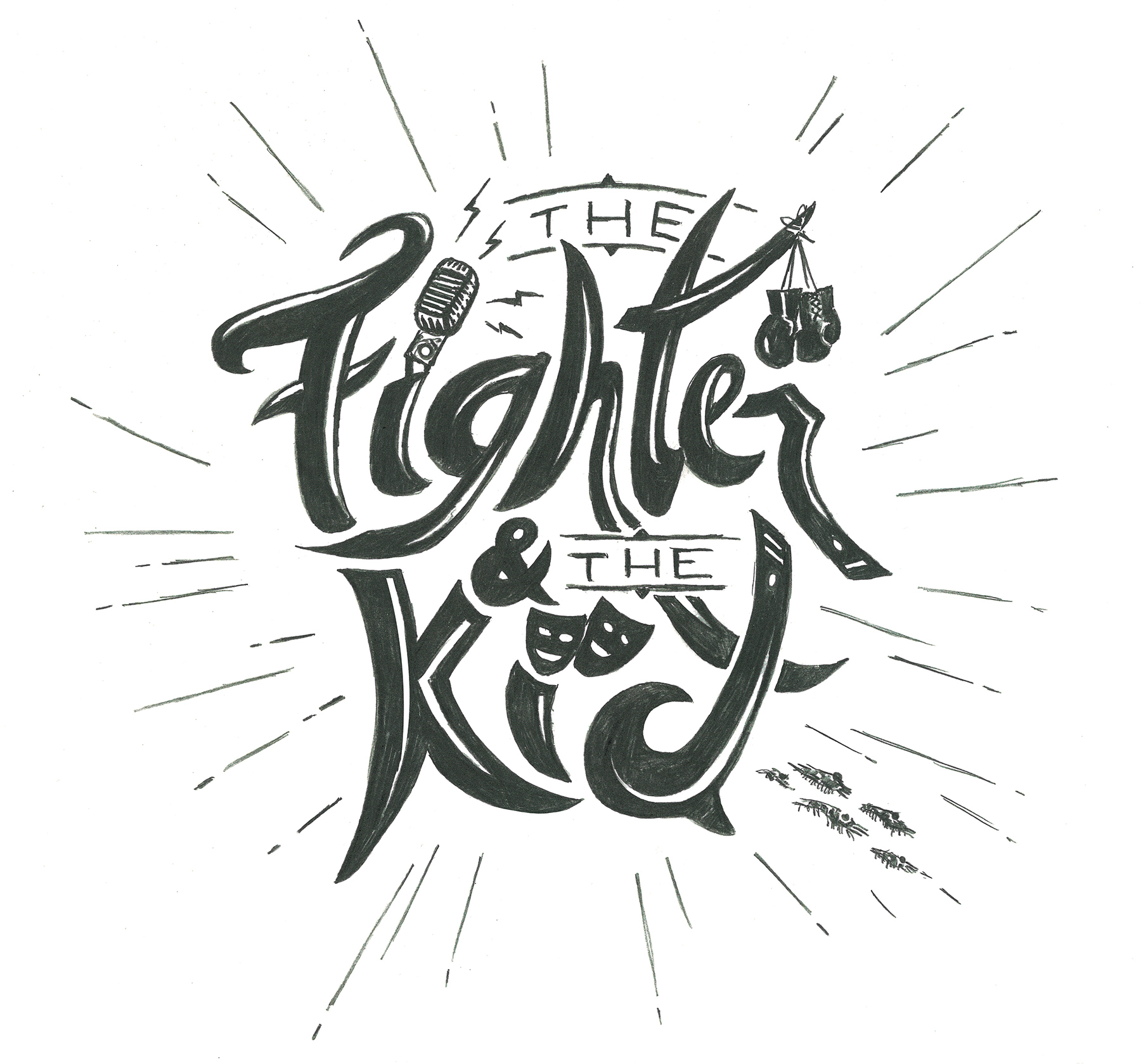
Quick sketch done after seeing Brendan tweet "ATTENTION artist Email the website or DM me if you have logo ideas." I would draw the final version in vector form (some color will help too) and work out all the details in the computer. Some parts need to be cleaned up and or redone, but you get the overall idea here. I got Brendan's gloves hung up (easily recognized with the boxing gloves, yeah I know UFC gloves are opened fingers to poke Mitrione in the eye and your a BJJ guy but you get it), the old school mic, some theatre/actor mask icons (since Callen is into theatre and is hilarious on The Goldbergs. Yeah, we look forward to the spin-off), the end of the "R" and top of the "D" are the ends of blackbelts (I've done some martial arts and threw a stripe or two on em) and there are some krill trying to get away from Bryan at the bottom right (little nod to Onnit too). Some won't get it, but it's fun and different.
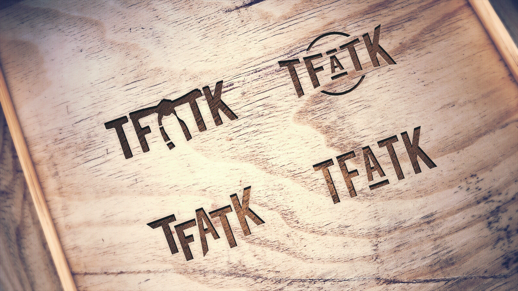
If you guys like the idea and it's useful with the new studio space, I will get on making the vector version, would make a simpler text version also and maybe even a "TFATK" same type treatment for really small thumbnails in various applications if needed. Anyway, the show is hilarious and I have followed Brendan's career from the Ultimate Fighter days through the podcasting/comedy days now. The dynamic with Bryan is great on the show and fight companions etc. Called is too funny and even my wife listens on road trips (though to this point I haven't used anything from a "dropping knowledge").
Seeing the pallet wood of the new studio made me think a hand-drawn type style could blend fun with a unique, tactile feel. Anyway, wish you guys more success as you take the next step for the show and hit me up if you are interested in my direction for the logo. Throwing in a couple alternate type treatment thoughts as I get time as well.


