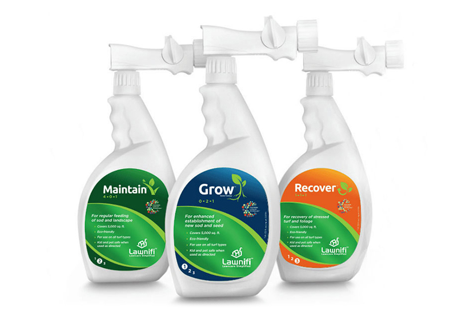
Randomly ran into this product online the other week and they looked familiar :). Yep, I did these label designs a few years ago and though I probably wouldn’t go to the gradient again, I did blur some grass imagery for the backdrop so that makes me feel a little better about them. It couldn’t be any more ironic for me to design lawn care product labels. My back yard looks like I’ve been putting forth real effort to actually destroy all signs of healthy grass. Anyway, the product labels needed to have a unified look across the series of products and also reflect the modern Lawnifi look. One challenge was making sure all the content sections were included, but also broken up into digestible pieces. That can be a challenge with so many details, benefits and suggestions. All in all, the final labels tell the story they need to and hopefully they help buyers improve their lawn.


