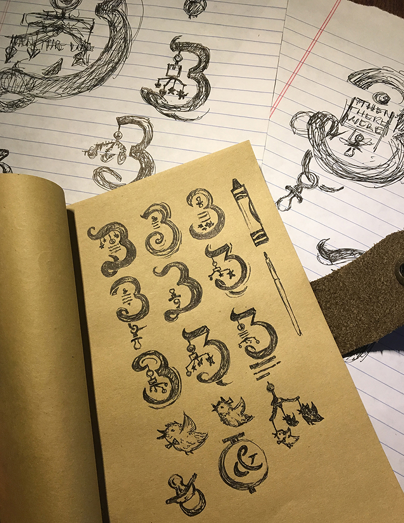
Jackie and I couldn't be more excited about having our first kid. Maybe a little embarrassing for people to hear right when I found out, my mind pretty quickly went to thinking of what type of design would I do to announce it :). For me, drawing typography takes some time, a nice micron and a stress ball. Coming up with the concept for the layout probably my favorite part. Most designers, artists, creative people in general can draw out some letters, but the composition meaning itself is what makes someones layout really stand out. My concept was to symbolize myself, my wife and the baby using 3 main instruments and showing the instruments themselves in the final image. The Micron pen represented myself, the pencil Jackie and the crayon (which I was pretty nervous about the point screwing up the lines) was a good way to symbolize the baby. I was deciding between a few phrases that use the number "3" until I thought it would be cool to choose a phrase I could continue to keep doing in a series (as we have more kids Lord willing). "And Then There Were 3" seemed to fit and I started the sketching out some thumbnails. I liked a few different directions and almost went with a rocking horse making up the bottom of the "3", but something wasn't working and my wife agreed it wasn't right. Killed. Drew more thumbnails and went the direction of a mobile. There is something about a mobile that would be less in your face than a pacifier, bib or diaper. I like doing detailed drawings and paintings and while the type I thought shouldn't be overly complex, it would be fun to add details to the mobile elements. I started off drawing random, funny animals. But in the end Jackie loves birds and it just made more sense.
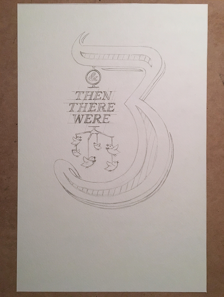
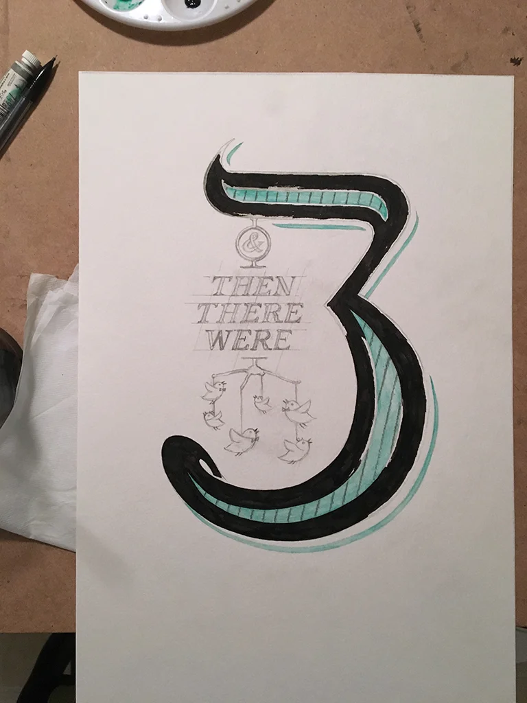
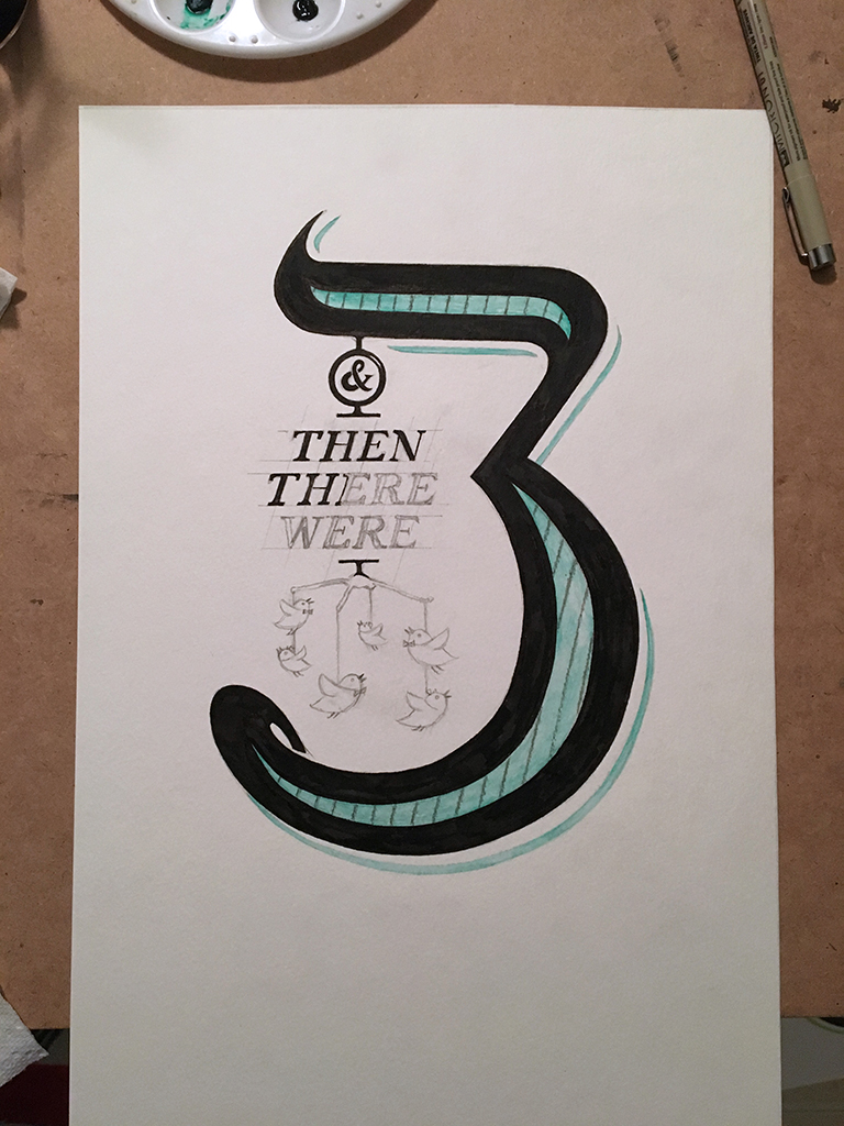
After sketching the layout full size on watercolor paper and refining, I took a needed eraser and tried to erase the dark lines so they wouldn't they wouldn't impact the watercolors too much. My plan was to use a gender neutral color (some kind of green) and contrast it with the Micron's black to really pop. I liked the way the flourish looked when it came out the bottom, but it seemed to crowd out the pen, pencil and crayon when placed on top, so I killed it. Next steps were to do the watercolor sections and then use the gray crayon to create the lines on top.
I know I know, the kerning and letterforms of the text aren't perfect. Should I have slowed way down and done one word a day or practiced 10 more time, sure, but it's hand drawn and that's what makes it interesting. If I wanted sharp lines and perfection, I could have drew it in Illustrator or chosen a typeface, but instead I thought the hand drawn look fit the occasion better. The detail in the birds was a lot of fun.
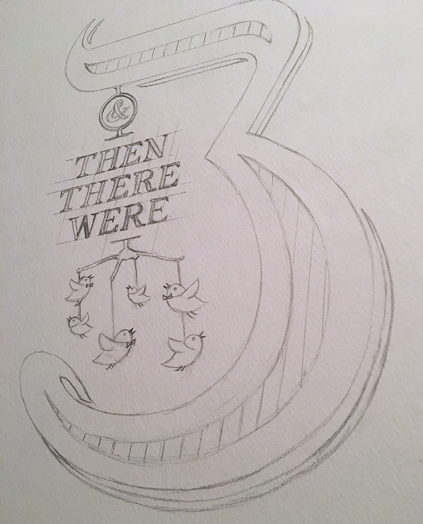
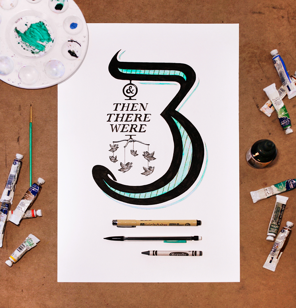
I thought about trying to do 3 birds too, but then I thought I was screaming "3" at that point. They get it, 2+1=3. I did 6 birds. 3 have bowties and 3 have hair bows. Would many people notice, probably not, but I love that about art direction. I like having some details in there that I know are thematic and smart, maybe they get discovered, maybe they don't but if you ever do a deep dive looking at a layout, I want my best work to have something extra to realize. I figured if I turned the crayon to show the Crayola logo it would be more identifiable and I could tweet it at them or something. Anyway the final design is to the right. Some of the curves could be better, but I don't want to make the black slightly more round only to have the black way too thick and looking strange/lopsided.
While the top of the mobile turned out as I would have hoped, the crossbar in the first "H" is tilted after I had it right and then screwed it up. That bothers me, but I didn't want to alter any letters, drawings or mistakes in post. I felt changing them in photoshop vs. what the illustration actually looks like would be compromising the integrity of the piece. I want to fix it, but I can't!
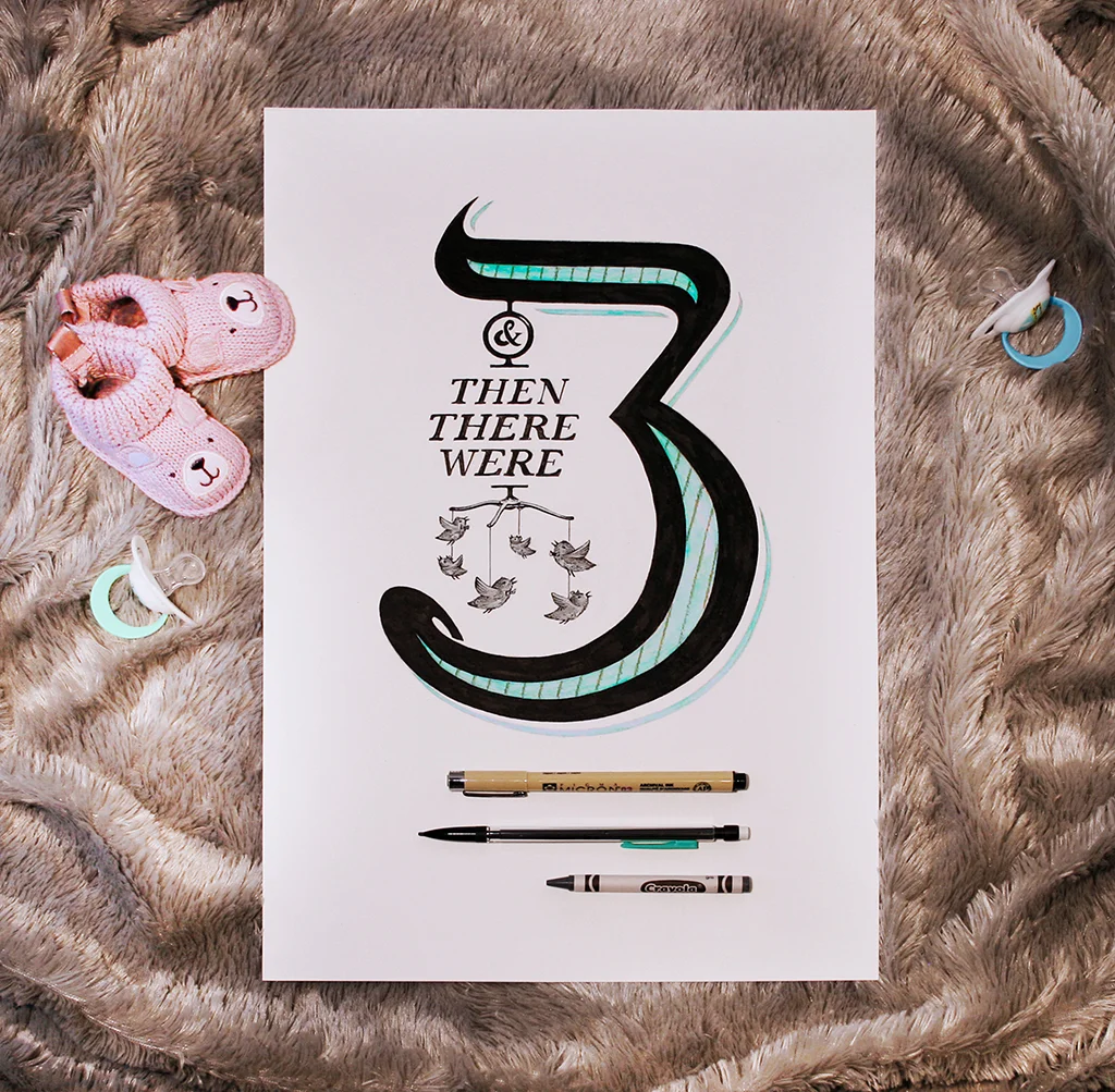
The final layout by itself seemed fine. Probably would get the point across and is simple enough, but then after some thought I experimented with some different environments too. I set it on a comfy blanket and thought we could position all kinds of baby stuff that relate to us around it. This way once I post the image, everyone would understand right away and it would stand out. Meh, it seemed to kiddy, too cute and I wasn't sold.
The other idea was to just leave it on my art board. Sprinkle some paint tubes around and took the pic. I thought the image would just be a blog post, but the more I looked at it, the more I thought it worked. I paint, draw and design, this just makes sense to post as a new piece and tell everyone that way. Showing all kinds of baby stuff is done enough. Holding a chalk board and us looking at each other is fine, but we didn't want to do that. I wanted to create a simple layout that had some thought to it and I think this showed it off the best.
All in all, it was a fun project. Having a baby is a big deal and this announcement will give it more justice than us just telling people. A few things I learned: slow down when drawing serifs and really keep the angle of the letters always in mind (I got off track way too much and went way too fast), incorporate things that have meaning even if not everyone will get it (the birds themselves since Jackie loves birds and the bow ties and hair bows on them to make 3 of each) and be very careful when a cat is around (Colby bent the paper a little in a corner and almost messed this up a couple times:).
