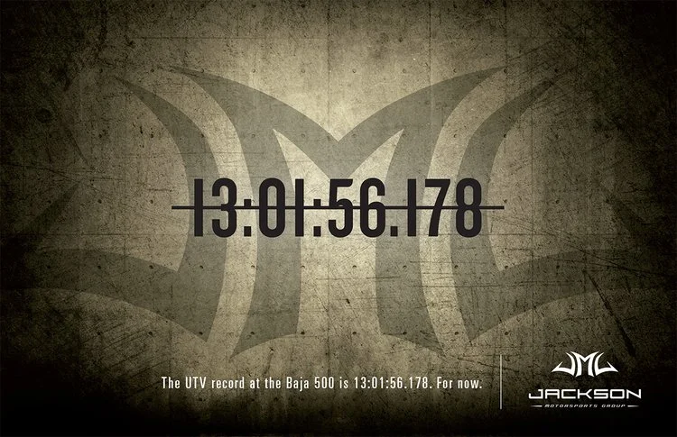
Being that it was in a cool industry and partnered with cool brands, the re-branding of Jackson Motorsports Group wasn't terribly difficult. They needed to have a style that would work both in the off-road and pavement racing markets. Oh, and it needed to be edgy.
I wanted to create a symbol that not only looked good, but also had a thought behind it. There aren’t many items more relevant to all forms of racing than a helmet. See how I got to the final mark, some of the branding pieces and a short video we used to launch it.
While the tribal style look didn’t stand the test of time and the branding was replaced years later, I learned a lot from the project and the symbol really was recognized in the motorsports track event space.
Art directed while at Jackson Marketing.


